
Total Plus Documentation
This documentation guides you through the installation, usage, configuration and customization options of the theme.
If you have any questions or need any assistance related to the theme, please feel free to open a support ticket. Our support team will be happy to help you.
Here are Demo and Purchase links in case you need it.
Theme Installation
After you have purchased the theme, you will need to login to the “My Account” page to download the theme.
Click on “Login” Menu on our website and then enter the username and password that you used while purchasing the theme.
Once you are logged in, you will be redirected to My Account Page. If you are not redirected then click on the “My Account” Menu. My Account Menu will only appear if you have successfully logged in to our website.
Now click on the “View Detail and Downloads” button. You will see the payment information along with the download of the Total Plus Theme and Revolution Slider at the bottom of the page.
Download the Total Plus Theme. Now you can install the theme in two ways.
Installation via WordPress Dashboard
To install the theme via WordPress Dashboard follow these steps:
- Go to Appearance > Themes.
- Click on Add New button then click on the Upload Theme button at the top of the page.
- Now Choose the downloaded zip file of the Total Plus Theme and click on Install Now button.
- Once installed, Activate the theme.
Installation Via FTP/Cpanel
To Install the theme via FTP/Cpanel follow these steps:
- Download the Total Plus Theme zip by logging in to your dashboard as described earlier.
- Save the downloaded theme zip file on your hard drive.
- Extract the downloaded zip file you will find a folder with style and other theme files inside it.
- Now Connect the FTP server using the FTP details and copy the extracted folder to ‘site-name/wp-content/themes/’ path.
- Now go to the Dashboard > Appearance > Themes.
- You’ll see the Total Plus theme in the theme dashboard.
- Activate the theme.
Demo Installation
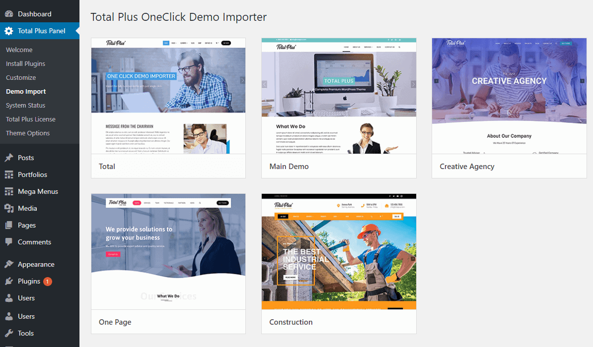
With the Total Plus theme, you can import and install the demo contents with just one click. There are 5 pre-built demos that you can import instantly. We will be adding more demos in the near future. To install the demo content, follow these process
- Go to Total Plus Panel > Demo Import. You will see 5 ready to import demos.
- Before you install the demo, Please make sure that your WordPress and Server has the minimum requirement needed for the demo import to work properly. For this, click on the Total Panel > System Status and make sure that there is no any red remark. Please contact your hosting provider in case there are any red remark and ask them to increase it.
- Also, install all recommended plugins suggested by the theme. You will see the notification at the top of the page if you have not installed the plugin. Or you can go to Total Plus Panel > Install Plugin and install all the recommended plugins.
- Now in the Total Plus Panel > Demo Import page, click on the “Install” button for the demo that you want to import.
- A New Page will appear. Check on “Reset Website”. Enabling it will remove all your old content so please be sure that you want to do it. And enabling this option is very important to import the demo properly. If the demo is imported without enabling it, the demo will not import properly. Click on the “Import Demo” button.
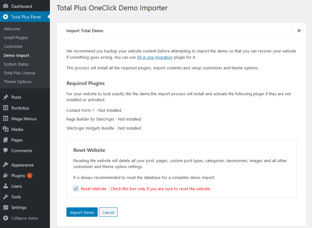
- A popup message will again appear asking you “Are you sure to proceed? Resetting the database will delete all your contents.”
- Click on the “Ok” button and it will start importing the demo. You will see the loading screen indicating that the demo installation is in progress.
- Depending on your internet speed and hosting providing, the demo installation might take 1 to 5 minutes.
- Once the demo installation is complete, the loading screen will change in to tick sign.
- Check your website to see the demo.
Front Page Setup
Total Plus theme provides an option to import the demo with just one click. After importing the demo, you can replace the imported content with your content.
However, if you don’t want to import the pre-built demo and set up the website from the beginning then this tutorial will help you. The theme provides you with the option to display a Static Normal page as a front page, or Featured home page (which includes featured home sections like ‘about us’ section, ‘portfolio section’ etc.) as a front-page or Blog Posts as a front page. You may choose any of the available three options as per your need.
Setting Featured Home Page as Front Page
Featured Home Page refers to the home page with various section such as About Us section, Featured Block Section, Portfolio Section and more.
To display a static front page follow these steps:
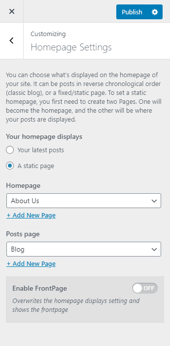
- Go to Appearance > Customizer > Homepage Settings.
- Set your homepage displays option to Your latest posts.
- Then, set the Enable FrontPage option to “Yes“
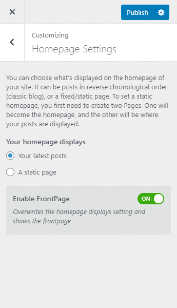
- Once done, click on the “Publish” button to save changes.
Now, you can go to the Homepage Section/Settings to customize your homepage.
Note: Enabling FrontPage option while setting your homepage displays as your latest posts will entirely overwrite your post page.
Setting Up Featured Homepage Along With Post Page
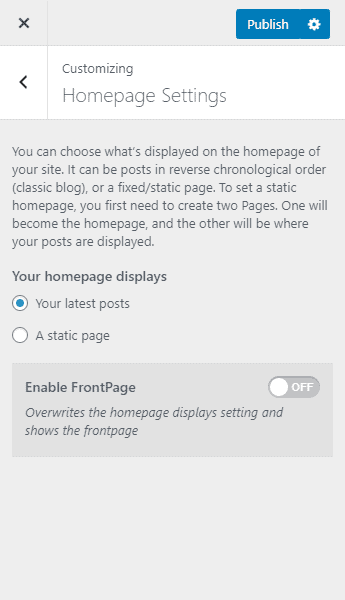
In the above step, the post page will be entirely overwritten by the featured homepage of the theme. So, if you want to a post page on your featured homepage, follow these steps:
- Go to Appearance > Customizer > Homepage Settings.
- Set your homepage displays option to A static page.
- Then, select any page you want for your homepage dropdown.
- Also, select the page where you want to locate all your posts.
- Set the Enable FrontPage option to “Yes“.
- Now the homepage will display the Featured Homepage section and the page that you have chosen for the Posts page will display all your blog posts.
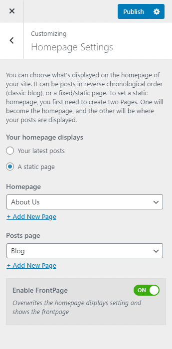
- Click on “Publish” to save changes.
Setting a Static Front Page
With the Static Frontpage, you can display a simple page content on the Home Page. Or you can even use the page builder to create various designed layouts.
To display a static front page follow these steps:
Create a page
- Go to Pages > Add New.
- Enter the title for the page.
- Enter the contents of the page in the content area.
- Click on Publish/Update button.
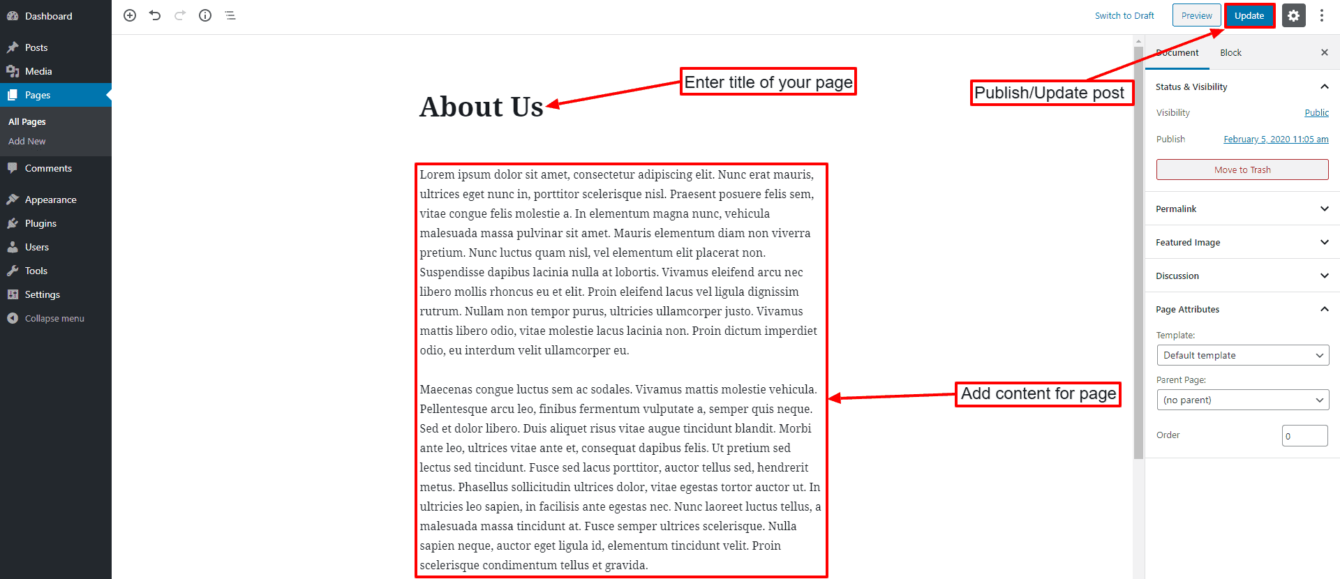
Configure to display a static front page
- Go to Appearance > Customizer > Homepage Settings.
- Set the option to A static page and choose the page you created from the Front Page drop-down list.
- Click on the “Publish” button to save changes.
Note: To display a Static Page as a homepage, you must disable the “Enable FrontPage” option.
Setting Blog as a Front Page
If you want to display a list of your latest posts (Blog) on the Home Page then follow these steps:
- Go to Appearance > Customizer > Homepage Settings.
- Set the option to Your latest posts.
- Click on the “Publish” button to save changes.
Note: To display the latest posts on the homepage, you must disable the “Enable FrontPage” option.
Template Color Setup
Before setting up anything, everyone wants to set the primary color of the theme. Square Plus allows you to choose from unlimited sets of colors for your website through a color picker. To set the theme primary color, follow these steps.
- Go to Appearance > Customize.
- Go to Color Settings.
- Choose the primary color for your website from Theme Primary Color color picker option.
- Once done, click on the Publish button.
General Settings
There are always few things that you will want to set up before adding any content to your website. And accordingly Total Plus has grouped few general setting under this heading,
- Go to Appearance > Customize.
- Click on General Settings.
The general settings include:
- HomePage Settings
- Background Image
- General Options
- Preloader Options
- Admin Logo
Homepage Settings
In the Home Page Settings, you can choose either to display Latest Posts or Static Page as a Home Page.
Background Image
The Background Image option allows you to choose the background image and color of the website.
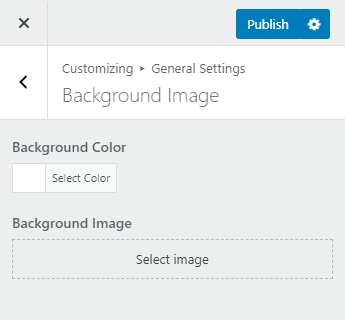
If you want to change the background and text color for each pages/posts, you can check out the article: Changing the Background and Text Color for Each Post and Page
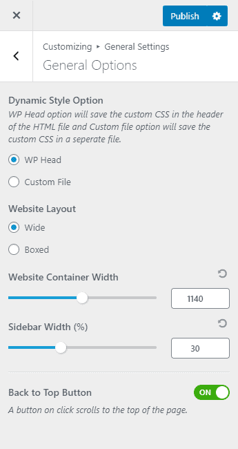
General Options:
The General Options contain few settings like Website Layout, Website Container Width, and Back to Top button. The Website Layout allows setting the website to be either full-width or the boxed layout. Website Container allows you to increase/decrease the width of the website. Back to Top button allows you either to show or hide this button that will display at the bottom right corner of the website and when clicked scrolls to the top of the page.
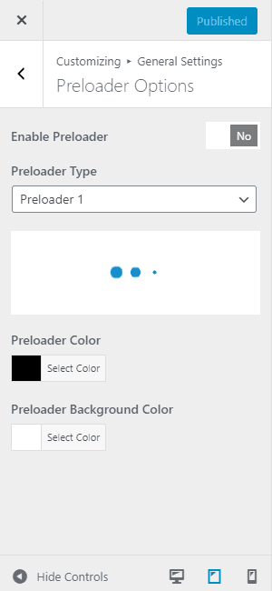
Preloader Options
Preloaders are the animated block that displays until the website is fully loaded. From the Preloader Option section, you can enable/disable the preloader. The theme contains 16 prebuilt preloaders. You can change the preloader background color and preloader color from the setting. Alternately, you can even add your own Preloader GIF image.
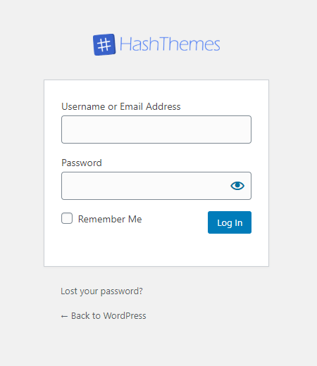
Admin Logo
The admin logo allows you to upload and change the logo of the admin login page. You can configure the width and height of the logo as well as add a custom URL in it.
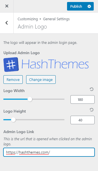
The Admin logo like the one below in the screenshot can be obtained after editing the settings available.
Typography Settings
With Typography Settings, you can change the typography parameters like Font Family, Font Style, Text Transform, Text Decoration, Font Size, Line Height and Font Color of each and every element of the website.
- Go to Appearance > Customize.
- Click on Typography Settings.
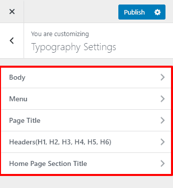
There are 5 setting options for the typography
1. Body Typography
This typography setting applies to all the text of the website excluding Header Menu, Home Section Title, and Headers(H1, H2, H3, H4, H5, H6) as they have their own individual settings.
2. Menu Typography
This typography setting applies to the Header Menu text. Make your website’s menu standout loud using this setting.
3. Home Section Title Typography
This typography applies to the main titles of the Homepage section. You may want to make the section title different than other text.
4. Page Title Typography
This typography applies to the main title of single and archive pages. It is the main title that appears in the header of all the page.
5. Header(H1, H2, H3, H4, H5, H6) Typography
This typography applies to the header H1, H2, H3, H4, H5, H6 respectively.
Note: The header H5 also applies to the main title of the block on the homepage sections. So this setting might be handy if you want to change the font parameter of the title of the blocks on the home page.
Header Settings
Total Plus theme allows you to configure each and every element of the header from the header layout to header elements and their design.
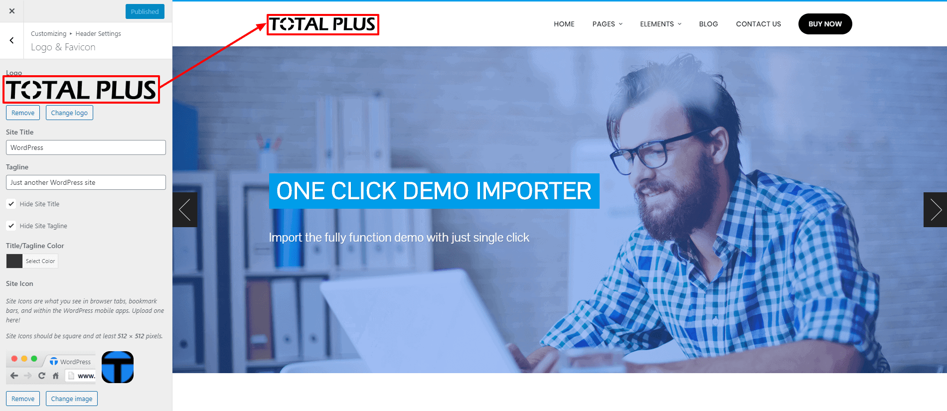
Adding Logo and Favicon
To upload the site logo, follow these steps:
- Go to Appearance > Customizer > Header Settings > Logo & Favicon.
- Click on the Select Logo button and choose the logo from the media library.
- You can also add the Site Title and Site Tagline and choose its color.
- Click on Select Site Icon to upload the favicon.
- Add the Site Title and Tagline if you want to show it just beside the logo.
- If you do not want to show Site Title and Tagline then check on Hide Title and Hide Tagline option.
- Change the color of the Site Title and Tagline from the Title/Tagline Color option.
- Once done, click on the “Publish” button.
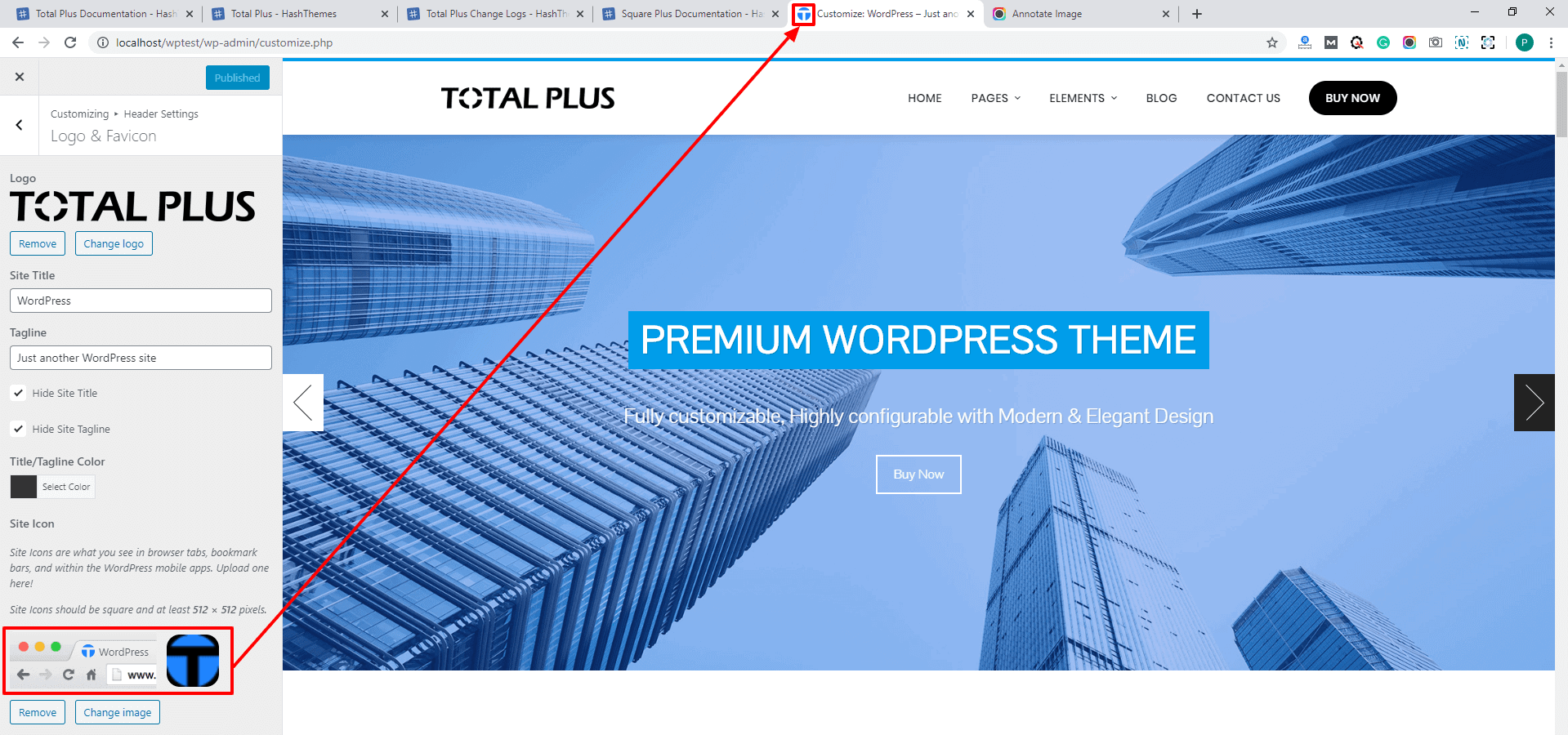
To upload the favicon, follow these steps
- Go to Appearance > Customizer > Header Settings.
- Click on Site Identity.
- In the Site Icon option, click on Select Image Button.
- Upload the favicon image, and crop it if required. Otherwise, click on Skip Cropping button.
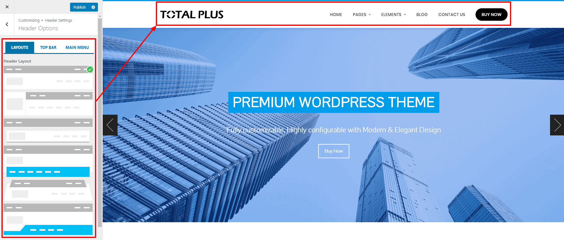
Change Header Layout
Total Plus comes with 6 different header layouts to choose from. You can choose any of them as per your choice. To choose the header layout:
- Go to Appearance > Customizer > Header Settings.
- Click on Header Option.
- Now, choose the best matching one for your website.
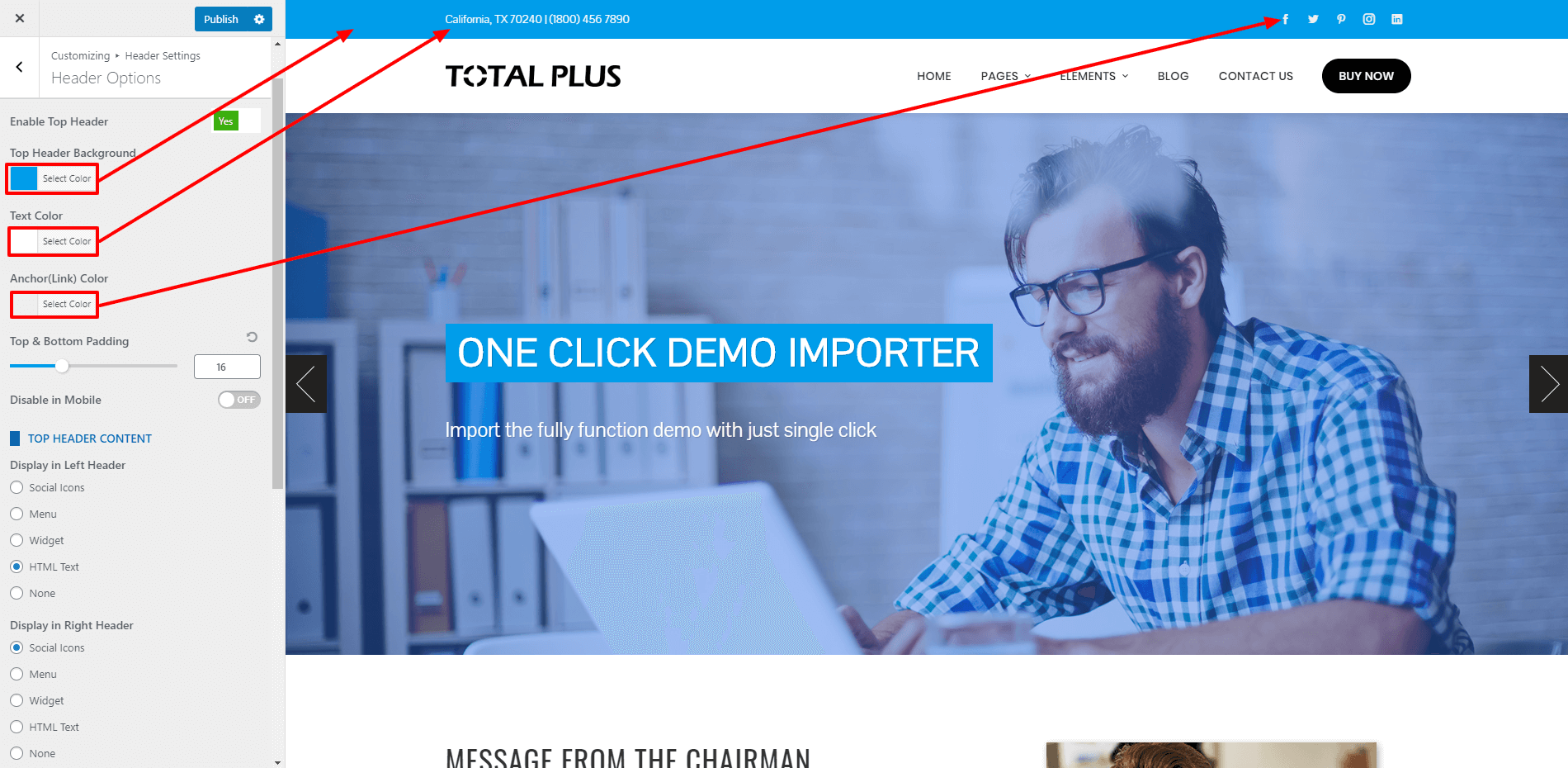
Setting Up Top Header
You can enable or disable the top header, configure the color setting, set the padding. You can also what content to display in the left and right top header. You can either display social icon, menu, widget, or custom HTML text. If you’d like to arrange more customizations, you can utilize a tool like WP Sticky and set up a sticky header in a matter of minutes. set up the top header, follow this instruction
- Go to Appearance > Customizer > Header Settings.
- Click on Header Option.
- Click on Top Header tab.
- Enable/Disable the Top Header.
- If enabled, choose the top header background, text color and the anchor color for the top header.
- Also, set the top and bottom padding of the top header.
- Set the Disable in Mobile option either to show or hide it in the mobile device. If disabled, the top header will not show in the screen smaller than 768px
- Choose what content to display in the left and right top header
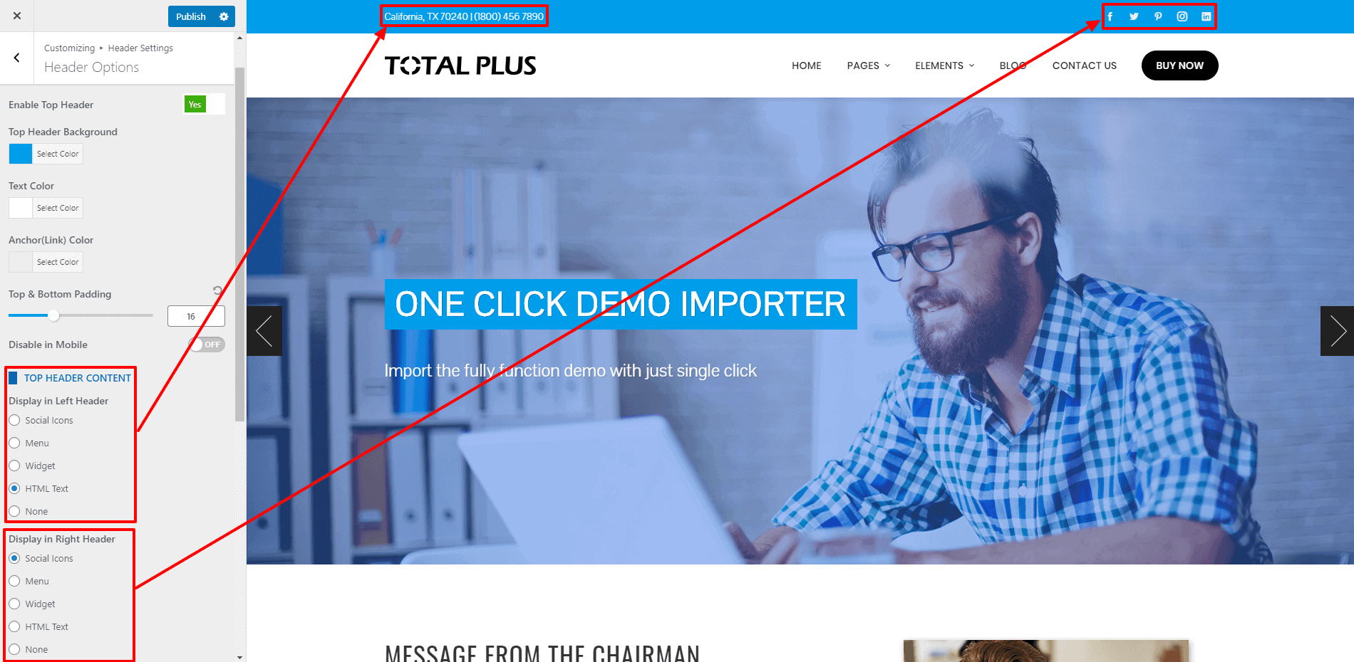
You can choose either to display Social Icon, Menu, Widget, or HTML content If you have chosen Social icons, follow the below steps
- Click on the Social Icon in the description text.
- Click on Add New to add social icons
- Choose the icon and add the link
- Follow the steps again to add more social icons
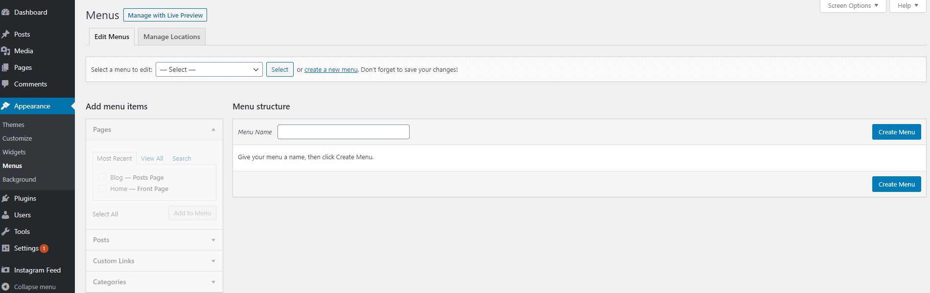
If you have chosen Menu, follow the below steps
- Go to Appearance > Menus
- Create a new menu
- Enter the Name of the Menu and click on Create Menu button
- Now add the menu items and click on Save Menu.
- Now go back to Appearance > Customizer > Header Settings.
- Click on Top Header Tab
- In the Select Menu option, the newly created menu will appear. select it
If you have chosen Widget, follow the below steps
- Go to Appearance > Widget.
- Select the Widget Area from the drop-down menu.
- In case you need to create a different new widget, you can go through the article.
If you have chosen HTML Text, follow the below steps
- Add your text in the HTML Text field. This field also supports HTML so you can add formatting to the text and even HTML elements.
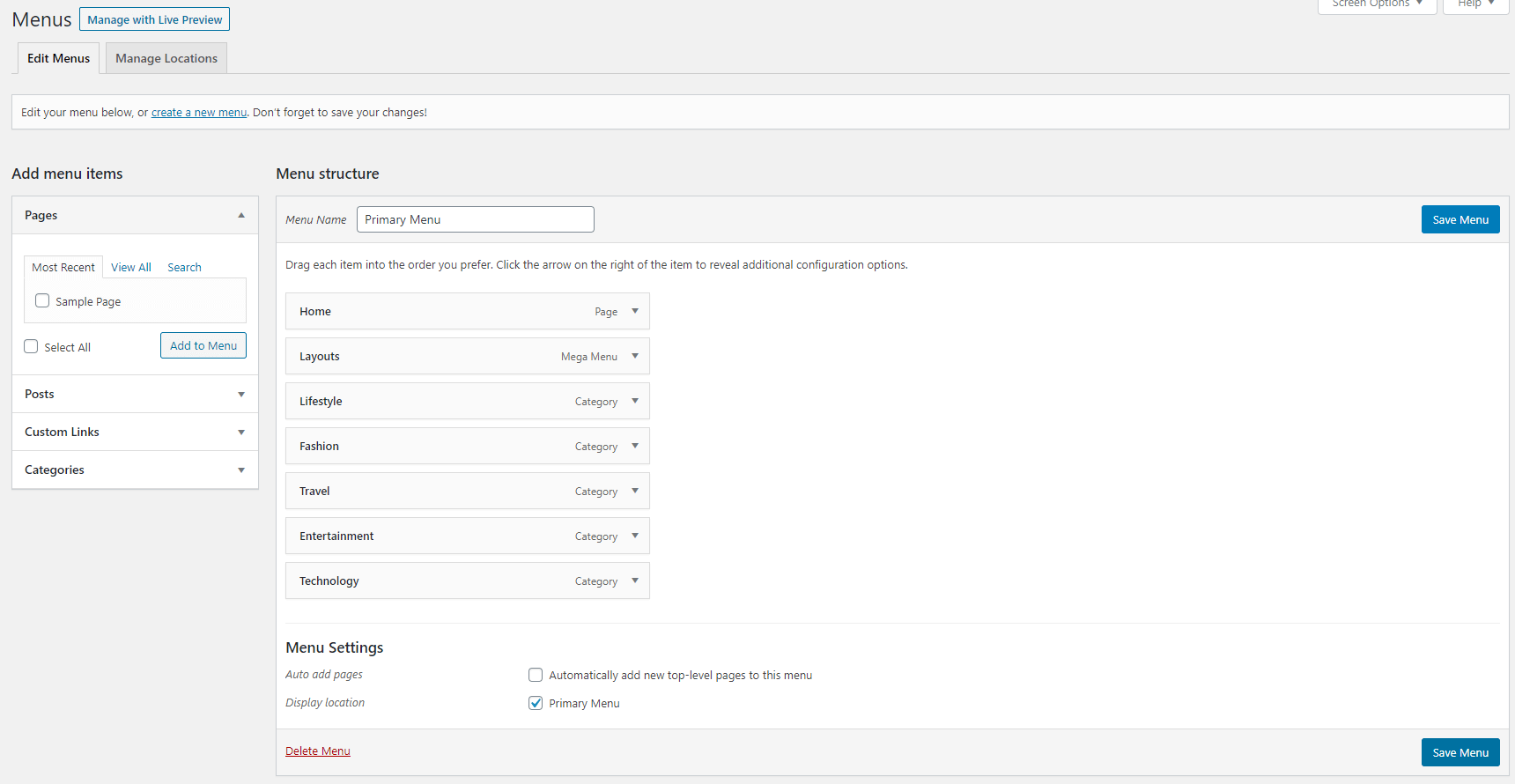
Menu Setup
Creating General Menu
1)Defining a Menu
You must define a menu before you can add items to it.
- To create a menu, go to Appearance > Menus to bring up the menu option.
- Click on create a new menu.
- Give the name to your new menu.
- Click on Create Menu button to create the menu.
Your new custom menu is now defined.
2) Adding Items to a Menu
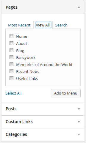
You can add different link types into your menu, these are split between panes left of the menu you’re currently editing.
- Locate the pane entitled Pages.
- Within this pane, select the View All link to bring up a list of all the currently published Pages on your site.
- Select the Pages that you want to add by clicking the checkbox next to each Page’s title.
- Click the Add to Menu button located at the bottom of this pane to add your selection(s) to the menu that you created in the previous step.
- Click the Save Menu button once you’ve added all the menu items you want.
After you have added the menu items, select the display location of your menu to “Primary Menu” and then click on Save Menu.
Alternatively, you can create the menu and add its item directly from the customizer.
- To create the menu from the customizer, go to Appearance > Customize > Menus to bring up the menu options.
- Click on create a new menu.
- Give the name to your new menu.
- Choose the location of the new menu.
- Click on the Next button to continue.
- Now add the menu items as per your need and set the menu location to Primary Menu.
- Once done, click to Publish to save.
You can make the menu responsive after certain px resolution size. To do that, you can go through the article: Enable Responsive Menu
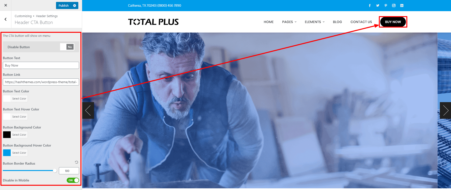
Adding Call to Action Button on Menu
Total Plus allows you to add a unique looking Call to Action Button in the main menu. To add the button in the main navigation, follow these steps
- Go to Appearance > Customizer > Header Settings > Header CTA Button.
- Choose no for the Disable Button option. This setting gives the option either to show or hide the button.
- Add the Button Text and Button Link.
- Also, choose the color for the button text and button background.
- Similarly, choose the color for the button text and button background on hover.
- Increase Button Border Radius value if you want to have a rounded button.
- You can also enable/disable the CTA button for mobile. If disabled, the CTA button will not show in the screen smaller than 768px.
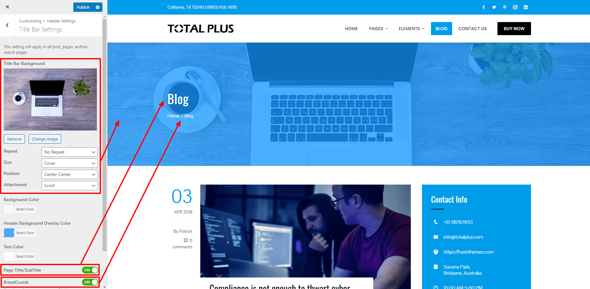
Title Bar Settings
Total Plus comes with an option to place a custom background image or color on the Title bar of the website. To configure the title bar settings:
- Go to Appearance > Customize > Header Settings > Title Bar Settings.
- Upload a background image for the title bar and configure its position, size, and attachment.
- You can also configure the background color and its opacity color. Set the opacity value of the overlay color below 50% so that the background can appear. Setting the opacity to 100% will completely cover the background image.
- Also, you can on/off page title/subtitle and breadcrumb settings on the title bar. Enabling the breadcrumb can be a great way to let your visitors know where they are on your website.
If you want to add a unique title bar background on each pages or posts, you can go through the article: Add a Unique Title Bar Background for Each Post and Page
Home Page Section/Settings
Total Plus comes with 17 different sections that can be added on the front page of the website. Each of the sections has its own variations and reordered using the drag and drop process.
Note: These sections will only be displayed in the featured homepage.
The different sections for front page are:
- Home Slider
- About Us Section
- Featured Section
- Portfolio Section
- Service Section
- Team Section
- Counter Section
- Testimonial Section
- Pricing Section
- Blog Section
- Clients Logo Section
- Call to Action Section
- Contact Section
- Tab Section
- News and Update Section
- Highlight Section
- Custom Section
Home Slider Section
In the Home Slider Section, you can create responsive slides on the homepage. The sides cane anything like image. video clips, contents, etc.
You can add 3 different kinds of sliders on the Home Slider Section.
- Normal Slider
- Revolution Slider
- Single Banner Slider
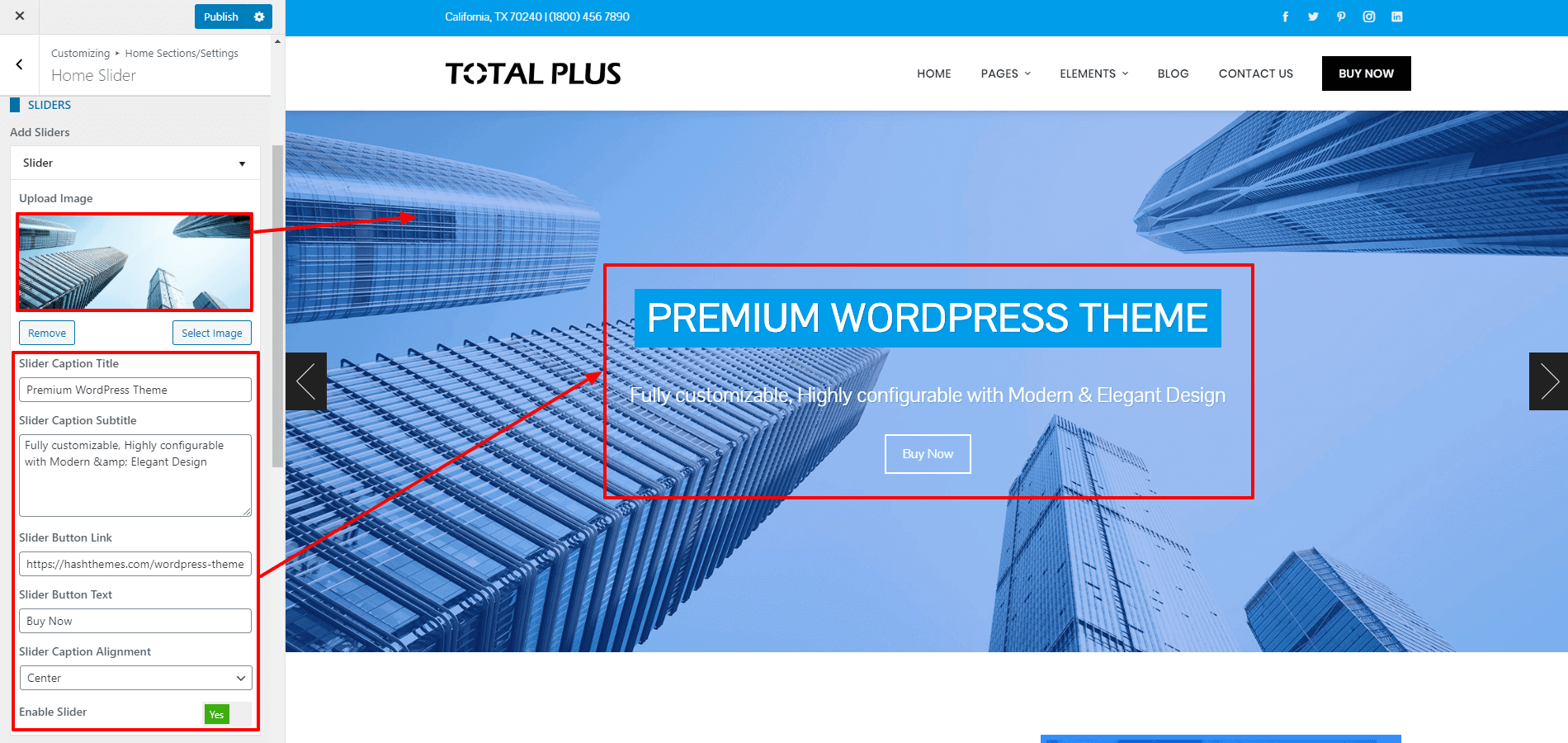
Normal Slider
Under the normal slider, you will be able to upload image sliders and add its caption title and subtitles. Also, you can place the button text/link and set the alignment for the caption and button text.
To add the Normal Slider, follow these steps:
- Go to Appearance > Home Sections/Settings > Home Slider
- Choose Normal Slider for the Slider Type option.
- Click on Add Slider to start adding slides.
- Upload the image for your slider and add its caption title and subtitle.
Note: The recommended size of the image is 1900*800. However, you can increase the height of the slider according to your requirements. But you need to make sure that all the images are of the same height and width.
- Add Button Text and Button Link and set the alignment of the slider.
- If you don’t want to show it, you can just set the Enable Slider option to “No“. You don’t need to delete it.
- If you want to change the color of different elements of Normal Slider, go to the Style Tab. There, you can pick any colors of your choice using color picker. Also, if you want to add separator or other advanced settings, you can check our article: Configuring Advanced Settings
Slider Settings
If you have chosen the normal slider as the home slider, the theme provides you with different slider settings to configure the parameter of your slider.
In the slider settings, you can set the slider transition to either slider or fade.
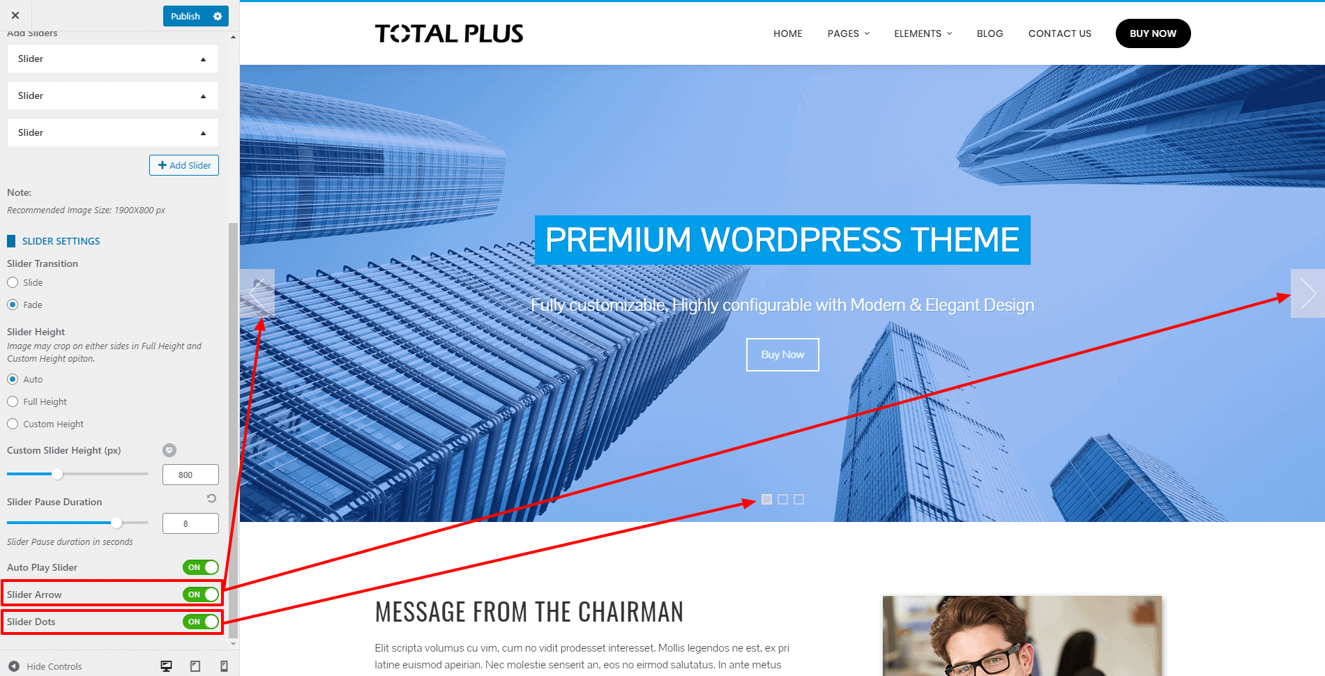
You can also select the slider height to auto or full height. If you choose auto, the slider will display the actual size of the upload and if you choose the full height, the image will be displayed the full-screen size of your device. Besides, you can set the custom height of the slider images for desktop, mobile, and tablets.
You can also set the slider pause duration, and enable/disable autoplay slider. Besides, you can also enable/disable the slider arrows and dots.
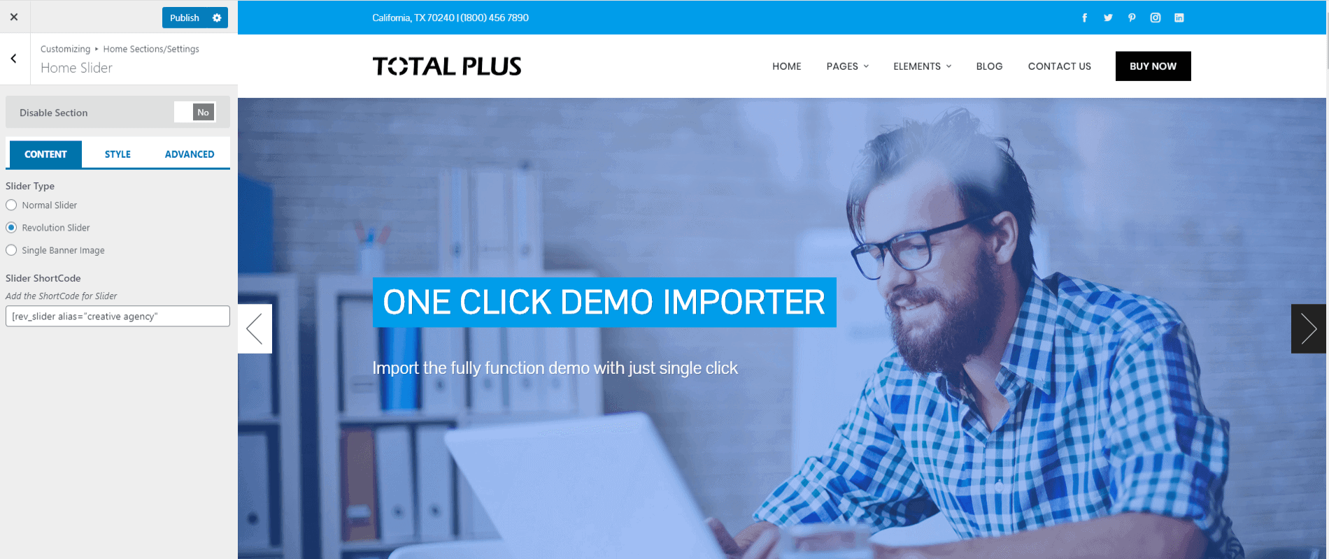
Revolution Slider
With Revolution Slider selected, you will be able to create an image or video slider with endless animation possibilities. Use this option if you need a slider different and more advanced than the Normal Slider option. To use this option, you will need to install the Revolution Slider plugin. The download will contain the Revolution Slider with the Theme zip. Follow the instruction to use Revolution Slider
- Download the Revolution Slider plugin by going to your account on our website.
- Go to Plugins > Add New
- Click on Upload Plugin at the top of the page
- Click on Choose File button and select the Revolution Slider zip and click on Install Now button
- Click on Activate after the plugin is installed
- Now in the dashboard main menu, go to Slider Revolution
- Click on New Slider with Plus sign to create the slider
- Go through the detailed documentation of the Revolution Slider here and Video Tutorial in order to create the slider.
- Once you have created the slider, copy the Shortcode of the slider which will be in the form [rev_slider alias=”slider_name”]
- Go to Appearance > Customizer > Home Sections/Settings > Home Slider.
- Choose the Revolution Slider for the Slider Type option and paste the copied shortcode in the Slider Shortcode field.
- Once done, click on the “Publish” button to save changes.
Note: Apart from Revolution Slider, you can use any free or premium slider plugin
Single Banner Image
With the Single Banner Image option, You will be able to upload a single static image with caption text and linkable button. Follow steps below to use a Single Banner Image:
- Go to Appearance > Home Sections/Settings > Home Slider
- Choose Single Banner Image for the Slider Type option
- Upload the Banner Image and add the Banner Title and Banner SubTitle. Leave the Banner Title and Banner SubTitle field if you don’t want to show text.
- Add the Button Text and Button Link to show a button. Leave these fields empty if you don’t want to show.
- Choose the Banner Text Alignment either to Left, Right or Center
- Also, choose the Background Effect either to be Parallax effect or Horizontal Scrolling Effect
- Finally, choose the Background Overlay Color. The Background Overlay Color brings some colorful effect to the banner and also make the text readable.
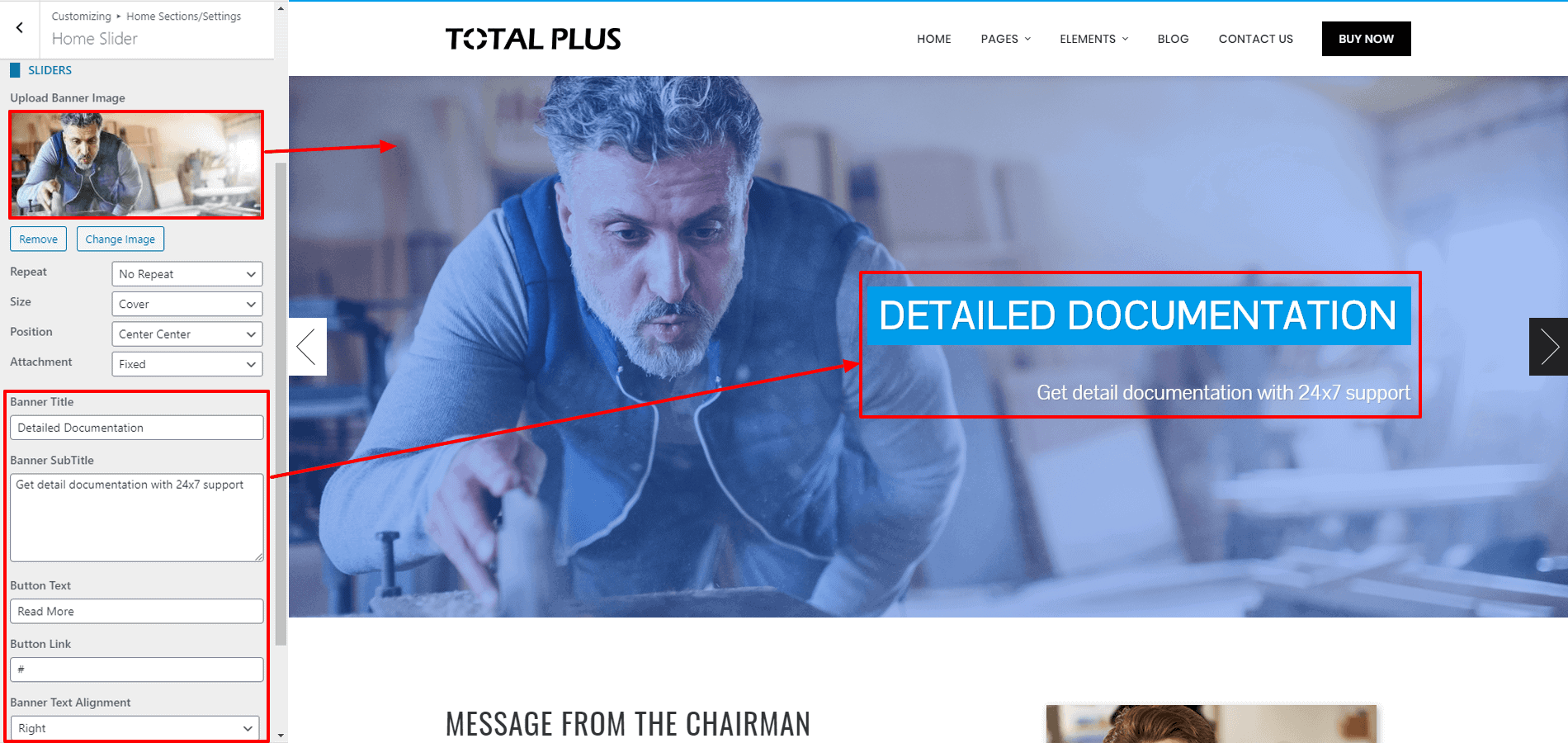
- Once done, click on “Publish” to save changes.
About Us Section
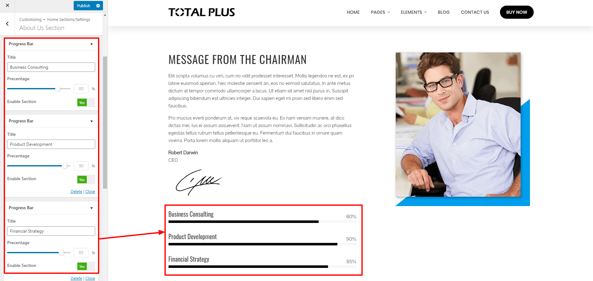
The about us section allows you to a short message from the about us page as well as the progress bar of your company to make your website more engaging. It is divided into 2 different blocks.
On the left block, you can choose the page of which you want to display the message and display the progress bar of your company. The progress bar will allow highlighting the current status of your company. While on the right block, you can either upload your custom image or insert a widget instead of the image.
To configure the about us section of Total Plus theme, follow the introduction:
- Go to Home Page Sections/Settings >About Us Section.
- Choose the page of which you want to display the message in the left block.
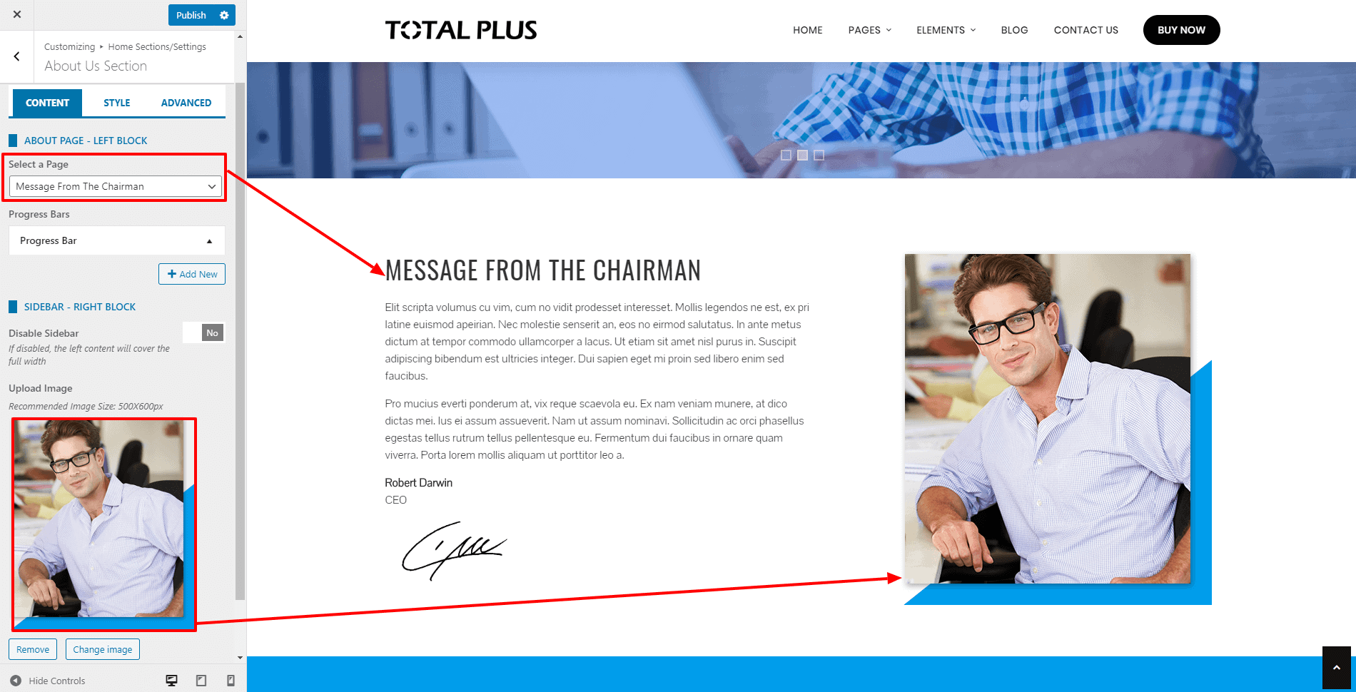
- Now give the title to your progress bar and configure the % of the bar. You can display as many progress bars as you want. If you don’t want to display the progress bar, simply set the Enable Section to No. You don’t need to delete it.
- Now upload the image or choose the widgets that you want to display on the right block.
Note: The theme allows you to create unlimited widgets areas on your website. So, to create a new widget area, you can go through the article: Adding New Widget Area
- You can even link the section with a button at the bottom of the page.
- Fill the fields More Button Text and More Button Link if you want to display a button at the bottom of the section.
- If you want to change the color of different elements of About Us Section, go to the Style Tab. There, you can pick any colors of your choice using color picker. Also, if you want to add separator or other advanced settings, you can check our article: Configuring Advanced Settings
- Once done, click on the “Publish” button to save changes.
Featured Section
Featured Section allows you to highlight the key features of your business firm in short. To configure the Featured Section, follow the instruction.
- Go to Home Page Sections/Settings > Featured Section
- Enter Super Title, Title, Sub Title. These are the heading texts that display at the top of the section. Leave this field blank if you don’t want to show them.
- Once you enter the text for these fields, you can display these titles in various ways. Choose the style that you want from the Title Style option.
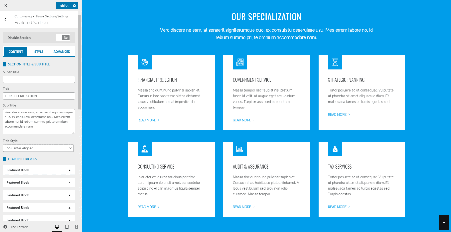
- Click on Add New button to add the Featured Blocks. You can add an unlimited number of these blocks.
- The Featured Block allows you to add the icon, title, short detail and a link to point the block to the internal/external page. You can even disable the block if you don’t want to show the block and keep it for future use.
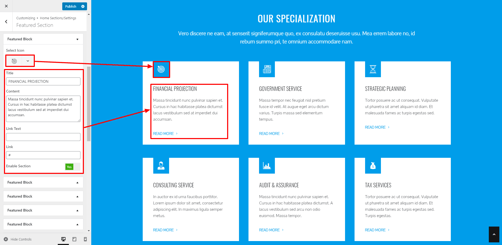
- The theme provides 7 different styles in which you can display the feature block. Choose the one that you like.
- You can even choose the no of columns to display in the single row from the option No of Columns.
- Also, you can set an extra button and link it to any contents of your website.
- You can even link the section with a button at the bottom of the page.
- Fill the fields More Button Text and More Button Link if you want to display a button at the bottom of the section.
- If you want to change the color of different elements of the Featured Section, go to the Style Tab. There, you can pick any colors of your choice using color picker. Also, if you want to add separator or other advanced settings, you can check our article: Configuring Advanced Settings
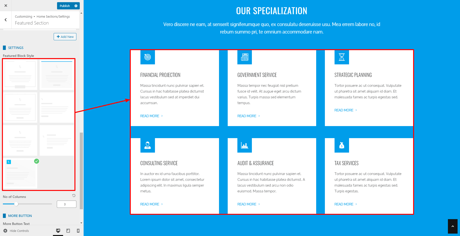
- Once done, click on “Publish” to save changes.
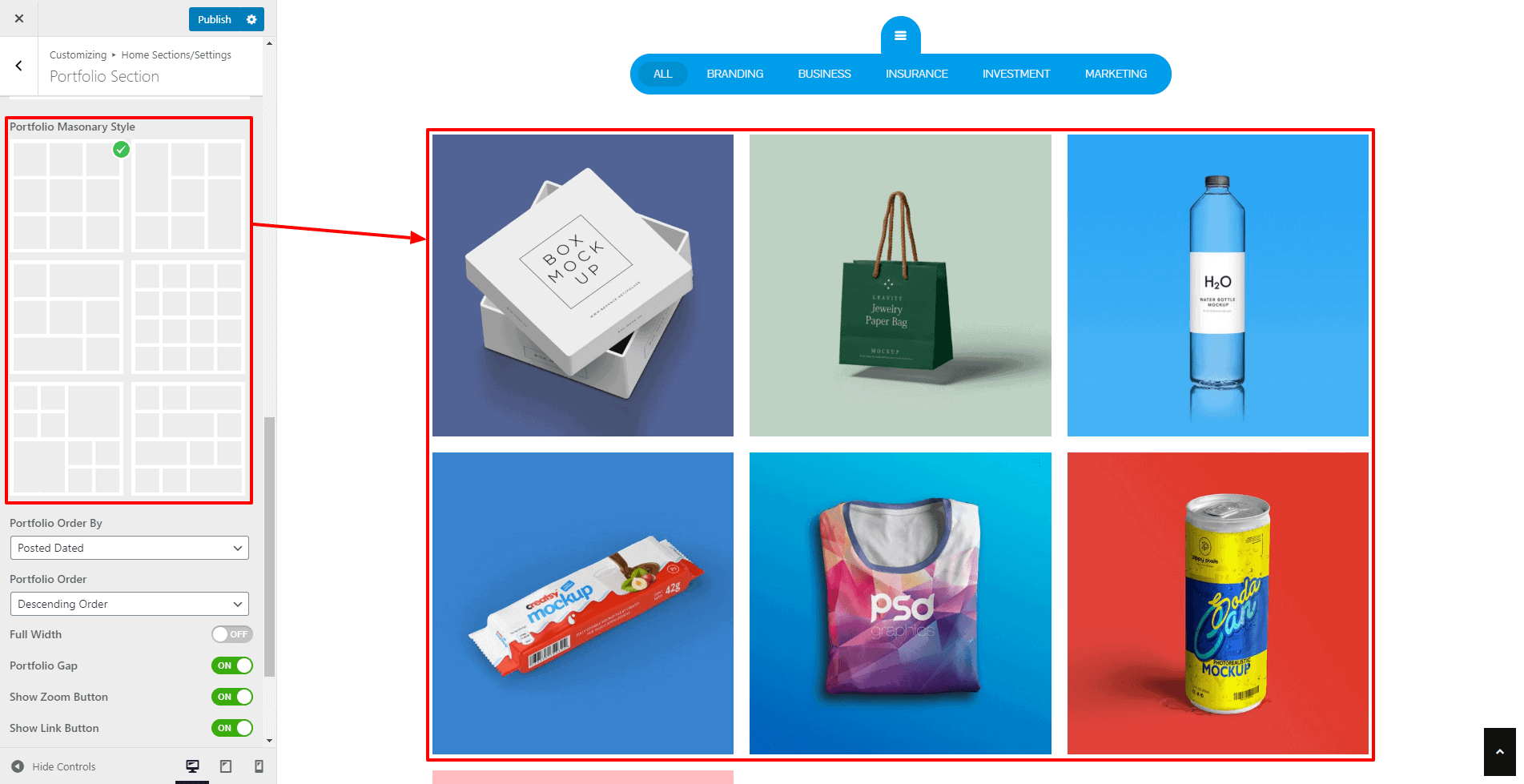
Portfolio Section
The portfolio section allows you to showcase your work or project in an interesting masonry view.
To configure the portfolio section, follow these steps:
(Before you configure the setting, you will need to create the portfolio post with an image.)
- Go to Home Page Sections/Settings > Portfolio Section.
- Enter Super Title, Title, Sub Title. These are the heading texts that display at the top of the section. Leave this field blank if you don’t want to show them.
- Once you enter the text for these fields, you can display these titles in various ways. Choose the style that you want from the Title Style option.
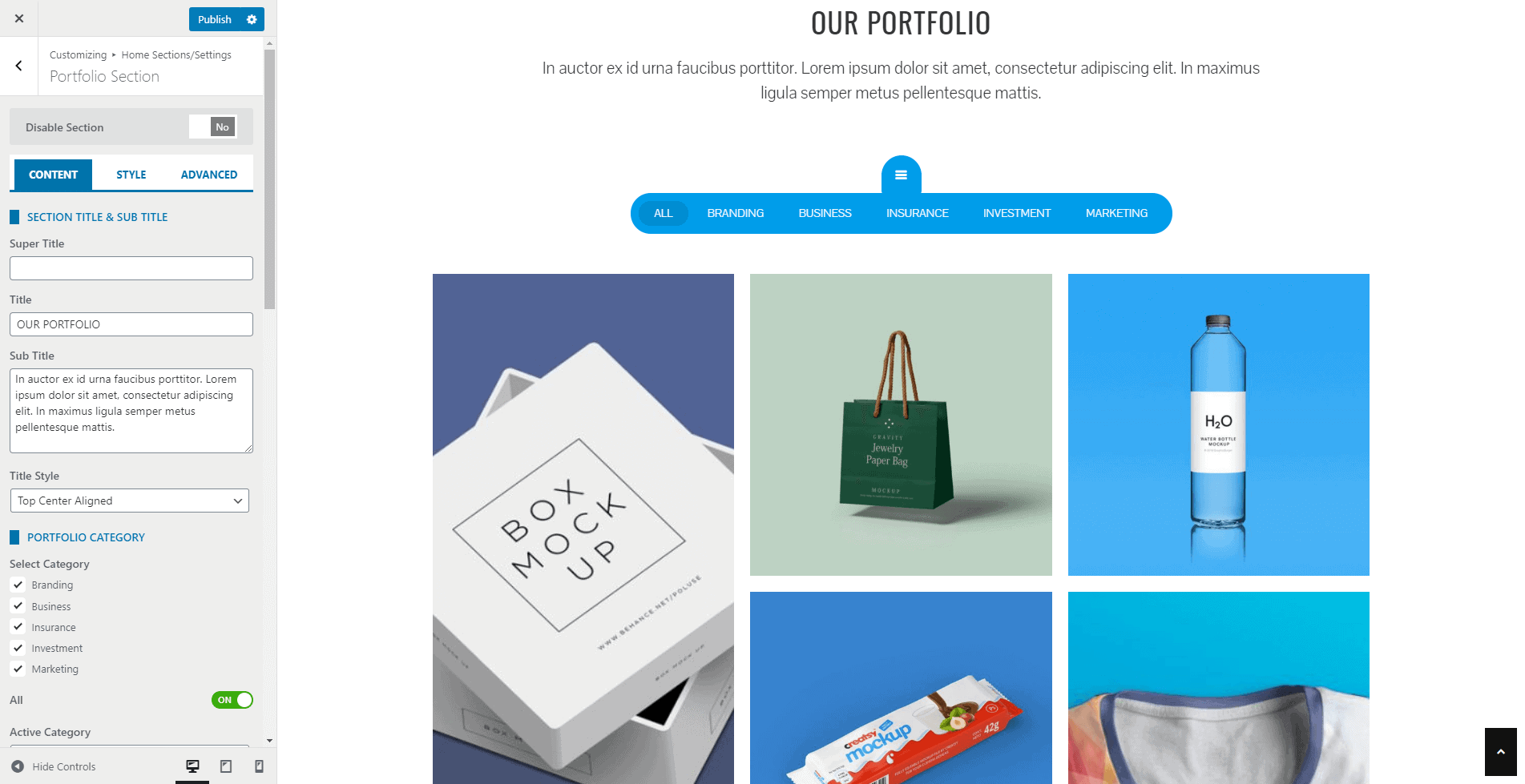
- Now select the categories that you want to display on the portfolio section and set the active category.
- Also, select the portfolio tab layout from any of the 4 pre available portfolio tabs.
- Now select the portfolio masonry layout from any of the 6 pre available layouts and set the order of the portfolio.
- You can also enable/disable the full-width portfolio, portfolio gaps, zoom button, and link button.
- You can even link the section with a button at the bottom of the page.
- Fill the fields More Button Text and More Button Link if you want to display a button at the bottom of the section.
- If you want to change the color of different elements of the Portfolio Section, go to the Style Tab. There, you can pick any colors of your choice using color picker. Also, if you want to add separator or other advanced settings, you can check our article: Configuring Advanced Settings
- Once done, click on the Publish button to save changes.
Service Section
The service section allows you to display the services your company provides. It is divided in 2 different blocks where you can list the services in one block and display an attractive image in another.
To configure the service section, follow these steps:
- Go to Home Page Sections/Settings > Service Section.
- Enter Super Title, Title, Sub Title. These are the heading texts that display at the top of the section. Leave this field blank if you don’t want to show them.
- Once you enter the text for these fields, you can display these titles in various ways. Choose the style that you want from the Title Style option.
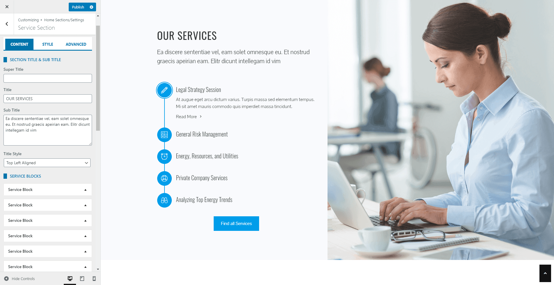
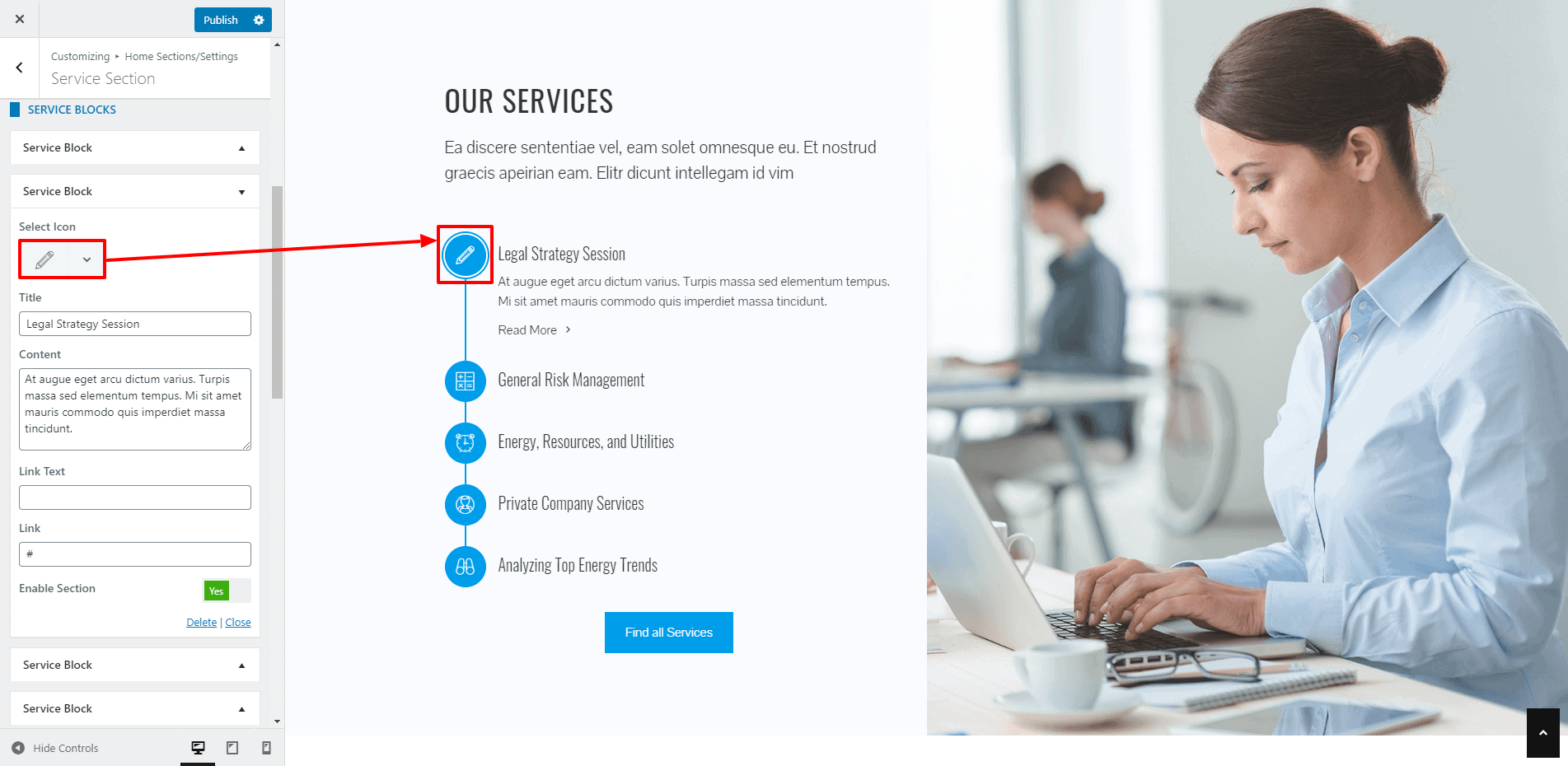
- Now add as many service blocks as you require. Then, give title, content, link text and links for each of the services. Also, upload the most suitable icons for each service.
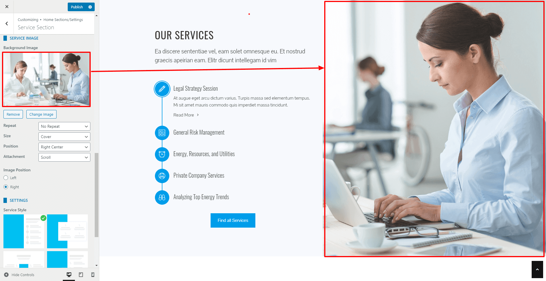
- After that, add the background image for the service section and configure its repeat, size, position, and attachment.
- You can display the services on the right block and background in on the left block or vise versa from the image position option.
- Now select any of the 4 service block layouts available to display the service section.
- You can even link the section with a button at the bottom of the page.
- Fill the fields More Button Text and More Button Link if you want to display a button at the bottom of the section.
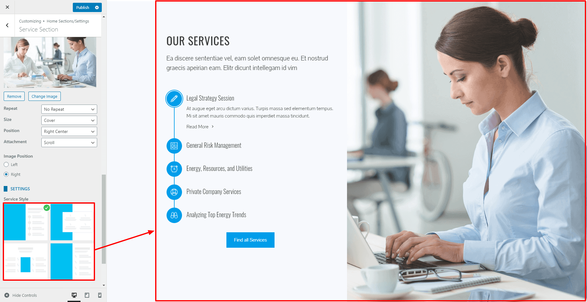
- If you want to change the color of different elements of Service Section, go to the style tab. There, you can pick any colors of your choice using color picker. Also, if you want to add separator or other advanced settings, you can check our article: Configuring Advanced Settings
- Once done, click on “Publish” to save changes.
Team Section
This section allows you to display the team member of your company in either grid or in a carousel form in multiple styles.
To configure the team section, follow these steps:
- Go to Home Page Sections/Settings > Team Section
- Enter Super Title, Title, Sub Title. These are the heading texts that display at the top of the section. Leave this field blank if you don’t want to show them.
- Once you enter the text for these fields, you can display these titles in various ways. Choose the style that you want from the Title Style option.
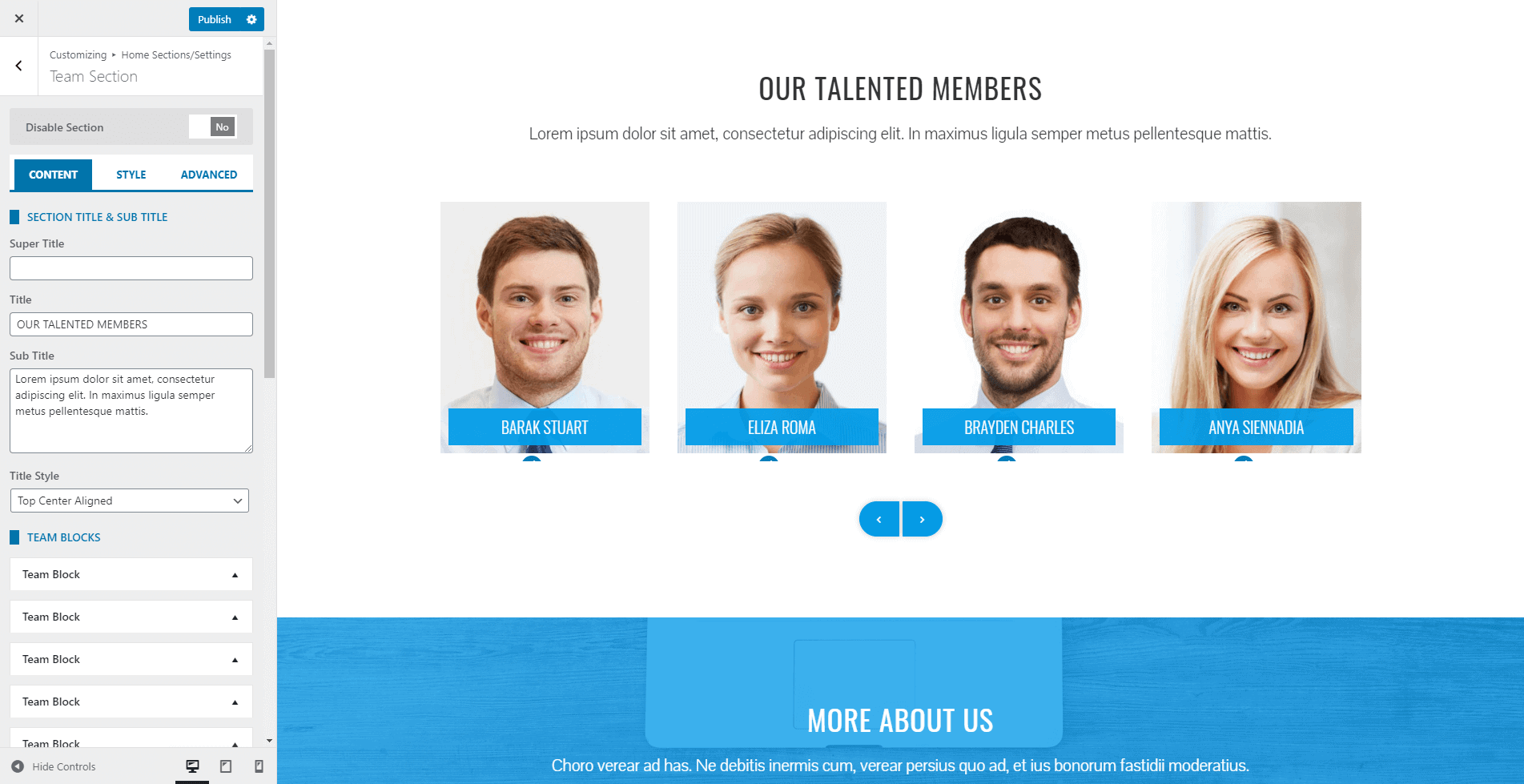
- Click on Add New button to add the Team Blocks. You can add an unlimited number of these blocks.
- Add the name and designation of your team members. Upload the image. Add short intro of the person and the social profile link. You can also add a link to point the block to the internal/external detail page. You can even disable the block if you don’t want to show the block and keep it for future use.
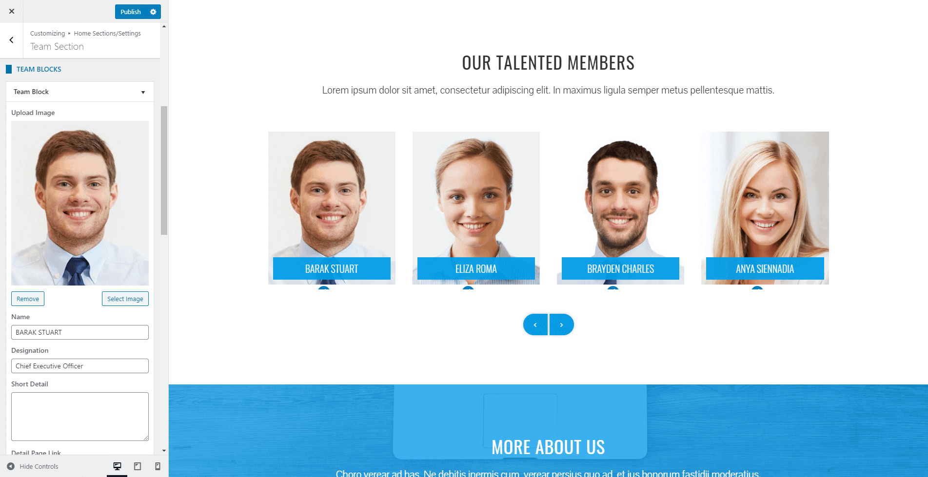
- The theme provides 6 different styles in which you can display the feature block. Choose the one that you like.
- You can even choose the no of columns to display in the single row from the option No of Columns.
- Enable Carousel Slider to Yes if you want to display the team member in Carousel.
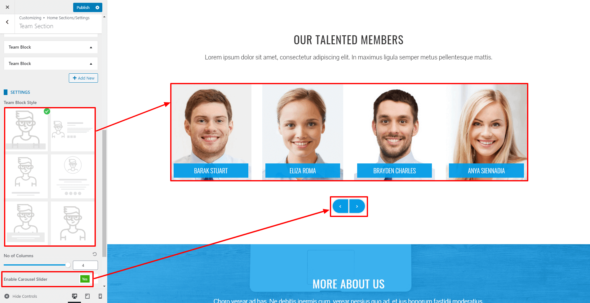
- You can even link the section with a button at the bottom of the page.
- Fill the fields More Button Text and More Button Link if you want to display a button at the bottom of the section.
- If you want to change the color of different elements of Team Section, go to the Style Tab. There, you can pick any colors of your choice using color picker. Also, if you want to add separator or other advanced settings, you can check our article: Configuring Advanced Settings
- Once done, click on the “Publish” button to save changes.
Counter Section
Counter section allows you to display the statistic of your company in numbers and animated counts. This can play a huge role in boosting the credibility of your business.
To configure the Counter Section, follow the instruction.
- Go to Home Page Sections/Settings > Counter Section
- Enter Super Title, Title, Sub Title. These are the heading texts that display at the top of the section. Leave this field blank if you don’t want to show them.
- Once you enter the text for these fields, you can display these titles in various ways. Choose the style that you want from the Title Style option.
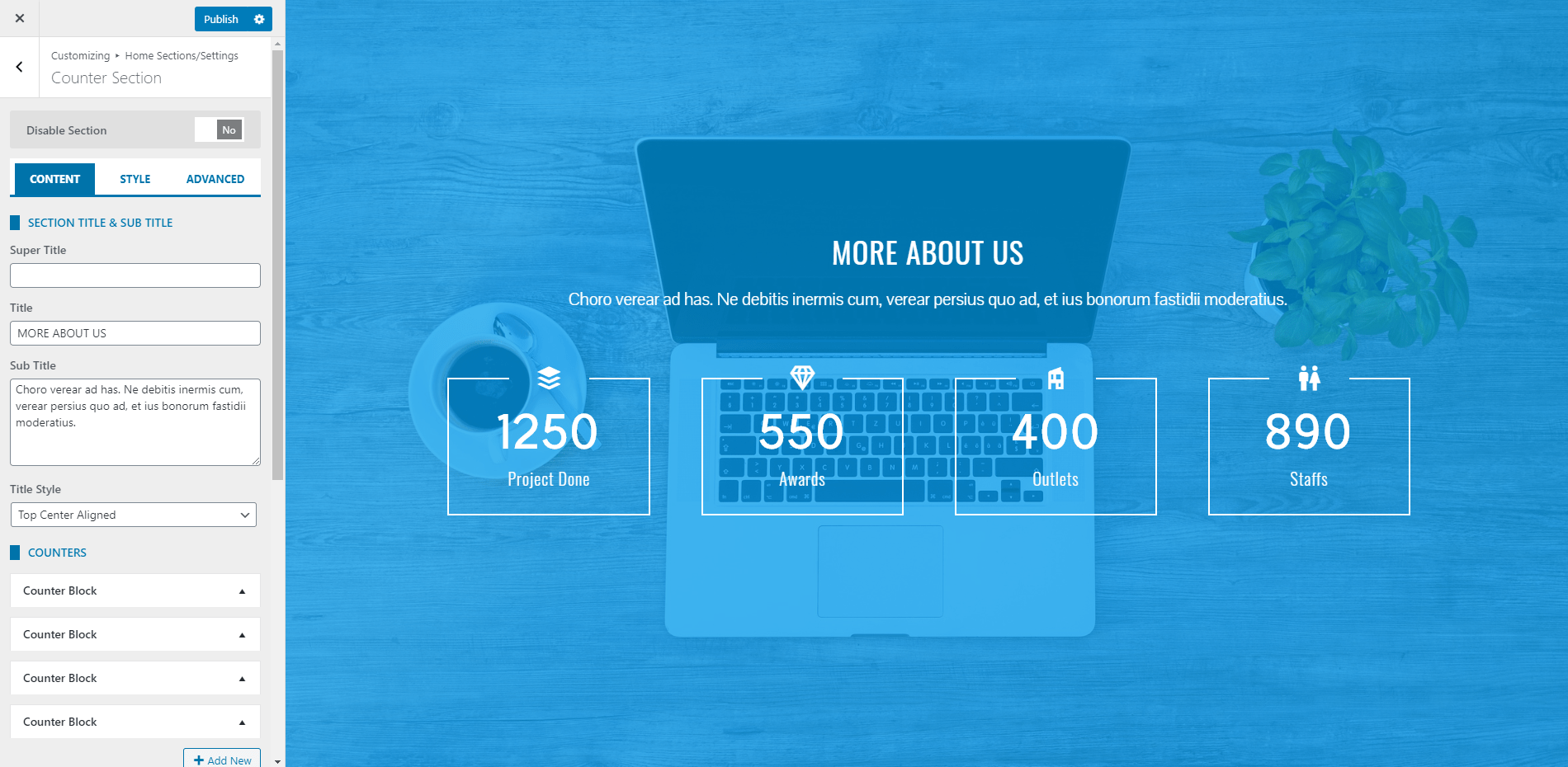
- Click on Add New button to add the Counter Blocks. You can add an unlimited number of these blocks.
- The Counter Block allows you to add the title, count value with an icon. You can even disable the block if you don’t want to show the block and keep it for future use.
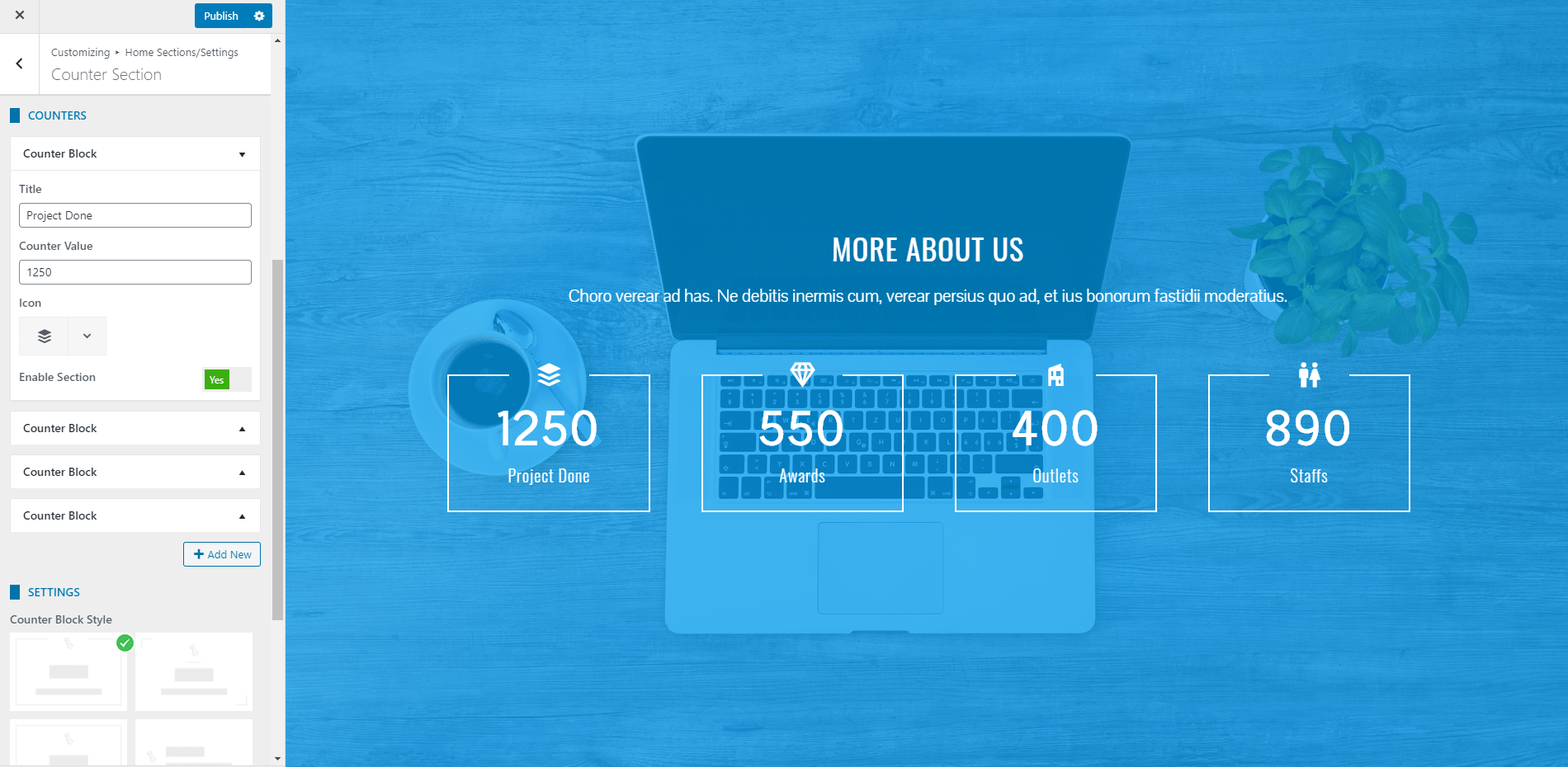
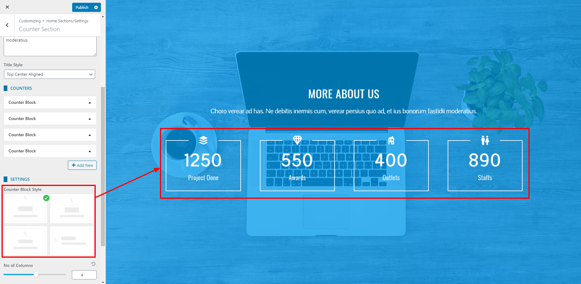
- The theme provides 4 different styles in which you can display the feature block. Choose the one that you like.
- You can even choose the no of columns to display in the single row from the option no of columns.
- Also, you can link the section with a button at the bottom of the page. Fill the fields More Button Text and More Button Link if you want to display a button at the bottom of the section.
- You can even link the section with a button at the bottom of the page.
- Fill the fields More Button Text and More Button Link if you want to display a button at the bottom of the section.
- If you want to change the color of different elements of Counter Section, go to the Style Tab. There, you can pick any colors of your choice using color picker. Also, if you want to add separator or other advanced settings, you can check our article: Configuring Advanced Settings
- Once done, click on “Publish” to save changes.
Testimonial Section
This section allows you to display testimonials in a grid, carousel, or slider. To configure the Testimonial Section, follow the instruction.
To configure the Testimonial Section, follow these steps:
- Go to Home Page Sections/Settings > Testimonial Section
- Enter Super Title, Title, Sub Title. These are the heading texts that display at the top of the section. Leave this field blank if you don’t want to show them.
- Once you enter the text for these fields, you can display these titles in various ways. Choose the style that you want from the Title Style option.
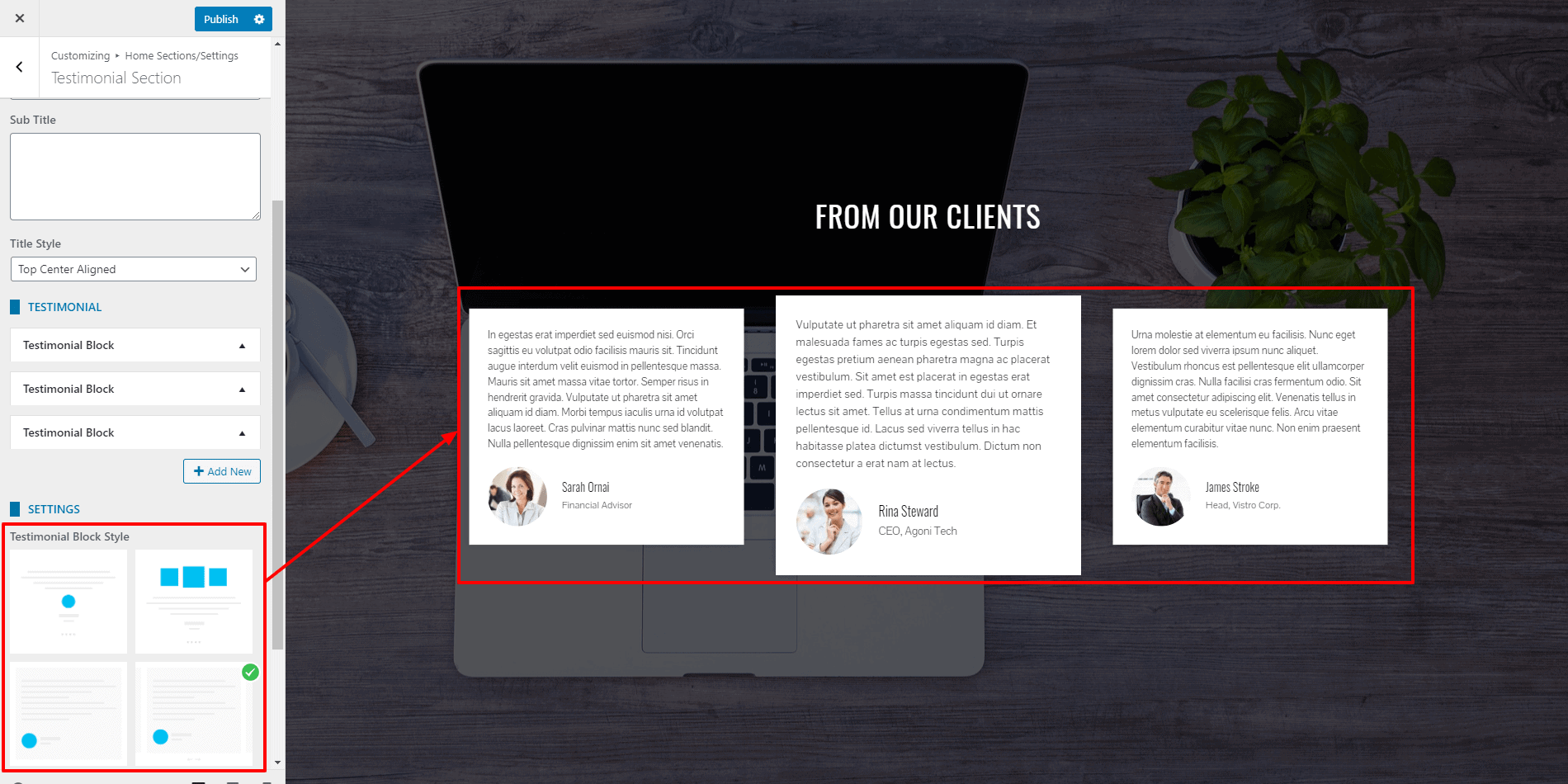
- Click on Add New button to add the Testimonial Blocks. You can add an unlimited number of these blocks.
- Add the name and designation and testimonial text of your client. Upload the image. You can even disable the block if you don’t want to show the block and keep it for future use.
- You can even link the section with a button at the bottom of the page.
- Fill the fields More Button Text and More Button Link if you want to display a button at the bottom of the section.
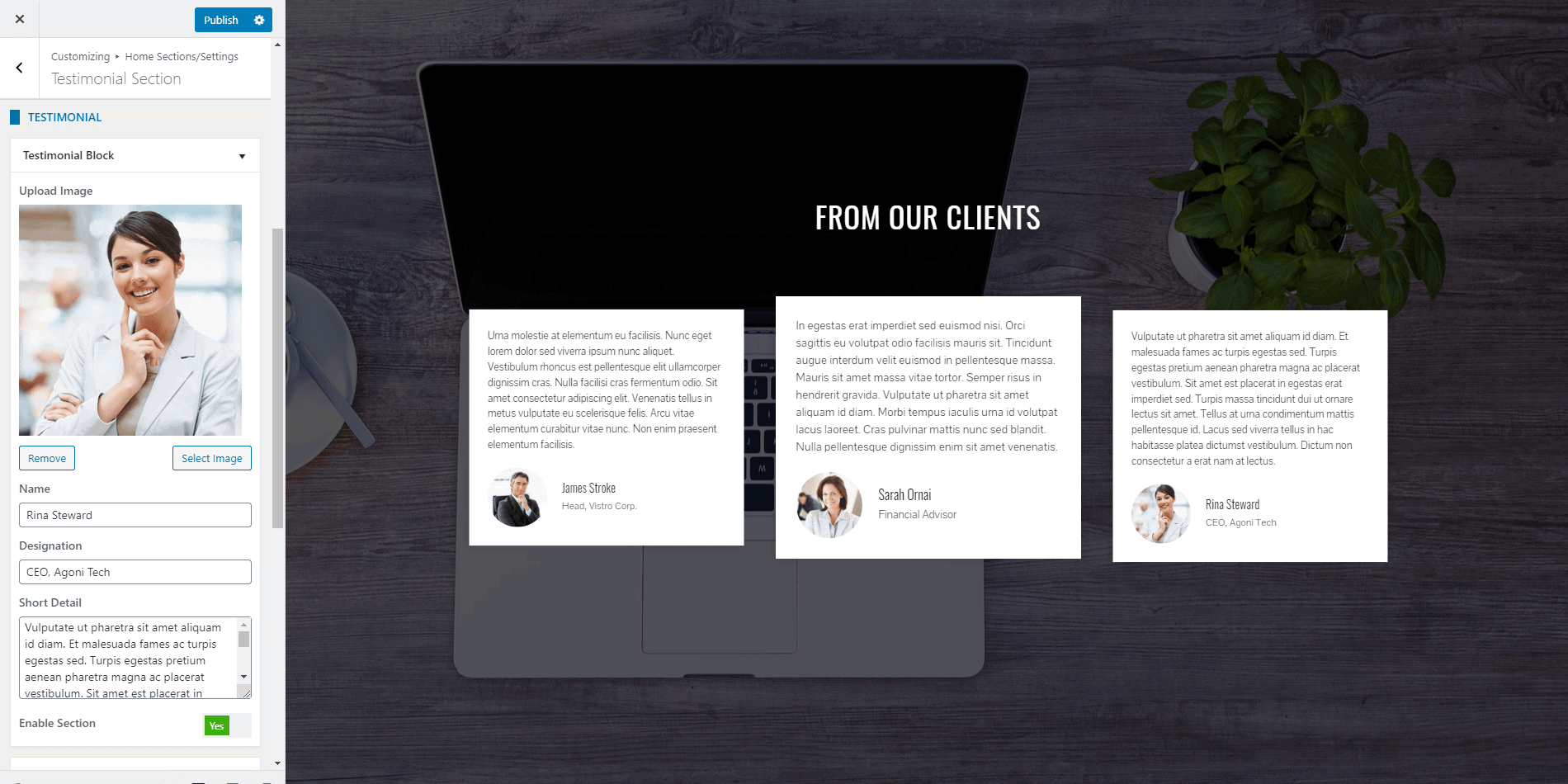
- The theme provides 4 different styles in which you can display the feature block. Choose the one that you like.
- You can even link the section with a button at the bottom of the page. Fill the fields More Button Text and More Button Link if you want to display a button at the bottom of the section.
- If you want to change the color of different elements of the Testimonial Section, go to the Style Tab. There, you can pick any colors of your choice using the color picker. Also, if you want to add separator or other advanced settings, you can check our article: Configuring Advanced Settings
- Once done, click on the Publish button to save changes.
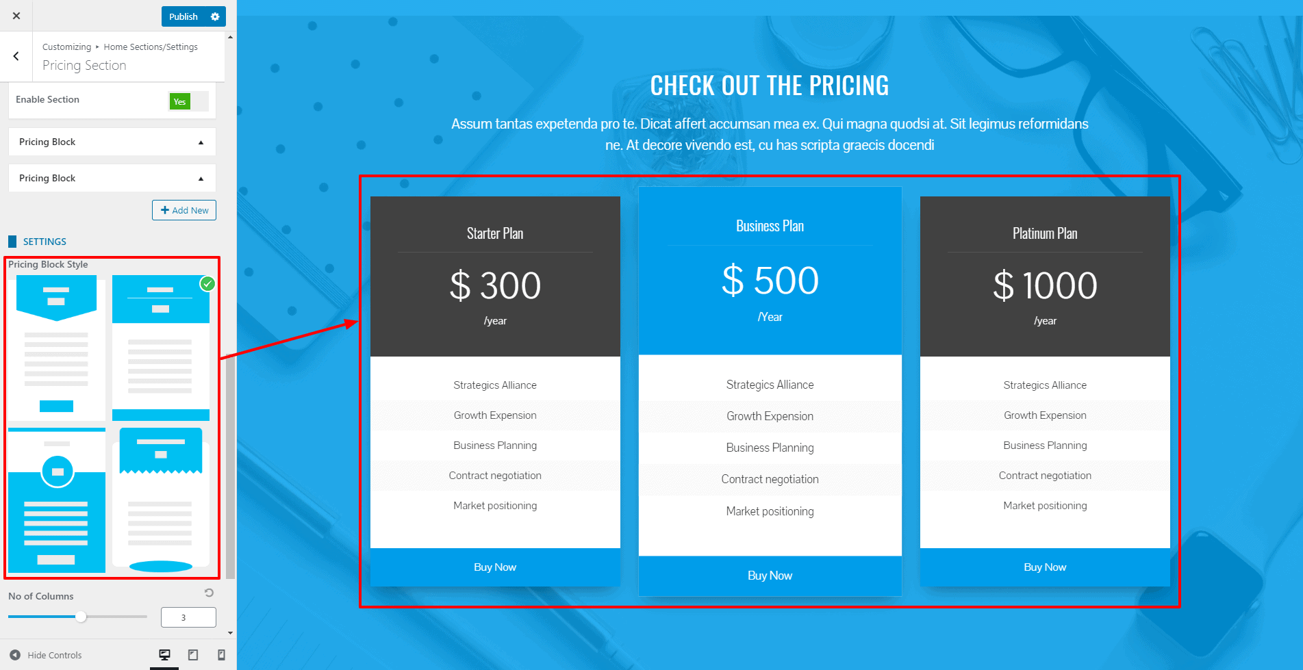
Pricing Section
Pricing Section helps you to display the pricing plan in a comparative way. There are 4 different styles in which you can display the pricing table.
To configure the Pricing Section, follow these steps:
- Go to Home Page Sections/Settings > Pricing Section
- Enter Super Title, Title, Sub Title. These are the heading texts that display at the top of the section. Leave this field blank if you don’t want to show them.
- Once you enter the text for these fields, you can display these titles in various ways. Choose the style that you want from the Title Style option.
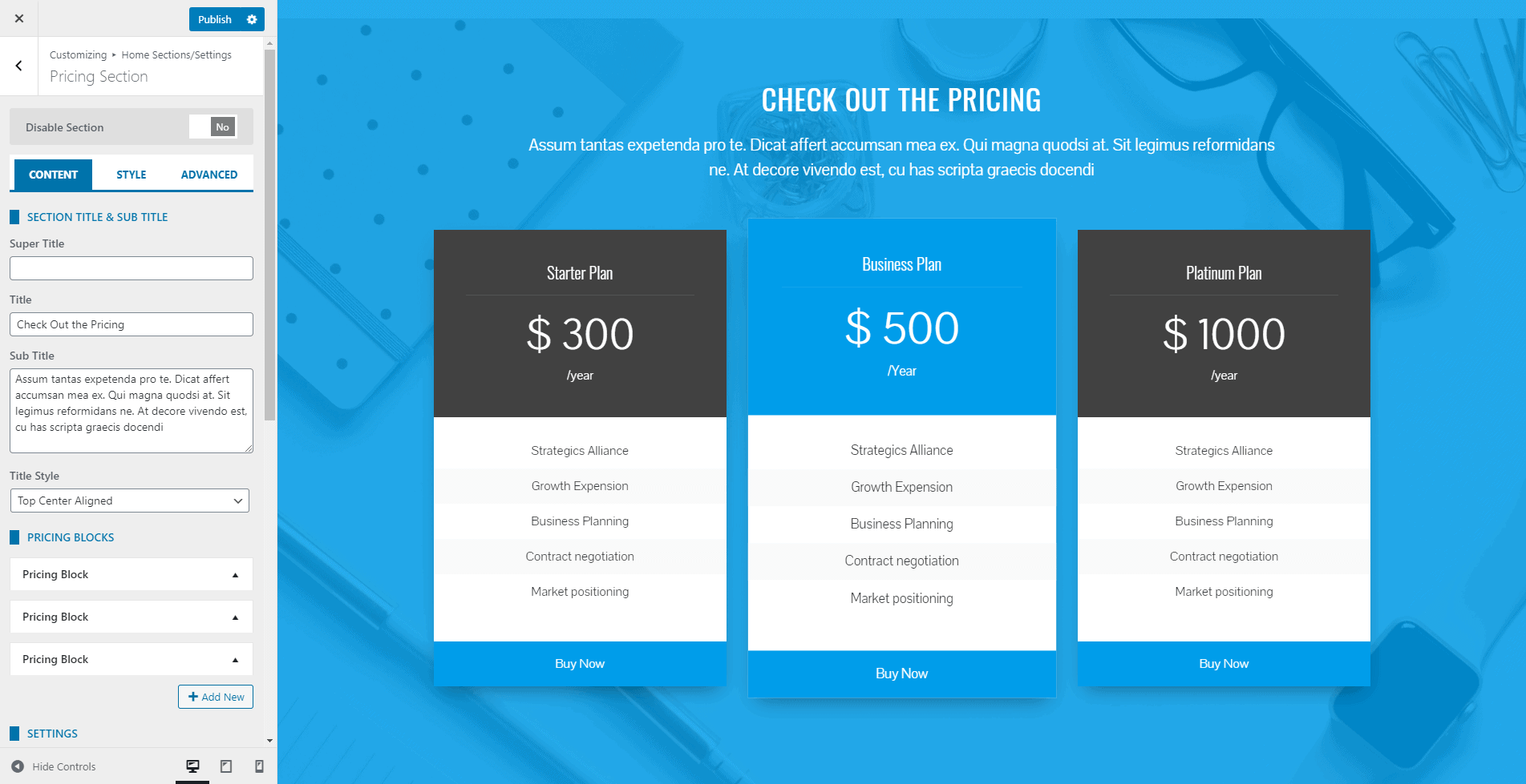
- Click on Add New button to add the Pricing Blocks. You can add an unlimited number of these blocks.
- Add Pricing Title, Currency Symbol, Price, Price Per(/month, /year), Plan Feature List, Button text, Button Link. Enter the Plan Feature List separated by entering. You can even disable the block if you don’t want to show the block and keep it for future use.
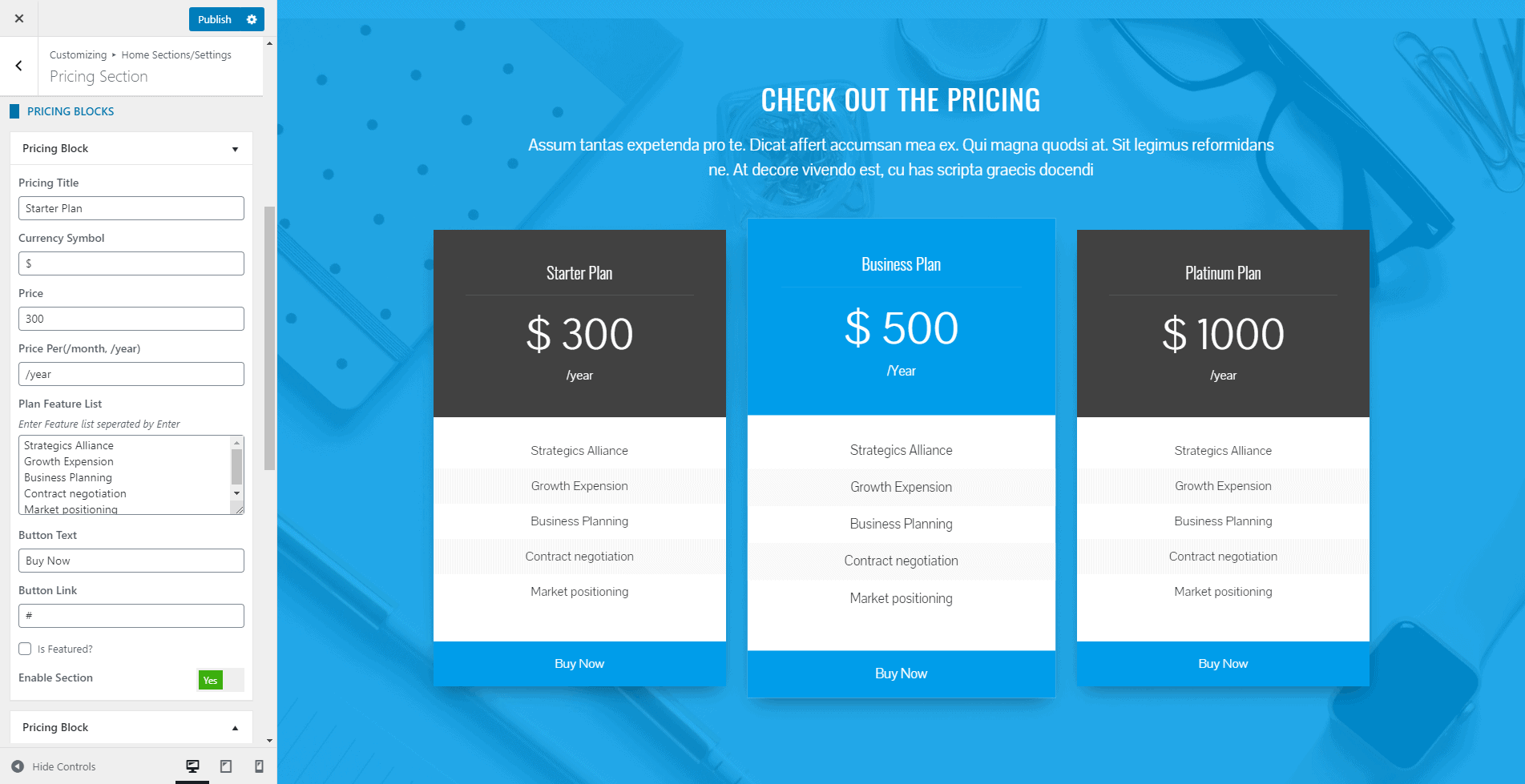
- The theme provides 4 different styles in which you can display the pricing block. Choose the one that you like.
- You can even link the section with a button at the bottom of the page. Fill the fields More Button Text and More Button Link if you want to display a button at the bottom of the section.
- You can even link the section with a button at the bottom of the page.
- Fill the fields More Button Text and More Button Link if you want to display a button at the bottom of the section.
- If you want to change the color of different elements of the Pricing Section, go to the Style Tab. There, you can pick any colors of your choice using color picker. Also, if you want to add separator or other advanced settings, you can check our article: Configuring Advanced Settings
- Once done, click on the Publish button to save changes.
Blog Section
The blog section allows you to display the blog posts in various layout.
To configure the blog section, follow these steps
- Go to Home Page Sections/Settings > Blog Section
- Enter Super Title, Title, Sub Title. These are the heading texts that display at the top of the section. Leave this field blank if you don’t want to show them.
- Once you enter the text for these fields, you can display these titles in various ways. Choose the style that you want from the Title Style option.
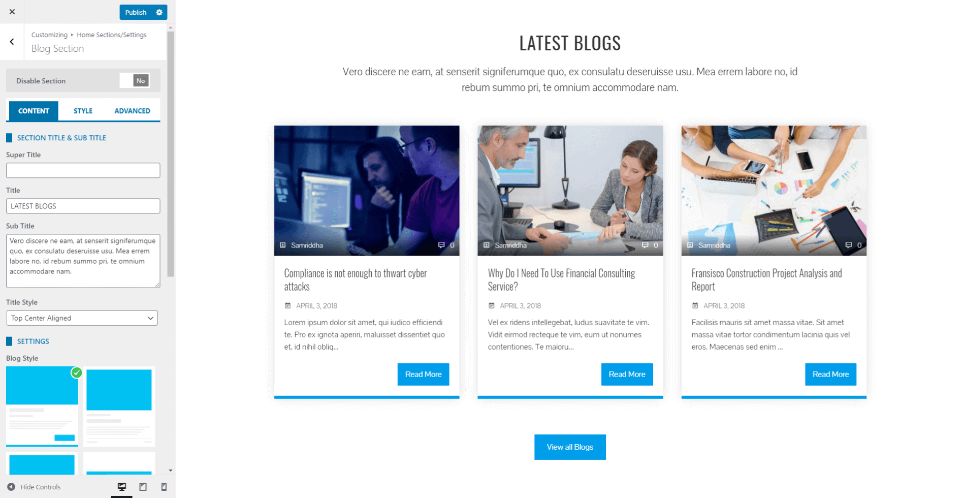
- Select any of the 4 pre-available styles in which you want to display the blog section.
- Exclude the category that you don’t want to show in your latest block.
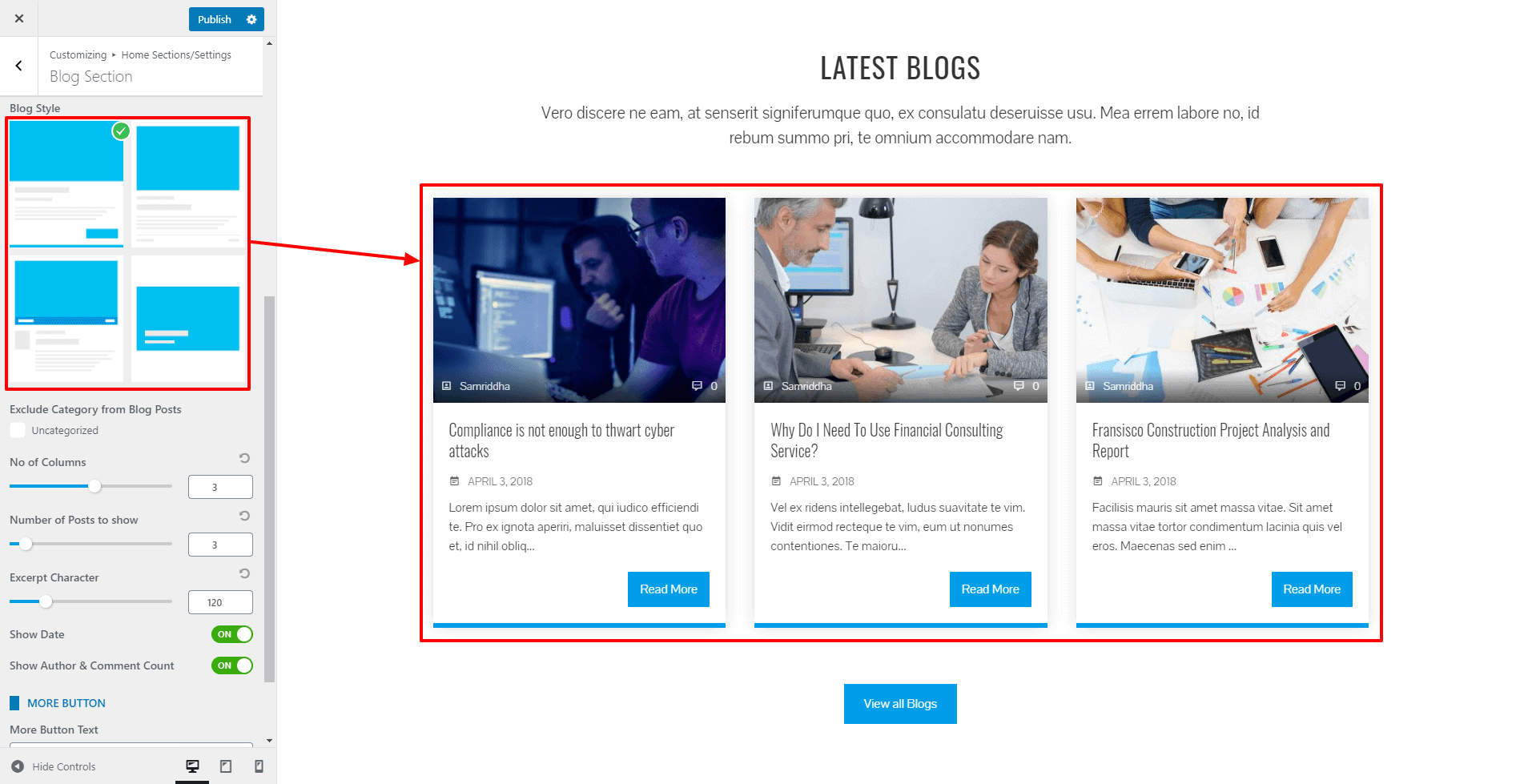
- Choose the number of columns and the number of latest blog posts to show.
- You can even control the blog excerpt length. Select the number of characters to display in the blog excerpt.
- Set either to display the date or not from the show date option.
- Add the Title and select the page. Choose the icon that displays along with the tab title. You can even disable the block if you don’t want to show the block and keep it for future use.
- You can even link the section with a button at the bottom of the page.
- Fill the fields More Button Text and More Button Link if you want to display a button at the bottom of the section.
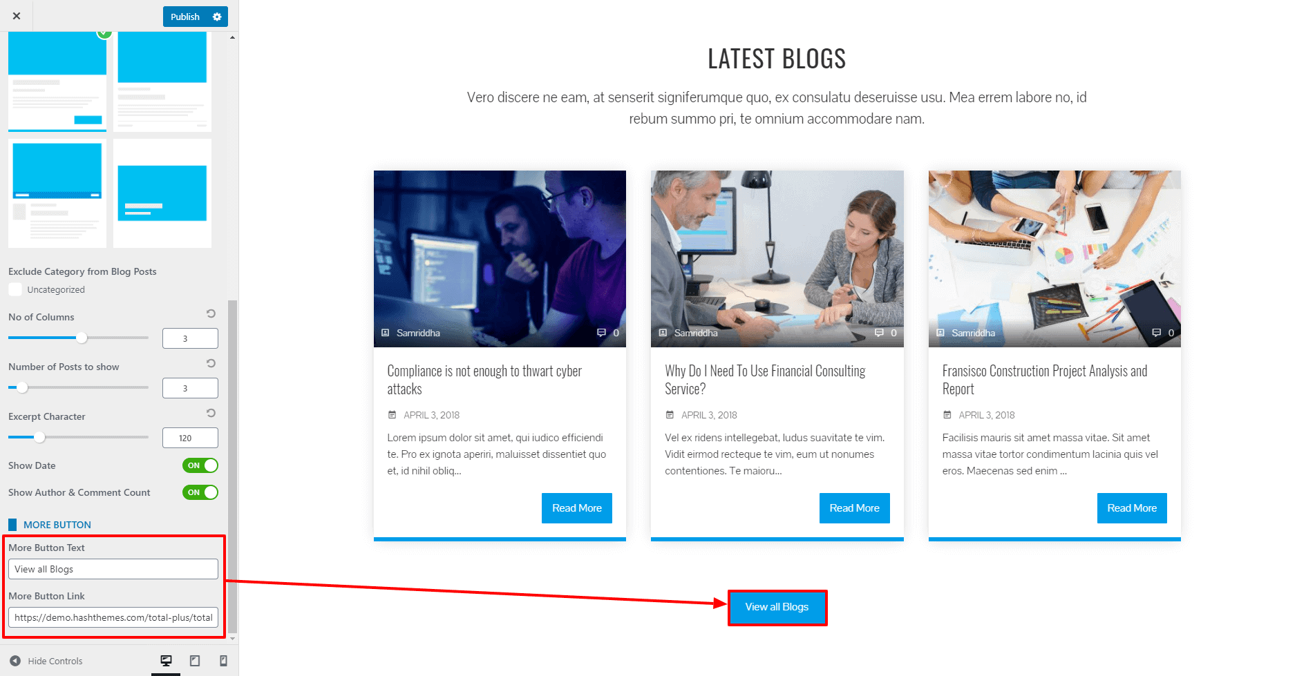
- If you want to change the color of different elements of Blog Section, go to the Style Tab. There, you can pick any colors of your choice using color picker. Also, if you want to add separator or other advanced settings, you can check our article: Configuring Advanced Settings
- Once done, click on the Publish button to save changes.
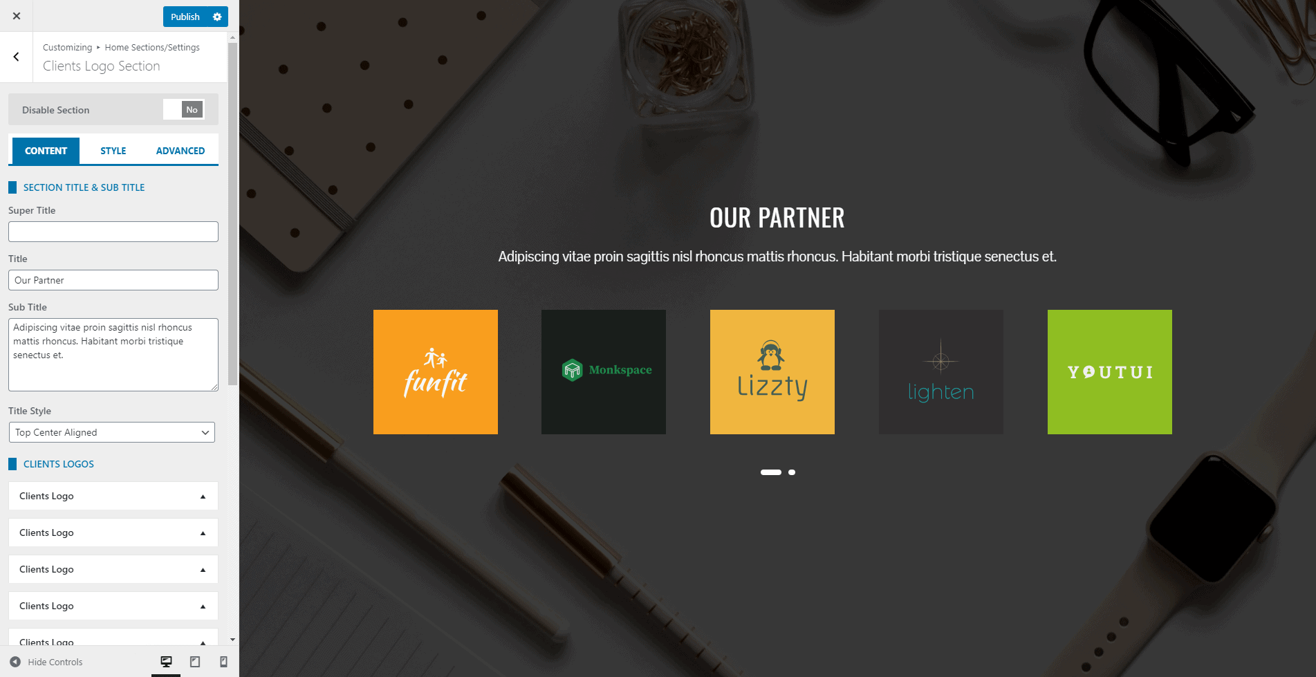
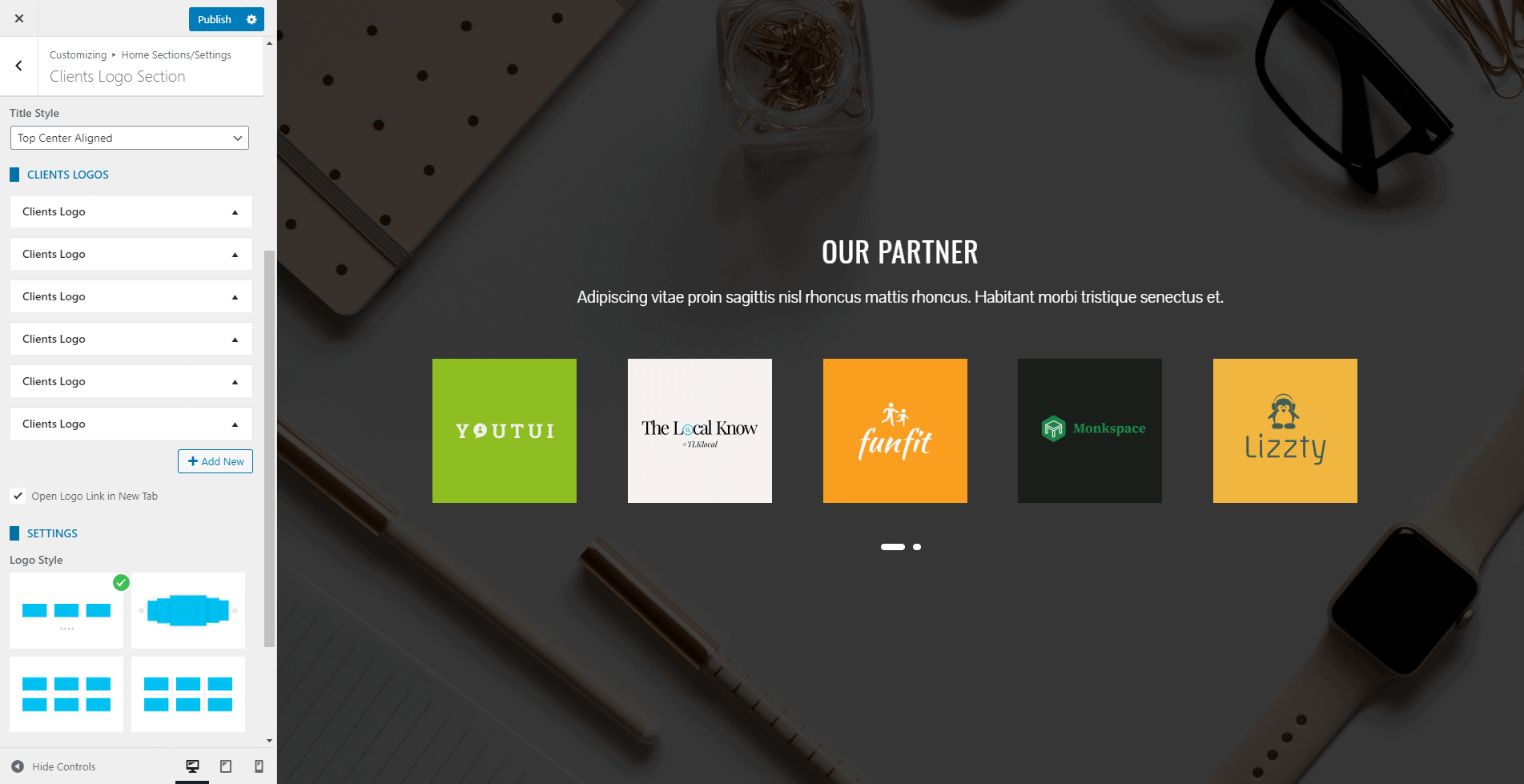
Client Logo Section
This section allows you to showcase the logo of your clients, partners, and sponsors with a clickable link.
To configure the Client Section, follow these steps:
- Go to Home Page Sections/Settings > Clients Section
- Enter Super Title, Title, Sub Title. These are the heading texts that display at the top of the section. Leave this field blank if you don’t want to show them.
- Once you enter the text for these fields, you can display these titles in various ways. Choose the style that you want from the Title Style option.
- Click on Add New button to add the Client Blocks. You can add an unlimited number of these blocks.
- Upload the client logo and add a link. You can even disable the block if you don’t want to show the block and keep it for future use.
- To make the logo link open in a new tab, check the Open Logo Link in New Tab option.
- You can even link the section with a button at the bottom of the page.
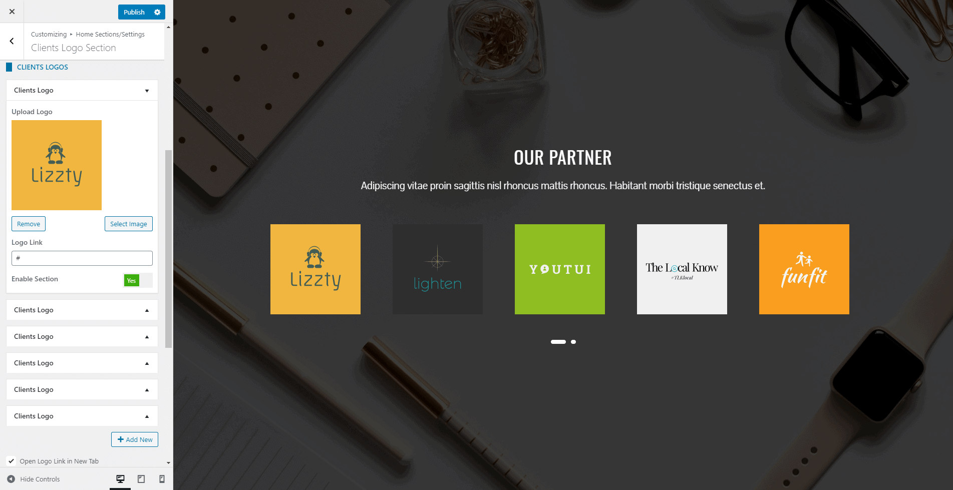
- The theme provides 4 different styles in which you can display the Client Logo. Choose the one that you like.
- Fill the fields More Button Text and More Button Link if you want to display a button at the bottom of the section.
- If you want to change the color of different elements of Clients Logo Section, go to the Style Tab. There, you can pick any colors of your choice using color picker. Also, if you want to add separator or other advanced settings, you can check our article: Configuring Advanced Settings
- Once done, click on the “Publish” button to save changes.
Call to Action Section
In the call to action section, you can display 2 CTA buttons in multiple layouts. It will help you to increase the user engagement of the website.
To configure the Call to Action Section, follow these steps:
- Go to Appearance > Customize > Home Page Sections/Settings > Call to Action Section.
- Enter Super Title, Title, Sub Title. These are the heading texts that display at the top of the section. Leave this field blank if you don’t want to show them.
- Enter Button Text and Button Link. Fill Button 1 and Button 2 if you want to show 2 buttons. Fill only Button 1 or Button 2 if you want to show a single button.
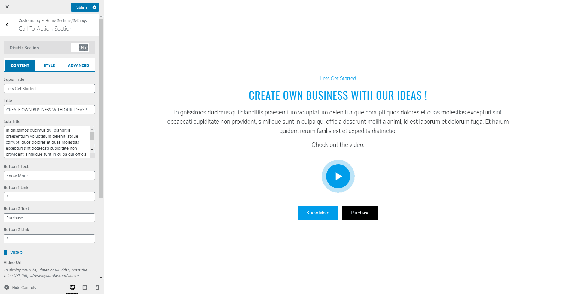
- You can embed the video from Youtube, Vimeo, and VK by pasting its link of the Video URL.
- Also, select the Video Play Icon.
- Choose the style in which you want to display the CTA Section from the 4 layouts.
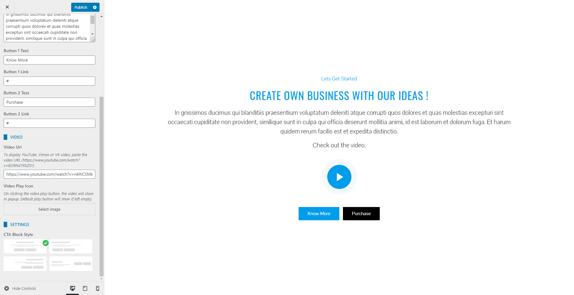
- If you want to change the color of different elements of Call to Action Section, go to the Style Tab. There, you can pick any colors of your choice using color picker. Also, if you want to add separator or other advanced settings, you can check our article: Configuring Advanced Settings
- Once done, click on the Publish button to save changes.
Contact Section
In Contact Section, you can display a google map with the contact form, contact details, and social icons.
- Go to Appearance > Customize > Home Page Sections/Settings > Contact Section
To add the Google Map, follow the instructions
- To display the Google Map, you need to generate the Google Map API Key. To generate the Google Map API, follow the instruction described here
- After generating the Google Map API, add the key in Google Map API Key field
- Enter the Longitude and Latitude value of the location. Get the Longitude and Latitude value of the location from here
- You can display the map in 3 different styles. Choose the one you like.
To add the Contact Form and Contact Detail, follow the instruction
- The Contact Form and Contact Detail can be shown or hidden as required. To show set the Show Contact Detail to Yes and to hide set it to No.
- Install Contact Form 7 plugin, add a new contact form with the fields that you need and generate the Shortcode.
- Paste the Shortcode in Contact Form Shortcode field
- Add the contact detail
- Set Show Social Icons Below Contact Detail to On to display the social icons just below the contact detail. Set it to Off if you don’t want to display.
- To add the social icon click on the link below Social Icons heading.

- If you want to change the color of different elements of Contact Section, go to the Style Tab. There, you can pick any colors of your choice using color picker. Also, if you want to add separator or other advanced settings, you can check our article: Configuring Advanced Settings
- Once done, click on the Publish button to save changes.
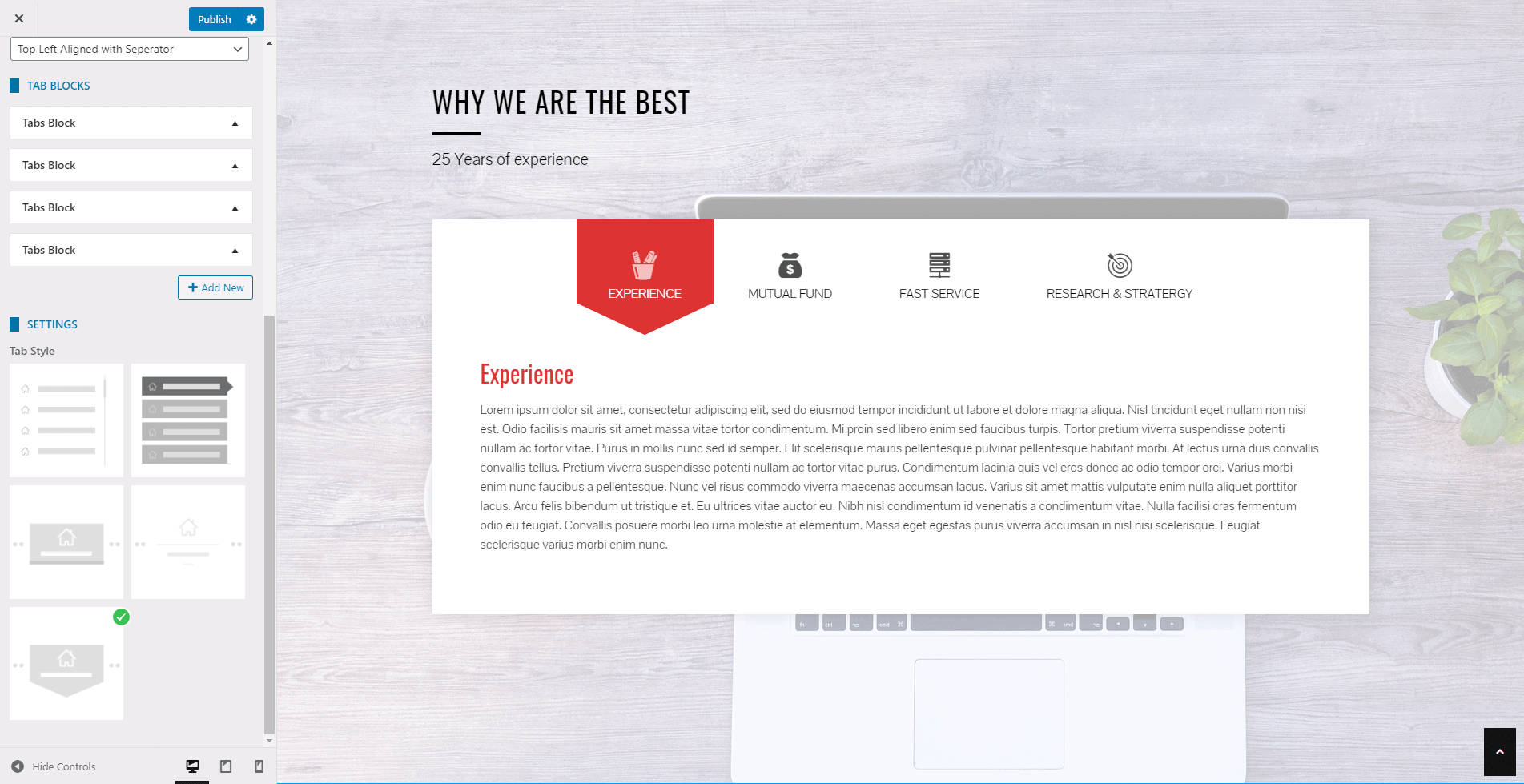
Tab Section
The tab section allows you to display your web content in a tabbed form. It will make it easier for your visitors to find the information that they are looking for.
To configure the tab section, follow the steps:
- Go to Home Page Sections/Settings > Tab Section
- Enter Super Title, Title, Sub Title. These are the heading texts that display at the top of the section. Leave this field blank if you don’t want to show them.
- Once you enter the text for these fields, you can display these titles in various ways. Choose the style that you want from the Title Style option.
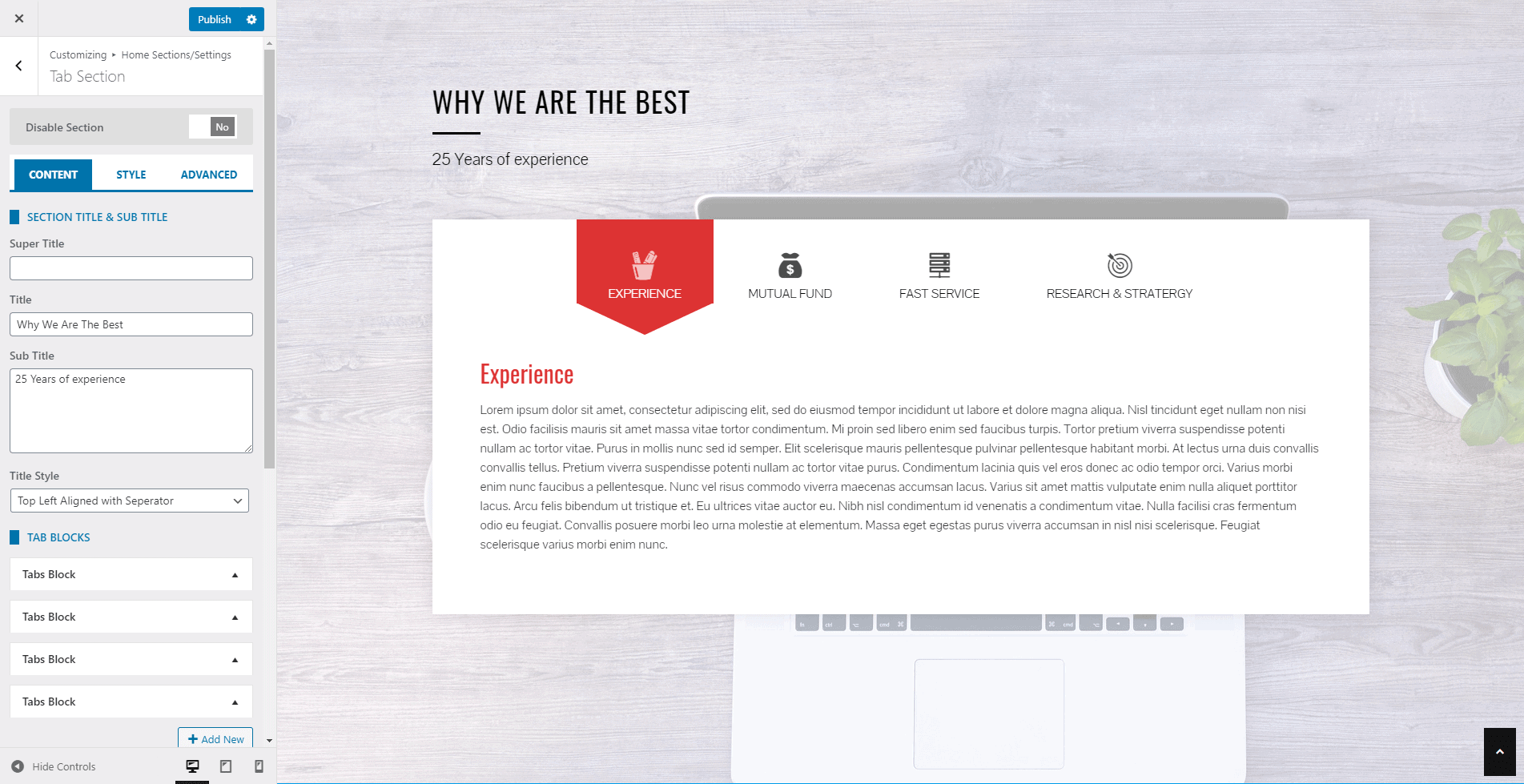
- Click on Add New button to add the Tab Blocks. You can add an unlimited number of these blocks.
- Create new pages and add content for the tab section.
- Add the Title and select the page. Choose the icon that displays along with the tab title. You can even disable the block if you don’t want to show the block and keep it for future use.
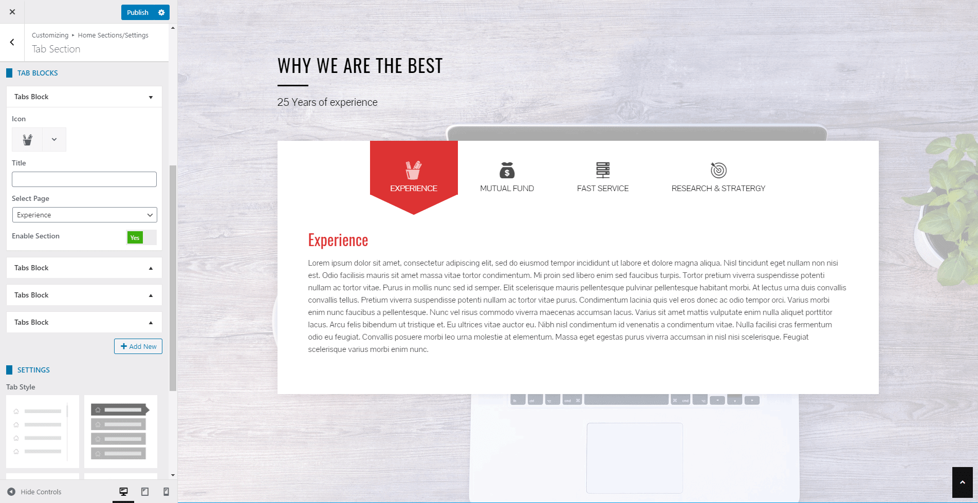
- The theme provides 3 different styles in which you can display the tab block. Choose the one that you like.
- If you want to change the color of different elements of Tab Section Section, go to the Style Tab. There, you can pick any colors of your choice using color picker. Also, if you want to add separator or other advanced settings, you can check our article: Configuring Advanced Settings
- Once done, click on the Publish button to save changes.
News & Update Section
News & Update Section allows you to display the images and text contents side by side with a read more button. This section can be used to highlight any types of news or updates that you have released on your website in a clean and attractive way.
To configure News & Update Section, follow these steps:
- Go to Appearance > Customize > Home Page Sections/Settings > News & Update Section
- Enter Super Title, Title, Sub Title. These are the heading texts that display at the top of the section. Leave this field blank if you don’t want to show them.
- Once you enter the text for these fields, you can display these titles in various ways. Choose the style that you want from the Title Style option.
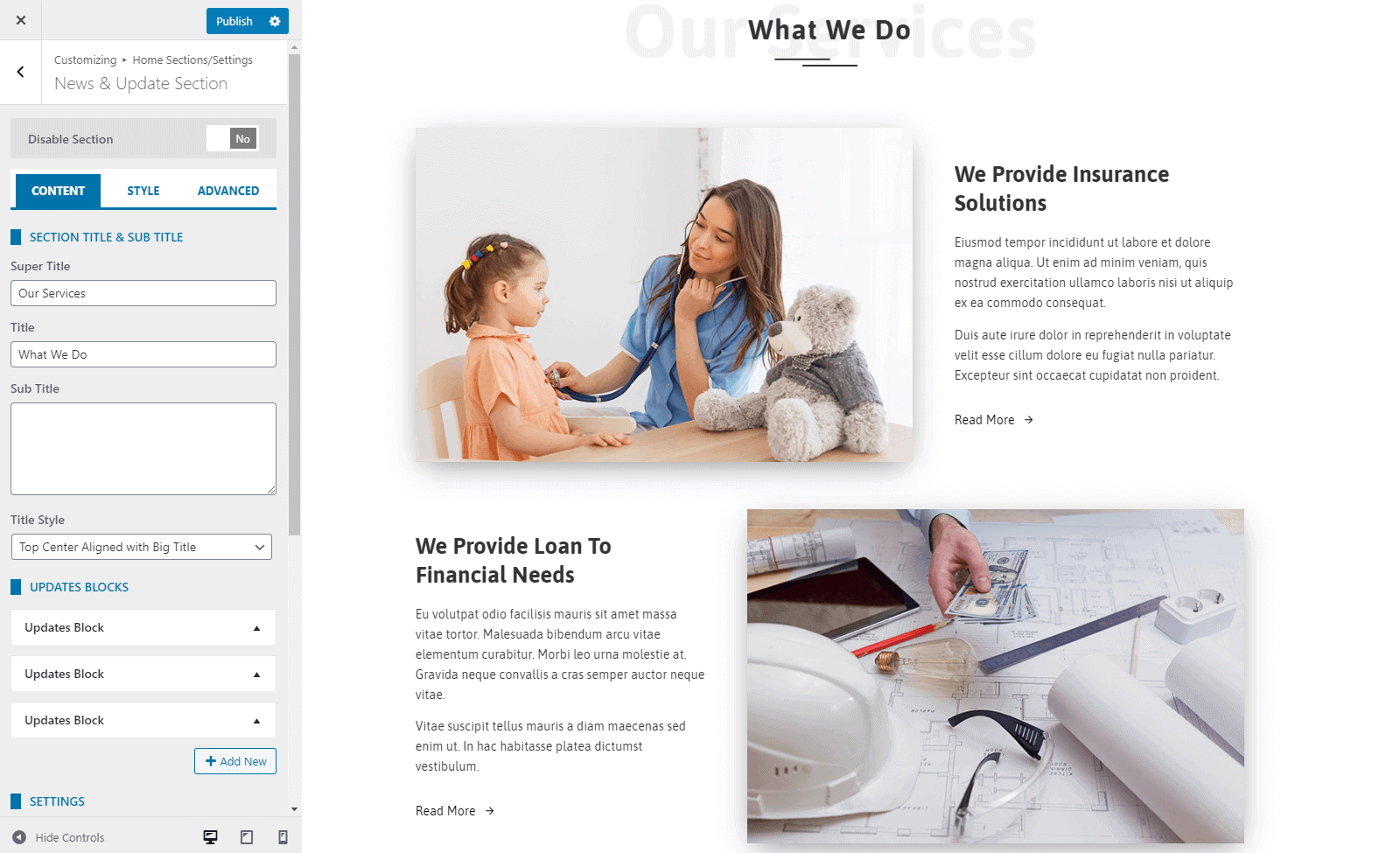
- Click on Add New button to add the News & Update Blocks. You can add an unlimited number of these blocks.
- Give Title to your Updates Block and add the required contents on them.
- Upload Image and add the button text and button link.
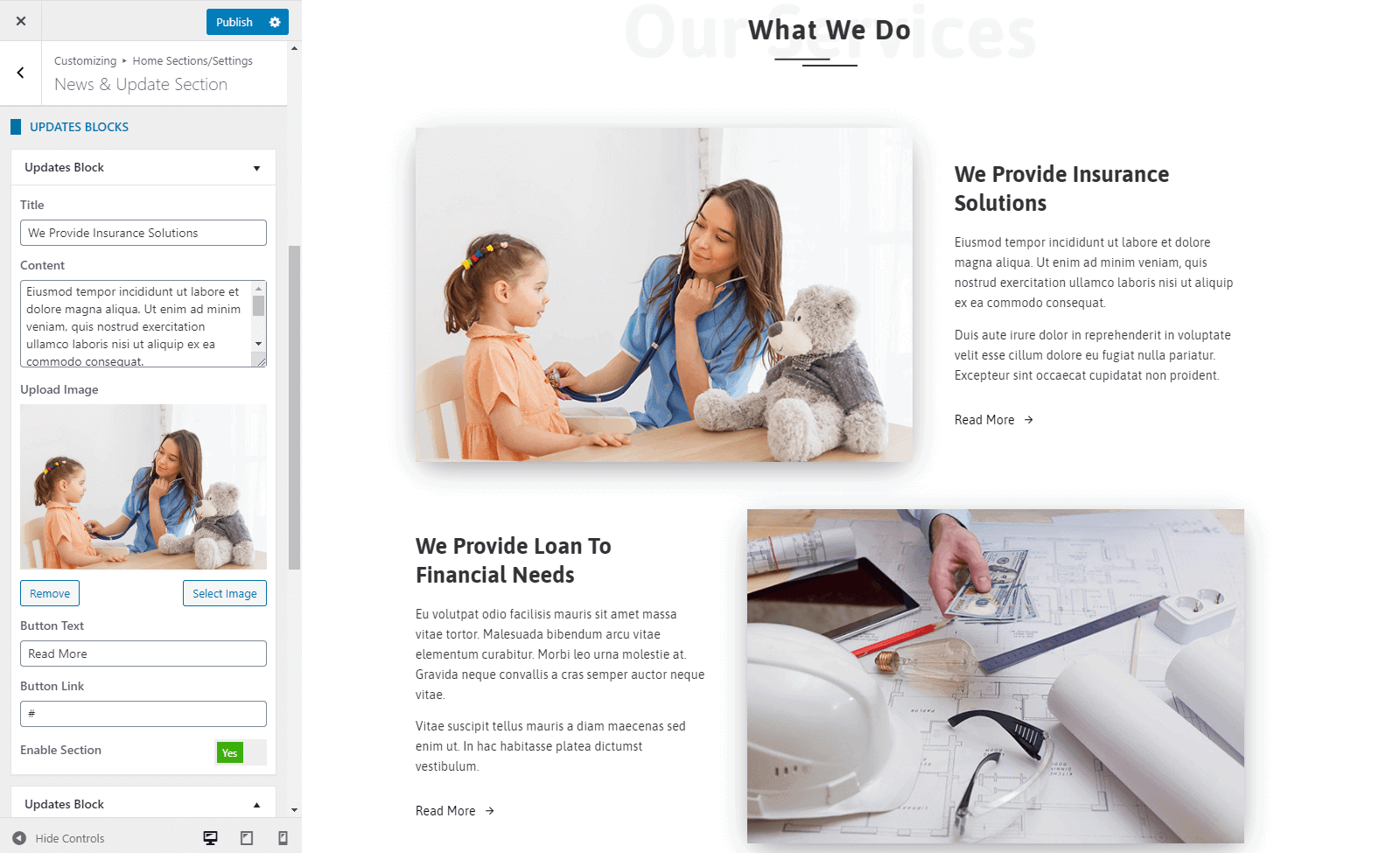
- Now select any of the block styles from 3 available update block styles.
- You can even link the section with a button at the bottom of the page.
- Fill the fields More Button Text and More Button Link if you want to display a button at the bottom of the section.
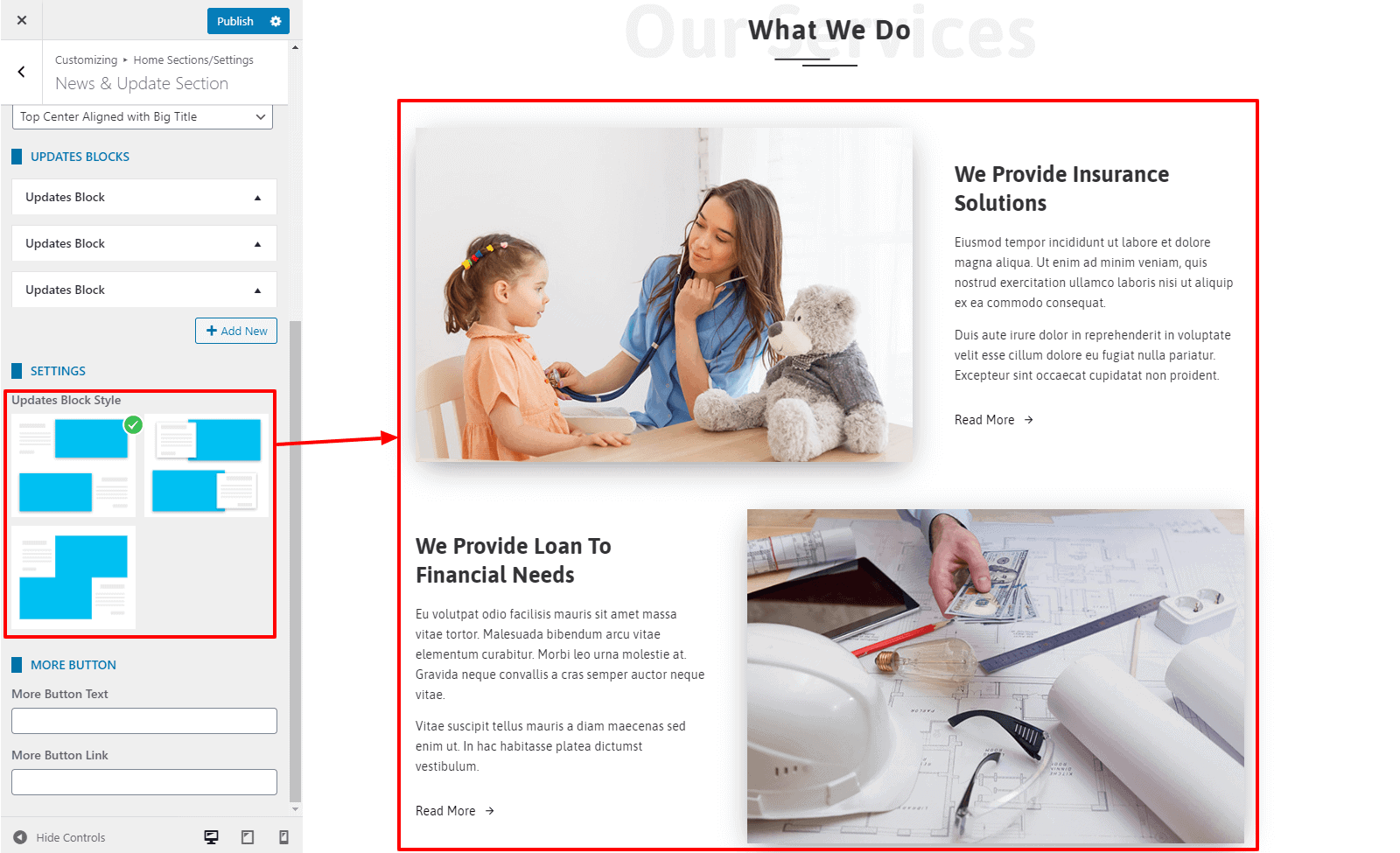
- If you want to change the color of different elements of News & Update Section Section, go to the Style Tab. There, you can pick any colors of your choice using color picker. Also, if you want to add separator or other advanced settings, you can check our article: Configuring Advanced Settings
- Once done, click on the “Publish” button to save changes.
Highlight Section
Highlight Section allows you to display some of your business firms with images and text.
To configure the Highlight Section, follow the steps:
- Go to Home Page Sections/Settings >Highlight Section
- Enter Super Title, Title, Sub Title. These are the heading texts that display at the top of the section. Leave this field blank if you don’t want to show them.
- Once you enter the text for these fields, you can display these titles in various ways. Choose the style that you want from the Title Style option.
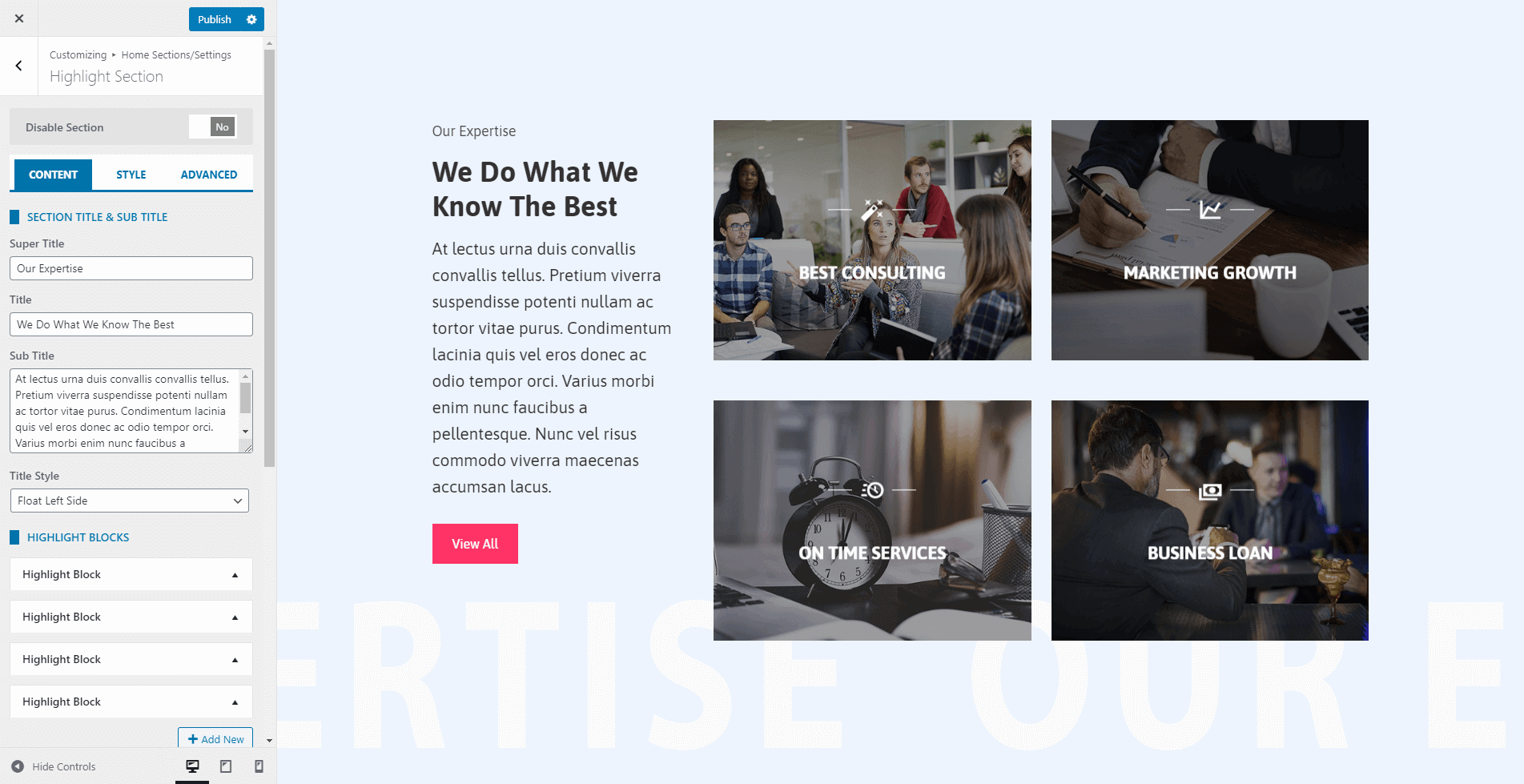
- Click on Add New button to add the Highlight Blocks. You can add an unlimited number of these blocks.
- The Highlight Block allows you to add the icon, image, title, short detail, and a link to point the block to the internal/external page. You can even disable the block if you don’t want to show the block and keep it for future use.
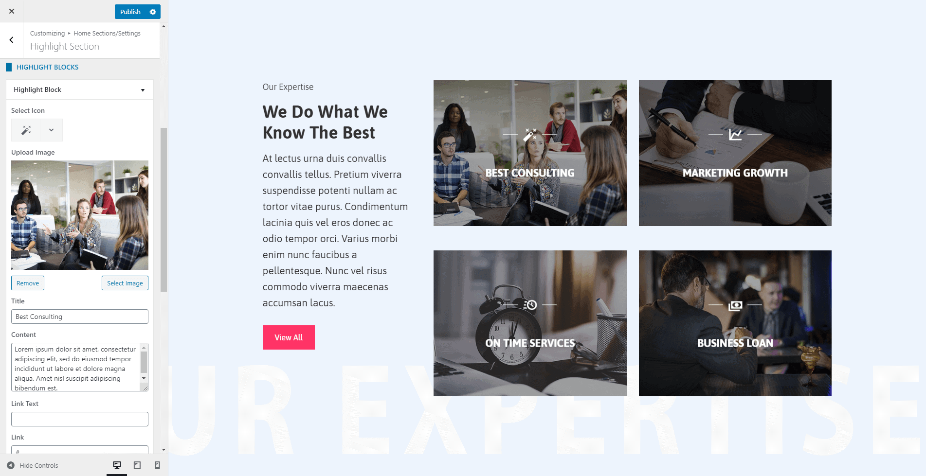
- The theme provides 4 different styles in which you can display the feature block. Choose the one that you like.
- You can even choose the no of columns to display in the single row from the option No of Columns.
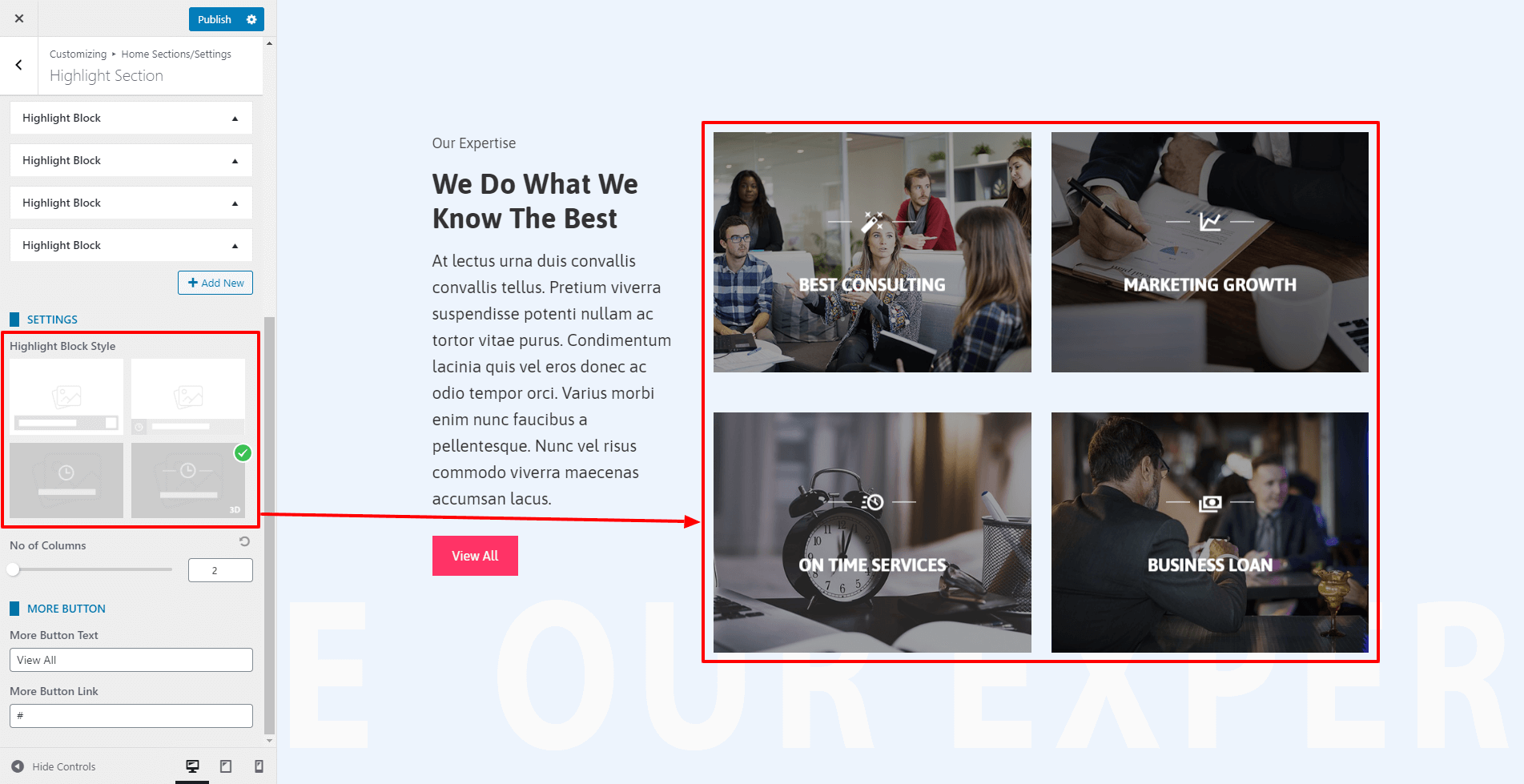
- Fill the fields More Button Text and More Button Link if you want to display a button at the bottom of the section.
- If you want to change the color of different elements of Highlight Section, go to the Style Tab. There, you can pick any colors of your choice using color picker. Also, if you want to add separator or other advanced settings, you can check our article: Configuring Advanced Settings
- Once done, click on the “Publish” button to save changes.
Custom Section
In the custom section, you can embed the contents from any custom created pages of the website.
To add the contents in the custom section:
- Go to Appearance > Customize > Home Page Sections/Settings > Custom Section.
- Enter Super Title, Title, Sub Title. These are the heading texts that display at the top of the section. Leave this field blank if you don’t want to show them.
- Once you enter the text for these fields, you can display these titles in various ways. Choose the style that you want from the Title Style option.
- Select a page of which you want to display the contents on the custom section. You can create a custom layout for the selected page using the page builder.
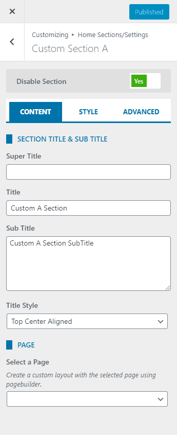
- If you want to change the color of different elements of the Custom Section, go to the Style Tab. There, you can pick any colors of your choice using the color picker. Also, if you want to add separator or other advanced settings, you can check our article: Configuring Advanced Settings
- Once done, click on the Publish button to save changes.
Blog Setting
By default, WordPress displays your content in a blog format on the homepage. But you can set a custom homepage as we described earlier and a separate page for blog posts. The blog setting applies to the blog page either you set it on the homepage or set a separate page for the blog. This setting also applies to the archive and search page. To configure the blog/archive page:
- Go to Appearance > Customize > Blog/Single Page Settings.
- By default, the blog tab will be active. If the block tab is not active, click on the Blog Page tab.
- Choose any of the 4 available layouts for your blog archive page.
- If you want to exclude any category on the blog archive page, check the category present in Exclude Category. The checked category won’t be included on the blog archive page.
- You can either display the Full Content of the post in the blog page or choose the Excerpt for archive contents.
- Also, change the text that links to the full detail page. For that, change the Read More Text option.
- Enable/Disable Posted Date, Author, Comment, Category, Tag.
- Once done, click on the “Publish” button to save changes.
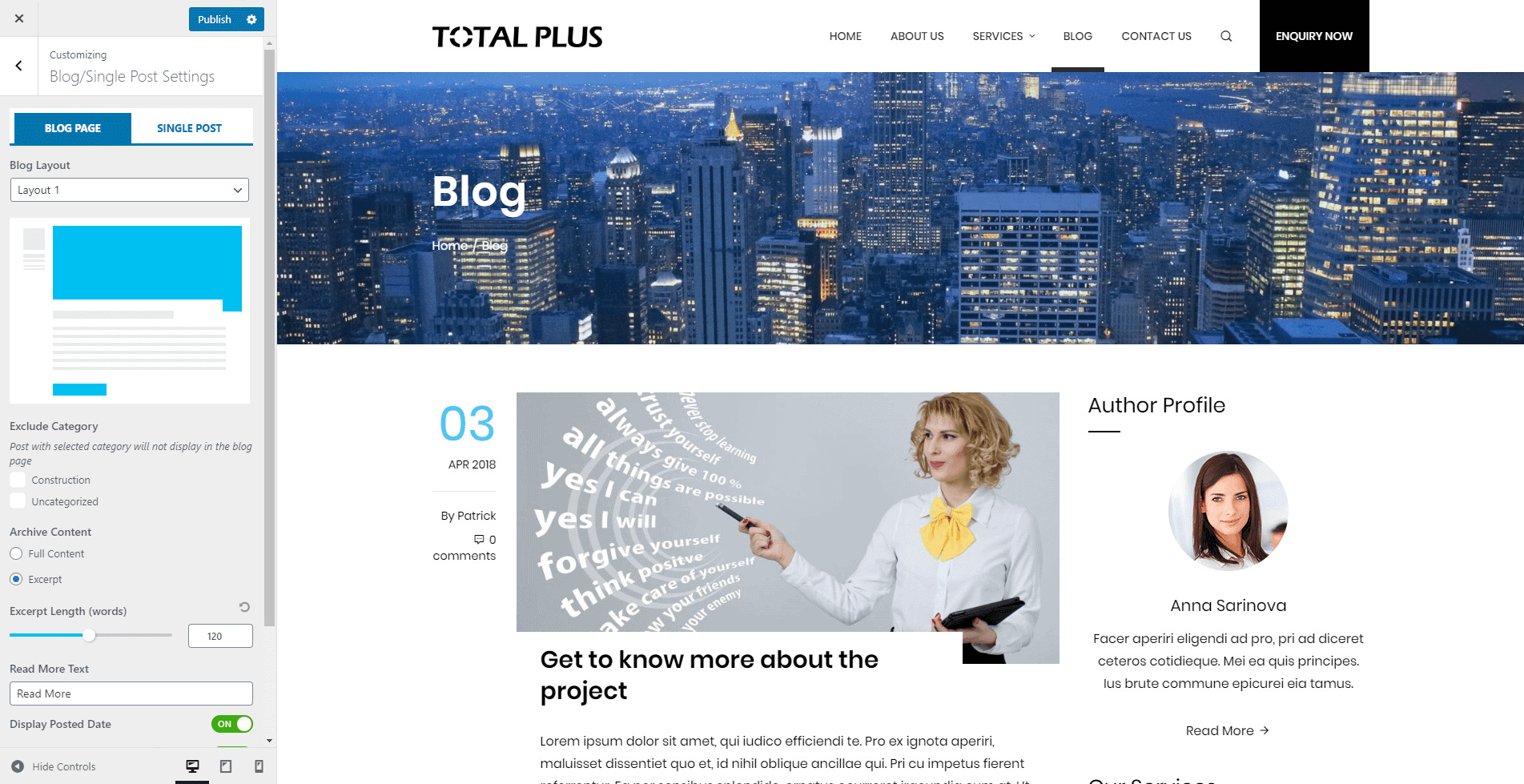
- If you want to show/hide featured image on each page/post, you can go through Show/Hide Featured Image for Each Post and Page
Single Post Settings
Whenever you click on the blog post, the single detail page opens. You can show and hide different elements on this page. To configure the Single Post, follow the instruction.
- Go to Appearance > Customize > Blog/Single Post Settings and click on Single Post tab.
- The first row in this page consists of Author, Date and Comment Count. You can either show or hide this row with Display Author/Date/Comments option. Set it to On to display and set it to Off to hide.
- Set Display Category to On to show the category of the post that appears just below the content of the post. Set it Off to hide it.
- The Tag appears just below the Categories. It only displays if you have any tags assigned to the post. You can set it to show or hide with Display Tags options.
- Set the Display Social Share option to On to display the social sharing icons and Off to hide it. The theme has inbuilt post sharing feature.
- Display Prev Next Navigation option displays the previous and next post of the current post. Set it to On or Off to show or hide it.
- Display Author Box shows the brief introduction of the post author along with social icons. To display the author detail, you will need to set the Display Author Box option to On. Once you set it to on, it may not display because you will need to add the brief introduction of the author. To add the author detail, follow the instruction
- Go to Users > All Users
- Hover over the author and click on the edit link
- Enter the First Name, Last Name, Nick Name and Social URL of the user.
- Most importantly, enter the Biographical Info. Add some brief introduction of the author. The Author Box will not be visible until you add Biographical Info.
- Now the last section is the Related Post. Set Display Related Posts to On or Off to show or hide the related post. Related posts are assigned by their category.
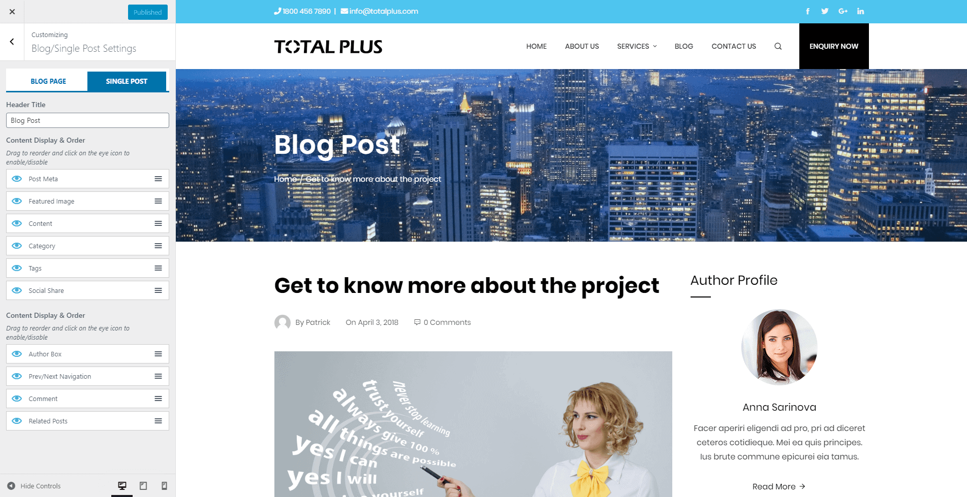
If you want to show/hide featured image on each page/post, you can go through Show/Hide Featured Image for Each Post and Page
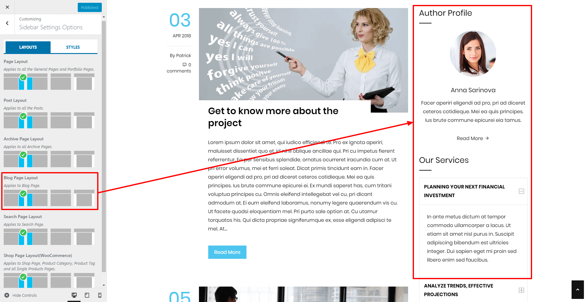
Sidebar Settings
The theme provides you the option to change the sidebar position of different pages and posts of the website. It will help you to display the widgets in a unique way.
To configure the sidebar settings:
- Go to Appearance > Customize > Sidebar Settings.
- Choose the most suitable sidebar positions for general pages, posts, archive page, blog page, search page, and shop page.
- Now go to the Styles tab and choose the most suitable sidebar style.
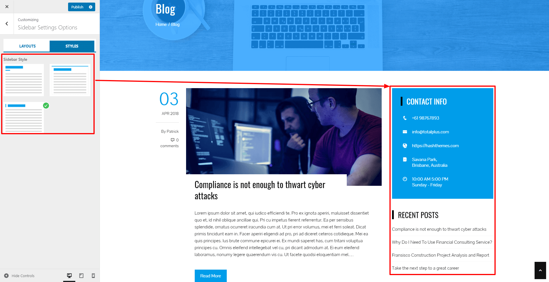
- Once done, click on the “Publish” button to save changes.
If you want to change the sidebar layout for each page/post of your website, you can go through: Changing the Sidebar Layout and Choosing Unique Widget to Display for each Post and Page
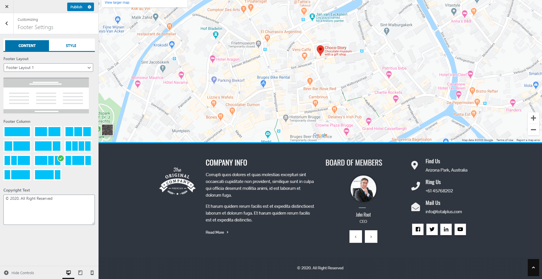
Footer Settings
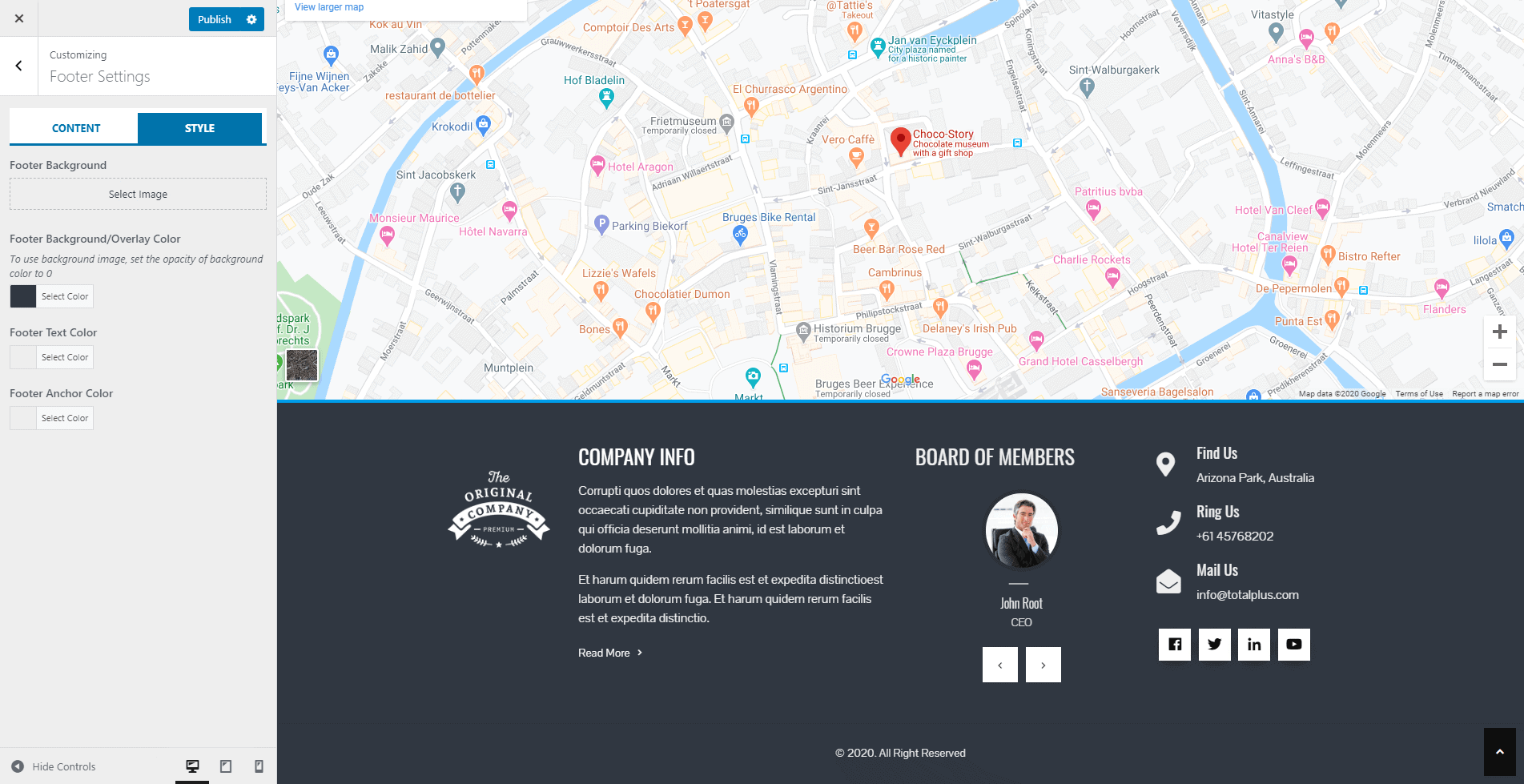
The theme provides an option to choose from 5 different styled footer layouts. Apart from it, you can also choose any of the 11 footer column layouts. You can also upload the image for the footer or set the background color, border color, title color, text color, and anchor color. To configure the footer settings:
- Go to Dashboard > Appearance > Customize > Footer Settings.
- Choose the Footer Layout from available 5 styles
- Also, choose the 15 Footer Column layout
- Add the Copyright Text. You can add any text you want. Leave it to blank if you do not want to add anything.
- Now go to Styles Tab to set the Footer Background Image.
- Don’t upload the Footer Background Image if you do not want to show the image in the background. Instead set the Footer Background Color, Footer Text Color, and Footer Anchor Color.
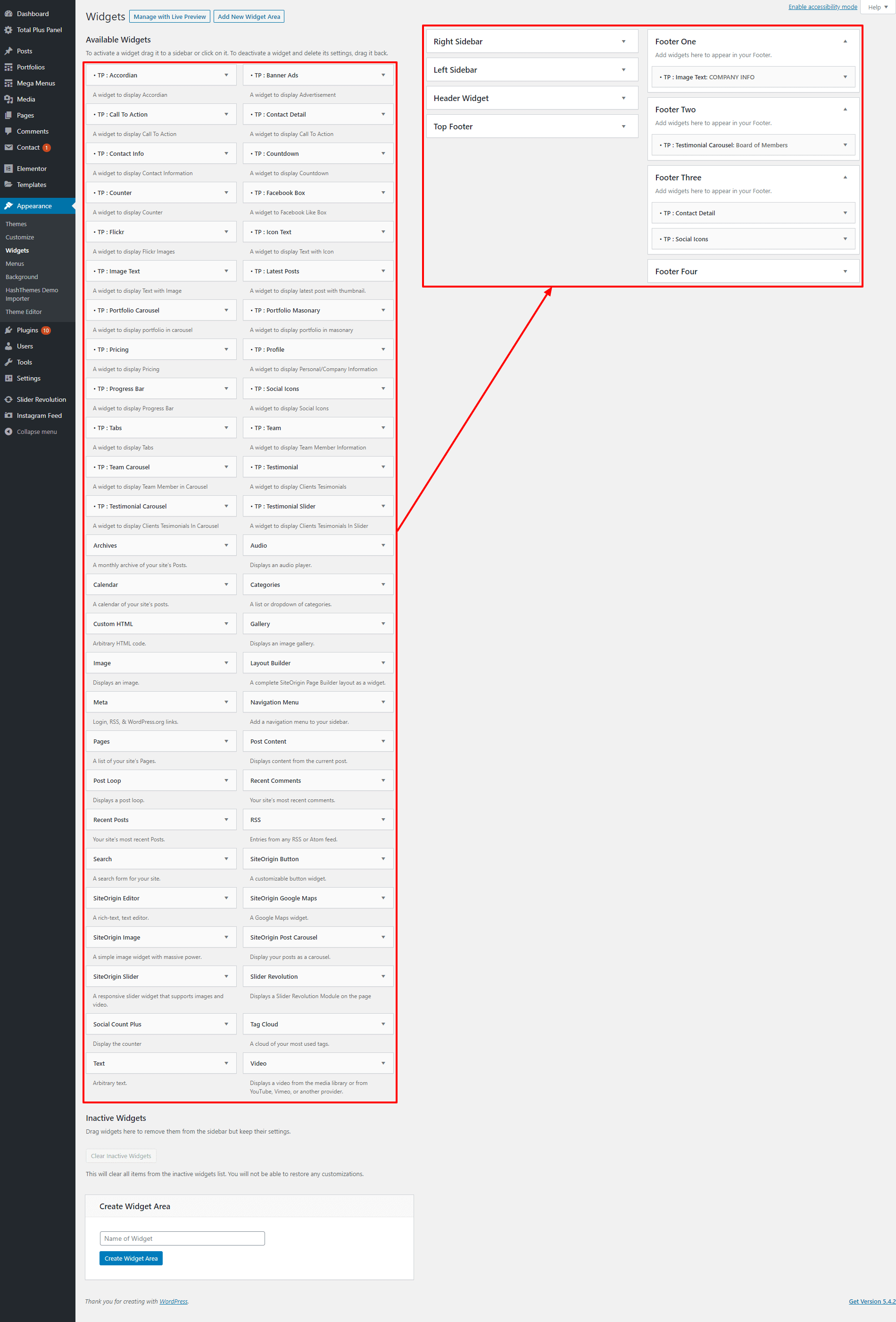
You can add different widgets on the footer section. To add widgets on the footer:
- Go to Appearance > Widgets.
- Drag and Drop the available widgets on the Footer Widget Area.
If you want to hide the header and footer section, you can check out the article: Hiding Header and Footer for Each Post and Page
Maintenance Mode
Total Plus comes with an inbuilt option to set up the maintenance mode page. The maintenance mode page will display an attractive landing page when the website is having any type of maintenance or is facing downstage. To set up and configure the maintenance mode page settings of the template, go through the article: Setting Up Maintenance Mode Page.
GDPR Settings
Total Plus is GDPR friendly WordPress theme that allows you to display cookie constant on the website. These cookie constants will send the notice to the visitors by asking them whether they agree or not to let the browser store their personal data. To configure the GDPR settings of the template, go through the article: Configuring GDPR Settings.
— THE END —
Other Articles
- Show/Hide Featured Image for Each Post and Page
- Changing the Sidebar Layout and Choosing Unique Widget to Display for each Post and Page
- Changing the Title Bar(Header) Background for each Post and Page
- Changing the Background and Text Color for each Post and Page
- Hiding Header and Footer for each Post and Page
- Create Portfolio with Images
- Menu Top and Bottom Padding
- Adding New Widget Area
- Configuring GDPR Settings
- Setting Up Maintenance Mode Page
- Configuring Advanced Settings
- Add Google Map with iFrame(Embed) Code
- Adding License Key and updating a Premium Theme
- Creating Mega Menu
- Creating One Page Menu in Total Plus
- Creating a Google Maps API Key