
Super WooCommerce Product Filter Documentation
Welcome to the Super WooCommerce Product Filter documentation! This guide will walk you through the installation and configuration of the plugin, enabling you to enhance your e-commerce website with powerful product filtering capabilities.
If you have any pre-sales questions or need any assistance related to the plugin, please feel free to open a support ticket. Our support team will be happy to help you.
Here are the Demo and Purchase links in case you need it.
Super WooCommerce Product Filter
The product filter plugin is a must-have for WordPress and WooCommerce online store owners, providing advanced filters for customers and complete control for administrators. With unlimited options, Super Product Filter for WooCommerce allows customers to filter products based on any criteria, ensuring they find precisely what they’re searching for.
Installation
The installation of Super WooCommerce Product Filter is a simple process of uploading a .zip file.
Here is the Purchase link if you need it.
Uploading VIA WordPress Dashboard
Installing Super WooCommerce Product Filter follows the standard plugin installation procedure, which you may already be familiar with. If not, here are the steps to guide you:
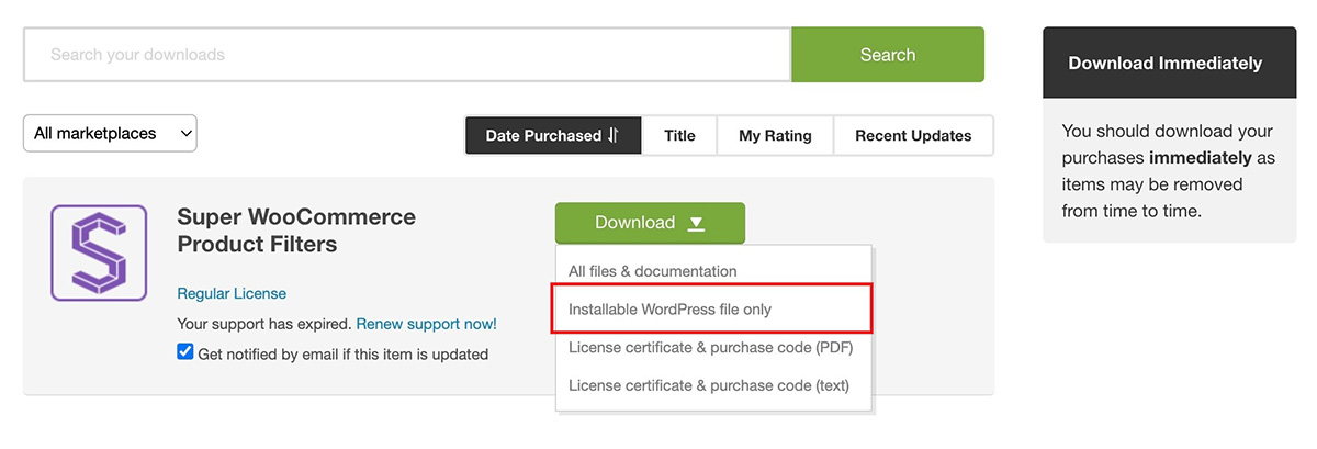
- After making your purchase, go to Downloads by hovering over the right-top corner menu of the Codecanyon website.
- Download the Super Woocommerce Product Filter .zip file and save it to your computer.
- Log in to your WordPress Dashboard and navigate to Plugins > Add New.
- Select Upload Plugin and then choose the plugin file you saved earlier.
- Click Install Now.
Wait for the plugin to be installed on your server, and once the installation is complete, click the Activate Plugin button.
Setting Up Super WooCommerce Product Filter
After successfully activating the plugin, you can configure your Super WooCommerce product filter for your online store. To configure the WooCommerce Product Filter:
- Go to your WordPress Dashboard.
- Navigate to the Super WooCommerce Product Filter option in the left-hand menu of your dashboard.
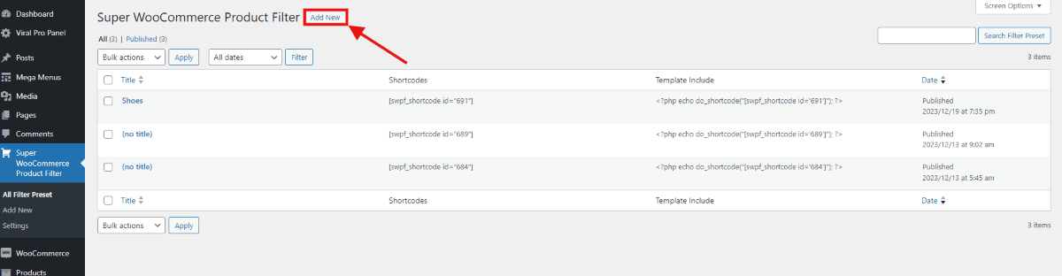
- Click the Add New button to create a new WooCommerce product filter.
- You’ll be directed to the plugin’s settings page, where you can tailor and personalize the product filter to your specifications.
If you are confused on how to set up a Super Woocommerce product filter then follow this article: A step by step guide on how to add a Woocommerce product filter.
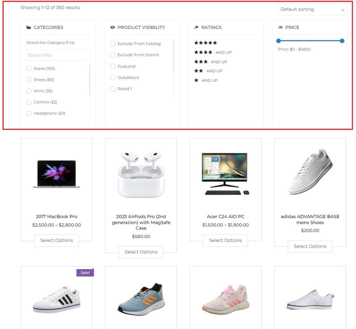
Filters
For a seamless online shopping experience, every store needs to have an efficient filter function. Without this feature, customers may struggle to find specific items, leading to frustration. You streamline their shopping journey by allowing customers to filter products based on attributes like color or size. For ease, you can drag and drop the filters to rearrange the filters according to your preference.
The default product attributes, applicable to most products, are already listed in this section. Additionally, any product attributes will appear here once it’s added.
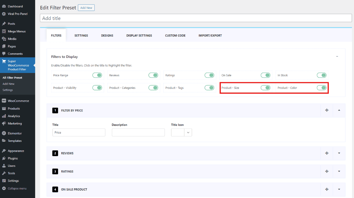
You’ll notice that any additional attributes you’ve added will be displayed after the default product attributes. Let’s see further what changes can be made in this section.
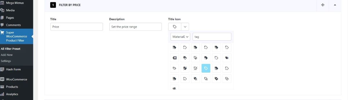
1. Price Range
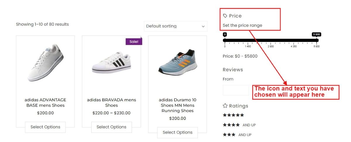
The price range feature lets users set a budget for products they’re interested in. You can describe this price setting and select icons to highlight this filter attribute.
Users have the flexibility to either use a slider to choose a price range visually or manually enter their desired minimum and maximum prices using specific input fields.
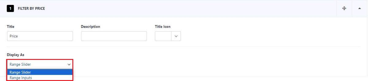
Let’s see how the range slider and range inputs look on your website.
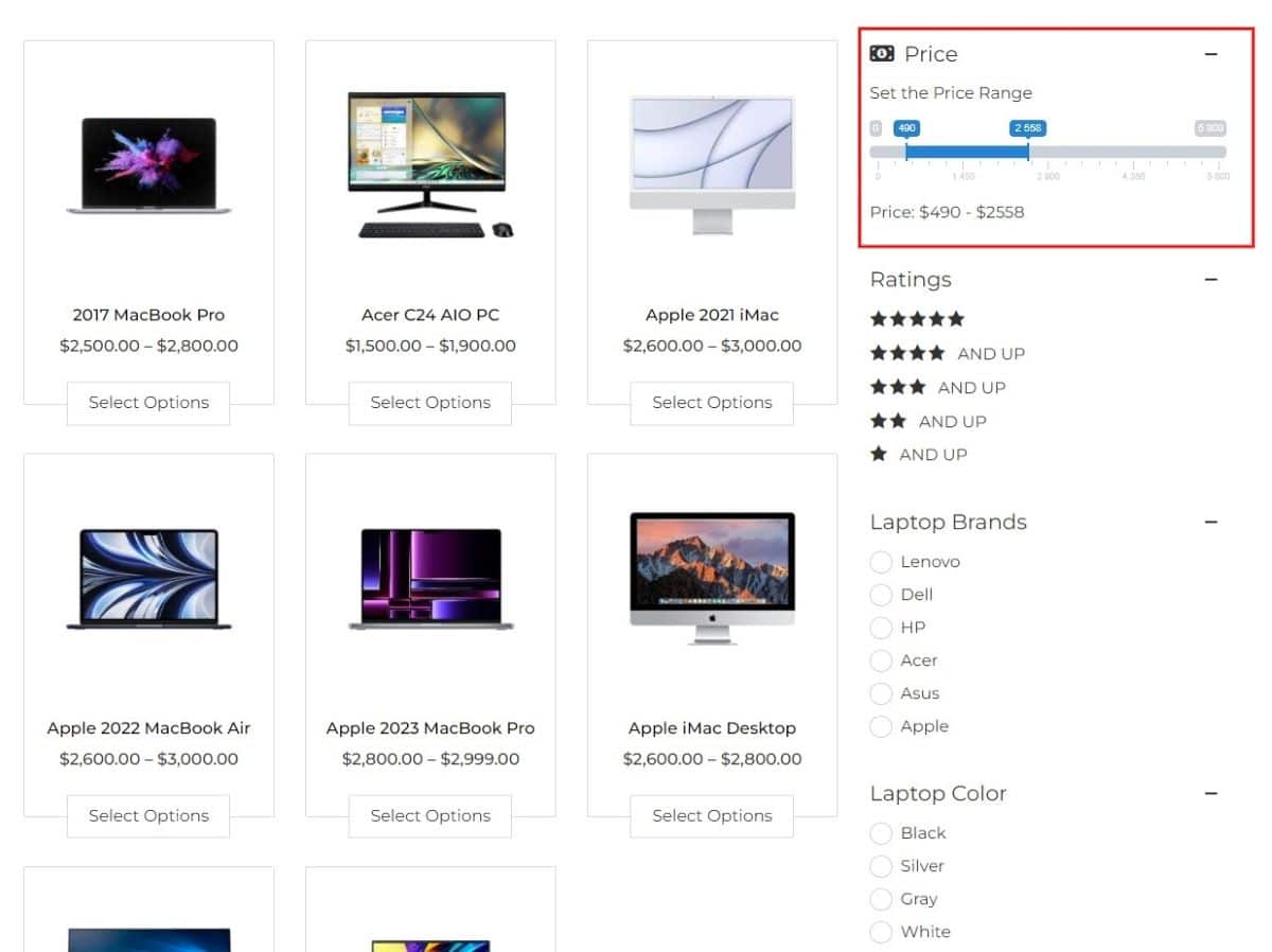
Range Slider
There are 7 unique styles available for the range slider. You can check the demos here.
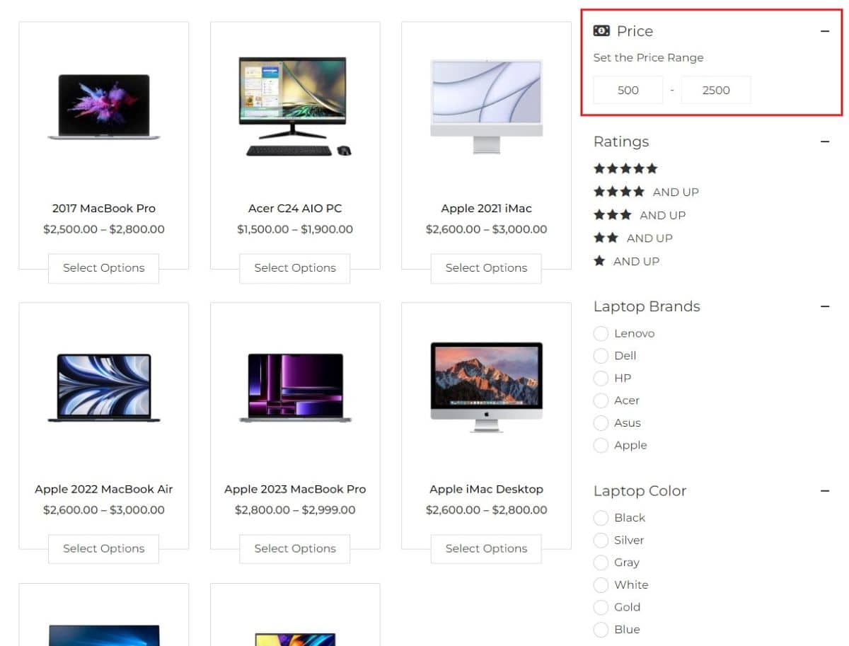
Range Input
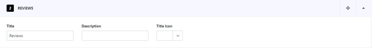
2. Review
You can select the description and a font icon for the review product filter as well.
When you apply a filter using numerical values, products matching that exact review count will be displayed. For instance, if you select products with more than 15 reviews, only items meeting that specific criteria will be shown.
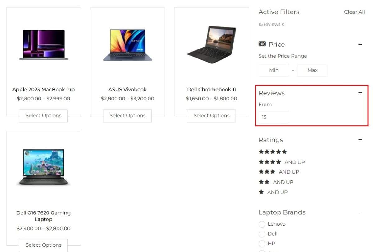
Products having 15 reviews are displayed
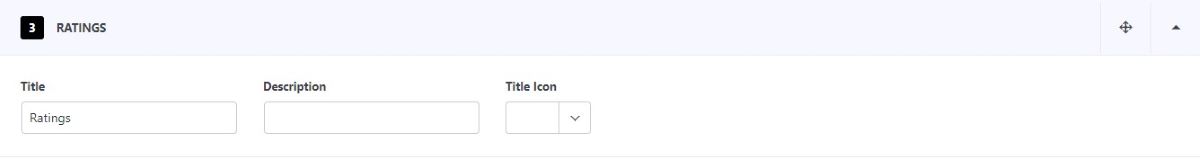
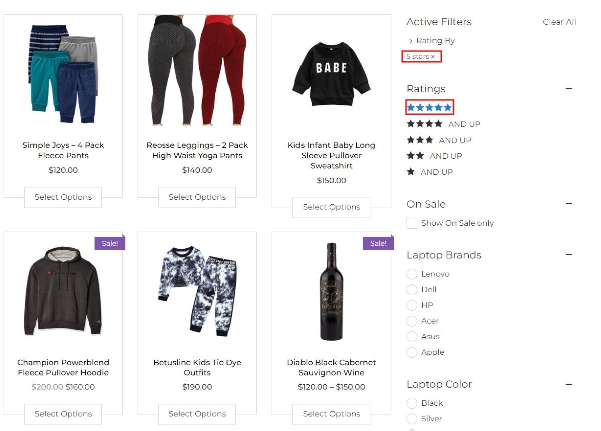
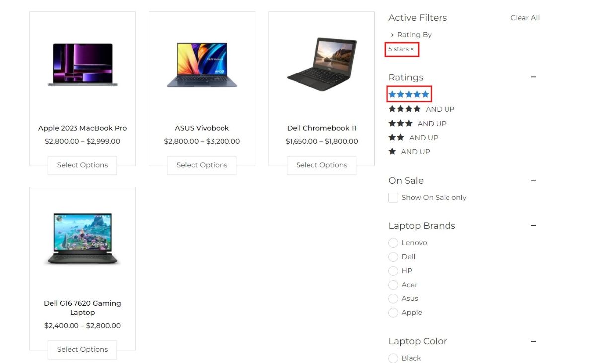
3. Ratings
The rating filter offers customization options where you can include a brief description and choose a specific font icon. This allows for a more descriptive presentation using concise information.
When you apply a rating filter, products will be displayed based on the star rating criteria you’ve chosen. For instance, selecting a 3-star rating or higher will prompt the system to showcase products that match or exceed this rating.
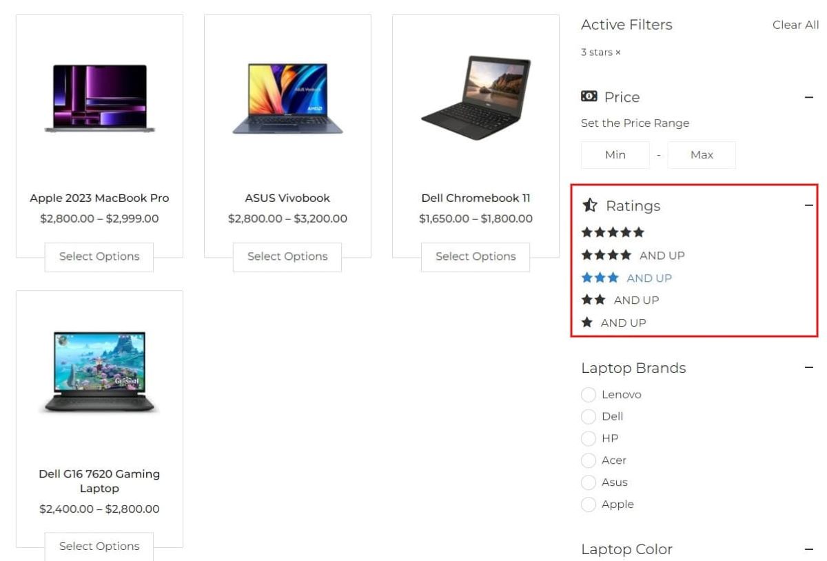
Products with 3-star rating and above
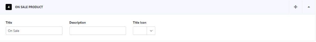
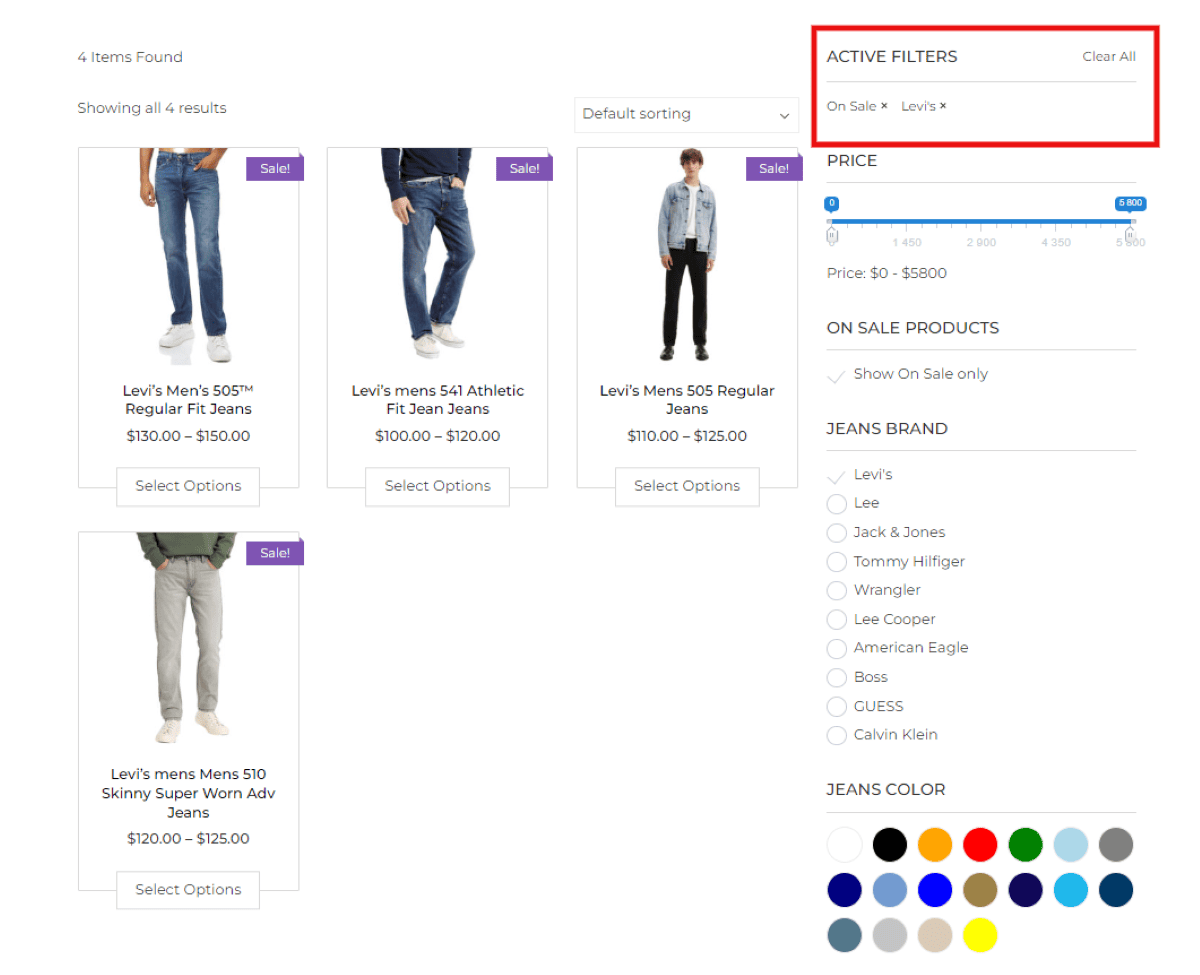
4. On Sale
Enhance your On Sale filter section by applying descriptive text along with icons. This will inform customers that the showcased products are currently available at discounted prices for a limited time.
Let’s see how the product filter appears on your website
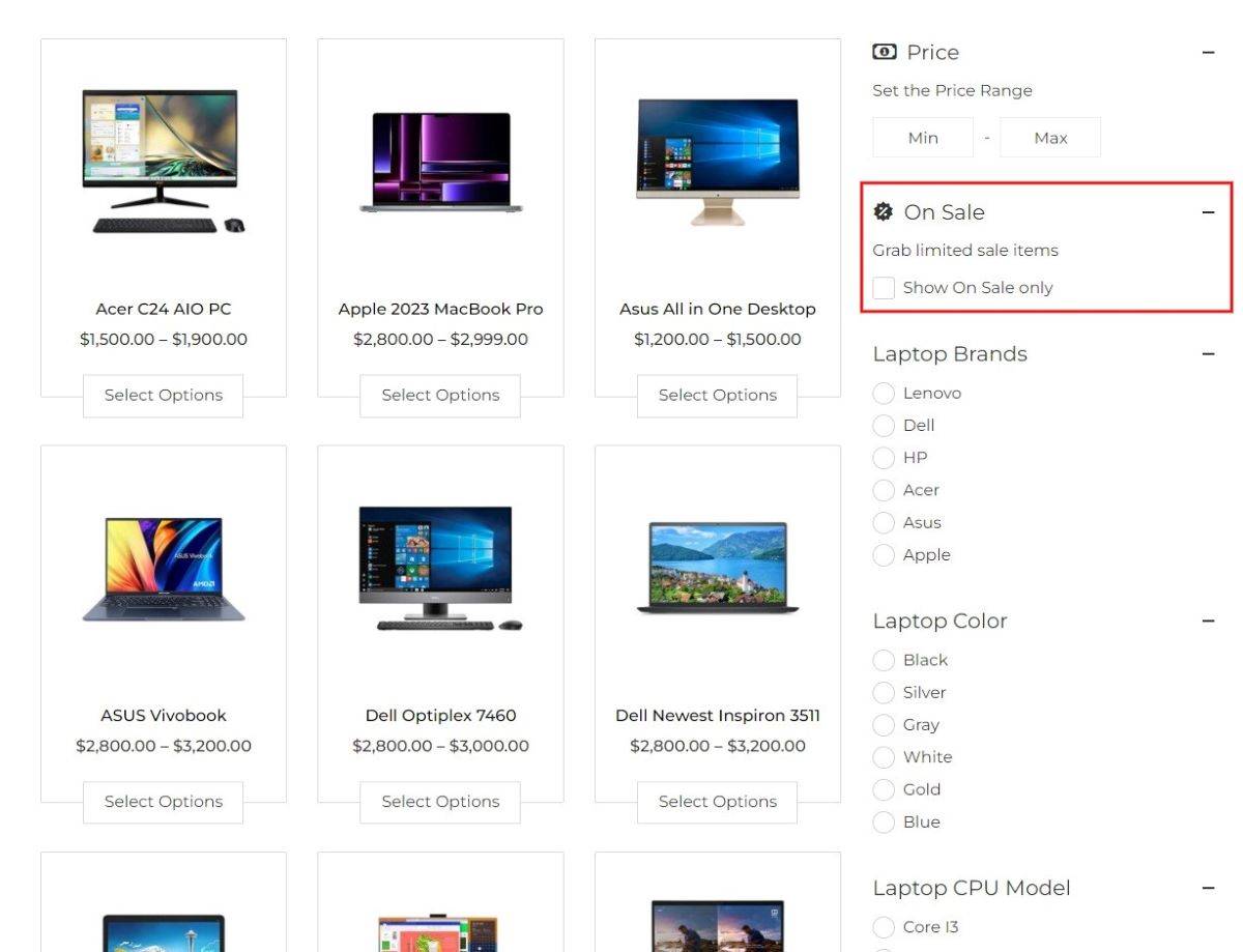
On Sale Product Filter
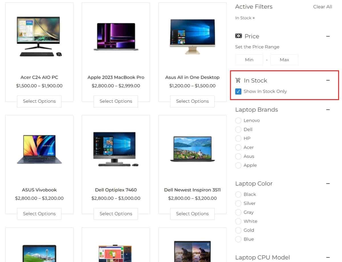
5. In Stock
Incorporate a descriptive note within your In Stock filter section, accompanied by relevant icons. This will notify customers that the displayed products are currently available and ready for immediate purchase.
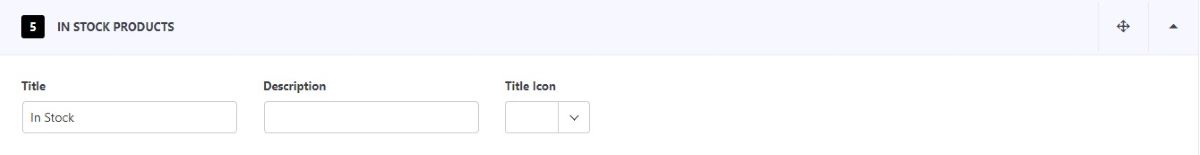
When you apply the In Stock filter, it will display products that are currently available and ready to be purchased.
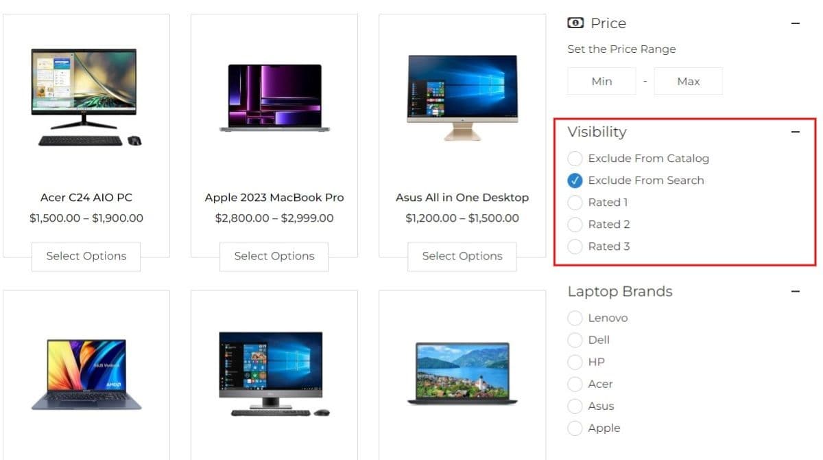
6. Product Visibility
This feature enables users to showcase all products or selectively display items based on specific criteria or terms.
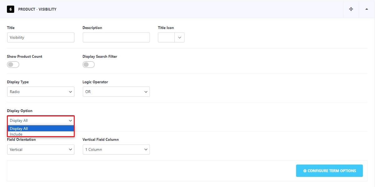
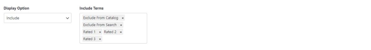
In the Display Options, you can choose to display all the terms or choose to include certain terms that you prefer.
You can further choose to Show/Hide the product count and search filter. Select your preferred display type, display option, and field orientation. Detailed explanations for these settings are provided in the following sections of this documentation.
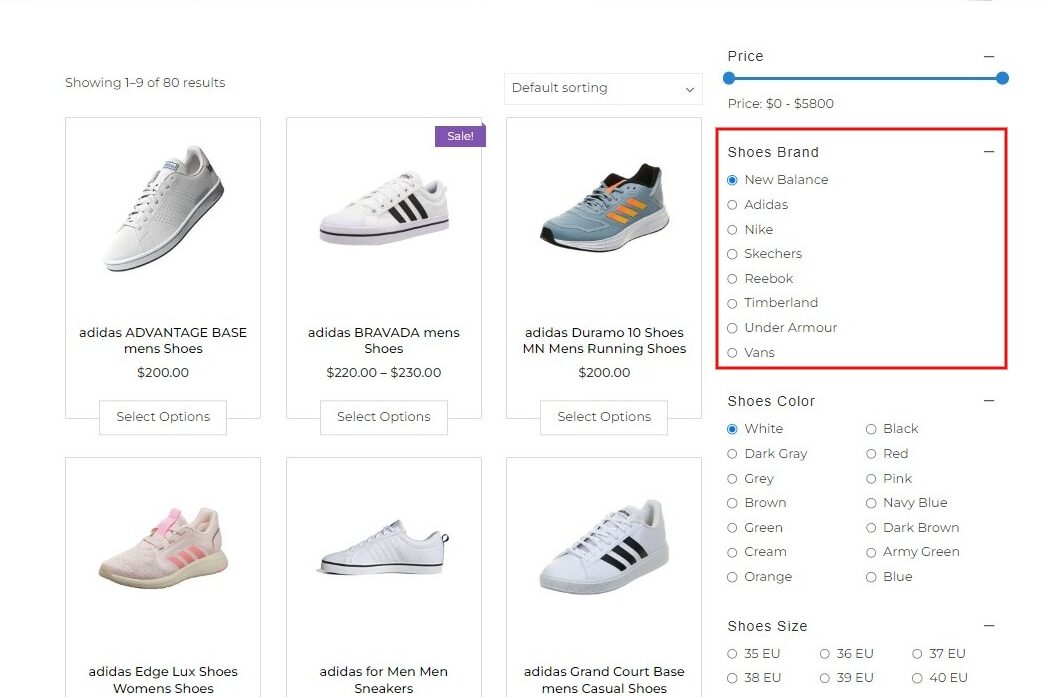
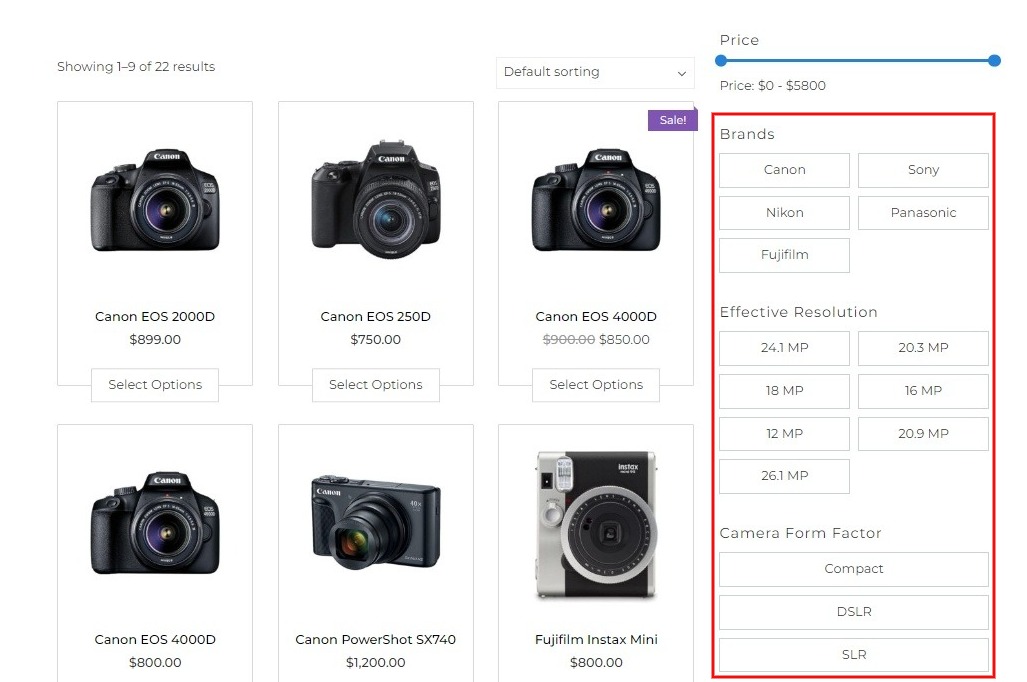
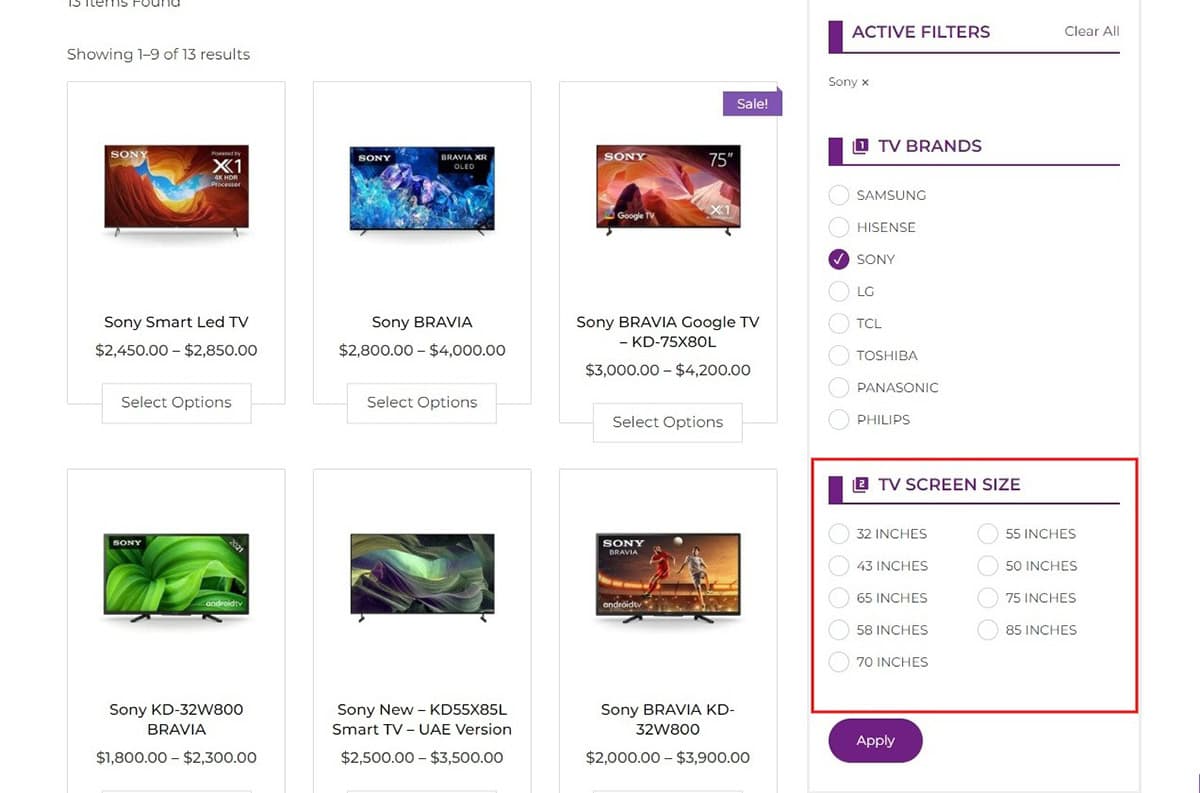
7. Product by Categories
A product category organizes and groups items. This organization simplifies the shopping experience for customers on a website and allows employees to swiftly locate specific products when needed.
To create the product category for your products:
- Go to Dashboard > Products > Categories.
- Create categories based on your products.
After adding categories, you can refine this section further. Choose the display type, options, and other functionalities to match it to your needs.
Provide a descriptive caption for the filter and accompany it with relevant icons.
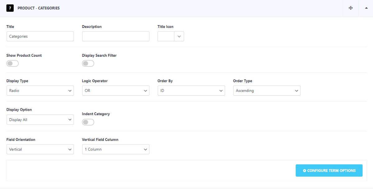
You can further choose to Show/Hide the product count and search filter. Select your preferred display type, display option, and field orientation. Detailed explanations for these settings are provided in the following sections of this documentation.
In the Display Option, you can choose to feature all categories or selectively show or hide specific ones according to your preference.
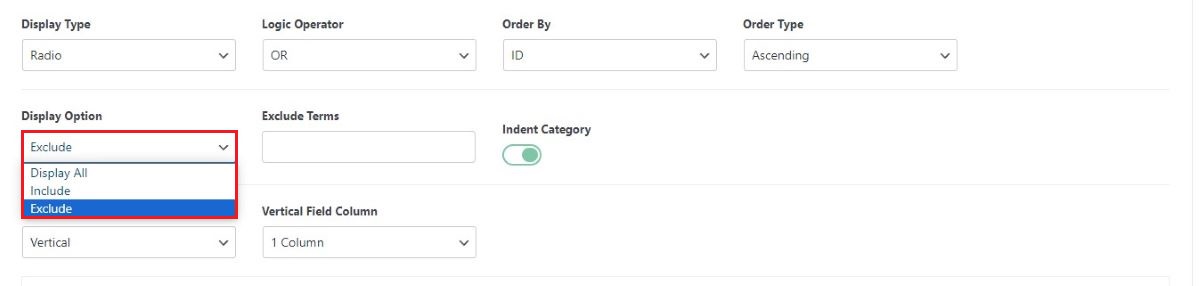
Once you’ve chosen to include, exclude, or display all categories, preview how it looks on your website.
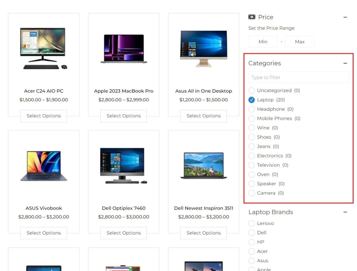
Product Category filter
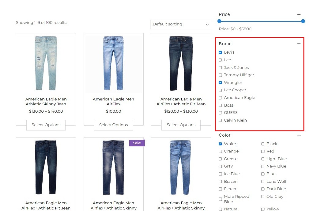
8. Product by Tags
A product tag is a descriptive keyword or label associated with a product. By using product tags in a filter, users can refine their search and find items that align with particular tags or descriptors.
To create the product tag for your products:
- Go to Dashboard > Products > Tags.
- Create tags based on your products.
After adding tags, you can refine this section further. Choose the display type, options, and other functionalities to match it to your needs.
Pair this filter with a descriptive caption and relevant icons for user-friendly navigation.
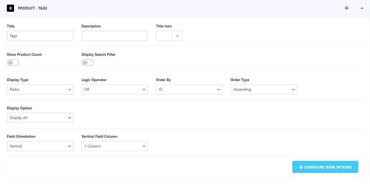
You can further choose to Show/Hide the product count and search filter. Select your preferred display type, display option, and field orientation. Detailed explanations for these settings are provided in the following sections of this documentation.
In the Display Option, you can choose to feature all tags or selectively show or hide specific ones according to your preference.
Once you’ve chosen to include, exclude, or display all categories, preview how it looks on your website.
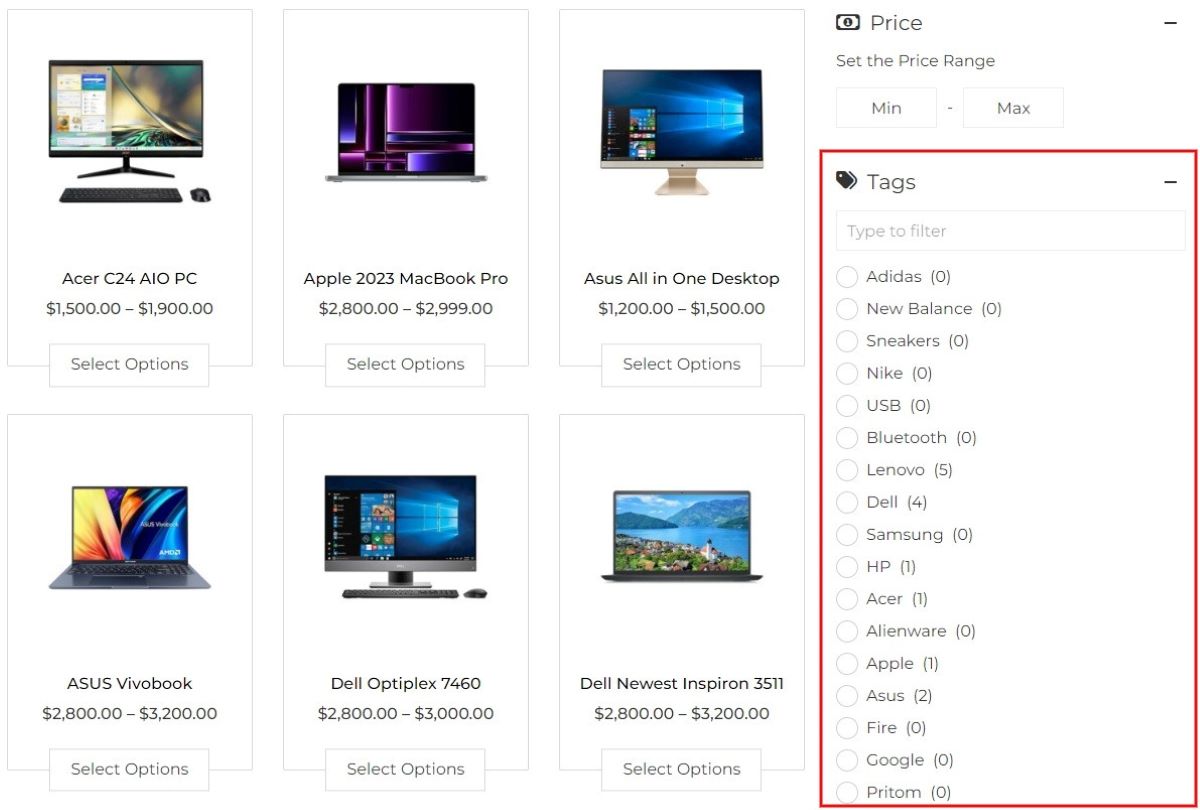
Product Tag Filter
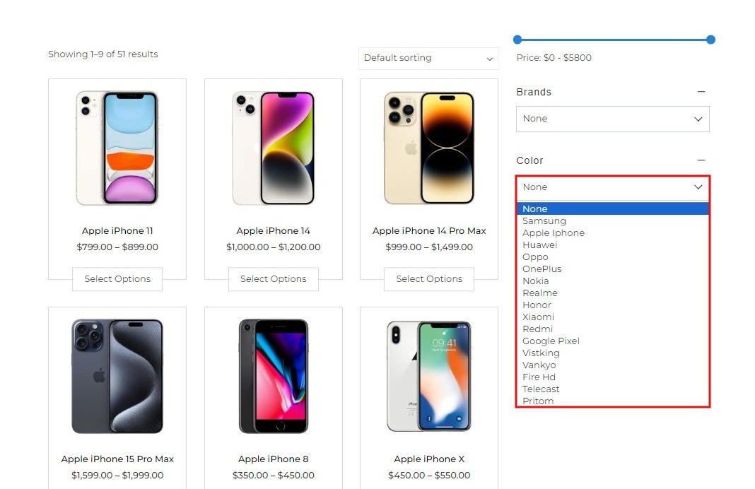
9. Product by Attributes
Product attributes are specific features describing a product, such as size, color, or material, helping customers understand its qualities.
Before diving into the settings, it’s essential to understand how to set up product filters. While there are some default filters available, you can customize and add more filters based on the attributes of your products. To add the filters
- Go to Dashboard > Products > Attributes
- Specify the attribute name, select the order type, add the slug, then click Add Attributes.
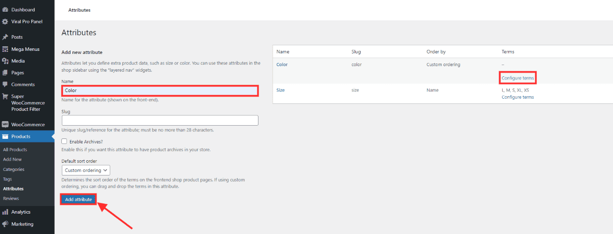
- You can set specific terms for the attributes you’ve created. For instance, under the Color attribute, you can specify available options like Black, White, Blue, Red, and Purple for your product.
- To set terms for your attributes, click on Configure terms of your product attribute. This will redirect you to a page where you can manage and add your product terms.
- Specify the name and slug for your color term, then click Add New Color.
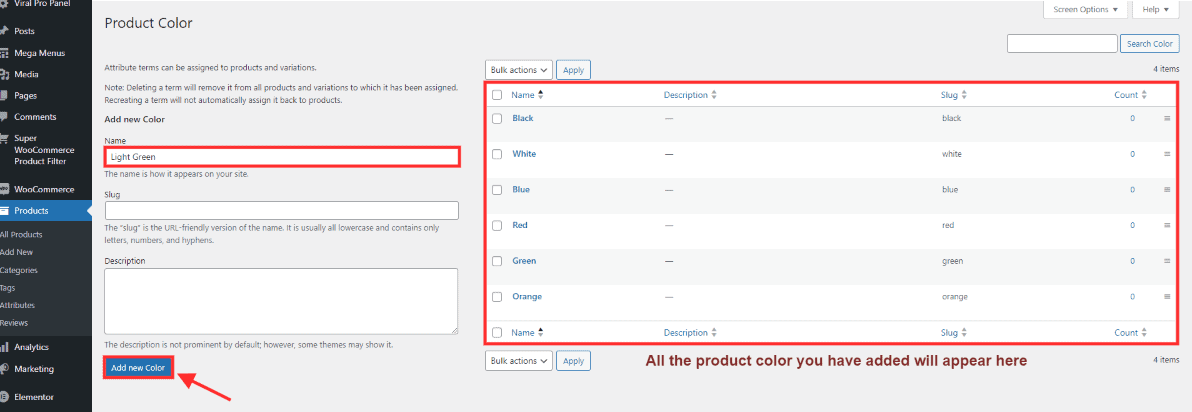
- The Super Product WooCommerce Filter plugin enables additional configuration for these attributes. Click here to further modify this term.
The product attributes that you have added now will appear in the settings.
You can further make changes to the product attribute that you have added.
When you modify the attributes you’ve set, those filters will be displayed on the website. Choose to Show/ Hide the product count and search filter. Further select the display type, logic operator, order by, order type, display option, display condition as well as field orientation.
After you have made the necessary changes, preview how it will look on your site.
You can similarly add attributes and make the changes as you prefer.
10. Meta Fields
A metabox is a customizable box that appears on the post, page, and product editing screen in the WordPress admin. It allows developers to add and manage additional custom fields or settings for posts, pages, or custom post types.
Super WooCommerce Product Filter supports metabox fields, allowing you to selectively display a metabox field within the filter and then filter products based on the selected options.
The plugin includes built-in support for the Advanced Custom Fields (ACF) plugin. You can find more details here.
Alternatively, if you’ve added a metabox using a plugin or custom code, you can also display it within filters. More information can be found here.
Filter Settings
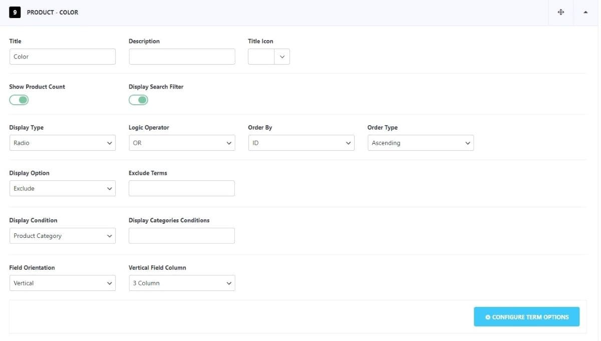
By default, you can customize the filter attributes. Add a title and description, then select the appropriate tile icon to display on the front end for a precise representation.
Similarly, you can also make changes in other default filters in the same way.
Beyond the default features, the Super WooCommerce Product Filter lets you modify your product filter attributes extensively. You can adjust the display type, options, conditions, field orientation, and more. To implement these changes:
- Go to Dashboard > Super WooCommerce Product Filter.
- Click on the Filter Tab.
- For the demonstration purpose, we have added a color attribute. Let’s see the configuration that we can do on it.
Display Type
You can choose to display the product filter in these display types:
- Radio
- Checkbox
- Dropdown
- Multi Select
- Button
- Toggle
- Color
- Image
Radio
When displaying product attributes, you can use radio buttons as a user interface element. Radio buttons are designed for scenarios where users must select only one option from a given list. For instance, if users are choosing a specific product variant or a preferred payment method, they can select only one option at a time.
You can customize the radio box according to your preferences. There are 11 Radio box styles. To view demos of different radio box styles, click on this link.
Checkbox
The checkbox indicates selected filters by displaying a tick mark inside the box.
You can customize the checkbox according to your preferences. There are 11 Checkbox styles. To view demos of different checkbox styles, click on this link.
Dropdown
The dropdown feature in a product filter allows users to select specific criteria, such as price range or category, from a compact menu. It streamlines the filtering process by presenting all essential options in a concise list, enabling users to refine their product search efficiently.
You can customize the dropdown according to your preferences. There are 2 Dropdown styles available. To view demos of different dropdown styles, click on this link.
Multi Select
The multi-select feature enables users to choose multiple product specifications simultaneously. For example, when searching for a laptop with specific features like display type, RAM size, color, and brand, users can easily pinpoint their desired product using this function.
You can customize the multi select according to your preferences. There are 2 Multi Select styles you can choose from. To view demos of different multi select styles, click on this link.
Button
The button adds a descriptive label to the filters, enhancing their clarity. Filters are displayed within a bordered box for a more polished appearance.
You can customize the button according to your preferences. There are 5 Button Styles. To view demos of different button styles, click on this link.
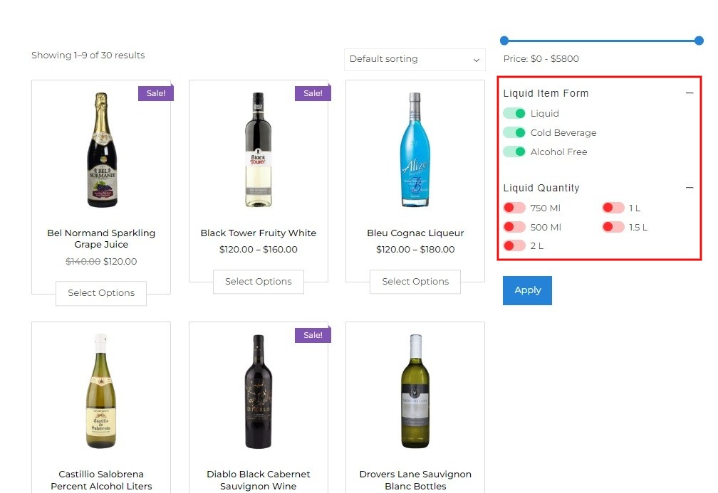
Toggle
The toggle style in a product filter provides a user-friendly way to switch between different filter options. Users can easily activate or deactivate specific attributes or features with a simple toggle switch, enhancing the interactive experience and simplifying the filtering process.
You can customize the toggle according to your preferences. There are 5 Toggle Styles. To view demos of different toggle styles, click on this link.
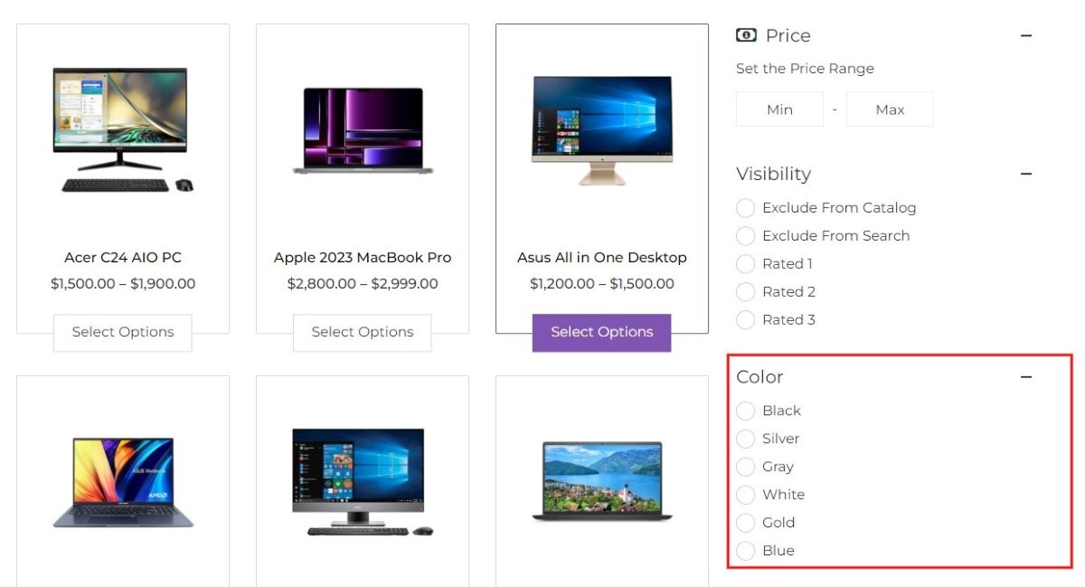
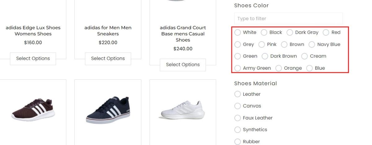
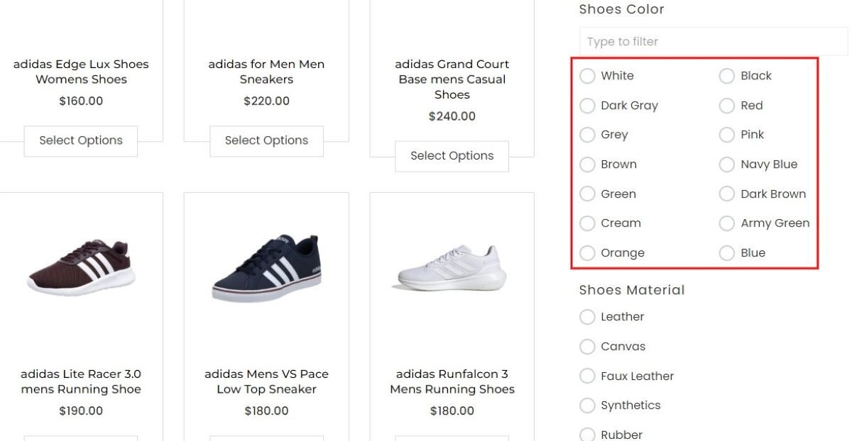
Color
The color option lets users select products by their desired color, presenting a visual spectrum of available shades. Additionally, you have the flexibility to display just the colors or include accompanying text alongside each shade.
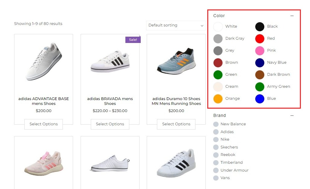
Color With Label
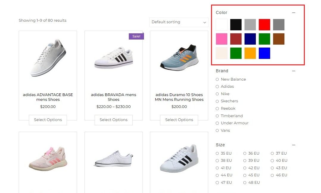
Color Only
To view the demo of the color styles mentioned above, follow this link.
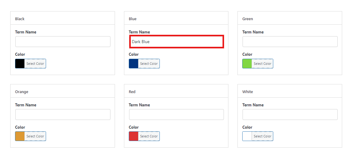
To add color to the product filter, click on Configure Term Options.
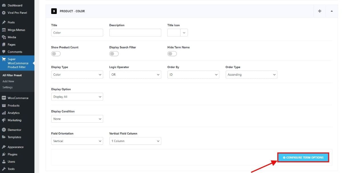
Here, you can select the color for the attribute and specify its name for precise identification.
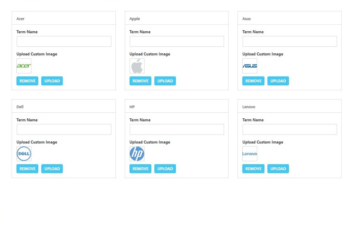
Image
The image feature lets users filter products based on visual representations, allowing them to view and select items based on specific images or visual attributes. Additionally, you have the flexibility to display just the image or include accompanying text alongside each image.
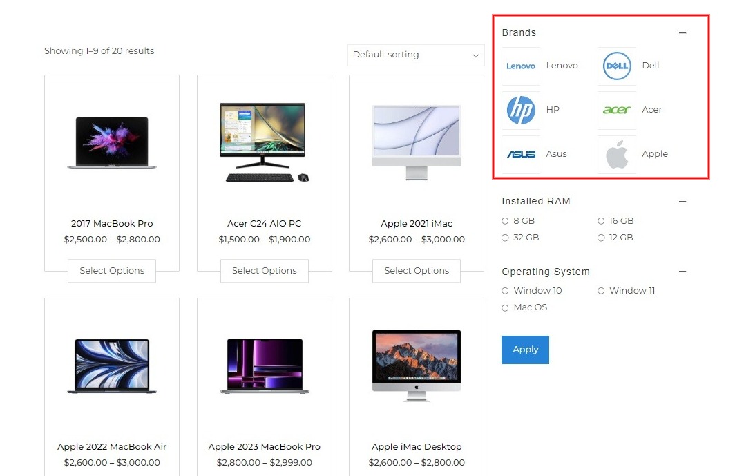
Image with Label
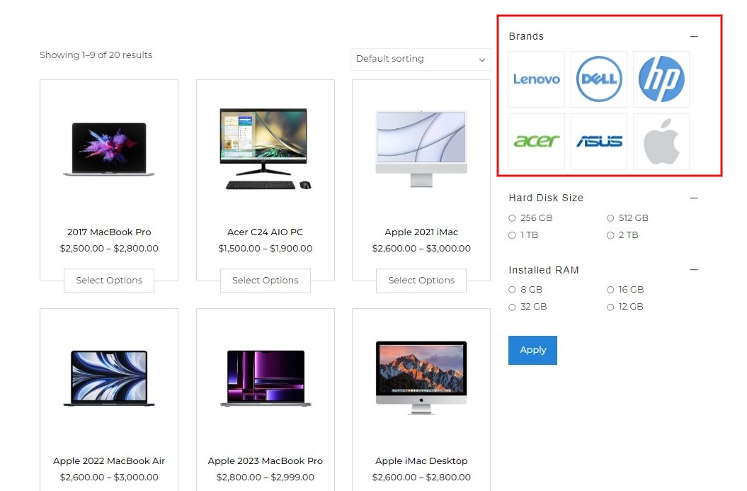
Image Only
To view the demo of the image styles mentioned above, follow this link.
To upload an image into the product filter, click on Configure Term Options.
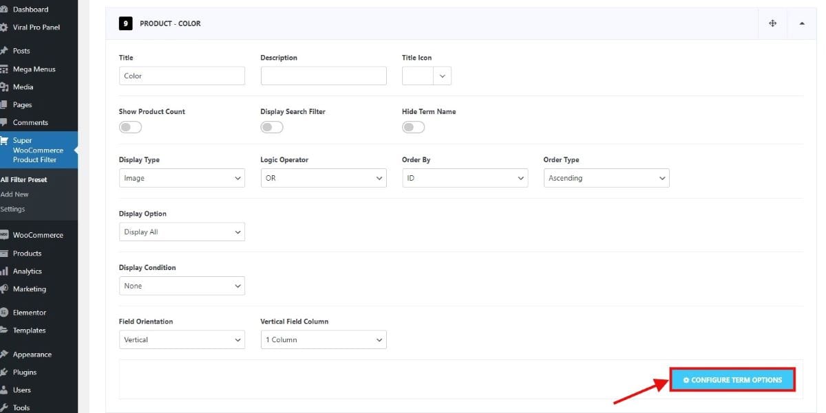
Here you can configure the attributes by adding images to it.
Show Product Count
This option allows users to see the number of products available for each filter selection, giving them an idea of the product volume within specific categories or criteria.
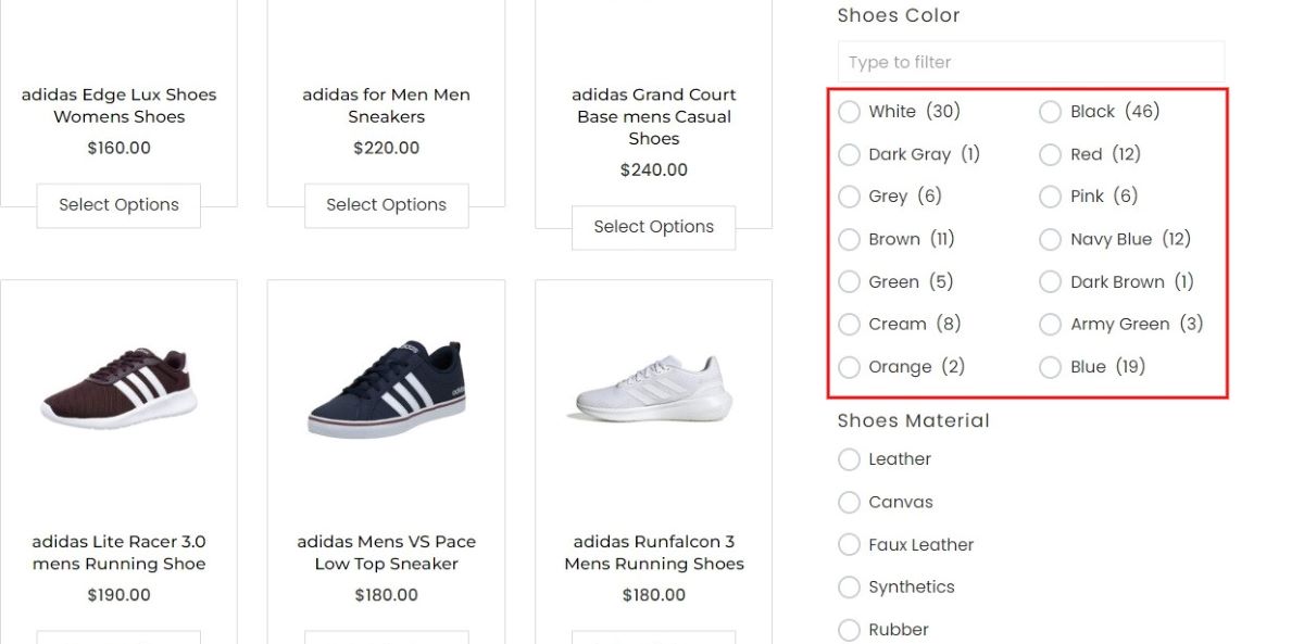
In the product filter, you can see how many of each product are available. To view the demo click on this link.
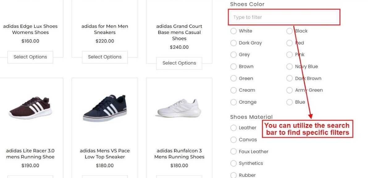
Display Search Filter
This feature provides users with a search bar within the product filter interface, enabling them to quickly find specific filter options or attributes without scrolling through a long list.
Logic Operator
Select either “AND” or “OR” as the logic operator. When “AND” is chosen, a product must meet all specified features to be included. In contrast, “OR” means a product can match one or more attributes without meeting all criteria.
Order By
You can also choose the criteria to sort by ID, Name, or Count.
Order Type
Choose how you want items to be arranged: either from the Ascending or from the Descending order.
Display Option
Within the display options, users have three choices to determine which items appear on the screen. The Display All setting showcases every available item without exception. On the other hand, selecting Include will only present the specific items you choose. Conversely, opting for Exclude will display everything except for the items you’ve selected to omit.
Display Condition
Users can set specific display conditions based on either Product Category or Product Tag. This means items will be shown or hidden according to the selected category or tag criteria, streamlining the viewing experience based on these parameters.
To view the demo for display condition when a certain category is selected.
Field Orientation
You have the flexibility to arrange filters either vertically or horizontally, depending on your preference for a streamlined appearance. If you opt for the vertical layout, you also can specify the number of columns for the filters, further customizing the display to suit your needs.
Horizontally Oriented Filters
Vertically Oriented Filters
Choose your preferred layout for displaying filters: opt for a single-column design for straightforward scrolling, a two-column setup for a balanced view, or a three-column layout to efficiently maximize space. Select based on your design preference and content volume to best suit your needs.
Step by Step Filter
A step by step filter in WooCommerce simplifies product searches by presenting users with an initial set of product listings and filter options. Users select criteria such as category or price range, and the product listings are updated accordingly to reflect their choices. As users refine their search, additional filter options become available, allowing for further customization of the results.
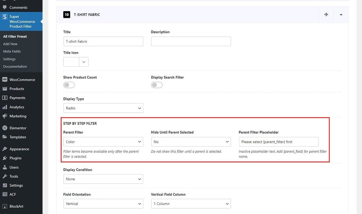
The step by step filter can be shown in two formats. If you choose the option to hide the filter choices until the parent filter is chosen, the additional filter options won’t be visible. This approach encourages users to concentrate on selecting the primary category first before exploring further filters.
You’ll notice that only the parent filter is available without any other filter options to choose from. Let’s see what happens when we choose any one parent filter.
Here, you’ll notice that the filters are revealed only after selecting the main category. As users continue to make selections, additional filters will appear accordingly, providing a smoother and more guided filtering experience.
To see how the filters appear after selecting the main category, you can click on this demo page for a closer look.
On the other hand, if you choose not to hide the other filters until you pick the main category, all the filter labels related to that category will be visible. But you can only select the filter options after you’ve chosen the parent category.
Let’s see what happens when a parent filter is selected from the filter options available.
When you choose the main filter, the other filter choices pop up too. This lets users step through the filtering process smoothly, making their online experience more enjoyable.
Settings
To configure the different settings features of the product filter:
- Go to Dashboard > Super WooCommerce Product Filter
- Click on the Settings Tab.
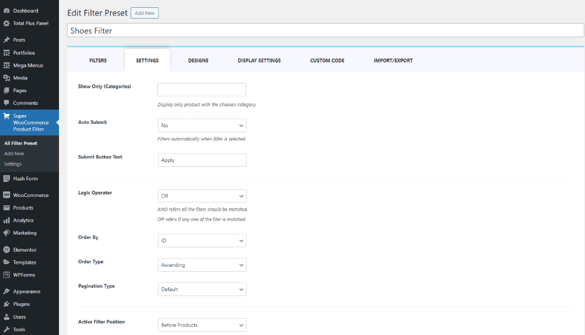
- Make changes in the respective fields.
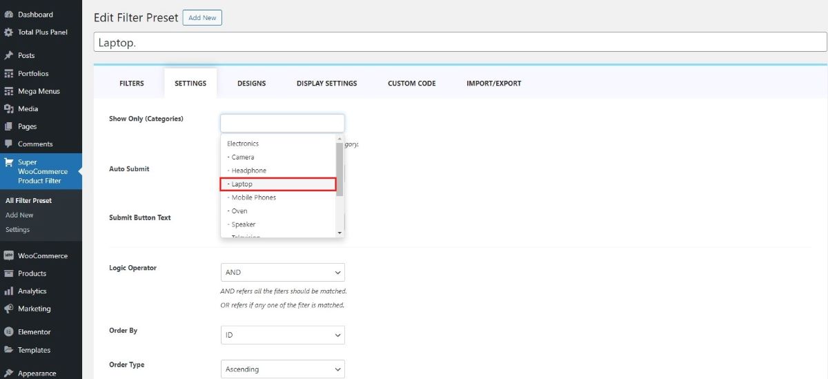
Show Only (Categories)
The “Show Only (Categories)” feature allows you to display and filter products exclusively within selected categories, ensuring unrelated items from other categories do not appear. This is especially helpful when creating category-specific pages such as “Laptops,” “Shoes,” or “Furniture.”
✅ How It Works
For each filter you create, the system generates an autogenerated shortcode that you can use to display only products and filters for a specific category. Below is a step-by-step guide to set this up.
Step-by-Step Setup Guide
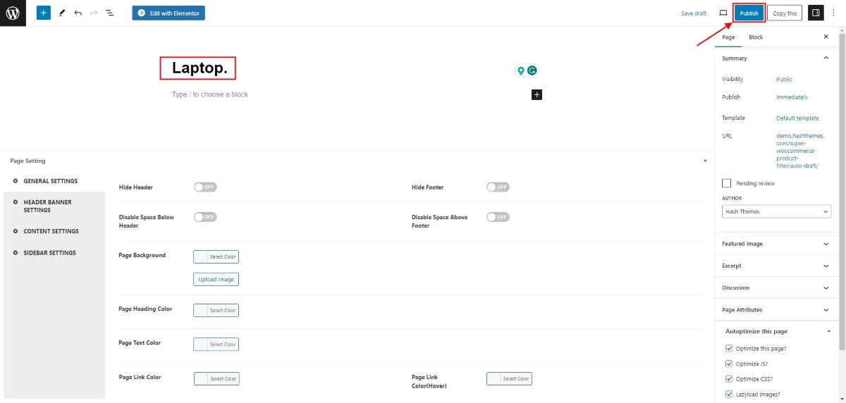
1. Create a New Page
- Go to Dashboard > Pages
- Click Add New
- Give your page a name (e.g., Laptops)
- Click Publish
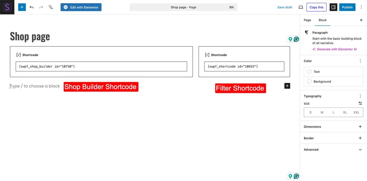
2. Add Product and Filter Shortcodes Using Elementor
- Click Edit with Elementor to launch the page builder.
- Add a 2-column section using the “+” icon.
- Use a wider column for product listings
- Use a narrower column for filters
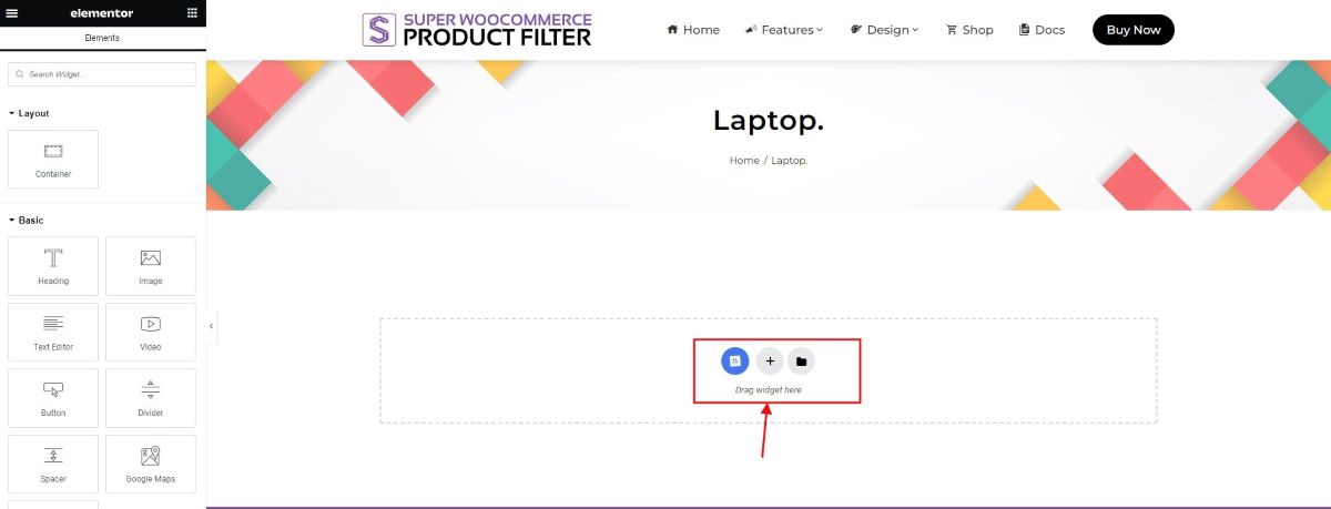
- In the wider column:
- Search for the Shortcode widget in the Elementor panel
- Drag and drop it into the column
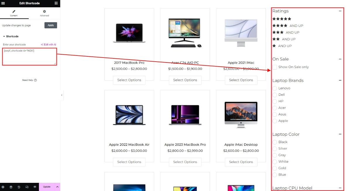
- Paste your WooCommerce product shortcode, for example:
[products category=”laptop” columns=”4″ rows=”2″]
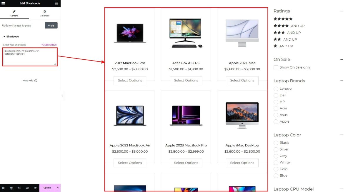
Note: You can get the shortcode from WooCommerce websites, allowing you to easily copy and paste them as needed.
3. Add the Filter Shortcode
- Go to Dashboard > Super WooCommerce Product Filter
- Find the filter you created for the “Laptop” category
- Copy the autogenerated shortcode from the column labeled Shortcode
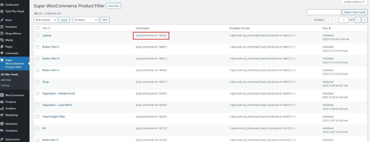
- Back in Elementor
- Select the narrow column
- Add another Shortcode widget
- Paste the filter shortcode here
4. Save and Preview
Click Update to save your Elementor layout. You’ll now see your category specific products and filters on the front end.
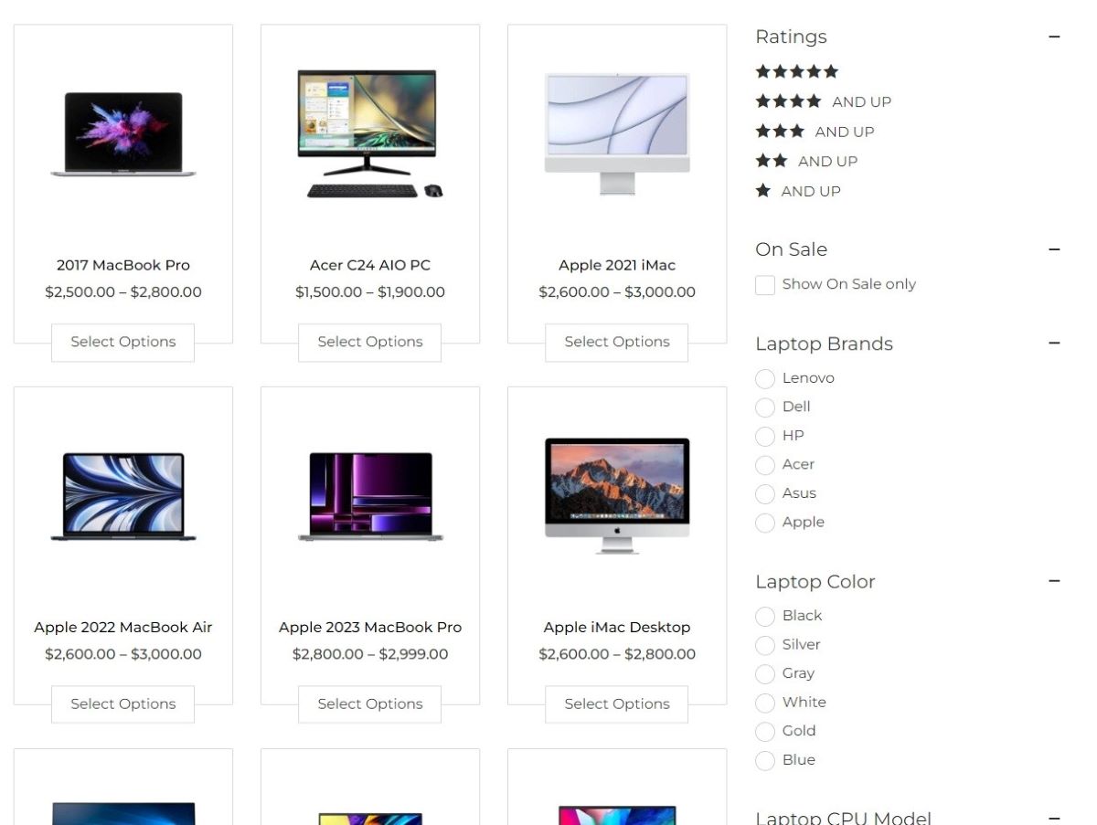
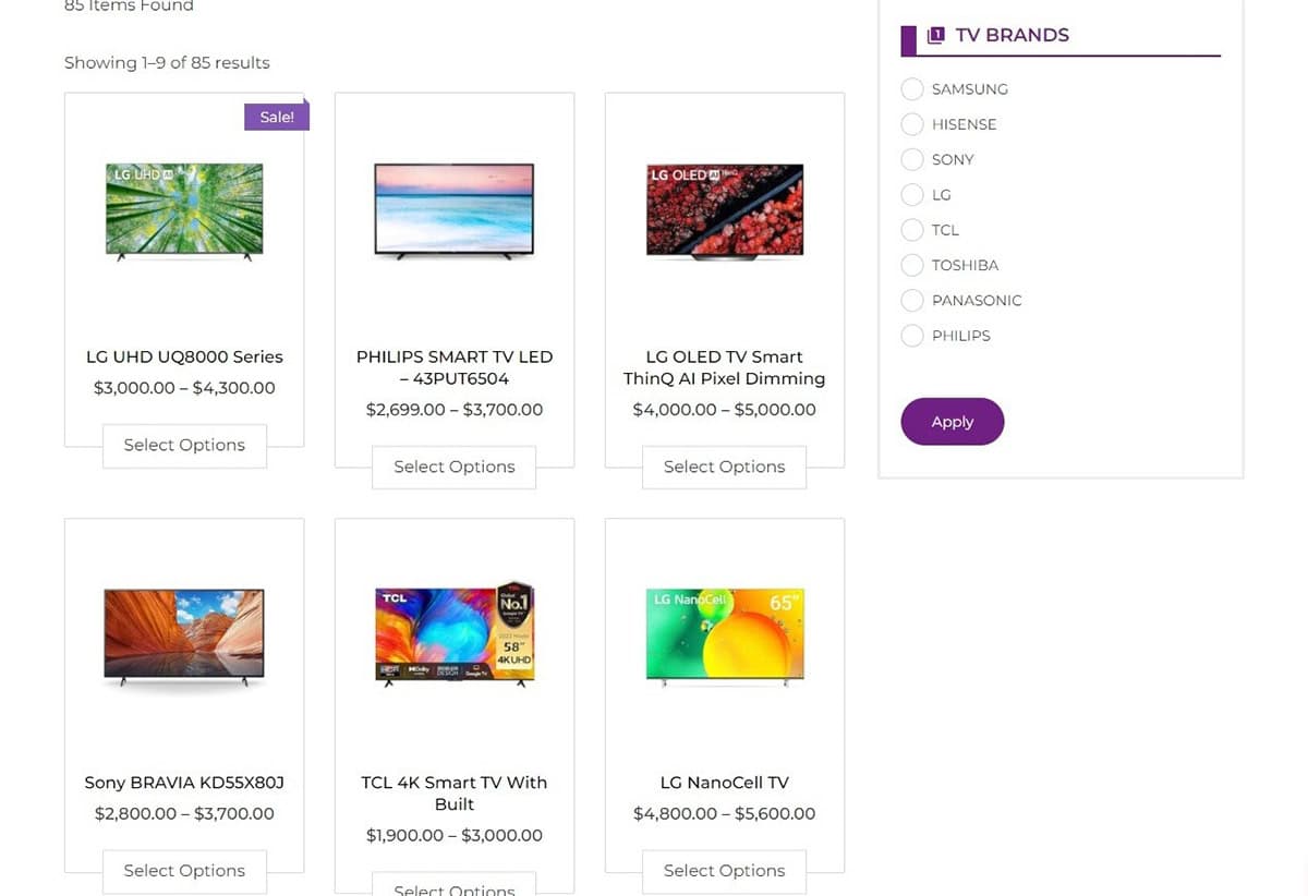
⚠️ Issue: Other Categories Still Showing?
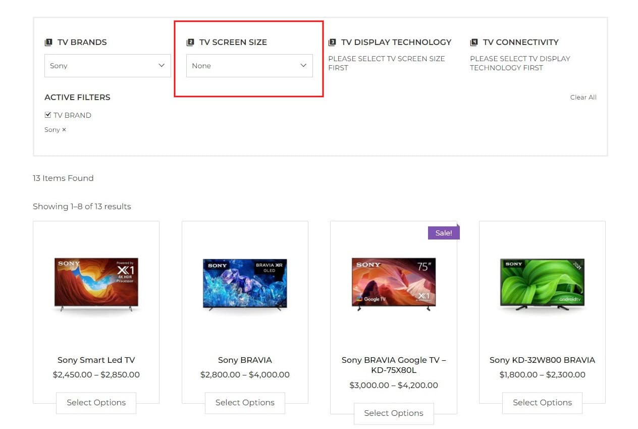
By default, filters may return products from multiple categories if their attributes match the filter criteria, as shown below.
To restrict filters to a single category (e.g., only laptops):
🔒 Restrict Filter to a Category
- Go to Dashboard > Super WooCommerce Product Filter > Settings
- Locate the “Show Only (Categories)” option
- Select the specific category you want to restrict (e.g., Laptop)
- Click Update to save your changes
Now, filters will only affect and display products within the selected category, preventing unrelated products from appearing even if they share the same attributes.
✅ Final Result
Your page will now:
- Display products only from the selected category
- Include filters that apply exclusively to that category
- Provide a clean and focused shopping experience for your users
Auto Submit
When you select a product filter, the auto-submit feature takes charge, automatically submitting your chosen filter options. This removes the need for users to manually click the submit button, simplifying the process for a more effortless experience.
To understand how this setting works in action, please navigate to the demo Auto Submit.
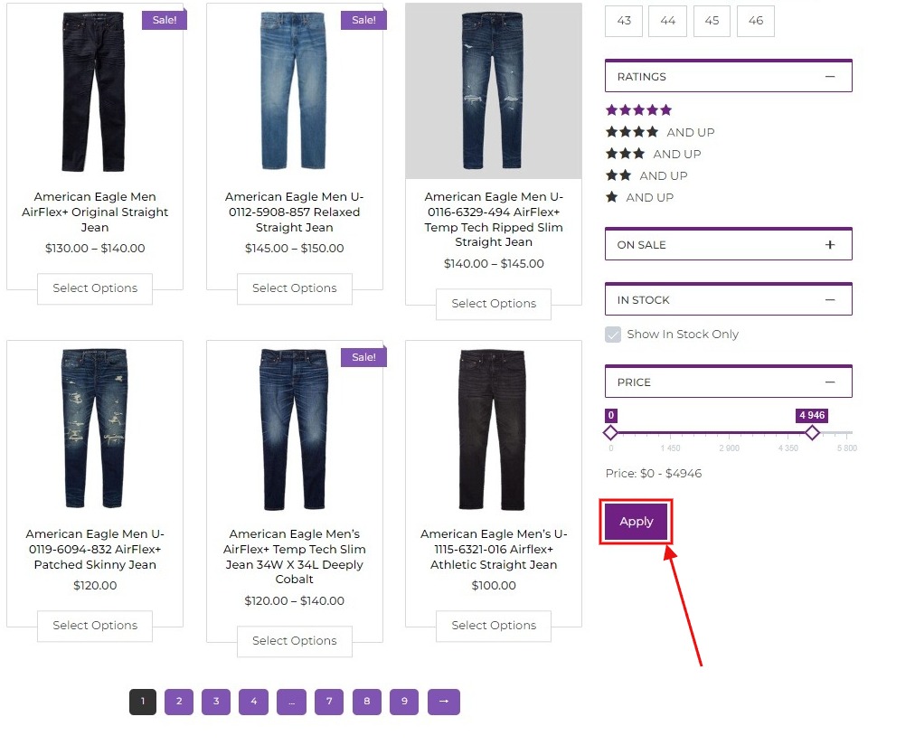
Submit Button Text
If you choose not to auto-submit the filters, users will need to manually click a button to apply their selections. In this section, you can customize the text on that button to make it clear for users, ensuring they understand its purpose.
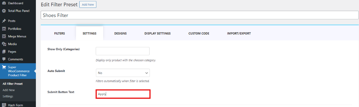
After you have added the submit button text it appears like this in the frontend.
Logic Operator
A Logic Operator is a setting that gives you control over how filters interact with each other when applied. When set to ‘AND,‘ all specified filters must align for a product to be included, ensuring a more precise match.
On the other hand, when set to ‘OR,’ a match with any one of the specified filters is adequate to display the product in the results. This feature provides flexibility in refining product searches based on your specific criteria, allowing for either a stricter or more inclusive approach.
Product Sorting
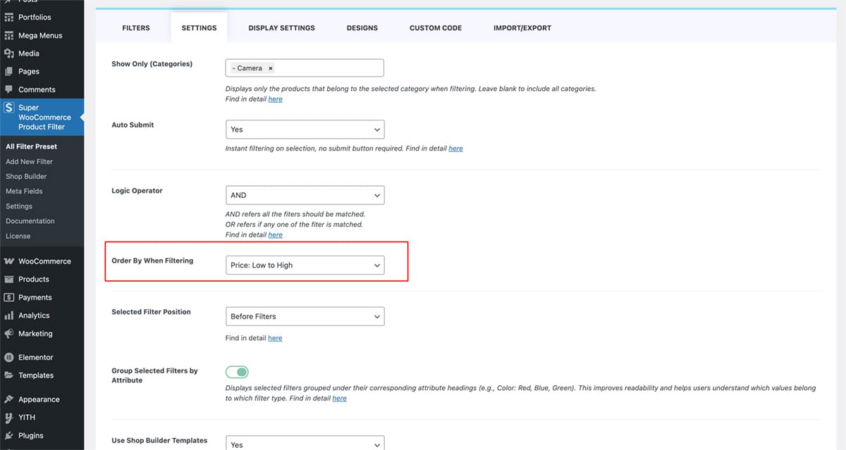
You can control the display order of your products by selecting from a range of predefined sorting options to match your shop’s layout and user preferences.
Under the Order By option, you can sort products based on:
- Default – Uses the store’s default sorting behavior
- Latest – Shows the most recently added products first
- Oldest – Displays older products first
- Price: Low to High – Sorts products from the lowest to the highest price
- Price: High to Low – Sorts products from the highest to the lowest price
- Title: A to Z – Alphabetically sorts by product name (ascending)
- Title: Z to A – Alphabetically sorts by product name (descending)
- Random – Displays products in a random order on each page load
This flexible sorting system ensures that your products are presented in a way that best suits your customers’ browsing habits and your business goals.
Selected Filter Position
You can choose to place the active filters:
- Before filters
- After filters
- Before products
Before Filters
When you select this option, any active filters will be displayed prominently at the very beginning, before any other filtering options.
After Filters
Opting for this setting places active filters immediately after the list or grid of available filter options.
Before Products
Selecting this option places the active filters prominently right before the list of products or items that match the selected criteria.
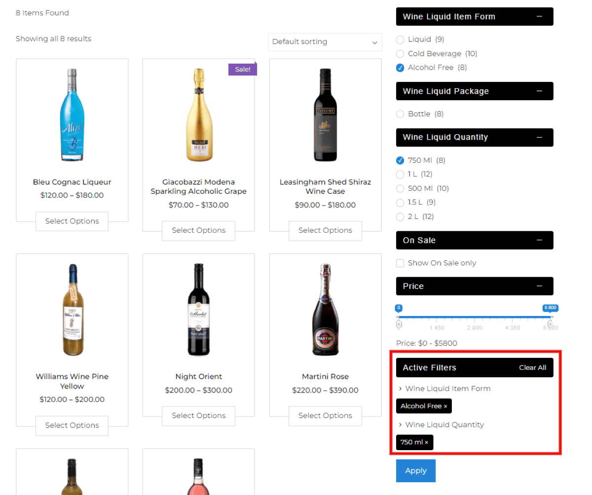
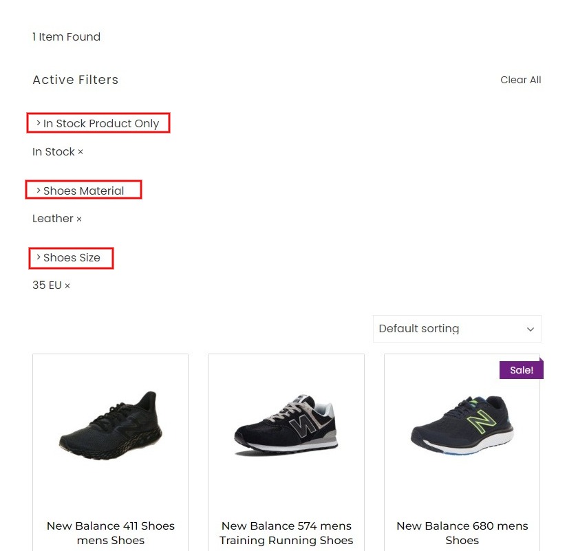
Group Selected Filters by Attribute
This option allows you to organize active filters by their attribute labels (e.g., Color, Size, Brand), creating a cleaner and more structured display.
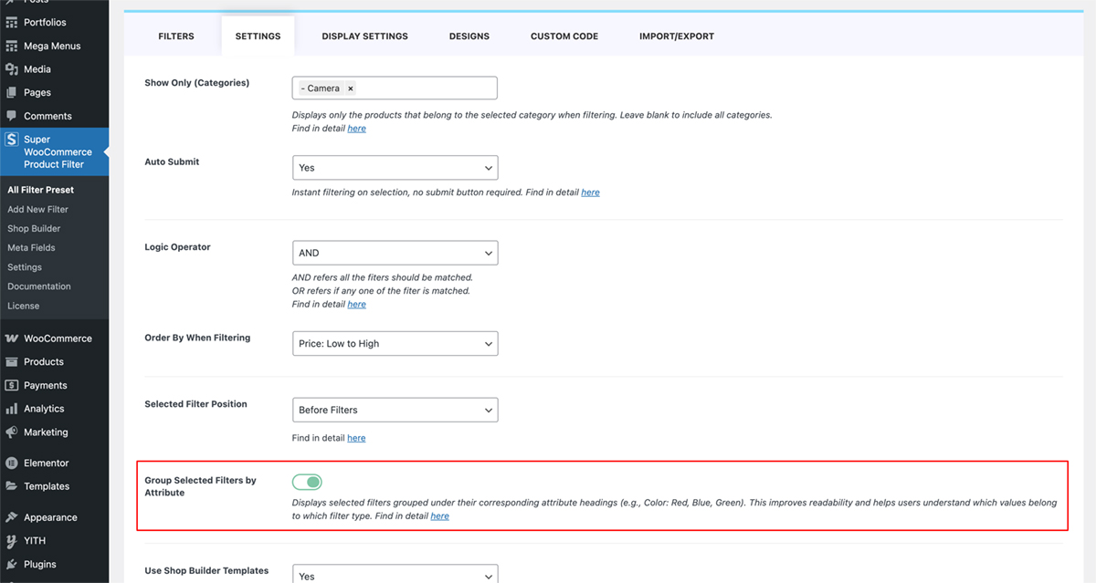
✅ When Enabled:
- Active filters are grouped under their respective labels as users make selections. Example:Color: Red, Blue Size: Medium, Large
- This improves clarity and makes it easier for users to understand which attributes are currently filtered.
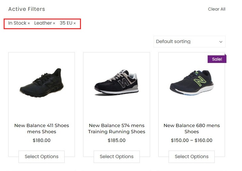
🚫 When Disabled:
- Attribute labels are hidden, and all selected filters appear in a single group without category headings.
This setting enhances the visual organization of filters, especially on sites with multiple filter types.
Shop Builder
The Shop Builder feature in Super WooCommerce Product Filter and Shop Builder allows you to create fully customized WooCommerce shop pages, with complete control over layout, product display, and styling.
Whether you’re customizing the main shop page or designing category-specific layouts, the Shop Builder gives you the tools to build a visually consistent and responsive storefront directly from your WordPress dashboard.
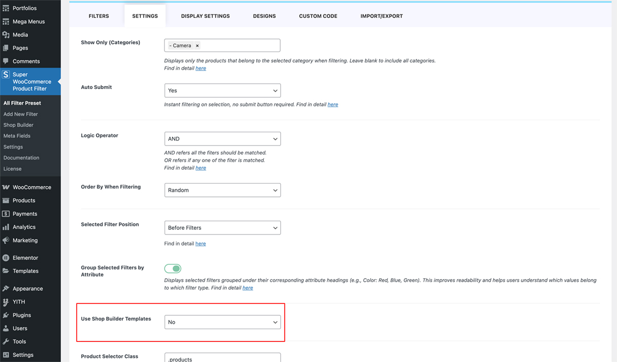
Using Shop Builder Templates
In the “Use Shop Builder Templates” setting, you can choose whether or not to apply a pre-built or saved Shop Builder template.
If you choose “Yes”:
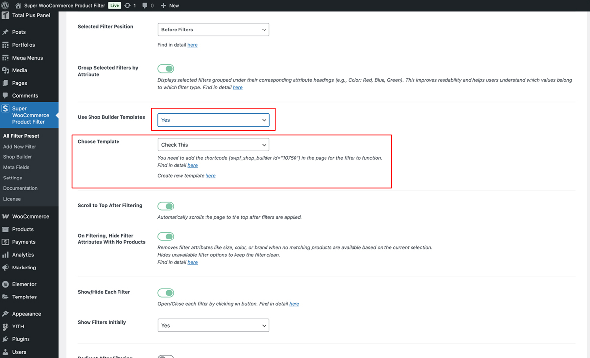
- Select a Shop Builder template you’ve created.
- Go to your filter page.
- Insert the Shop Builder shortcode and the Product Filter shortcode into columns on the page (see example screenshot).
- You can do this with the Gutenberg editor, Elementor, WPBakery, or any page builder of your choice
✅ This method handles layout, product output, and filtering automatically using the selected template.
If you choose “No”:
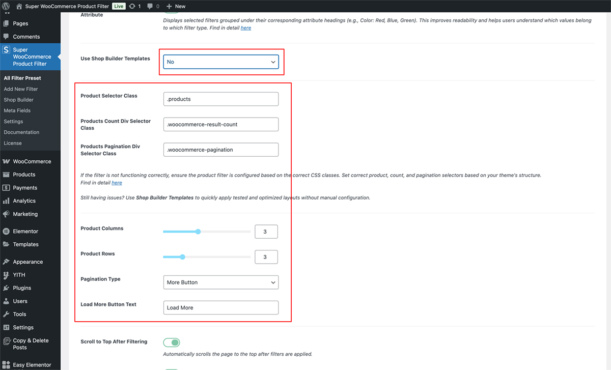
If you’re not using a Shop Builder template, you’ll need to configure the layout manually.
Required settings:
- Product Container Selector – class used to wrap product items (e.g., .products)
- Product Item Selector – class used for each product (e.g., .product)
- Product Count Selector – used to update product count dynamically
- Pagination Wrapper – selector for pagination container (e.g., .woocommerce-pagination)
- Product Columns and Rows – define how many items display per page
- Pagination Type – choose between paged, load more, or infinite scroll
⚠️ These selectors must match your theme’s structure for the filter and layout to work correctly.
Product Selectors
To ensure your product filter works seamlessly with your theme, you may need to configure selectors for the product container, product count, and pagination. These settings help the plugin correctly identify where to apply filtering and updates via AJAX.
All these fields can be conveniently adjusted within the plugin settings.
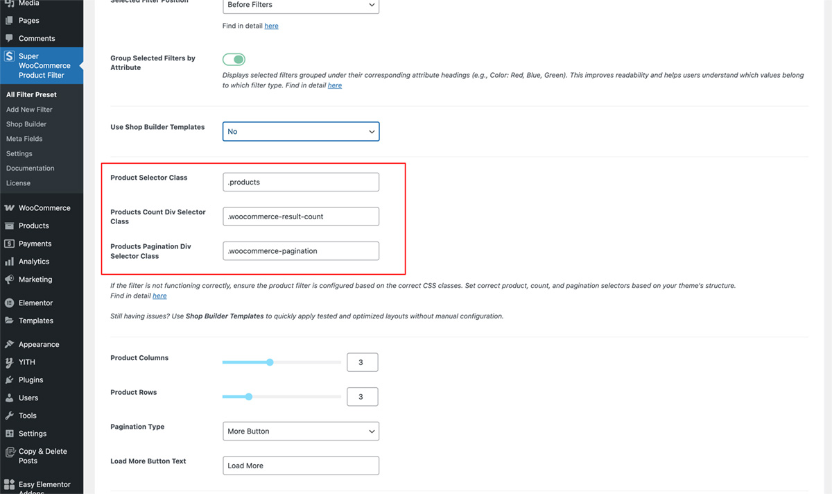
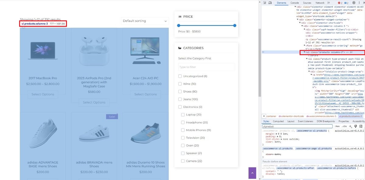
Product Selector Class
The Product Selector Class targets the container that holds the product list. This is typically the element that wraps each WooCommerce product on the shop or archive page.
- Default: ul.products
- Why it matters: Filtered results are loaded inside this container using AJAX.
- Note: Some themes use different class names. You may need to inspect your site’s HTML (using browser dev tools), locate the product wrapper element, and paste its class here.
🔍 Need help? Check our tutorial on how to find HTML classes using your browser’s inspect tool.
Product Count Div Selector
This selector targets the div that displays the number of products currently shown.
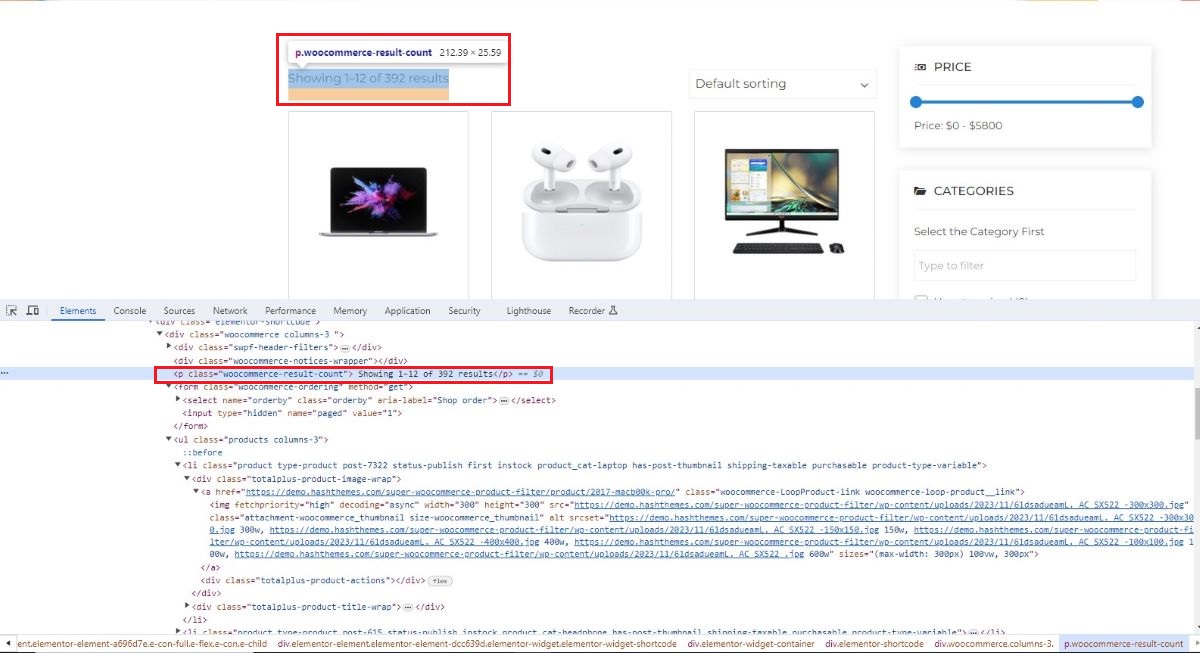
- Default: .woocommerce-result-count
- Purpose: Displays how many products are visible after filtering (e.g., “Showing 1-12 of 24 results”).
- Custom Themes: If your theme uses a different class for this element, inspect and update the selector accordingly.
🔍 Need help? Check our tutorial on how to find HTML classes using your browser’s inspect tool.
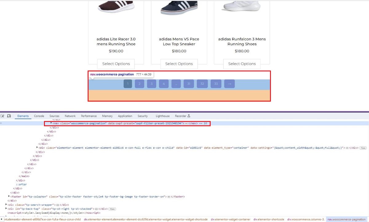
Products Pagination Div Selector
The Pagination Div Selector defines the container for pagination elements like page numbers.
- Default: .woocommerce-pagination
- Why it matters: Ensures proper AJAX reloading and interaction with the pagination system.
- Custom Themes: Themes may change the pagination structure. Inspect and replace the selector to match your theme’s markup.
🔍 Need help? Check our tutorial on how to find HTML classes using your browser’s inspect tool.
Summary
If the filter isn’t updating or behaving as expected:
- Inspect your theme’s HTML structure.
- Locate and copy the correct selectors for:
- Product Container
- Product Count
- Pagination Wrapper
Paste them into the appropriate fields in the plugin settings.
This ensures smooth AJAX filtering and compatibility with any theme layout.
Product Row and Columns
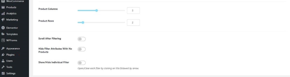
Specify the number of products you want to display in each row and column on your website page. This configuration allows you to enhance the visual appeal of your site by determining how many products are showcased in each row and column layout.
Note: When AJAX is applied during filtering, the product displays according to the rows and columns added here.
Pagination Type
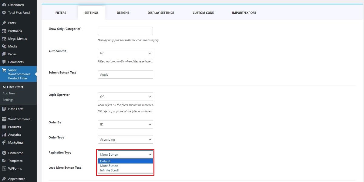
When navigating through pages, there are three pagination types available:
- Default
- Infinite Scroll
- More Button
Default
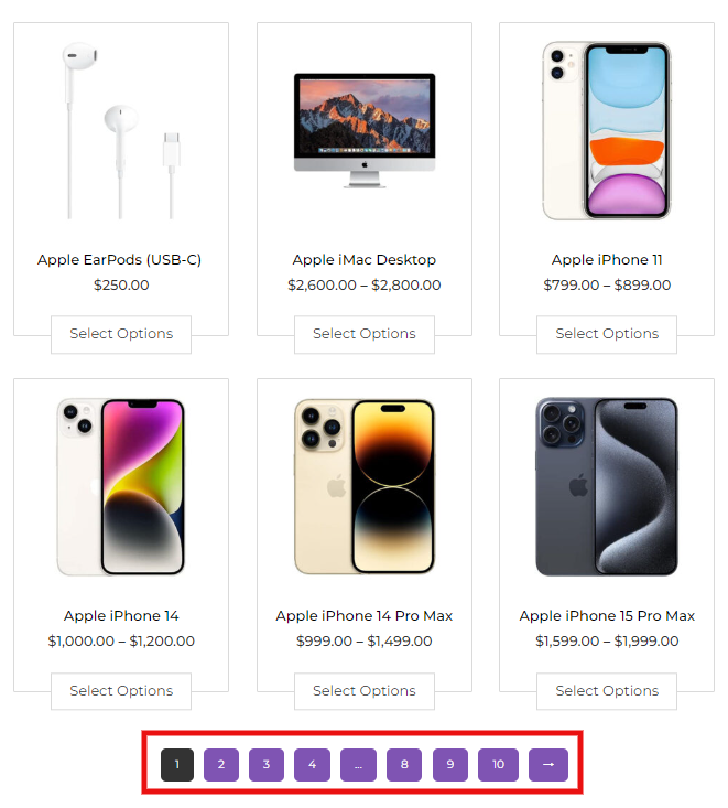
When set to the default option, the navigation will present page numbers, ensuring users are informed about their current page within the content. This allows users to easily track and understand their position as they navigate through the pages.
To explore the demo of this feature, please follow this link.
Infinite Scroll
Opting for the infinite scroll feature means that as users scroll downward, new content will automatically load without the need to click on page numbers or buttons. This creates a seamless browsing experience where content appears continuously as the user explores the page.
To explore the infinite scrolling feature, please click on the following demo link.
Load More Button
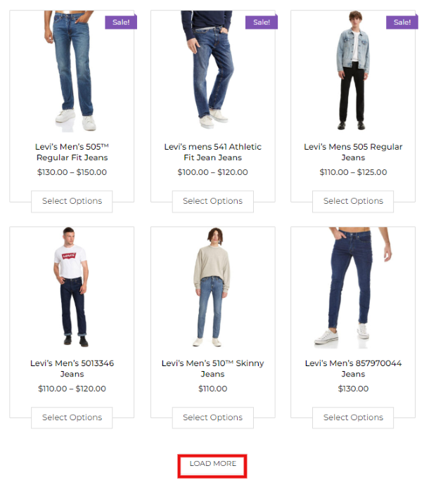
The Load More Button prompts users to manually click a designated button to load additional products or content onto the page. This provides users with control over when they want to view more items, ensuring a more deliberate browsing experience.
To explore the infinite more button feature, please click on the following demo link.
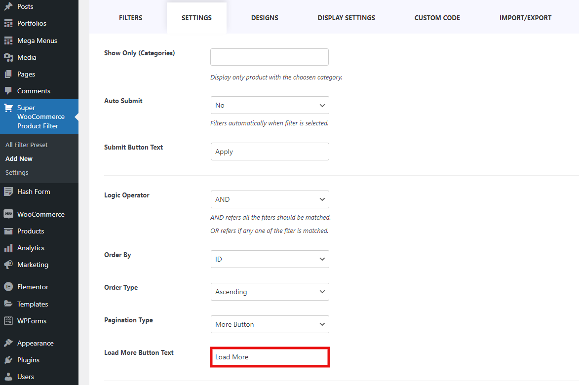
Load More Button Text
If you opt for the manual Load More button during scrolling, you have the option to customize the text that appears on this button.
Scroll to Top After Filtering
When you select a filter, the page seamlessly scrolls to the top, unveiling the products that precisely match your preferences. It’s a convenient and user-friendly experience, making it easier for visitors to quickly view and engage with the products that align with their specific criteria.
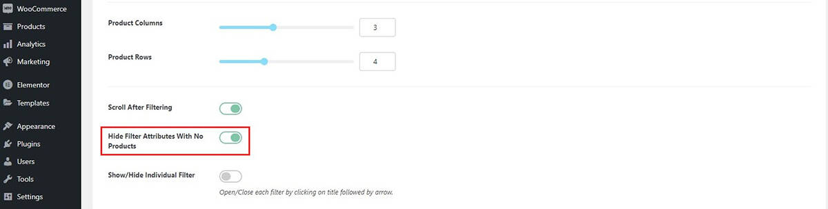
Hide Filter Attributes With No Product
When users shop online, they often rely on filters such as size, color, brand, or operating system to quickly narrow down products that match their specific preferences.
However, if filter attributes that don’t apply to the current selection remain visible, it can clutter the interface and confuse the user experience.
Why This Matters
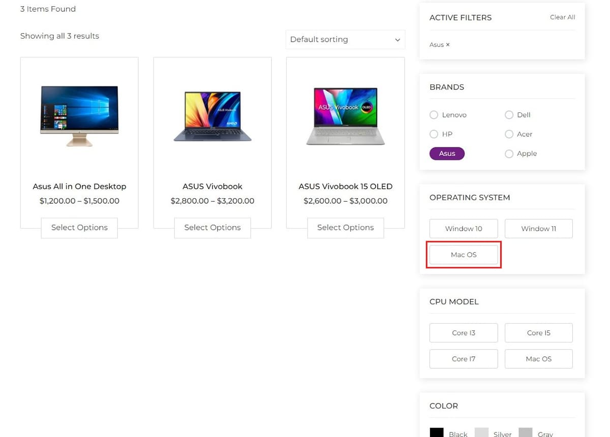
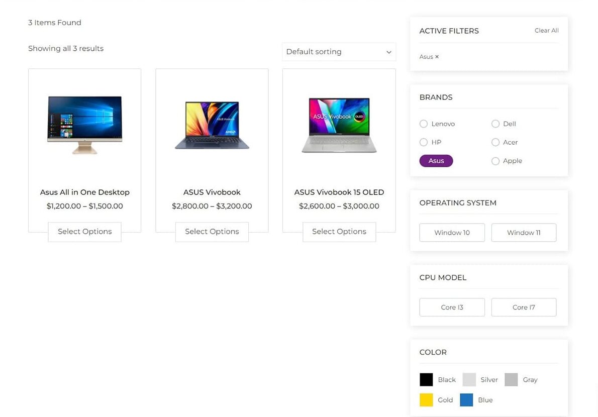
Take the example shown in the above screenshot
If the ASUS brand is selected, attributes like MAC OS under Operating System or irrelevant CPU Models still appear. Since ASUS laptops run on Windows, these terms are not applicable and may mislead users.
To avoid this, you can enable the “Hide Filter Attributes With No Product” setting. This ensures only the relevant attribute terms are shown based on the current filter selection.
✅ When Enabled:
- Filters dynamically update to only show attribute terms that are applicable to the filtered products.
- Unrelated or unavailable options are hidden automatically, reducing visual noise.
- The filter UI becomes cleaner and easier to understand, especially with many attributes in use.
Another Dynamic Example:
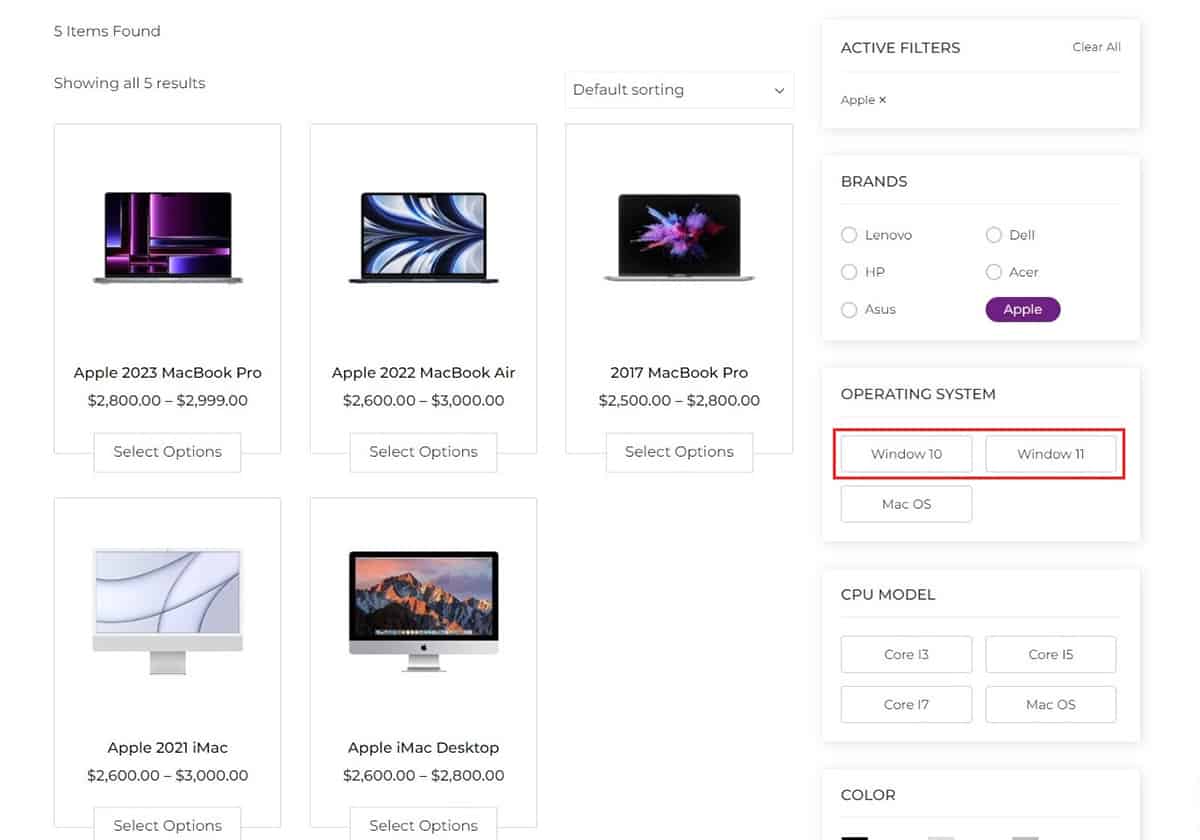
When selecting Apple as a brand:
- Irrelevant terms like Windows OS or Intel Core i3 may appear if the setting is disabled.
- When enabled, those unrelated attributes are hidden, showing only the terms that apply to Apple products.
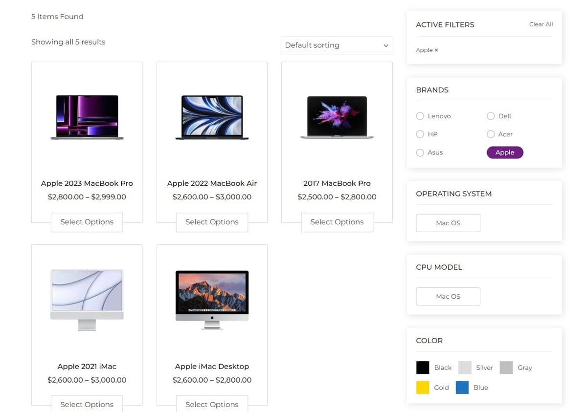
This real-time adjustment makes filtering faster and more intuitive for users, especially when dealing with large catalogs and complex product specifications.
While this example uses just a few attributes, in real-world scenarios with dozens of filters, this feature greatly improves clarity and usability by displaying only what’s relevant.
Click here to view a demo of this feature.
Show/Hide Each Filter
To streamline the process of selecting filters, you have the option to manage their visibility. While selecting filters, you can ensure a cleaner interface by hiding unnecessary filters. Simply click the “+” or “-” sign, and the filters will appear or disappear accordingly.
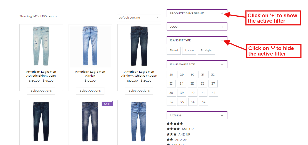
To view the demo of the show/hide individual filters, follow this link.
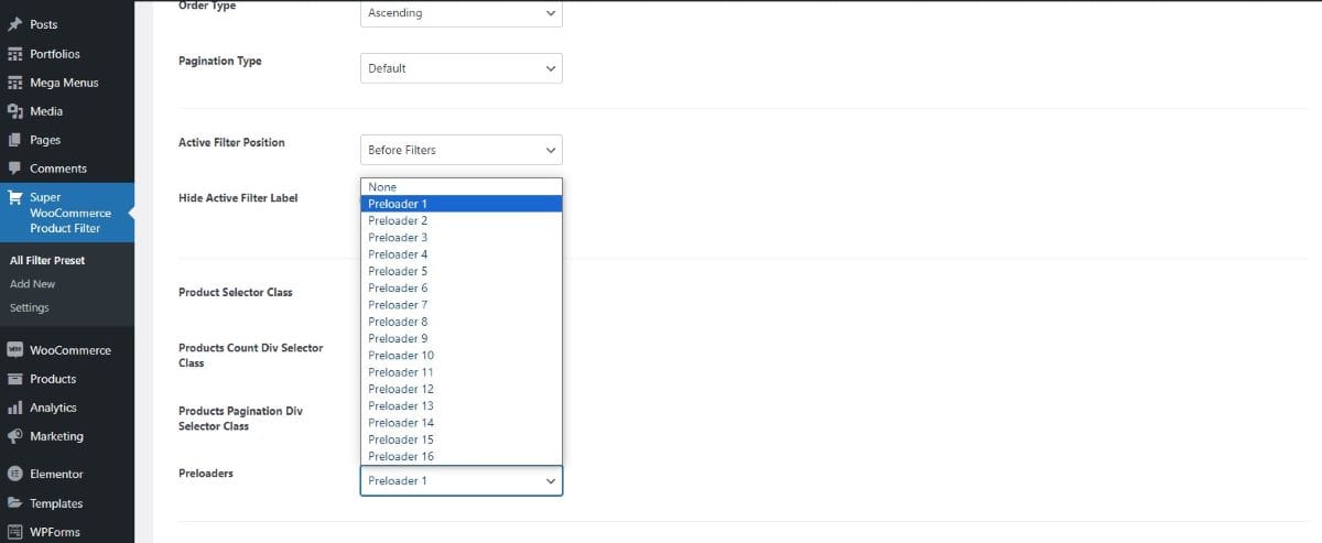
Preloaders
Preloaders are brief animations that display when product filters are being applied or when there’s a delay in loading content on the page. They indicate that the website is processing information and can be a visual cue for users to wait momentarily.
There are 16 different Preloader styles that you can choose from.
Display Settings
Within this section, you can choose from three different layouts to showcase the product filter. Use a shortcode to easily display and customize the filter according to your preferences. Additionally, explore offcanvas settings and decide whether you want to include the product filter in the header of archive pages for added flexibility.
Shortcode
Shortcodes in product filter display settings allow for easy integration and customization of product filters on specific pages or posts in an eCommerce site. By inserting these shortcodes, users can dynamically present and customize filter options without the need for extensive coding, providing a flexible and user-friendly solution.
If you are not sure how to add shortcodes to your website follow this link.
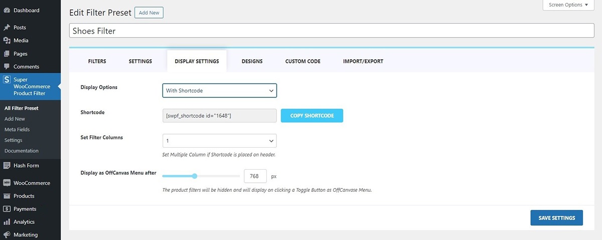
Set Filter Columns
After inserting the product filter shortcode into the header, you have the option to adjust the columns for better display. This feature enables you to enhance user experience by allowing them to view multiple filters simultaneously. By presenting several filters at once, users can conveniently select their desired product filters in one go, streamlining the shopping process.
Display as Off Canvas Menu After
After adding the product filter, you can choose to activate the Off Canvas Menu display. This is great for mobile users, as it adjusts to the narrower screen size. You can specify when the filter switches to this mode based on pixels. It makes filtering products easier on mobile devices by providing a menu that slides in from the side.
Off Canvas
The off-canvas menu enables users to incorporate a menu alongside the product filter, enhancing the website’s visual clarity and streamlining the product filtering process. Let’s explore what changes you can make in this section:
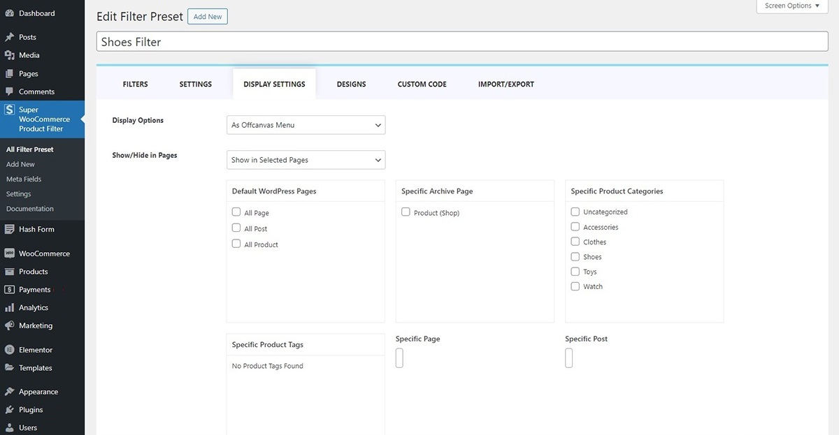
Show/Hide in Pages
Decide where you want the off-canvas menu to appear on your website. Choose to show or hide it on all pages, and specify its visibility on selected pages.
Header of Archive Pages
Archive page headers feature the product filter prominently at the top, setting the stage before displaying the products. Toggle the visibility of the product filter on archive pages with the option to set filter columns for a customized display.
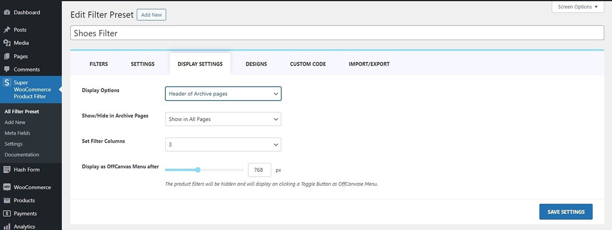
Set Filter Columns
After choosing to show your filter in the header of archive pages you can set filter columns as per your website requirement. This feature enables you to enhance user experience by allowing them to view multiple filters simultaneously. By presenting several filters at once, users can conveniently select their desired product criteria in one go, streamlining the shopping process.
Display as Off Canvas Menu After
After adding the product filter, you can choose to activate the Off Canvas Menu display. This is great for mobile users, as it adjusts to the narrower screen size. You can specify when the filter switches to this mode based on pixels. It makes filtering products easier on mobile devices by providing a menu that slides in from the side.
To view the demo of how the filter appears on the header of archive pages, follow this link.
Design
In the design section, you can customize various elements, including colors, text, spacing, and other personalized features for your filters. To make adjustments, follow these steps:
- Go to Dashboard > Super WooCommerce Product Filter
- Click on the Design Tab
Let’s see what changes you can make in the design section.
Filter Box
The Filter Box of a product filter refers to the visual container that holds the filter options or criteria on a webpage. Within this filter box, you can make several design customizations:
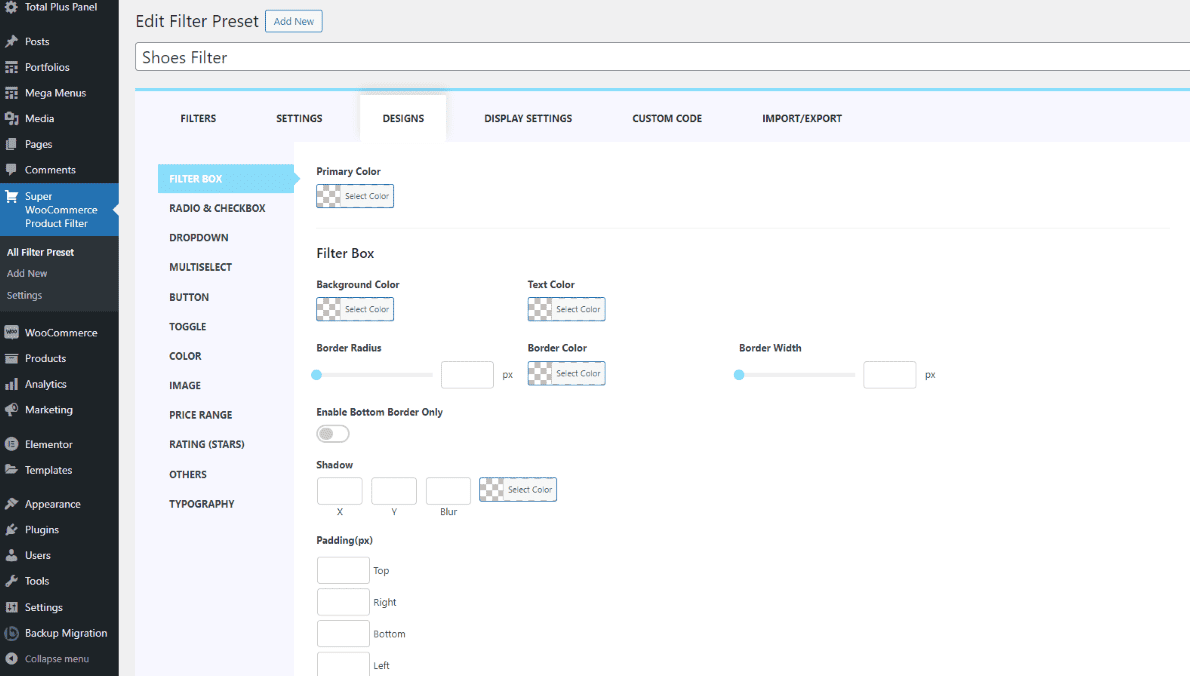
- Background Color: This is the color that fills the area behind the filter options. Choosing a background color can impact the overall look and feel of the filter box.
- Text Color: This refers to the color of the text used for the filter options. It allows you to adjust the visibility and contrast of the text against the background.
- Border Radius: The border radius determines how rounded the corners of the filter box are. A higher border radius value results in more rounded corners, while a lower value creates sharper corners.
- Border Color: This is the color of the border surrounding the filter box. Adjusting the border color can help define the boundaries of the filter box and create visual separation from the surrounding content.
- Box Shadow (X and Y): This feature allows you to add a shadow effect to the filter box. The “X” and “Y” parameters control the horizontal and vertical offset of the shadow, respectively. Adjusting these values provides control over the direction and positioning of the shadow effect.
- Padding (in pixels): Padding determines the space between the content inside the filter box and its borders. You can set padding values for the top, right, bottom, and left sides, ensuring proper spacing and alignment of the filter options within the box.
Off Canvas Menu
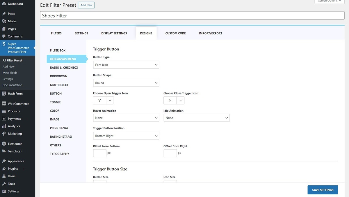
Trigger Button
A trigger button is a symbolic button that you can tap or click to make something happen on a website. It’s like a little button that sets things in motion when you interact with it. Here you can choose from various trigger icons:
- Font Icon
- Image Icon
- Hamburger Icon
1) Font Icon
In this section, you have the option to select from a diverse range of font icons for opening and closing. You can effortlessly choose from a wide array of trigger open and close icons that best suit your preferences.
2) Image Icon
This section enables you to customize the trigger open and close icon. You can easily upload images from your desktop, and the trigger button will be represented by the image you have selected.
3) Hamburger Icon
The hamburger icon is the three horizontal lines you often see in the corner of a website or app. When you click or tap on it, it opens up a menu with more options. There are 16 predefined hamburger icons that you can select from.
Button Shape
Here you can choose the filter button shapes as well. There are many button shapes that you can choose from. The shapes available to choose from:
- Square
- Round
- Rounded Square
- Animating Blob
Moreover, you can choose the open/close trigger icon.
Hover Animation
This section allows you to choose the animation that takes effect when you hover over the button just before clicking on it.
To set your hover animation:
- Go to Dashboard > Super Woocommerce Product Filter > Display Settings Tab.
- Within the Hover Animation section, you can pick from a range of animations including:
- Grow
- Shrink
- Pulse
- Pulse Grow
- Pulse Shrink
- Push
- Pop
- Bounce In
- Bounce Out
- Tilt
- Grow Tilt
- Float
- Sink
- Bob
- Hang
- Skew
- Skew Forward
- Skew Backward
- Buzz
- Buzz Out
- and numerous others
- Click on the Save Changes button.
Idle Animation
The menu button, even when not in use, features subtle animations. These animations are designed to captivate users’ interest as they browse and shop.
To adjust your idle button animation:
- Go to Dashboard > Super Woocommerce Product Filter > Display Settings Tab.
- In the Idle Animation section, you get to make a captivating choice for how the trigger button behaves when it’s not actively in use.
You have several options to choose from for the idle animation:- Bounce
- Flash
- Pulse
- Rubber Band
- Shake X
- Shake Y
- Swing
- Tada
- Wobble
- Jello
- Heartbeat
- Click on the Save Changes button.
Trigger Button Position
This section provides you with the option to select the off-canvas menu placement and gives you the freedom to adjust its position by adding a pixel offset. This allows you to place the menu exactly where you desire.
To configure the Menu position:
- Go to Dashboard > Super Woocommerce Product Filter > Display Settings Tab.
- In the Trigger Button Position section, choose the position that best suits your page settings from the following options:
- Top Left
- Top Middle
- Top Right
- Bottom Left
- Bottom Middle
- Bottom Right
- Middle Left
- or Middle Right
- Moreover, you can fine-tune the exact placement of the menu position by adjusting the offset (in pixels) from your chosen position.
- Click on the Save Changes button.
Trigger Button Size
To customize the menu button size
- Go to Dashboard> Super Woocommerce Product Filter > Display Settings Tab.
- In the Trigger Button Sizes section, you have the option to manually input the pixel values for the Button shape, as well as the Font/Image Size Icon.
- Click on the Save Changes button.
Trigger Button Colors
Trigger button colors can also be customized. To configure the settings:
- Go to Dashboard> Super Woocommerce Product Filter > Display Settings Tab.
- In the Trigger Button section, choose the color scheme for the Trigger Button Background, including the background color when hovered over, as well as the icon color and its hover color.
- Click on the Save Changes button.
Panel Settings
Here you can choose the panel position, width, animation, and other settings as well. Let’s see under what headings you can further make changes:
Panel Position
Decide where to place the panel with the panel position setting. Choose between showcasing it on the right or the left side of your website.
Panel Width
In the Panel Width section, you can modify the width of the content panel when it’s opened. This allows you to ensure the content appears well-proportioned and remains easily readable for all users visiting your website.
Panel Show/Hide Animation
You have the option to select the menu panel animation when it appears. There is a variety of Show/Hide animations available for the menu panel that you can customize according to your preference.
Panel Background Color
Select the background color for the panel to create a visual distinction between the panel background and the foreground of your website.
Scroll Bar
Customize the scroll bar behavior in the panel as you scroll. Opt to show or hide the scroll bar, and if displayed, you can specify the scroll bar width, drag rail, and drag bar colors according to your preferences.
Radio and Checkbox
The check box and radio are the options users click on to choose their desired filter. You can customize the radio and checkbox with the pre-designed skins that are available and make it more presentable. There are 10 styles available to choose from. To make the changes:
- Go to Dashboard > Super WooCommerce Product Filter
- Click on the Design Tab
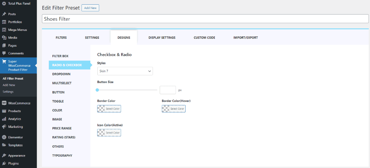
- In the Filter Box section, select the skin type and adjust the button size, along with other configuration features, to customize the appearance and functionality according to your preferences.
- Click on Update to save the changes that you have made.
Dropdown
The dropdown menu provides users with a list of options when they click on a button. You have the flexibility to style the menu with a fancy design or keep it in its default appearance. To choose the style for the dropdown:
- Go to Dashboard > Super WooCommerce Product Filter
- Click on the Design Tab
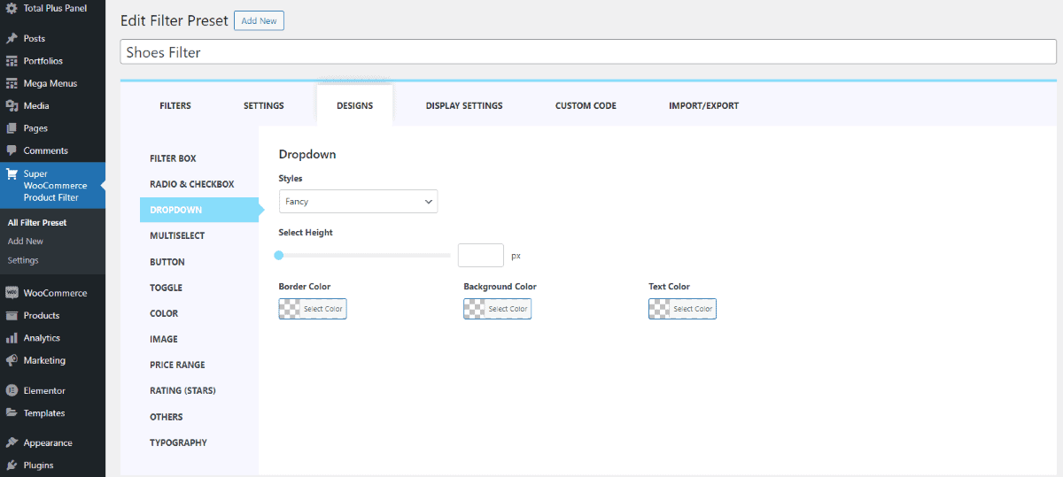
- In the Dropdown section, customize the dropdown menu by selecting a preferred style. Additionally, adjust the height, border, background, and text color to tailor the appearance according to your preferences.
- Click on Update to save the changes that you have made.
Multiselect
The multi-select feature in a product filter allows users to choose multiple options simultaneously, providing flexibility in refining search criteria. Users can select multiple items at once, streamlining the filtering process based on their specific preferences. To customize the multi select feature:
- Go to Dashboard > Super WooCommerce Product Filter
- Click on the Design Tab
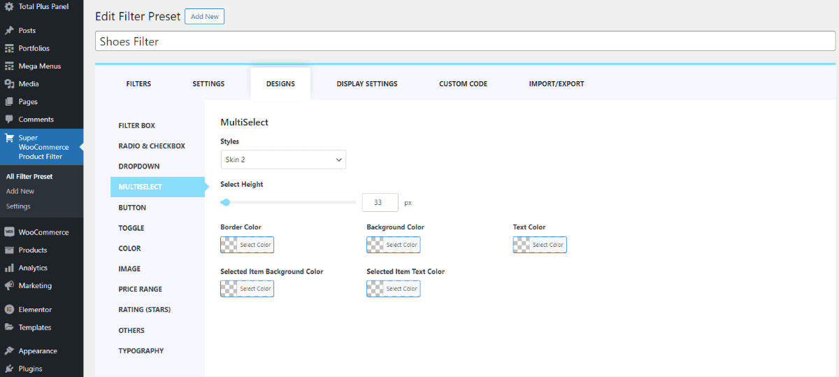
- In the Multi-Select section, choose a style for the multi-select feature. Further, configure settings such as border, background, text color, selected background, and selected item text color to customize its appearance to your liking.
- Click on Update to save the changes that you have made.
Button
To enhance the appearance of your product filter, you can select from 5 pre-built button styles. Choose the one that best suits your design preferences. To configure these styles:
- Go to Dashboard > Super WooCommerce Product Filter
- Click on the Design Tab
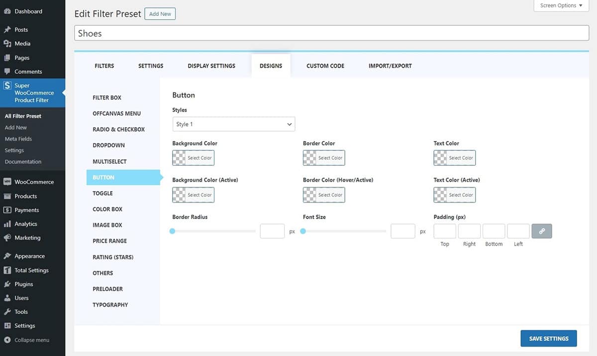
- In the Button section, select the style for the button that matches your preference. Moreover, you have the liberty to choose the Background color, Border color, Text color, Background color (active), Border Color (Hover/Active), and Text Color (Active).
- Click on Update to save the changes that you have made.
Toggle
The toggle button on the product filter can also be customized with the color customization feature as well. To configure:
- Go to Dashboard > Super WooCommerce Product Filter
- Click on the Design Tab
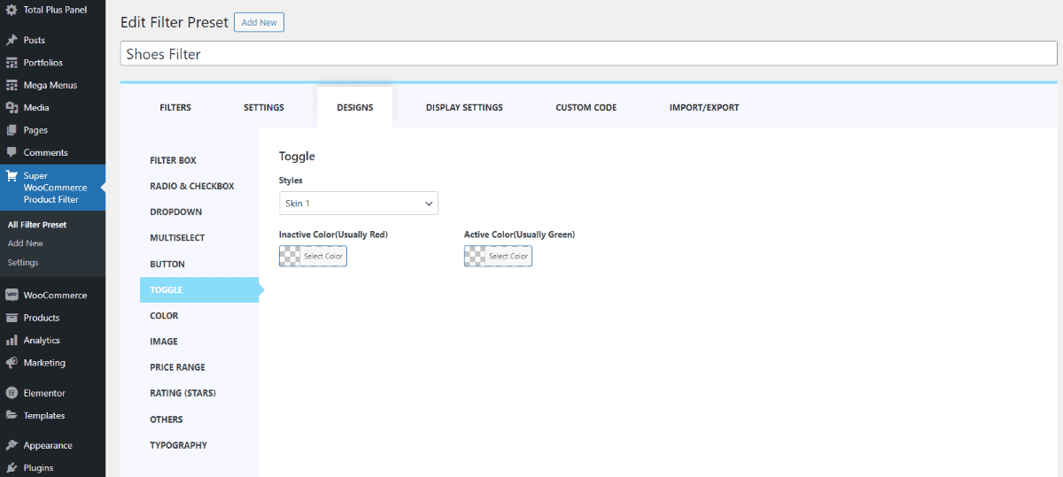
- In the Toggle section, select the skin type and choose the color.
- Click on Update to save the changes that you have made.
Color
In a product filter, you can customize the appearance of the color feature with options for Color and Color Box Size. Adjust these settings to control the size of the color boxes and their respective colors, tailoring the filter to your visual preferences. To make the changes:
- Go to Dashboard > Super WooCommerce Product Filter
- Click on the Design Tab
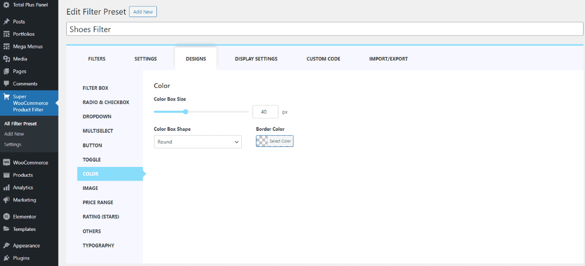
- In the Color section, select the color box size, shape, and border color as well.
- Click on Update to save the changes that you have made.
Image
In a product filter, you have control over the image presentation with settings like Image Box Size, Image Box Padding (in pixels), Image Box Shape, and Border Color.
- Go to Dashboard > Super WooCommerce Product Filter
- Click on the Design Tab
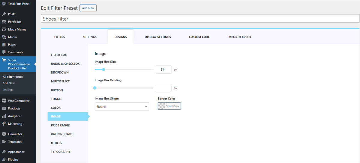
- In the Image section, select the image box size, shape, color, and more.
- Click on Update to save the changes that you have made.
Price Range
The price range slider bar comes with various styles for you to choose from. Opting for a visually appealing slider can enhance the online shopping experience for customers. To make changes:
- Go to Dashboard > Super WooCommerce Product Filter
- Click on the Design Tab
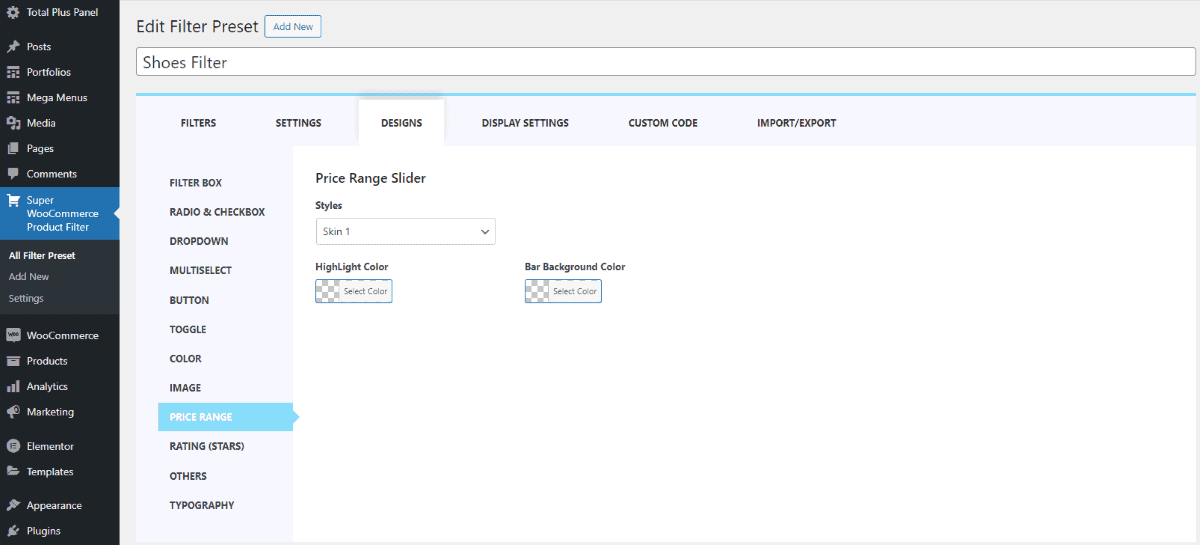
- Within the Price Range section, pick from a selection of 7 available skins according to your preference. Additionally, customize the Highlight and Bar Background Color to align with your desired aesthetics.
- Click on Update to save the changes that you have made.
Ratings (Star)
The star rating colors can also be customized. To make the changes follow the instructions:
- Go to Dashboard > Super WooCommerce Product Filter
- Click on the Design Tab
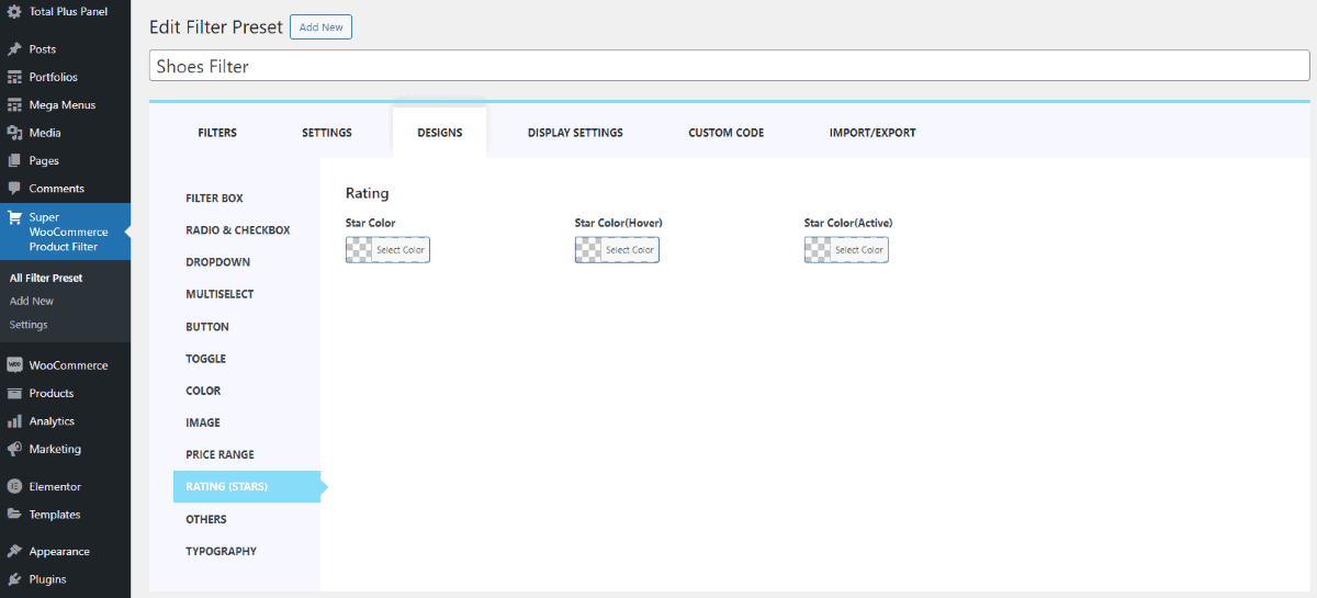
- In the Ratings section, select colors for regular stars, hover-over stars, and active (selected) stars to customize the appearance.
- Click on Update to save the changes that you have made.
Other
In this section, you can configure not only buttons and search fields but also customize their appearance. You have the flexibility to choose the color of the buttons and text, set the border radius, and define padding for a tailored design. To configure the settings:
- Go to Dashboard > Super WooCommerce Product Filter
- Click on the Design Tab
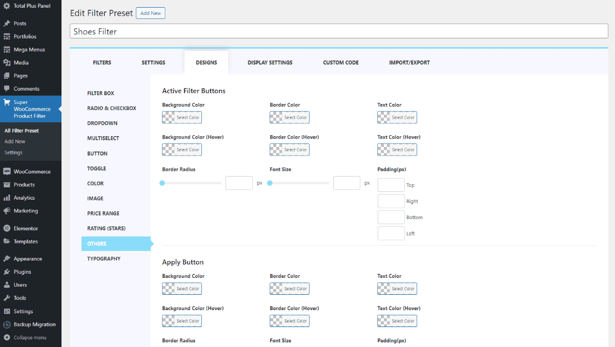
- In the Others section, you can customize various aspects for active filter buttons and apply buttons. Specify the background color, border color, and text color for both regular and hover states.
- Additionally, adjust the border radius, font size, and padding (in pixels) for each side (top, right, bottom, left) of the button types. This provides detailed control over the button’s appearance, allowing you to fine-tune its rounded corners, text size, and spacing.
- Click on Update to save the changes that you have made.
Preloaders
Choose to make further changes in the preloader section. Let’s see what changes you can make in this section. For this:
- Go to Dashboard > Super WooCommerce Product Filter
- Click on the Design Tab

In the Preloader section, you can choose the Preloader as well as the background color. Moreover, set the Z index value to make sure that the preloader is in the preferred location.
Typography
You can also choose the typography for the filter heading as well as the content. To make the changes follow these instructions:
- Go to Dashboard > Super WooCommerce Product Filter
- Click on the Design Tab
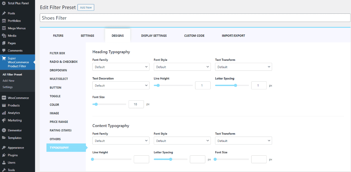
- In the Typography section, you can personalize the appearance of your content by selecting the font family, style, and decoration for both headings and content.
- Additionally, you have the option to enhance the text by choosing specific decorations and adjusting line height, letter spacing, and font size according to your preferences.
- Click on Update to save the changes that you have made.
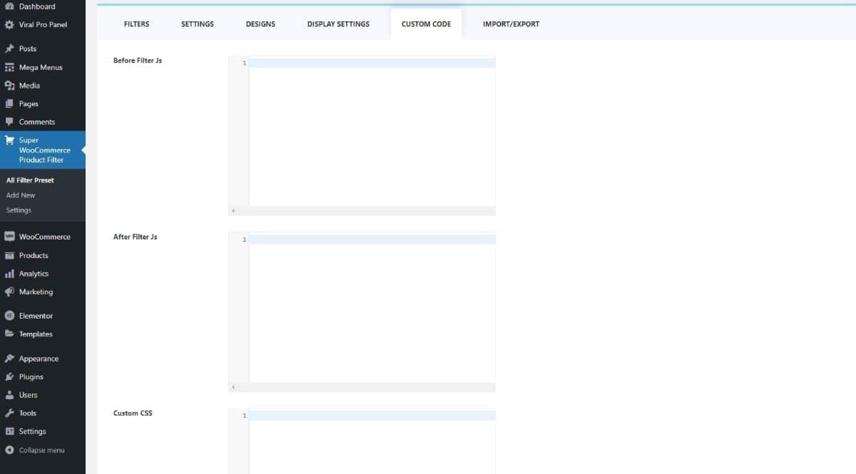
Custom Code
Custom code is used for styling web pages, including the design, layout, and appearance. Custom CSS refers to specific styles or design elements that have been customized or tailored for the product filter interface. This could include adjusting colors, fonts, spacing, or other visual aspects to ensure that the product filter aligns with the overall design and branding of the website.
Import/ Export
Importing and Exporting product filters as a way to move or copy these filters between systems or platforms. Just like you might import or export data, doing the same with product filters helps in sharing or backing up configurations.
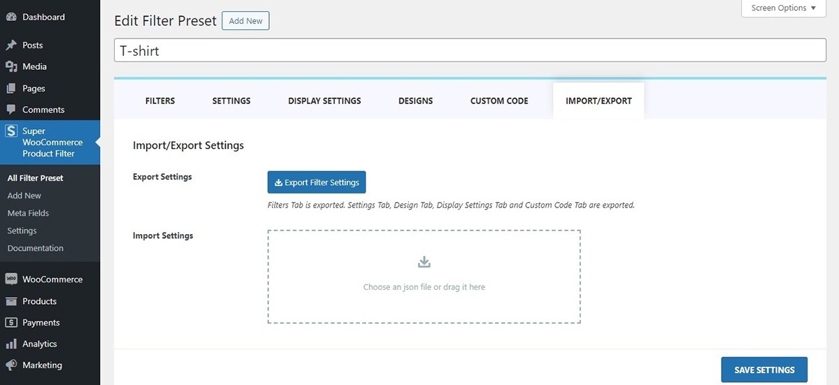
Eliminate the hassle of setting up the same product filter configurations multiple times. Easily export the settings from one product filter and smoothly import them into another.
General Settings
The general settings allow users to make additional changes in the Super WooCommerce Product filter plugin. Here you can choose to display the Google Fonts and load product variable images. Let’s see what changes these settings make in the plugin.
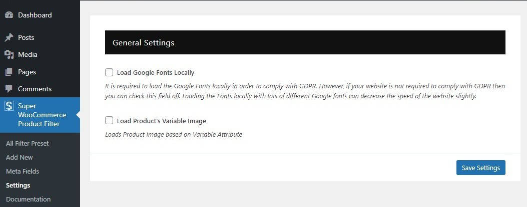
Load Google Fonts Locally
Loading Google Fonts directly onto your website can help you meet GDPR rules, but it might slow things down. If GDPR isn’t a concern, you can skip this and load the fonts from Google’s servers. Just remember, if you load many different fonts, it could still affect your site’s speed a little.
Load Product’s Variable Image
This setting allows users to choose a specific variation of a product like color or size, the displayed image will match that variation. This feature of the WooCommerce product filter settings ensures that the customers see the right image for the variation of the selected product.
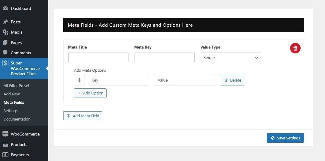
Meta Fields
Creating a meta box can be complex, and incorporating those fields into the filter preset adds a layer of difficulty. Meta fields are made for skilled coders, enabling them to add the custom created product filters effortlessly. These boxes provide a simple way to add important data fields to the filter section. Users can easily choose from various filter options, making their experience smoother and more streamlined.
If you’re not familiar with coding, don’t worry! Plugins can be a lifesaver for adding meta boxes. Let’s walk through how to create them and see how they show up in both the filter section and on product pages.
1. Using Advanced Custom Field (ACF) Plugin
For those unfamiliar with coding, there are numerous that plugins offer a convenient solution for creating meta boxes and adding multiple filters.
In this demonstration, we’ll showcase the use of the Advanced Custom Fields (ACF) plugin to create meta boxes for filters. Once, you have installed and activated the plugin follow these steps to add the meta field of the products:
- Go to Dashboard> ACF > Field Groups.
- Click on Add Field Group.
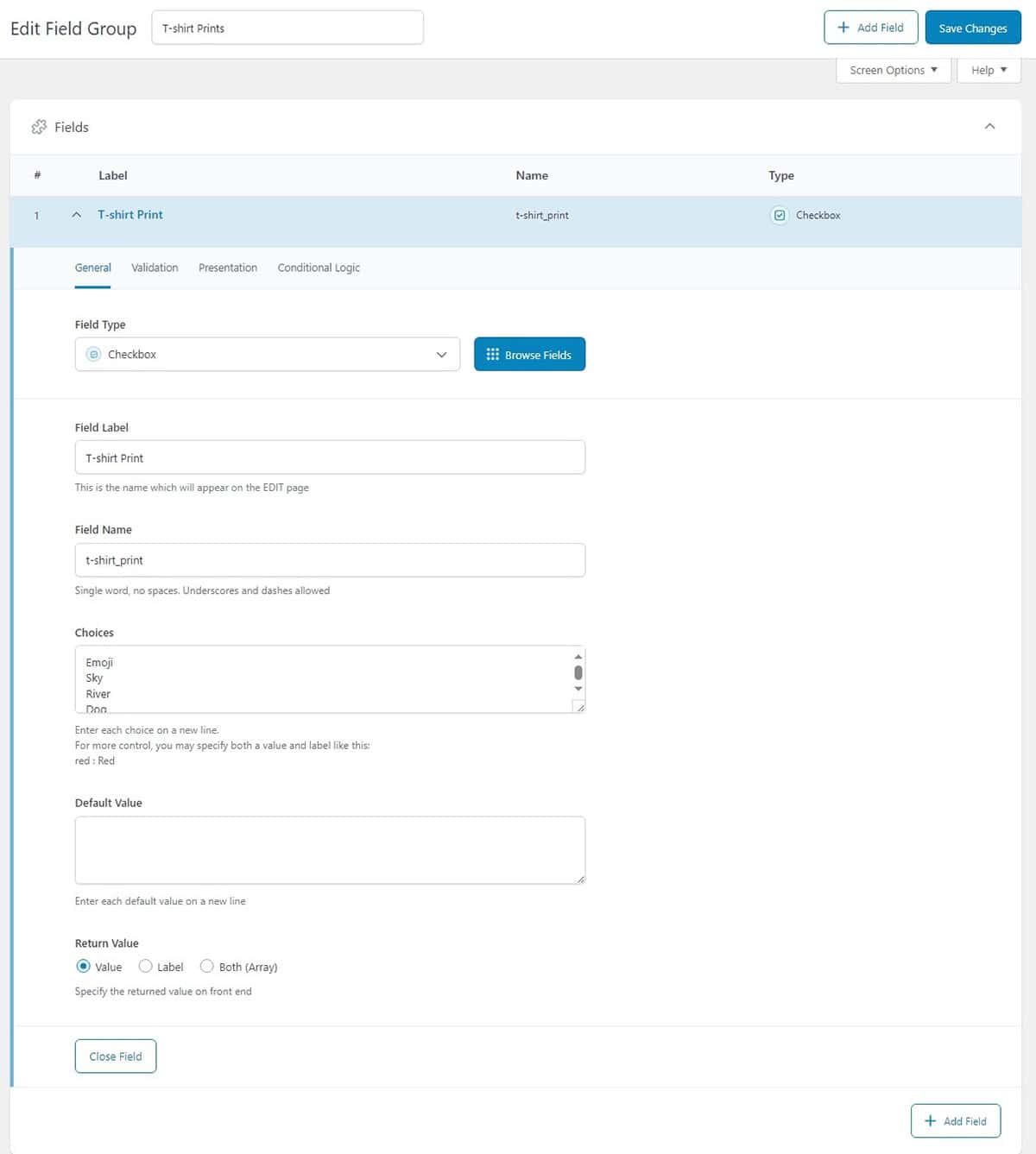
- Name your Meta box with a title that matches your meta field. Next, select the field type, and provide a field label. For this demonstration, we have chosen to provide choices for the t-shirt prints so we are adding the available t-shirt print to choose from.
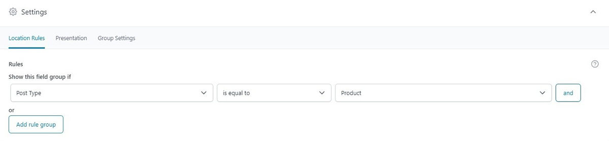
- To display the meta box on the desired product, you’ll also need to specify its location. In the settings, designate the location for the meta box. In this example, we’re placing our meta box within the product T-shirt’s post type.
- After you have added the necessary fields click on Save Changes.
To view the meta box that you have recently created:
- Go to Dashboard > Products
- Click on the product type where you have added your meta box.
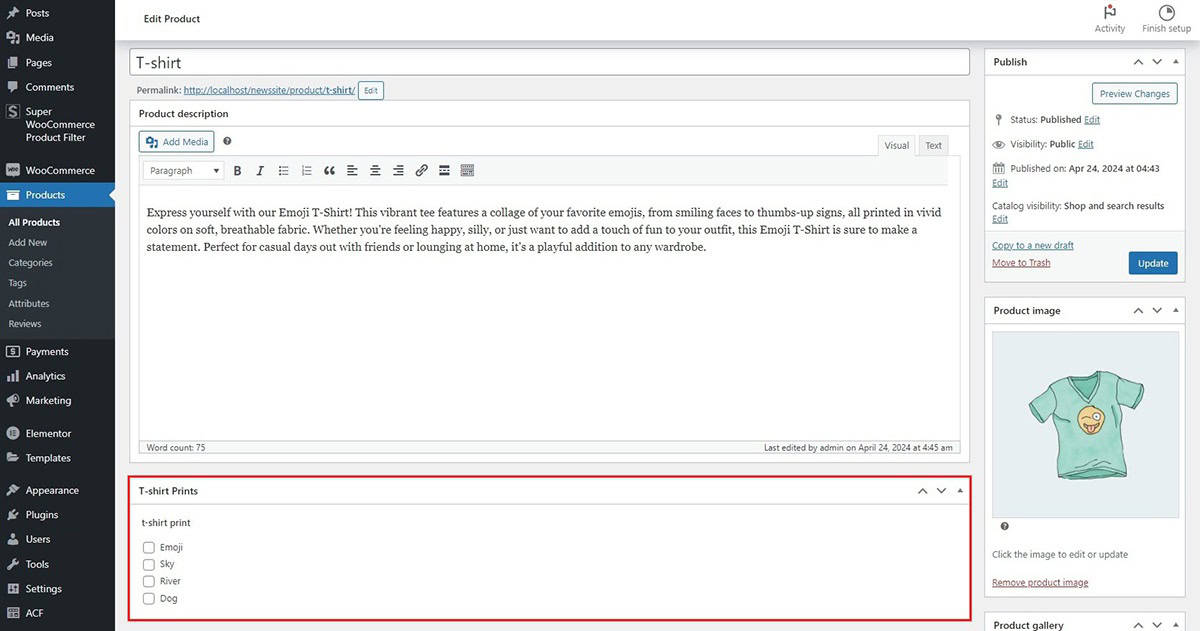
You’ll notice that the meta box you’ve just created has now appeared here.
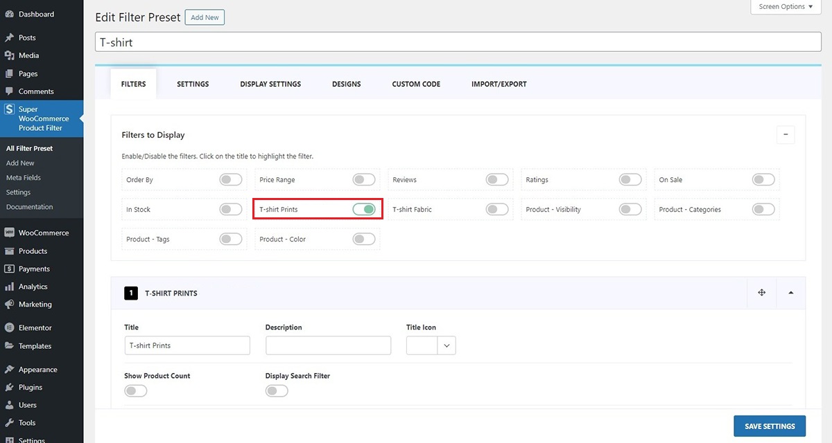
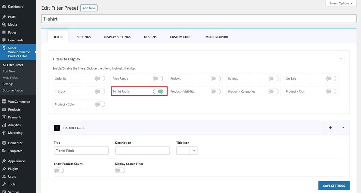
To check the created meta field in the filter presets, navigate to Super WooCommerce Product Filter and click on All Filter Presets. Here, you’ll find the filter configurations that you have recently added, allowing you to make any necessary adjustments.
2. Using Other Metabox Plugin or Custom Metabox Coding
This section is intended for those who are using plugins other than ACF (Advanced Custom Fields) or have custom-coded their metaboxes.
Adding custom meta fields requires a solid grasp of coding and a deep technical understanding. Once you have coded the meta fields for your desired products it is crucial to add the meta values to the meta field section. For demonstration, we have created the codes for the T-shirt fabric. Let’s see how to add the required fields in this section:
- Go to Dashboard> Super WooCommerce Product Filter > Meta Fields.
- In the Meta Title field, input the name you’ve assigned to your meta box. Then, enter the unique Meta Key added during coding.
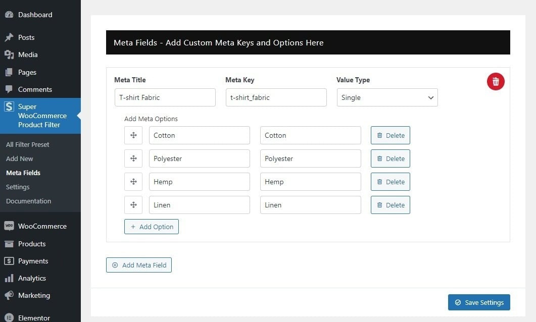
- Include the Meta options along with their key and value to display them as filter choices for your products.
- After you have added the necessary fields click on the Save Settings.
To adjust the meta field you’ve added, you can customize it further through the filter preset and make any required modifications.
Updating Plugin
Regularly updating your WordPress themes and plugins is crucial for maintaining the security and performance of your website. Developers often release updates to introduce new features, fix bugs, and enhance overall functionality. While the auto-update feature is available for free themes and plugins from the WordPress.org repository, managing updates for premium products requires a manual process. For users of Envato Marketplace, simplifying the update process is possible with the Envato Market plugin. By connecting your Envato account, this plugin enables seamless installation and updates for all premium WordPress themes and plugins purchased from Themeforest and CodeCanyon. This means you can conveniently auto-update Envato WordPress themes and plugins directly from your WordPress dashboard, ensuring your website stays secure and optimized effortlessly. To learn more on how to update follow this article: How to Auto Update Envato WordPress Themes and Plugins?