
Super Floating and Fly Menu Documentation
The application provides the choice to display the side panel menu in side/skew orientation, full-screen mode, and also includes a navigation indicator. This documentation will guide you through installing and implementing the Super Floating and Fly Menu plugin into your website. Incorporating this extension enhances users’ ability to seamlessly explore the menu options, significantly contributing to user-friendliness and enhancing the entire user journey.
If you have any questions or need any assistance related to the plugin, please feel free to ask us questions. Our support team will be happy to help you.
Here are the Demo and Purchase links in case you need it.
Super Floating and Fly Menu
The Super Floating and Fly Menu plugin offers two distinct menu configurations within a single plugin. This allows users to choose between the Floating Menu and the Fly Menu options, providing versatility and flexibility in menu design and functionality. The Floating Menu is a flexible tool that allows users to easily browse through menu items. It can serve as a stationary navigation feature, a social media menu, or a simplified one-page scroll, providing an improved user experience for website visitors. The Fly Menu is designed to enhance the navigation functionality of your website, providing an ultimate solution. With this, you can improve the user experience by implementing a dynamic and interactive menu that enhances navigation and makes it more engaging for visitors.
Installation
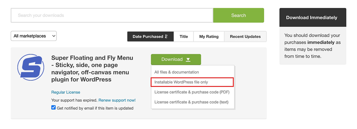
The installation of Super Floating and Fly Menu is a simple process of uploading a .zip file. Here is the Purchase/Download link if you need it.
Uploading VIA WordPress Dashboard
Installing Super Floating and Fly Menu follows the standard plugin installation procedure, which you may already be familiar with. If not, here are the steps to guide you:
- After making your purchase, go to Downloads by hovering over the right-top corner menu of the Codecanyon website.
- Download the Super Floating and Fly Menu .zip file and save it to your computer.
- Log in to your WordPress dashboard and navigate to Plugins > Add New.
- Select Upload Plugin and then choose the plugin file you saved earlier.
- Click Install Now.
- Wait for the plugin to be installed on your server, and once the installation is complete, click the Activate Plugin button.
- These steps should help you successfully install the Super Floating and Fly Menu on your website.
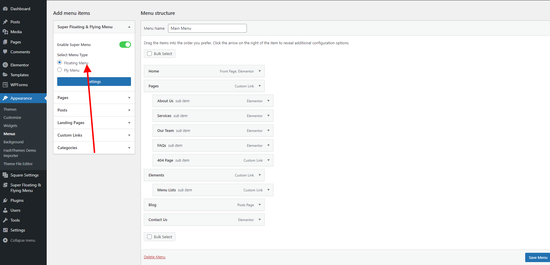
Creating a Menu
The plugin Super Floating and Fly Menu relies on the creation of a menu in order to function properly. Before you can configure the settings for the plugin, you will need to create a new menu. This can be done by following these steps:
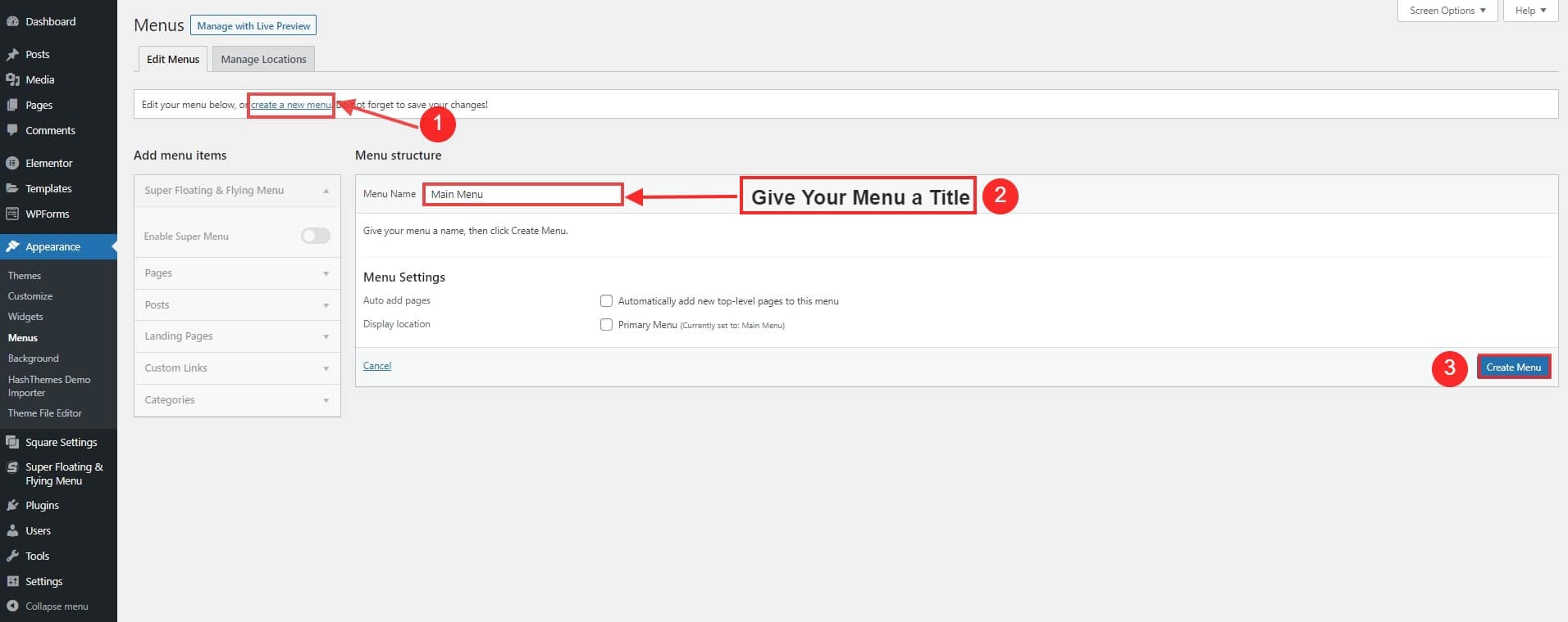
- Go to Appearance > Menu.
- Click on Create a New Menu.
- Give your menu a Title.
- Click on Create Menu to save the changes made.
You can add more menus and sub-menus according to your needs.
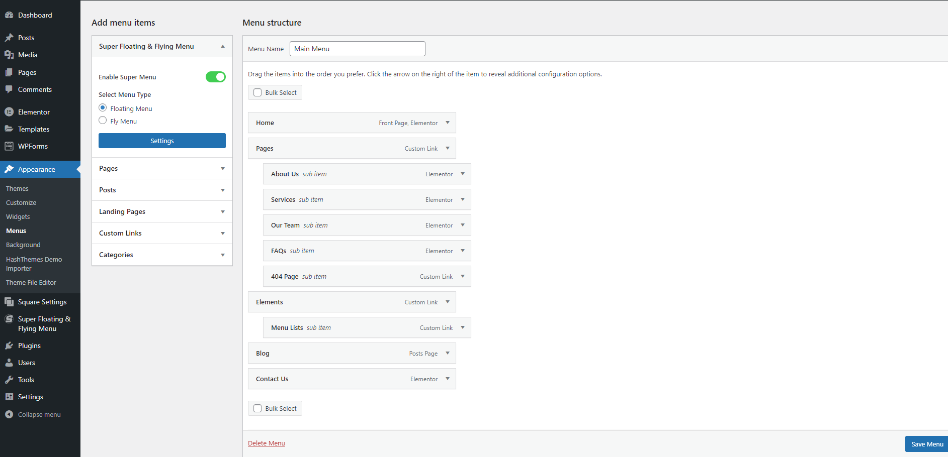
Enable the Super Menu after creating the menu in WordPress.
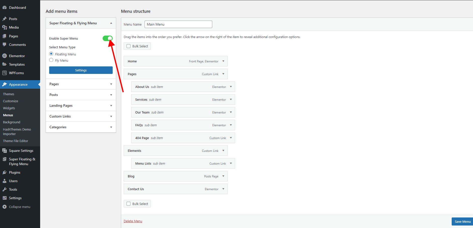
- In the Menus screen, select the menu you want to enable as the Super Menu.
- Look for the Enable Super Menu option, usually located at the top or bottom of the menu settings.
- Check the box or toggle the button to enable the Super Menu feature.
- Save your changes.
Once you have enabled the Super Menu, the menu you created will have enhanced functionality and features beyond a regular menu on your WordPress site.
Floating Menu
As mentioned before, this plugin has two configurations: Here you will learn how to adjust the settings of the Floating Menu. The Super Floating Menu is a versatile tool that enables users to effortlessly navigate through the menu items. It can function as a fixed navigation tool, social menu, or even a streamlined one-page scroll, offering enhanced ease of use for visitors.
Setting Up Floating Menu
To modify your website using the Floating Menu, the initial step is to choose the menu type. This guide will demonstrate how to designate the Floating menu as your preferred menu setting. To set up the Super Floating Menu:
- Log in to your WordPress dashboard.
- Go to Appearance > Menu.
- You will be directed to the Add menu item page, which serves as the repository for all the Super Menu items you have created.
- Select Floating Menu from the option.
Layout Settings Tab
This feature provides a selection of pre-designed templates that you can utilize to customize the appearance of your menu according to your preferences. To configure the settings:
- Go to Dashboard > Appearance > Menu.
- Click on the Settings Button located on the left panel under the Add Menu icon.
- Typically, the Layout Tab will show up on its own. If it doesn’t, just give it a click to access the settings.
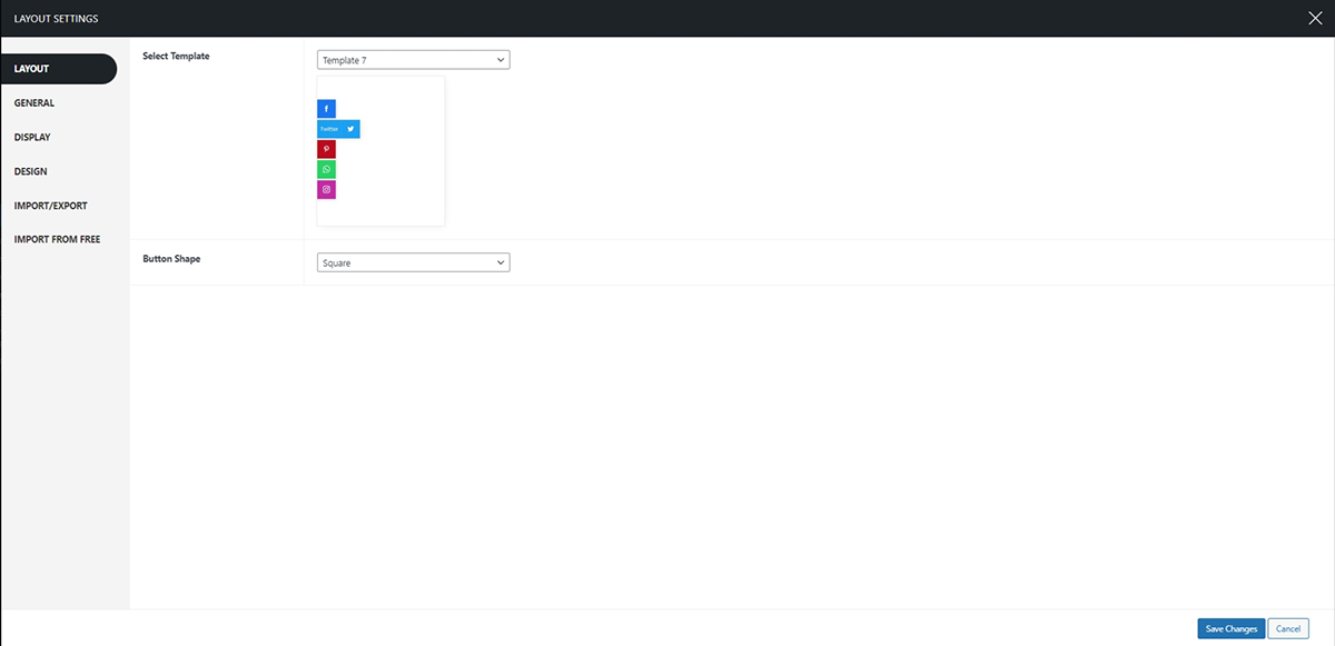
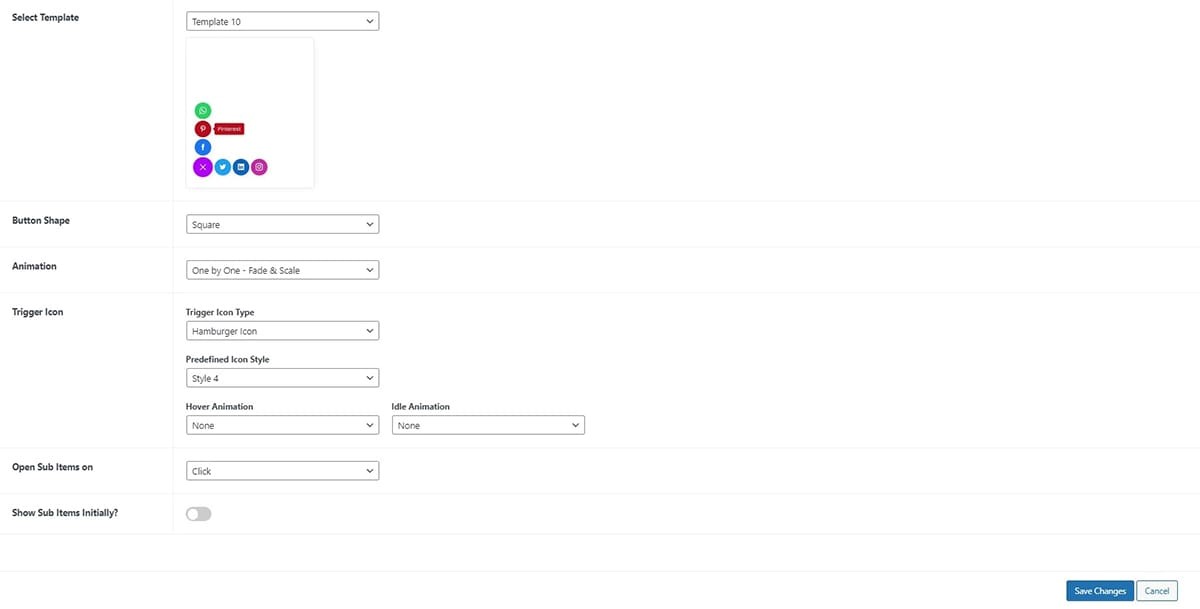
Select Template
Here you can select from various templates. There are 10 pre-built templates with additional 4 templates:
- Template 1
- Template 2
- Template 3
- Template 4
- Template 5
- Template 6
- Template 7
- Template 8
- Template 9
- Template 10
- Quarter Circular
- Half Circular
- Full Circular
- and Navigation Indicators.
Templates 1 through 7 offer standard options, which allow you to select from the various button shapes, including :
- Square
- Round
- and Rounded Square
Whereas the templates from 8 to 10 have different settings that come with the extra configurations for the trigger button.
Quarter Circular
A quarter circular trigger button is a rounded button shaped like a quarter of a circle. It’s used in interfaces to prompt actions when tapped, making interaction with an app or website more intuitive and engaging.
Half Circular
A half-circular trigger button is a button that appears as half of a circle. It is frequently utilized in user interfaces to initiate actions when users interact with it, offering a visually appealing and intuitive way to engage with a website or application.
Full Circular
A complete circular trigger button is a fully circular button used in interfaces to prompt actions when clicked, providing a user-friendly way to interact with an app or website.
Navigation Indicator
A navigation indicator is a visual element used in user interfaces to provide guidance and show users their current location within a system. It helps users understand where they are with other sections or pages, making navigation more intuitive and user-friendly. You can find the detailed article on how to create a Navigation Indicator Menu.
The other settings are under this tab are
Button Shapes
These templates allow you to choose from the button shapes. The available button shapes are:
- Square
- Round
- Triangle
- Rounded Square
- Oval
- Star
- Rhombus
- Pentagon
- Hexagon
- Rabbet
- and Animating Blob
Animation
When the trigger button is clicked, it employs a distinct animation for both opening and closing, enhancing the user experience during the interaction with the trigger button. The available animations are :
- One by One
- Fade
- Scale
- Fade and Scale
- Fade and Rotate
- Rotate and Scale
- Fade, Rotate, and Scale
- All at Once
- Fade
- Scale
- Fade and Scale
- Fade and Rotate
- Rotate and Scale
- Fade, Rotate, and Scale
If you want to see the demo of the animations mentioned please click here.
Trigger Icon
A trigger icon is a symbolic button that you can tap or click to make something happen on a website. It’s like a little button that sets things in motion when you interact with it. Here you can choose from various trigger icons:
- Font Icon
- Image Icon
- Hamburger Icon
1) Font Icon
In this section, you have the option to select from a diverse range of font icons for opening and closing. You can effortlessly choose from a wide array of trigger open and close icons that best suit your preferences.
2) Image Icon
This section enables you to customize the trigger open and close icon. You can easily upload images from your desktop, and the trigger button will be represented by the image you have selected.
3) Hamburger Icon
The hamburger icon is the three horizontal lines you often see in the corner of a website or app. When you click or tap on it, it opens up a menu with more options. There are 16 predefined hamburger icons that you can select from.
Hover Animation
This section allows you to choose the animation that takes effect when you hover over the button just before clicking on it. To set your hover animation:
- Go to Dashboard > Appearance > Menu.
- Find the Settings Button on the left-hand panel, just below the Add Menu icon. Click on the Settings Button to continue.
- The settings page will appear. Click on the Layout tab.
- Within the Hover Animation section, you can pick from a range of animations including:
- Grow
- Shrink
- Pulse
- Pulse Grow
- Pulse Shrink
- Push
- Pop
- Bounce In
- Bounce Out
- Tilt
- Grow Tilt
- Float
- Sink
- Bob
- Hang
- Skew
- Skew Forward
- Skew Backward
- Buzz
- Buzz Out
- and numerous others
- Click on the Save Changes button.
Idle Animation
The menu button, even when not in use, features subtle animations. These animations are designed to captivate users’ interest as they browse and shop. To adjust your idle button animation:
- Go to Dashboard > Appearance > Menu.
- Find the Settings Button on the left-hand panel, just below the Add Menu icon. Click on the Settings Button to continue.
- The settings page will appear. Click on the Layout tab.
- In the Idle Animation section, you get to make a captivating choice for how the trigger button behaves when it’s not actively in use.
- You have several options to choose from for the idle animation:
- Bounce
- Flash
- Pulse
- Rubber Band
- Shake X
- Shake Y
- Swing
- Tada
- Wobble
- Jello
- Heartbeat
- Click on the Save Changes button.
Open Sub Items
The submenu items can be opened in two ways. You have the option to either click or hover to open the submenu items.
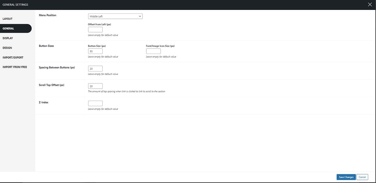
General Settings Tab
The general settings allow you to choose the menu position, and tweak the button sizes, and spaces between the buttons. Top configure this setting:
- Go to Dashboard > Appearance > Menu.
- Click on the Settings Button to continue.
- The settings page will appear. Click on the General tab.
Here you can make changes under the following sections:
Menu Position
This section provides you with the option to select the menu placement and gives you the freedom to adjust its position by adding a pixel offset. This allows you to place the menu exactly where you desire. To configure the Menu position:
- Go to Dashboard > Appearance > Menu.
- Click on the Settings Button to continue.
- The settings page will appear. Click on the General tab.
- Choose the position that best suits your page settings from the following options:
- Top Left
- Top Right
- Bottom Left
- Bottom Middle
- Bottom Right
- Middle Left
- or Middle Right
- Moreover, you can fine-tune the exact placement of the menu position by adjusting the offset (in pixels) from your chosen position.
- Click on the Save Changes button.
Orientation
When selecting the position of the floating menu button, you can also choose its orientation. Please note that these orientations are only available for the Top Left, Top Right, Bottom Left, and Bottom Right positions.
 Choose from the orientation either horizontal or vertical to enhance the menu appearance more.
Button Sizes
To customize the menu button size
- Go to Dashboard > Appearance > Menu.
- Click on the Settings Button to continue.
- The settings page will appear. Click on the General tab.
- In the Button Sizes section, you have the option to manually input the pixel values for the Button shape, as well as the Font/Image Size Icon.
- Click on the Save Changes button.
Spacing Between Button
You have the option to include a small gap between your buttons. You can specify the pixel offset that you prefer for the buttons. This means you can determine the exact amount of space between each button by specifying the number of pixels you want to offset them.
- Go to Dashboard > Appearance > Menu.
- Click on the Settings Button to continue.
- The settings page will appear. Click on the General tab.
- In the Button Spacing section, you can enter the pixel values manually to create space between the buttons according to your preference.
- Click on the Save Changes button.
Z-Index
The z-index determines the stacking order of elements on a webpage, indicating which elements should be positioned in front of or behind others. You have the ability to set the index value based on your website’s layout requirements.
- Go to Dashboard > Appearance > Menu.
- Click on the Settings Button to continue.
- The settings page will appear. Click on the General tab.
- Set the Z-index value.
- Click on the Save Changes button.
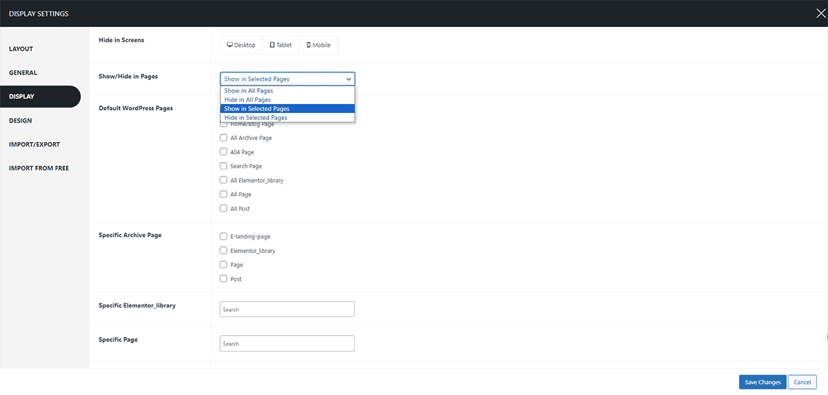
Display Settings Tab
This section particularly allows you to display the Floating Menu selectively on different pages. To configure the settings:
- Go to Dashboard > Appearance > Menu.
- Click on the Settings Button to continue.
- The settings page will appear. Click on the Display tab.
- Under the Hide in Screens section, select the options where you wish the Super Floating Menu to be hidden, whether it’s Desktop, Tablet, or Mobile.
- Moreover, you can show/hide the Floating Menu in the selective pages.
- Click on the Save Changes button.
Design Settings Tab
With this setting, you can customize the button color, font family, and style, as well as configure options for the Tooltip, Trigger Button, and Circle Background.
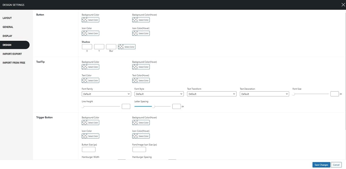
Button
Within this section, you have the option to modify the background color, background color on hover, icon color, icon color on hover, and button shadow. To configure the settings:
- Go to Dashboard > Appearance > Menu.
- Click on the Settings Button to continue.
- The settings page will appear. Click on the Design tab.
- Under the Button Section, select the color of your linking for each section.
- Click on the Save Changes button.
ToolTip
When you hover over the menu items, a text appears providing information. This is the tooltip that helps users understand where they are navigating. Here, you can adjust the background color and text as well. To configure this setting:
- Go to Dashboard > Appearance > Menu.
- Click on the Settings Button to continue.
- The settings page will appear. Click on the Design tab.
- In the Tool Tip section, choose the color scheme for the Tooltip Background, including the background color when hovered over, as well as the icon color and its hover color.
- Here you can choose the Font family/ style, Text transformation, text decoration, and tweak the font size as well.
- Click on the Save Changes button.
Trigger Button
Trigger button colors can also be customized. To configure the settings:
- Go to Dashboard > Appearance > Menu.
- Click on the Settings Button to continue.
- The settings page will appear. Click on the Design tab.
- In the Trigger Button section, choose the color scheme for the Trigger Button Background, including the background color when hovered over, as well as the icon color and its hover color.
- Click on the Save Changes button.
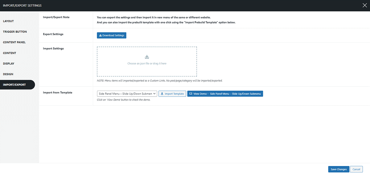
Import/Export Settings Tab
Now, you can simply import the templates that you like and make your e-commerce site like you want to.
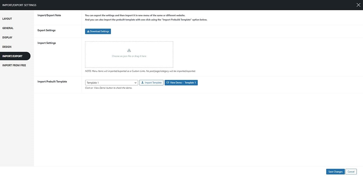
Eliminate the need to repeatedly configure identical settings for multiple menus. Simply export the settings from one menu and seamlessly import them into another menu. Moreover, there are Prebuilt Templates that you can import. If you want to view the demo templates click here. Effortlessly download the menu settings with a single click. Then, effortlessly import them into any other menus on the same website or different websites. Streamline your workflow and save valuable time with the Super Floating & Flying Menu.
Import from Free Tab
The import settings functionality in the Super Floating Menu allows for a seamless transition from the free Simple Floating Menu plugin to the premium version. By using this feature, you can swiftly import your previous menu settings, saving time and effort in configuring the menu from scratch. To configure the settings:
- Go to Dashboard > Appearance > Menu.
- Click on the Settings Button to continue.
- The settings page will appear. Click on the Import From Free tab.
- Choose the file you want to import from your device.
- Click on the Save Changes button.
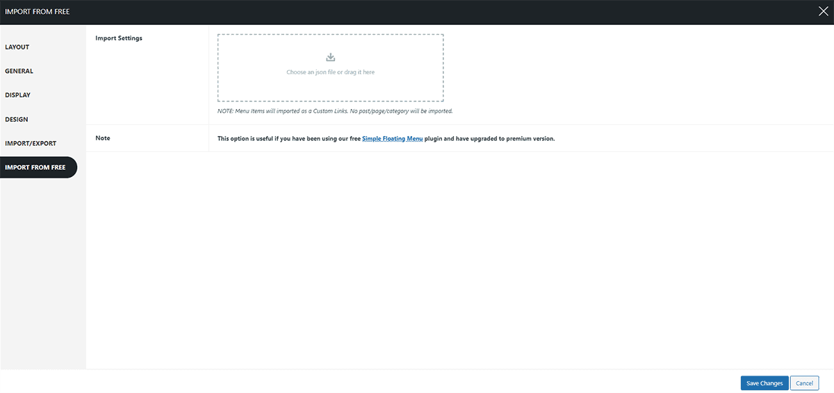
Note: The imported menu items will be registered as Custom Links, and no post/page/category will be imported. For more detail on how to import/ export templates from Simple Floating Menu to Super Flying Menu follow this article: Migrating from Simple Floating Menu to Super Floating Menu
Configure Each Menu Item – Floating Menu
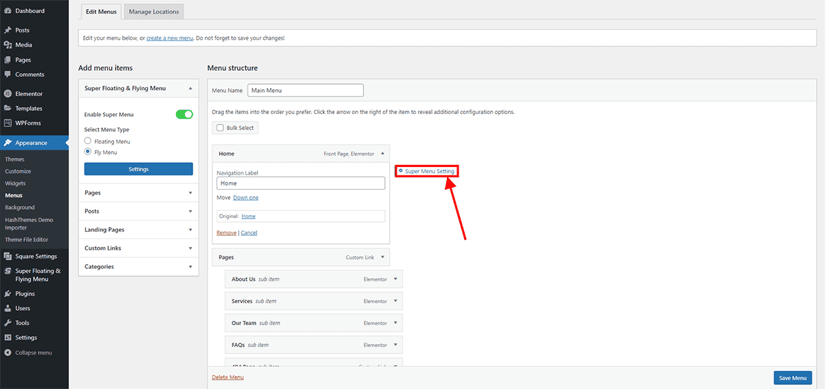
Moreover, you can opt to personalize the configurations for each individual menu item within the Super Floating Menu. For this:
- Go to Dashboard > Appearance > Menu.
- Go to the Menu Structure.
- Choose the item you wish to configure.
To make changes to each menu item:
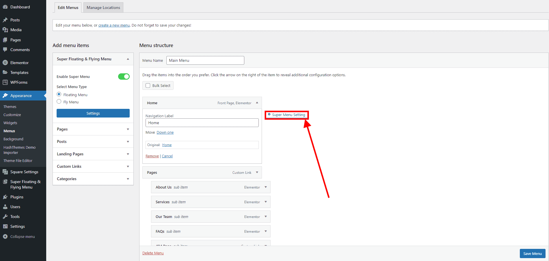
- To make specific changes, just select the menu item you want to modify, like clicking on the ‘Home’ item, for example. This action will allow you to access and adjust the settings for that particular item.
- Once you’ve opened the item, hover your cursor over the menu to find the Super Menu Setting button. It’s located right next to the menu box you want to configure. Remember that the button will vanish if you move your cursor away from the menu.
- Click on this setting to make any additional adjustments.
Note: Please be aware that the Super Menu Settings do not apply to the sub-menus. Let’s see what changes you can make for each menu:
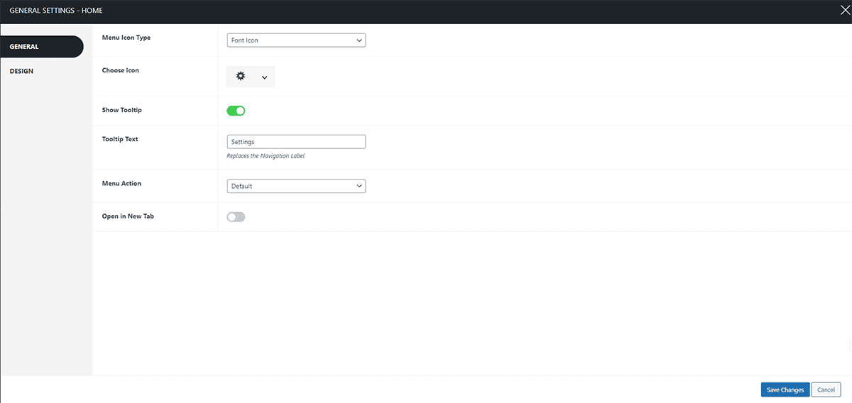
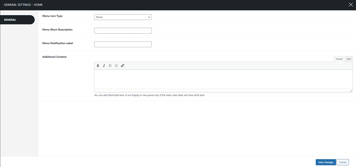
General
The general setting allows you to choose the menu icon type and make further changes in the tooltip button as well.
Menu Icon
The menu icon allows you to choose the menu icon type. The available options are:
- Font Icon
- Image Icon
i) Font Icon
Within the font icon section, you have the option to select from a wide range of icons for the menu items you are customizing. The icons are further divided into sections for your convenience:
- Font Icon
- Close Icon
- Font Awesome
- Essential Icon
- Material Icon
- Elegant Icon
When picking an icon for the menu, think about how it will represent the menu item. If you’re having trouble finding the right icon, utilize the search field. Input a keyword related to the menu item, like “Home,” and it will display the home icon specifically for you to select.
ii) Image Icon
The image icon feature enables you to upload your own custom icon from your desktop. Just choose the menu icon for the item you’re working on and upload it in this section. After the upload, the menu will display the icon you uploaded.
Tool Tip Text
When you hover over the menu items, a text appears providing information. This is the tooltip that helps users understand where they are navigating. This section allows you to choose the tooltip text.
Design
The design settings enable you to select the background color for the text and tooltip, as well as the color of the icon.
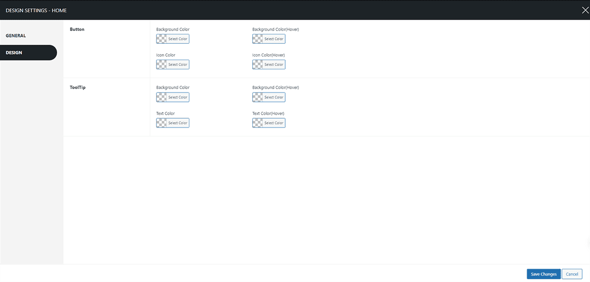
Button
Within this section, you have the option to modify the background color, background color on hover, icon color, and icon color on hover for the button. Choose the appropriate color for each as per your preference.
ToolTip
Within this section, you have the option to modify the background color, background color on hover, icon color, and icon color on hover for the ToolTip. Choose the appropriate color for each as per your preference. Note: When using the super menu setting, please be aware that any changes you make will exclusively impact the main menu. Sub-menus, however, will remain unaffected by these adjustments.
Fly Menu
The other configuration of this plugin is the Fly Menu. A fly menu is a stylish menu type popular among the latest trends. It displays your web content in the sidebar with beautiful animation effects to provide the best navigation experience. This provides you with the choice to display the side panel menu in side/skew orientation, full-screen mode, and also includes a navigation indicator.
Setting Up Super Fly Menu
To set up the Super Fly Menu:
- Log in to your WordPress dashboard.
- Navigate to the Super Floating and Fly Menu option in the left-hand menu of your dashboard.
- Go to Appearance > Menu.
- You’ll arrive at the Add menu item page, where all your created Super Menu items are stored.
- Select Fly Menu from the option.
You can configure the Super Fly Menu settings hereafter. The settings you can make changes:
- Layout
- Trigger Button
- Content Panel
- Content
- Display
- Design
- Import/ Export
Layout Settings
This setting allows you to choose the menu type and make necessary changes. To configure the settings:
- Go to Dashboard > Appearance > Menu.
- Find the Settings Button on the left-hand panel, just below the Add Menu icon. Click on the Settings Button to continue.
- Typically, the Layout Tab will show up on its own. If it doesn’t, just give it a click to access the settings.
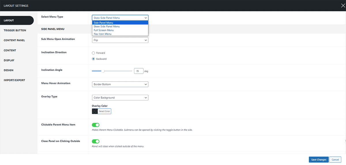
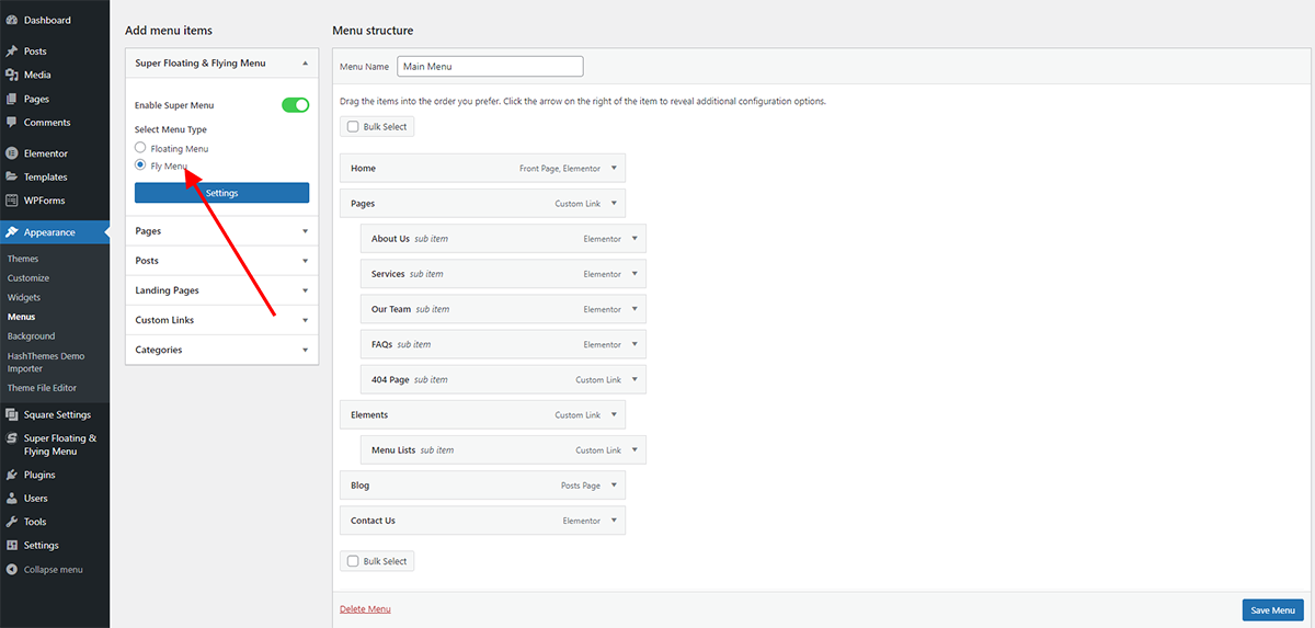
Select the Menu Type
Here you can choose to select the type of menu that suits your preference. The options available are as:
- Side Panel Menu
- Skew Side Panel Menu
- Full-Screen Menu
- Nav Icon Menu
1/2) Side Panel Menu/Skew Side Panel Menu
The Skew/ Side Panel Menu appears on the side of the screen. The trigger button allows the menu panel to appear, which can be positioned at different spots as needed. Additionally, you can customize the side/skew panel by changing settings such as how the sub-menus appear, how the menu behaves when you hover over it, the type of overlay, whether the main menu can be clicked, the icons used to show and hide sub-menus, and the layering of the panel over other elements.
3) Full-Screen Menu
The title of the menu suggests that it will fill the entire screen, and this happens when you click the trigger button. Moreover, you can choose the fullscreen columns, sub-menu open animation, menu hover animation, and set the Z-index.
4) Nav Icon Menu
The Nav Icon menu is a bordered menu that appears on the side of the screen as you scroll, without requiring a separate trigger button. The Nav Icon menu comes with the following set of features:
- Sleek Bordered Design: It boasts a neat, well-defined look with borders that add a touch of elegance to the overall appearance.
- Seamless Auto-Display: Without the need for a separate button, the menu smoothly appears on the side of the screen, ensuring an effortless and unobtrusive user experience.
- Intelligent Responsive Behavior: It cleverly adapts to your scrolling, making sure it stays accessible and within reach without obstructing your view, allowing for convenient navigation at all times.
Once you have selected the menu type let’s configure the settings from thereon.
Sub Menu Open Animation
A sub-menu animation refers to the visual effect or movement that occurs when a sub-menu, which is a secondary menu within a main menu, appears or disappears on the screen. This animation adds an aesthetic and interactive element to the user experience, making the transition between different menu levels more visually appealing and engaging. For instance, you can decide if it smoothly slides into view, appears suddenly, or perhaps fades in gradually. To configure the settings:
- Go to Dashboard > Appearance > Menu.
- Click on the Settings Button to continue.
- The settings page will appear. Click on the Layout tab.
- From the Select Menu Type choose the Skew side panel menu.
- Choose the sub menu animation. The options available are:
- Slide Up/ Down
- Flip
- Translate X
- Translate Y
- Zoom In
- and Zoom Out
- Click on the Save Changes button.
Menu Hover Animation
This section allows you to choose the animation that takes effect when you hover over the trigger button just before clicking on it. To configure the settings:
- Go to Dashboard > Appearance > Menu.
- Click on the Settings Button to continue.
- The settings page will appear. Click on the Layout tab.
- From the Menu Hover Animation section select the animation that you prefer. The options available are:
- Side Border
- Border Bottom
- and Liner Slide
- Click on the Save Changes button.
Overlay Type
The overlay option lets you decide how the background looks when the menu is open. You can select a Colored Background, Blurred Background, or even opt for no overlay. To configure the settings:
- Go to Dashboard > Appearance > Menu.
- Click on the Settings Button to continue.
- The settings page will appear. Click on the Layout tab.
- Select the Overlay type.
- Click on the Save Changes button.
Clickable Parent Menu
The clickable Parent Menu setting enables users to click on main menu items on a website, leading to either a page or submenu options. Once the submenu appears, users can interact with it by clicking the toggle button on the side, usually represented by an arrow or plus/minus sign.
- Go to Dashboard > Appearance > Menu.
- Click on the Settings Button to continue.
- The settings page will appear. Click on the Layout tab.
- Enable/Disable the Clickable Parent menu.
- Click on the Save Changes button.
Close the Panel on Clicking Outside
If you wish to eliminate the extra click required to close the menu panel, you can enable this setting, allowing the panel to close when you click anywhere outside of the menu.
- Go to Dashboard > Appearance > Menu.
- Click on the Settings Button to continue.
- The settings page will appear. Click on the Layout tab.
- Enable/ Disable if you want to close the menu panel when clicked outside.
- Click on the Save Changes button.
Freeze the Scroll Bar
This setting gives you the ability to immobilize the scrollbar when the menu panel is open. This effectively prevents any unintended scrolling of the website’s main panel while you’re hovering on the menu.
- Go to Dashboard > Appearance > Menu.
- Click on the Settings Button to continue.
- The settings page will appear. Click on the Layout tab.
- Enable/Disable the Freeze the Scroll Bar settings.
- Click on the Save Changes button.
Sub Menu Toggle Icons
You have the option to modify the icons for the sub-menu toggle here. Additionally, you can customize both the toggle for opening and closing the sub-menu.
- Go to Dashboard > Appearance > Menu.
- Click on the Settings Button to continue.
- The settings page will appear. Click on the Layout tab.
- Choose the appropriate icons for each open and close toggle.
- Click on the Save Changes button.
Z-Index
Z-index determines the priority of elements on a webpage, specifying which elements should appear in front of or behind others. You can set the index value according to your website layout.
- Go to Dashboard > Appearance > Menu.
- Click on the Settings Button to continue.
- The settings page will appear. Click on the Layout tab.
- Set the Z-index value.
- Click on the Save Changes button.
Inclination Direction
You can also choose the inclination direction of the Skew Side Panel menu. To configure the settings:
- Go to Dashboard > Appearance > Menu.
- Click on the Settings Button to continue.
- The settings page will appear. Click on the Layout tab.
- From the Select Menu Type, choose the Skew side panel menu.
- Choose the inclination direction: Forward or Backward.
- Click on the Save Changes button.
Note: This setting is only applicable to the Skew Side Panel Menu
Inclination Angle
Furthermore, you can choose to select the inclination angle of the Menu. For this:
- Go to Dashboard > Appearance > Menu.
- Click on the Settings Button to continue.
- The settings page will appear. Click on the Layout tab.
- From the select menu type choose the Skew side panel menu.
- Tweak the Inclination Angle.
- Click on the Save Changes button.
Note: This setting is only applicable to the Skew Side Panel Menu
Trigger Button Settings
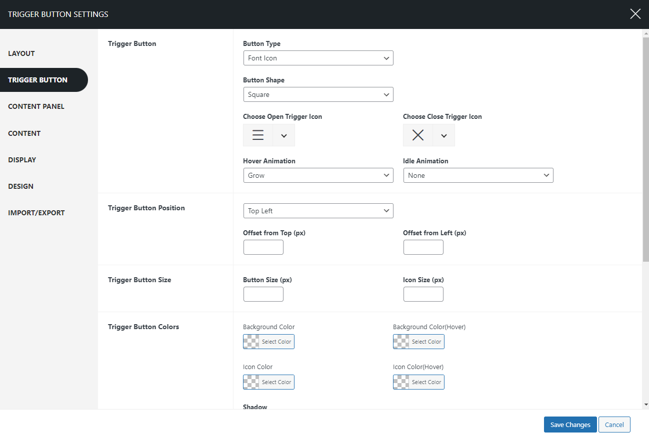
Trigger Button Type
A trigger icon is a tiny symbol that you can tap or click to make something happen on a website. It’s like a little button that sets things in motion when you interact with it. Here you can choose from various trigger icons:
- Font Icon
- Image Icon
- Hamburger Icon
1) Font Icon
In this section, you have the option to select from a diverse range of font icons for opening and closing. You can effortlessly choose from a wide array of trigger open and close icons that best suit your preferences.
2) Image Icon
This section enables you to customize the trigger open and close icon. You can easily upload images from your desktop, and the trigger button will be represented by the image you have selected.
3) Hamburger Icon
The hamburger icon is the three horizontal lines you often see in the corner of a website or app. When you click or tap on it, it opens up a menu with more options. There are 16 predefined hamburger icons that you can select from.
Button Shape
To customize your menu button shape:
- Go to Dashboard > Appearance > Menu.
- Click on the Settings Button to continue.
- The settings page will appear. Click on the Trigger Button tab.
- In the Trigger Button section choose from 4 different button shapes:
- Square
- Round
- Rounded Square
- and Animating Blob
- Click on the Save Changes button.
Hover Animation
This section allows you to choose the animation that takes effect when you hover over the button just before clicking on it. To adjust your hover animation:
- Go to Dashboard > Appearance > Menu.
- Click on the Settings Button to continue.
- The settings page will appear. Click on the Trigger Button tab.
- Within the Hover Animation section, you can pick from a range of animations including:
- Grow
- Shrink
- Pulse
- Pulse Grow
- Pulse Shrink
- Push
- Pop
- Bounce In
- Bounce Out
- Tilt
- Grow Tilt
- Float
- Sink
- Bob
- Hang
- Skew
- Skew Forward
- Skew Backward
- Buzz
- Buzz Out
- and numerous others
- Click on the Save Changes button.
Idle Animation
The menu button, even when not in use, features subtle animations. These animations are designed to captivate users’ interest as they browse and shop. To adjust your idle button animation:
- Go to Dashboard > Appearance > Menu.
- Click on the Settings Button to continue.
- The settings page will appear. Click on the Trigger Button tab.
- In the Idle Animation section, you get to make a captivating choice for how the cart basket behaves when it’s not actively in use.
- You have several options to choose from for the idle animation:
- Bounce
- Flash
- Pulse
- Rubber Band
- Shake X
- Shake Y
- Swing
- Tada
- Wobble
- Jello
- Heartbeat
- Click on the Save Changes button.
Button Position
This section provides you with the option to select the menu placement and gives you the freedom to adjust its position by adding a pixel offset. This allows you to place the menu exactly where you desire. To adjust your cart button position:
- Go to Dashboard > Appearance > Menu.
- Click on the Settings Button to continue.
- The settings page will appear. Click on the Trigger Button tab.
- In the Button Position section, you can place your menu button in various positions.
- You can choose from the following available positions:
- Top Left
- Top Middle
- Top Right
- Bottom Left
- Bottom Middle
- Bottom Right
- Middle Left
- Middle Right
- Moreover, you can fine-tune the exact placement of the menu button by adjusting the offset (in pixels) from your chosen position.
- Click on the Save Changes button.
If you’d like to preview the appearance of the shape, button placement, and animations, please visit the demo page.
Trigger Button Colors
This section allows you to choose the background color, Icon color, and Shadow for the trigger button. To configure the settings:
- Go to Dashboard > Appearance > Menu.
- Click on the Settings Button to continue.
- The settings page will appear. Click on the Trigger Button tab.
- In the Trigger Button Color section, choose the background color, icon color as well shadow for the trigger button.
- Click on the Save Changes button.
Menu Trigger Class
Open the Menu Panel by clicking on custom links, icons, or buttons
You can make custom links, icons, or buttons to open the Menu Panel when clicked. For it, please follow these steps:
- Copy the class name from the main settings under the option Menu Trigger Class. The class name appears as “sffm-open-menu-7“.
- Now you can paste this class name on the HTML or Pagebuilders or in Menus to open the menu panel.
Content Panel Settings
This setting allows you to choose the panel position, width, background type, and background color. To configure the settings:
- Go to Dashboard > Appearance > Menu.
- Click on the Settings Button to continue.
- The settings page will appear. Click on the Content Panel tab.
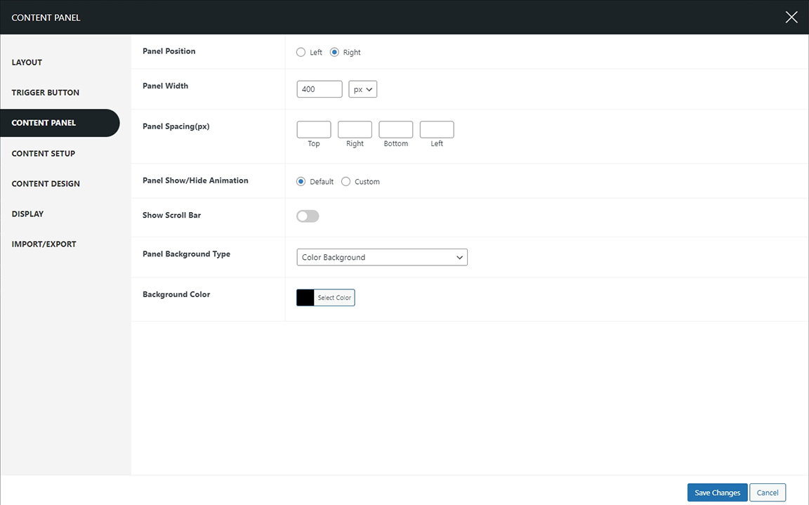
Panel Position
Select the panel position here. You can choose between two options: Left or Right.
Panel Width
The content width section lets you adjust how wide the content panel appears when you open it. This way, you can make sure the content looks just right and is easy to read for anyone using your website. To customize the content width:
- Go to Dashboard > Appearance > Menu.
- Click on the Settings Button to continue.
- The settings page will appear. Click on the Content Panel tab.
- On the Content Width section, add the desired pixel width for the menu panel.
- Click on the Save Changes button.
Panel Spacing (px)
The panel spacing can be adjusted using pixel measurements, allowing for precise spacing on the top, right, bottom, and left sides. This means that the gaps between the panels can be set to specific pixel values, ensuring consistent spacing on all sides.
Panel Show/Hide Animation
You have the option to select the menu panel animation when it appears. There is a variety of Show/Hide animations available for the menu panel that you can customize according to your preference. To select the menu panel animation:
- Go to Dashboard > Appearance > Menu.
- Click on the Settings Button to continue.
- The settings page will appear. Click on the Content Panel tab.
- In the Panel Show/Hide Animation section, you can select from a variety of animations for when the menu panel opens or closes.
- These animations include:
- Bouncing Entrances/Exits
- Fading Entrances/Exits
- Slide Entrances/Exits
- Zoom Entrances/Exits
- Flip Entrances/Exits
- Lightspeed Entrances/Exits
- Back Entrances/Exits
- Rotate Entrances/Exits
- These animations add visual effects to enhance the appearance of the menu panel as it opens or closes.
- Choose the show/ hide animations from various options.
- Click on the Save Changes button.
If you’d like to preview the Panel Show/ Hide animations, please visit the demo page.
Show Scroll Bar
Displaying the scroll bar on the menu panel enhances the user experience by adding a touch of style as users navigate through the content. This feature offers a visually appealing and user-friendly way to interact with the menu panel, making it easier for users to browse through the available options. To enable the scroll bar:
- Go to Dashboard > Appearance > Menu.
- Click on the Settings Button to continue.
- The settings page will appear. Click on the Content Panel tab.
- Enable the show Scroll Bar section to show the fancy scroll bar.
- Click on the Save Changes button.
Panel Background Type
This setting allows choose the panel background type. The options available are:
- Color Background
- Image Background
- Video Background
1) Color Background

When you select the color background you can select the background color of the menu panel.
2) Image Background

Customize your background with an image using this section. You can further control your background appearance by selecting options such as background repetition, size, position, and attachment.
3) Video Background
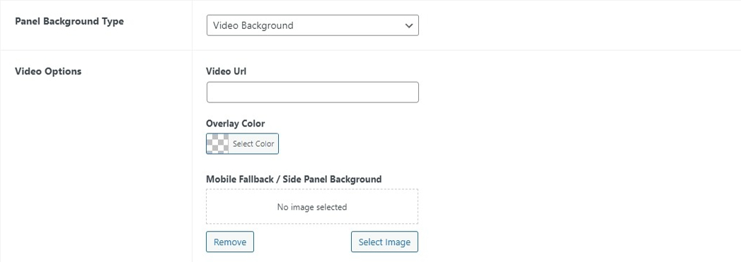
Enrich your menu panel by featuring captivating videos in the background. Simply add the Video URL from various sources to create an immersive experience. Moreover, choose the overlay color and mobile fallback/side panel background.
Content Settings
The content settings allow you to make changes in the content placement and add text in different sections as well. In the display content section, you can choose from the custom content or the Elementor content.
i. Custom Content
To configure the settings:
- Go to Dashboard > Appearance > Menu.
- Click on the Settings Button to continue.
- The settings page will appear. Click on the Content tab.
- From the Display Content choose the Custom Content.
Content Vertical Alignment
Here you can choose your content to display in various positions:
- Top
- Middle
- Bottom
- Stretch
Header Section

In the header section, you get to choose the header image along with its width. Moreover, you can choose to add the header text and additional header text as well. Also, choose the content alignment:
- Left
- Center
- Right
To configure:
- Go to Dashboard > Appearance > Menu.
- Click on the Settings Button to continue.
- The settings page will appear. Click on the Content tab.
- In the Header Section, you can change the header image add header text as well as additional header text, and adjust the alignment.
Body Section-Main Menu
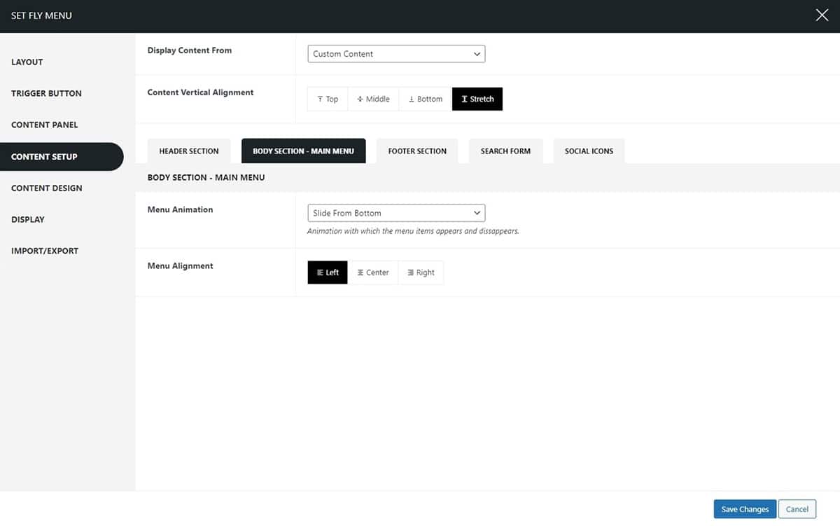
In the body section, you can choose to make changes in the menu animation and choose the menu alignment.
Footer Section

This section allows you to add text in the footer section which allows users to know more about your company profile. Here you can also choose the alignment of the text from
- Left
- Center
- Right
To configure this setting:
- Go to Dashboard > Appearance > Menu.
- Click on the Settings Button to continue.
- The settings page will appear. Click on the Content tab.
- In the Footer section, you can add additional footer text as well as adjust the content alignment.
Social Media Section
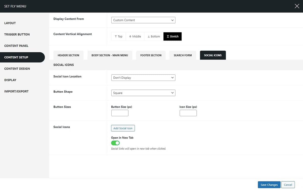
The social media icon in the menu section allows users to interact with your social media accounts more easily. You can choose to display the social media icon in the header or footer. Choose the social media button shape and button sizes. To configure the settings:
- Go to Dashboard > Appearance > Menu.
- Click on the Settings Button to continue.
- The settings page will appear. Click on the Content tab.
- In the Social Media section, you can choose the button shapes from
- Square
- Round
- Triangle
- Rounded Square
- Oval
- Star
- Rhombus
- Pentagon
- Hexagon
- Rabbet
- and Animating Blob
- Moreover, you can customize the button size and icon size by setting the offset in pixels (px). This allows you to adjust the dimensions according to your preferences or design requirements.
- Yes, you can add social icons to your buttons and choose to open them in a new tab. This is a great way to provide links to your social media profiles or other external websites.
ii. Elementor Content
Elementor provides you with the freedom to make changes to the fly menu according to your preferences. With its user-friendly interface and customizable options, you can easily tailor the fly menu to suit your website’s design and navigation needs. To configure the settings:
- Go to Dashboard > Appearance > Menu.
- Click on the Settings Button to continue.
- The settings page will appear. Click on the Content tab.
- From the Display Content choose the Elementor Content.
Let’s further see what changes you can make by using Elementor.
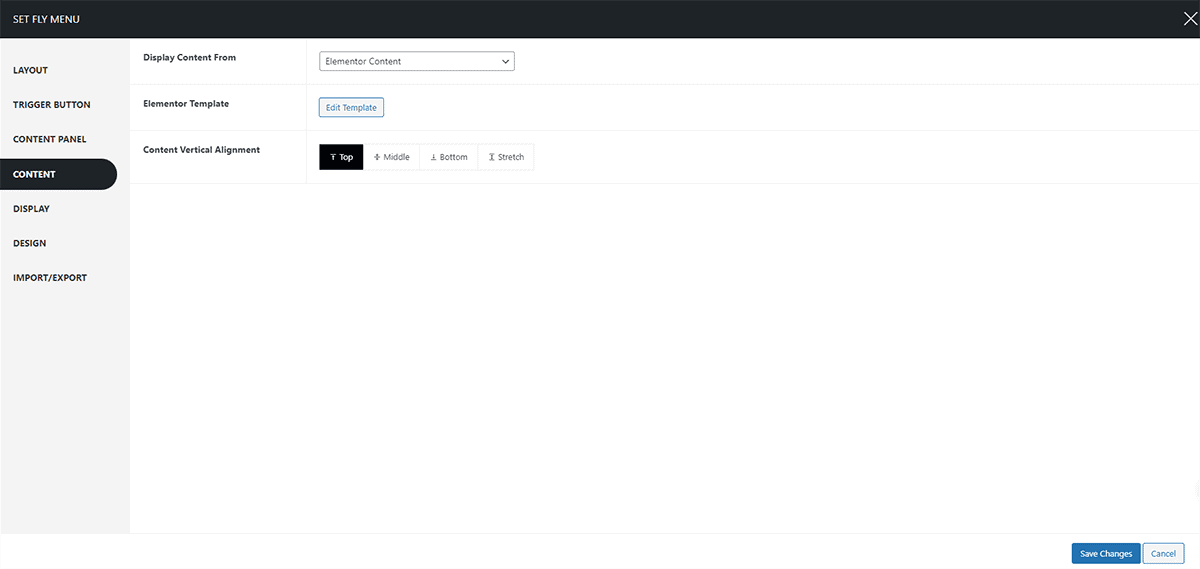
Content Vertical Alignment
Here you can choose your content to display in various positions:
- Top
- Middle
- Bottom
- Stretch
To configure the Elementor settings click on the Edit Elementor on the Elementor Template. You will be redirected to the Elmentor Page where you can make further changes.
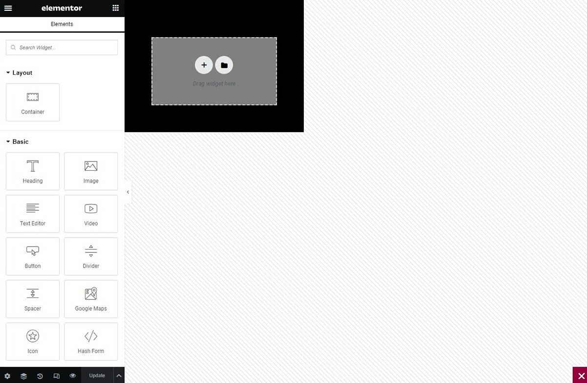
Elementor gives you access to make changes by giving you all the liberty to change the fly menu as you like. The Super Floating and Fly menu consists of draggable elements that enable you to create a customized menu based on your preferences. These elements include:
- Animated Hover Menu
- Multi Level Menu
- Multi-Level Breadcrumb Menu
- Close Menu Button
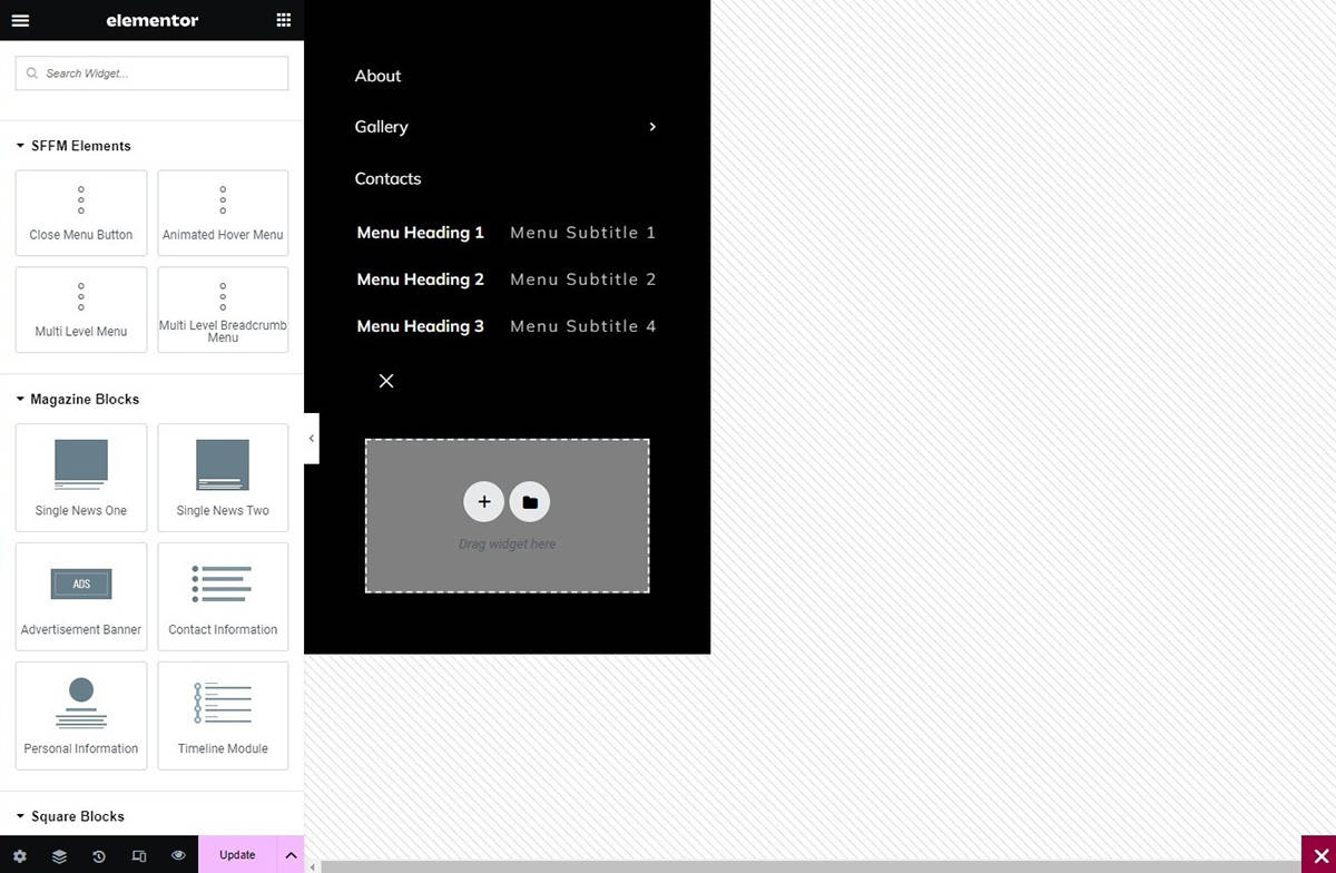
- Animated Hover Menu: This feature allows you to incorporate an interactive hover effect on the menu items, making the navigation experience engaging and visually appealing for your website visitors.
- Multi-Level Menu: With this element, you can create a menu structure that supports multiple levels, enabling you to organize and categorize your content hierarchically, enhancing the accessibility and organization of your website’s information.
- Multi-Level Breadcrumb Menu: This feature helps users understand the current page’s position within the website’s hierarchy, making it easier for them to navigate back to previous pages or categories, improving overall user experience and site navigation.
- Close Menu Button: The close menu button allows users to easily close the menu when they are done navigating, providing a convenient and intuitive way to manage the menu’s visibility without any hassle.
These elements serve as building blocks to simplify the menu creation process. With your creativity and the diverse range of available elements, you have the freedom to craft a unique and personalized menu that aligns perfectly with your website’s design and navigation requirements. This allows you to tailor the menu structure to your specific preferences and create a seamless and engaging user experience for your website visitors.
Design Settings
The design section lets you customize each area further. Select the tab for the section you want to modify.
Header
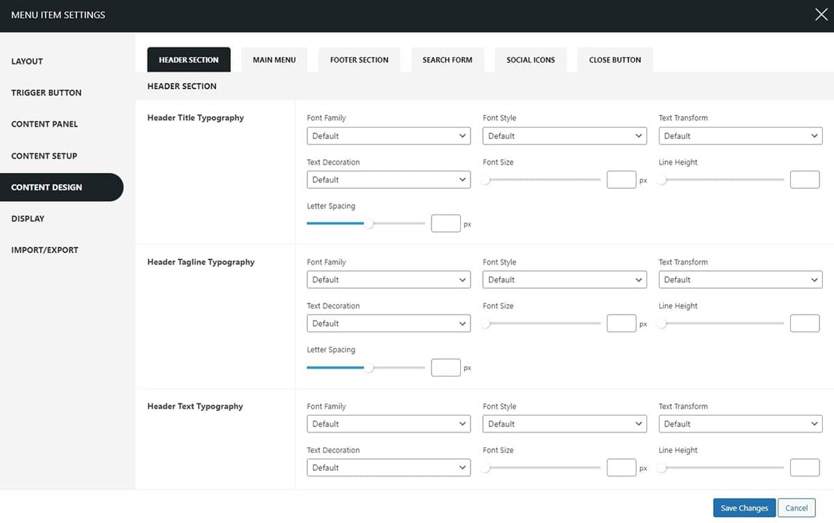
Within this section, you can choose to make changes in the typography of the header title, tagline, and header text and also change the header colors as well as the header spacing (px). To configure:
- Go to Dashboard > Appearance > Menu.
- Click on the Settings Button to continue.
- The settings page will appear. Click on the Design tab.
- In the Header section, choose the typography for the Header title, Header Tagline, and header text.
- Further, adjust under these headings:
- Font Style: Adjust the style of the font.
- Text Decoration: Apply decorations like underlines or strikethroughs.
- Text Transformation: Change the capitalization style.
- Font Size: Set the size of the font.
- Line Height: Define the spacing between lines.
- Spacing: Adjust the spacing between characters and words as needed.
- In the Header color section, you can choose to change the header title color, header tagline color, and header text color and further choose the header spacing in pixels and also select spacing between the elements.
- Click on the Save Changes button.
Main Menu
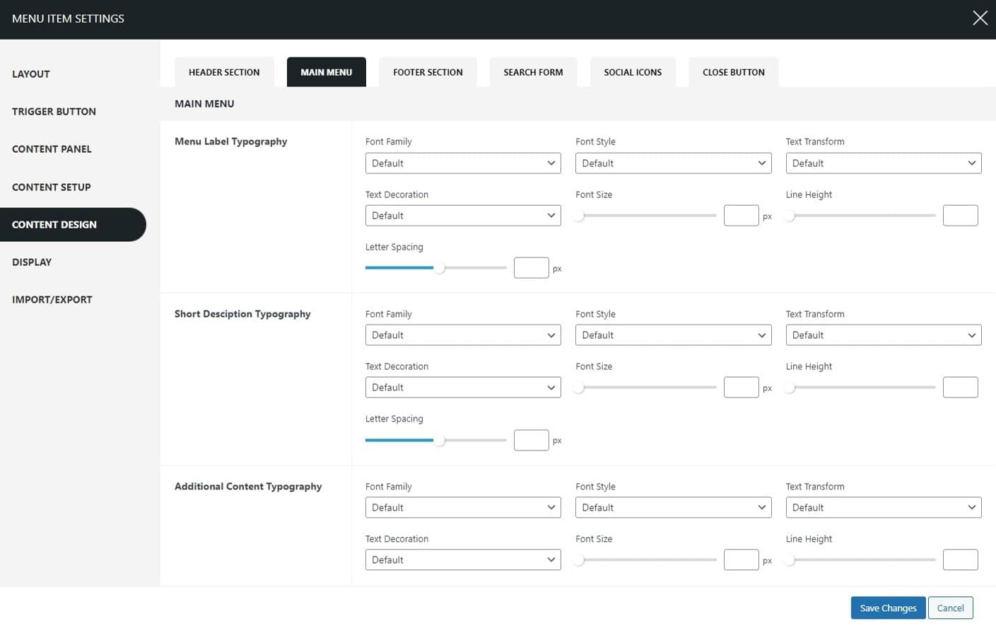
This section allows you to choose the typography family, color spacing, padding, and many other configurations of the menu item. To configure the settings:
- Go to Dashboard > Appearance > Menu.
- Click on the Settings Button to continue.
- The settings page will appear. Click on the Design tab.
- In the Menu section, choose the typography for the menu label, menu short description, and additional content.
- Further, adjust under these headings:
- Font Style: Adjust the style of the font.
- Text Decoration: Apply decorations like underlines or strikethroughs.
- Text Transformation: Change the capitalization style.
- Font Size: Set the size of the font.
- Line Height: Define the spacing between lines.
- Spacing: Adjust the spacing between characters and words as needed.
- In the Color section, you can choose to change the color of the menu item, menu short description, menu additional content, and menu notification as well.
- Click on the Save Changes button.
Footer
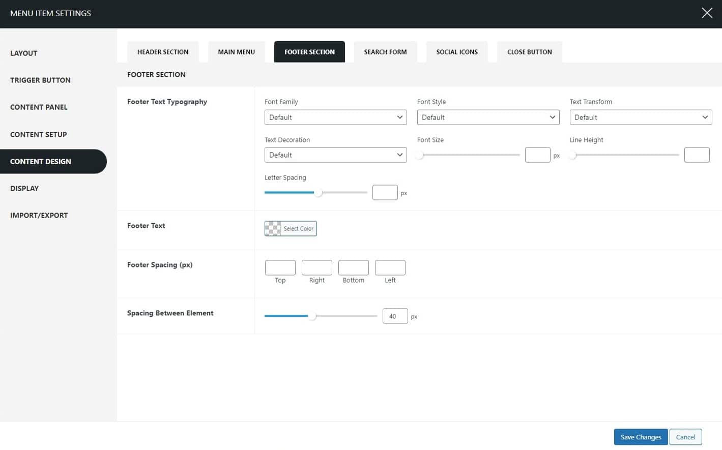
This section allows you to choose the typography family for the footer text. To configure:
- Go to Dashboard > Appearance > Menu.
- Click on the Settings Button to continue.
- The settings page will appear. Click on the Design tab.
- In the Footer section, choose the typography for the footer text.
- Further, adjust under these headings:
- Font Style: Adjust the style of the font.
- Text Decoration: Apply decorations like underlines or strikethroughs.
- Text Transformation: Change the capitalization style.
- Font Size: Set the size of the font.
- Line Height: Define the spacing between lines.
- Spacing: Adjust the spacing between characters and words as needed.
- Further, choose the footer spacing in pixels and also select the spacing between the elements.
- Click on the Save Changes button.
Search Form

This section mainly allows you to choose the color and make more manual settings to choose the color for the search item. To configure the settings:
- Go to Dashboard > Appearance > Menu.
- Click on the Settings Button to continue.
- The settings page will appear. Click on the Design tab.
- In the Search section, choose the background color, border color, text color, button color, and button icon color.
- Also, fix the padding of the search button by choosing the pixels for top, right, bottom, and left.
- Click on the Save Changes button once you are done.
Social Icons
You can choose the social icon colors in this section. To configure the settings:
- Go to Dashboard > Appearance > Menu.
- Click on the Settings Button to continue.
- The settings page will appear. Click on the Design tab.
- In the Social Icon section, choose the icon color, background color, border color, and tooltip color as well.
- Click on the Save Changes button.
Close Button

This section allows you to choose the close button color and the display position. To configure more:
- Go to Dashboard > Appearance > Menu.
- Click on the Settings Button to continue.
- The settings page will appear. Click on the Design tab.
- In the Close Button section, choose where the button is to be displayed: left or right.
- Moreover, choose the close button colors, button offset (px), button size, and button border radius as well.
- Click on the Save Changes button.
Display settings
This section particularly allows you to display the Super Flying Menu selectively on different pages. To configure the settings:
- Go to Dashboard > Appearance > Menu.
- Click on the Settings Button to continue.
- The settings page will appear. Click on the Display tab.
- Under the Hide in Screens section, select the options where you wish the Super Floating Menu to be hidden, whether it’s Desktop, Tablet, or Mobile.
- Moreover, you can show/hide the Super Floating Menu in the selective pages.
- Click on the Save Changes button once you are done.

Import & Export Settings
Now, you can simply import the templates that you like and make your e-commerce site like you want to.
Eliminate the need to repeatedly configure identical settings for multiple menus. Simply export the settings from one menu and seamlessly import them into another menu. Moreover, there are Prebuilt Templates that you can import. If you want to view the demo templates click here. Effortlessly download the menu settings with a single click. Then, effortlessly import them into any other menus on the same website or different websites. Streamline your workflow and save valuable time with the Super Floating & Flying Menu.
Configure Each Menu Item – Fly Menu
Moreover, you can opt to personalize the configurations for each individual menu item within the Super Floating Menu. For this:
- Go to Dashboard > Appearance > Menu.
- Go to the Menu Structure.
- Choose the item you wish to configure.
To make changes to each menu item:
- To make specific changes, just select the menu item you want to modify, like clicking on the ‘Home’ item, for example. This action will allow you to access and adjust the settings for that particular item.
- Once you’ve opened the item, hover your cursor over the menu to find the Super Menu Setting button. It’s located right next to the menu box you want to configure. Remember that the button will vanish if you move your cursor away from the menu.
- Click on this setting to make any additional adjustments.
Note: Please be aware that the Super Menu Settings do not apply to the sub-menus. Let’s see what changes you can make for each menu:
General
The general setting allows you to choose the menu icon type and make further changes to the menu description, label, and additional content.
Menu Icon
The menu icon allows you to choose the menu icon type. The available options are:
- Font Icon
- Image Icon
1) Font Icon
Within the font icon section, you have the option to select from a wide range of icons for the menu items you are customizing. The icons are further divided into sections for your convenience:
- Font Icon
- Close Icon
- Font Awesome
- Essential Icon
- Material Icon
- Elegant Icon
When picking an icon for the menu, think about how it will represent the menu item. If you’re having trouble finding the right icon, utilize the search field. Input a keyword related to the menu item, like “Home,” and it will display the home icon specifically for you to select.
2) Image Icon
The image icon feature enables you to upload your custom icon from your desktop. Just choose the menu icon for the item you’re working on and upload it in this section. After the upload, the menu will display the icon you uploaded.
Menu Short Description
This allows you to add a brief and concise text that provides a quick overview or summary of the menu item. It helps users understand the content or purpose of the menu item without needing to open it, enhancing the overall user experience and facilitating easy navigation.
Menu Notification Label
This is a visual indicator or label that highlights specific menu items to draw the user’s attention. It is typically used to showcase important or new updates, notifications, or any other relevant information associated with the menu item, ensuring that users are informed about any recent changes or developments.
Additional Content
This feature allows you to include supplementary or extra information related to the menu item, such as images, videos, or detailed descriptions. It enables you to provide users with more comprehensive insights or context about the menu item, enhancing their understanding and engagement with the content.
Create a Multilingual Menu on Super Floating and Fly Menu
Translating websites into different languages has become easier with advancements in technology and the availability of translation tools. However, when it comes to translating dynamic elements like menus, separate plugins or tools may be required, as they often involve more complex interactions and functionalities. These plugins or tools help ensure accurate and efficient translation of menus and other dynamic content on websites. If you are unaware of how to translate the menu into another language follow this article: How to create a multilingual menu on Super Floating and Fly Menu.
Updating Plugin
Regularly updating your WordPress themes and plugins is crucial for maintaining the security and performance of your website. Developers often release updates to introduce new features, fix bugs, and enhance overall functionality. While the auto-update feature is available for free themes and plugins from the WordPress.org repository, managing updates for premium products requires a manual process. For users of Envato Marketplace, simplifying the update process is possible with the Envato Market plugin. By connecting your Envato account, this plugin enables seamless installation and updates for all premium WordPress themes and plugins purchased from Themeforest and CodeCanyon. This means you can conveniently auto-update Envato WordPress themes and plugins directly from your WordPress dashboard, ensuring your website stays secure and optimized effortlessly. To learn more on how to update follow this article: How to Auto Update Envato WordPress Themes and Plugins?