Ultimate WooCommerce Ajax Cart & Added To Cart Popup Documentation
This documentation will guide you through the installation and implementation of the Ultimate WooCommerce Ajax Cart plugin into your e-commerce website. By integrating this plugin, you’ll have the capacity to bring significant enhancements to your online business operations.
If you have any pre-sales questions or need any assistance related to the plugin, please feel free to open a support ticket. Our support team will be happy to help you.
Here are the Demo and Purchase links in case you need it.
Ultimate WooCommerce Ajax Cart
Readiness to checkout and easy payment options are crucial for a quick online purchase process. WooCommerce Ajax Cart is a frequently employed functionality in e-commerce websites, aimed at enhancing the user experience. It offers effortless accessibility for users to review the items they’ve chosen for purchase and enables them to make alterations to their selections while continuing to shop.
Installation
The installation of Ultimate WooCommerce Ajax Cart is a simple process of uploading a .zip file. Here is the Purchase/Download link if you need it.
Uploading Via WordPress Dashboard
Installing Ultimate WooCommerce Ajax Cart follows the standard plugin installation procedure, which you may already be familiar with. If not, here are the steps to guide you:
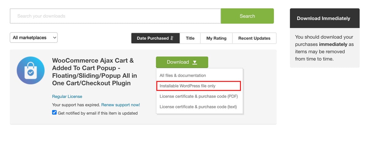
- After making your purchase, go to “Downloads” by hovering over the right top corner menu of the Codecanyon website.
- Download the Ultimate WooCommerce Ajax Cart .zip file and save it to your computer.
- Log in to your WordPress dashboard and navigate to Plugins > Add New.
- Select “Upload Plugin” and then choose the plugin file you saved earlier.
- Click “Install Now.”
- Wait for the plugin to be installed on your server, and once the installation is complete, click the “Activate Plugin” button.
- These steps should help you successfully install Ultimate WooCommerce Ajax Cart on your website.
Setting Up WooCommerce Ajax Cart
After successfully activating the plugin, you can configure your WooCommerce floating cart for your online store. To configure the Ultimate WooCommerce Ajax Cart:
- Log in to your WordPress dashboard.
- Navigate to the “Ultimate WooCommerce Ajax Cart” option in the left-hand menu of your dashboard.
- You’ll arrive at the “All Cart” page, where all your created WooCommerce carts are stored.
- Click the “Add New” button to create a new WooCommerce cart for your online shop.
- You’ll be directed to the plugin’s settings page, where you can tailor and personalize the floating cart to your specifications before integrating it into your WordPress based e-commerce site.
Main Settings
Configure the Main Settings
The main settings are categorized into two other sub settings: General Settings and Display Settings.
General Settings
Let’s see what general settings allow you to make changes:
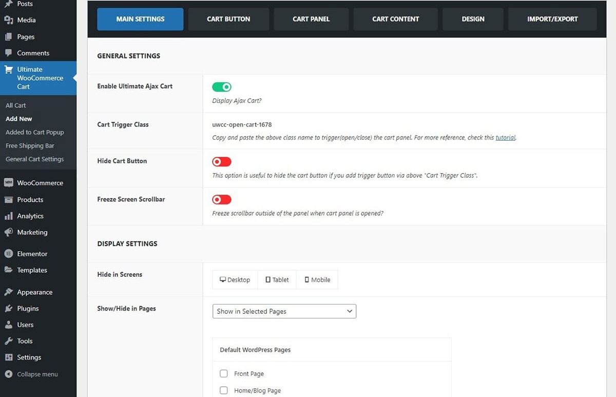
Here, you’ll find the setting to enable the Ajax Cart display. By switching it to ‘On’, the cart will become visible on your website for user interaction.
Cart Trigger Class
Open the Cart Panel by clicking on custom links, icons, or buttons
You can make custom links, icons, or buttons to open the Cart Panel when clicked. For it, please follow these steps:
- Copy the class name from the main settings under the option Cart Trigger Class. The class name appears as uwcc-open-cart-123.
- Now you can paste this class name on the HTML or Pagebuilders or in Menus to open the cart panel.
For more information, please refer to the link “Open Add To Cart Panel” guide for a comprehensive explanation of manually applying CSS class.
Hide Cart Button
You can use this setting to hide the shopping cart button when you’ve added the trigger button using the Cart Trigger Class mentioned earlier. To hide the cart the cart button
- Go to Dashboard > Ultimate WooCommerce Cart > Main Settings Tab.
- On the Hide Cart Button option, toggle to show/hide the cart button.
Freeze Screen Scrollbar
This setting gives you the ability to immobilize the scrollbar when the cart is in use. This effectively prevents any unintended scrolling of the website’s main panel while you’re making necessary adjustments within the cart panel. To freeze the screen scrollbar:
- Go to Dashboard > Ultimate WooCommerce Ajax Cart > Main Settings Tab.
- Toggle the Freeze Screen Scrollbar option to enable/disable.
Display Settings
Customize Cart Display Options
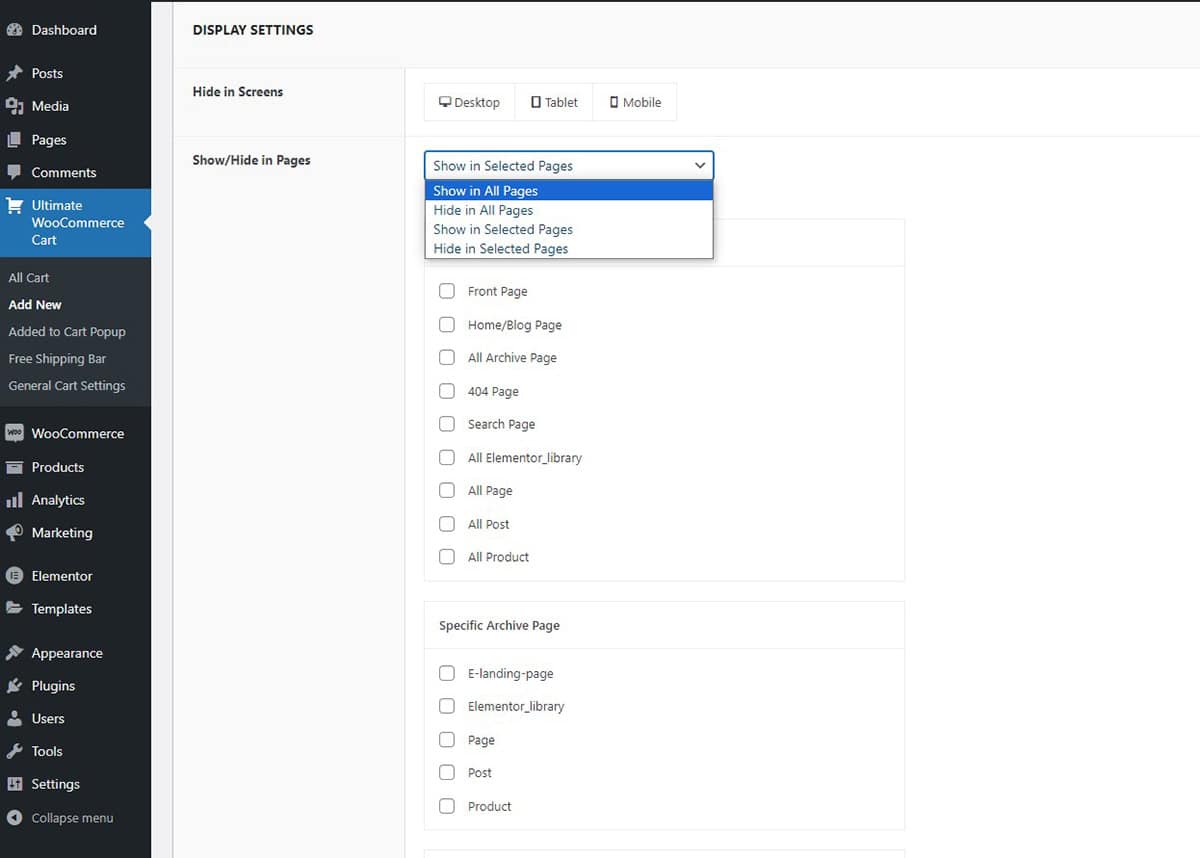
- This section particularly allows you to display the WooCommerce Cart selectively on different pages.
- You can either show or hide the WooCommerce Cart on selected pages. This allows you to control the visibility of the cart as you want.
- You can also configure it to display between desktop, tablet, and mobile. Choose the device where you don’t want your cart to be visible.
- You have the freedom to fine-tune the cart’s visibility on selected pages and devices enabling you to eliminate any unwanted appearances of the Ultimate WooCommerce Ajax Cart.
Cart Button
These configurations allow you to customize the appearance of the cart button, and icons, alter their shape, and even add animations to them. Let’s further dive into the details of the changes you can make to your cart button.
- Icon
- Button Shape
- Button Position
- Animation
- Show Product Counter
- Hide Cart if Empty
Icon
Customizing Your Cart Icon
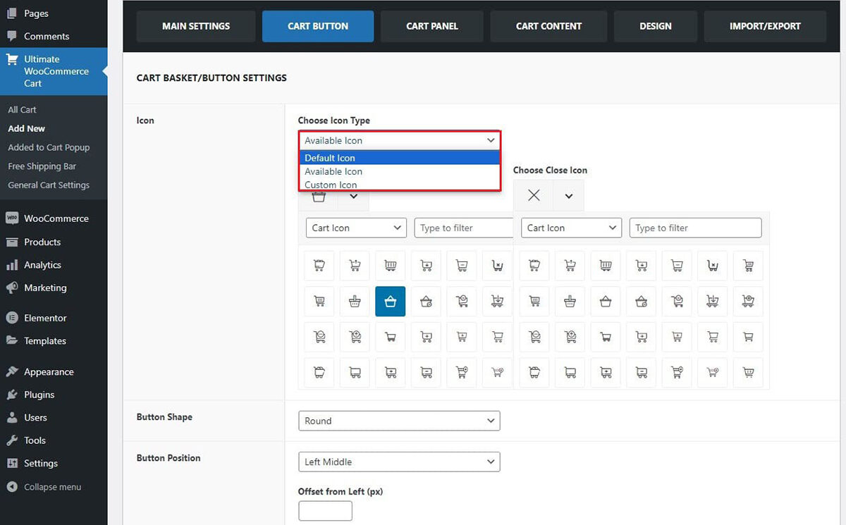
You have the option to select the cart icon from the preexisting cart icons or to upload your own custom cart icon. To customize your cart icon:
- Go to Dashboard > Ultimate WooCommerce Ajax Cart > Cart Button Tab.
- In the Cart Icon section, you can change the icon by selecting from
- Default icons,
- Available icons,
- or Custom icon (uploading image icon)
- You have the flexibility to select from a diverse range of cart icons for both the open and close actions of the cart.
- Click on the Save/Update button to save the changes made.
Button Shape
Customize Your Cart Button Shape
To customize your cart button shape:
- Go to Dashboard > Ultimate WooCommerce Ajax Cart > Cart Button Tab.

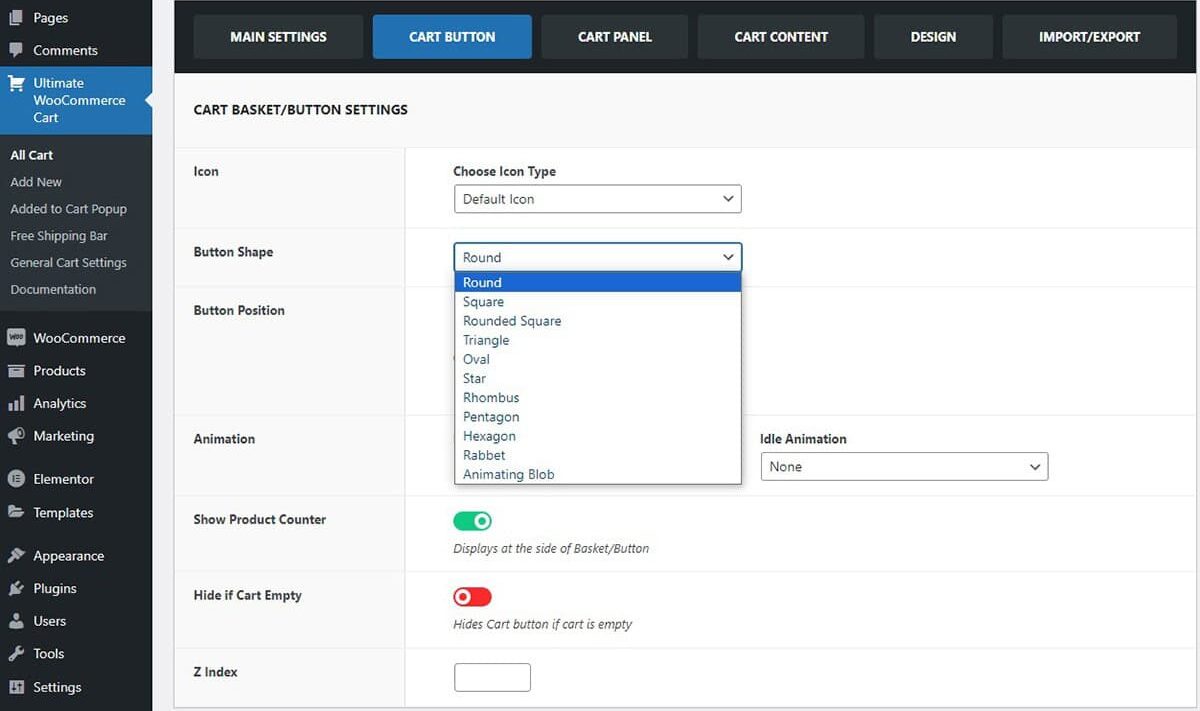
- In the Button Shape section, there are 11 button shape options for you to explore. These shapes include
- Round
- Square
- Rounded Square
- Triangle
- Oval
- Star
- Rhombus
- Pentagon
- Hexagon
- Rabbet
- Animating Blob
- Choose the button shape that suits your preference from the available options.
- Click on the Save/Update button to save the changes made.
Button Position
Adjust Cart Button Placement and Offset
To adjust your cart button position:
- Go to Dashboard > Ultimate WooCommerce Ajax Cart > Cart Button Tab.

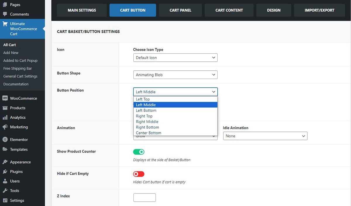
- In the Button Position section, you can place your cart button in various positions. You can choose from the following available positions:
- Left Top
- Left Middle
- Left Bottom
- Right Top
- Right Middle
- Right Bottom
- Center Bottom
- Moreover, you can fine-tune the exact placement of the cart button by adjusting the offset (in pixels) from your chosen position.
- Click on the Save/Update button to save the changes made.
Animation
Enhance Engagement with Cart Animations
The shopping cart can be enhanced with animations to captivate customers. You have the option to select animations when you hover over the cart button or when the cart is in an idle state.
Hover Animation
Select Hover Animation for Cart Button
This section allows you to choose the animation that takes effect when you hover over the cart button just before clicking on it. To adjust your hover animation:
- Go to Dashboard > Ultimate WooCommerce Ajax Cart > Cart Button Tab.
- Within the Hover Animation section, you have the ability to pick from a range of animations including
- Grow
- Shrink
- Pulse
- Pulse Grow
- Pulse Shrink
- Push
- Pop
- Bounce In
- Bounce Out
- Tilt
- Grow Tilt
- Float
- Sink
- Bob
- Hang
- Skew
- Skew Forward
- Buzz
- Buzz Out
- and numerous others
- You have the freedom to choose from this wide array of options to apply when customers hover over the cart basket.
- Click on the Save/Update button to save the changes made.
Idle Animation
Idle Animations for the Shopping Cart Button
The shopping cart button, even when not in use, features subtle animations. These animations are designed to captivate users’ interest as they browse and shop. To adjust your idle cart animation:
- Go to Dashboard > Ultimate WooCommerce Ajax Cart > Cart Button Tab.
- In the Idle Animation section, you get to make a captivating choice for how the cart basket behaves when it’s not actively in use.
- You have several options to choose from for the idle animation:
- Bounce
- Flash
- Pulse
- Rubber Band
- Shake X
- Shake Y
- Swing
- Tada
- Wobble
- Choose from the animations and click on Save/Update button to save the changes made.
If you’d like to preview the appearance of the shape, button placement, and animations, please visit the demo page.
Show Product Counter
Highlight the Number of Items in Your Shopping Cart
This section enables users to easily determine the specific quantity of products currently in their shopping basket. To show the product counter:
- Go to Dashboard > Ultimate WooCommerce Ajax Cart > Cart Button Tab.
- To emphasize the quantity of items in your shopping cart, Enable the Show Product Counter settings.
- Click on the Save/Update button to save the changes made.
Hide if Cart Empty
Automatically Remove the Cart Display When No Products Are Selected
If you wish to hide the cart when there are no items in the cart, you can simply hide the cart button in this situation. To hide the cart button when empty:
- Go to Dashboard > Ultimate WooCommerce Ajax Cart > Cart Button Tab.
- To hide the cart when it’s empty, simply Enable this option. It will reappear once you add items to the basket.
- Click on the Save/Update button to save the changes made.
Cart Panel
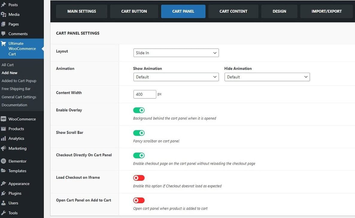
A cart panel is the panel that appears when the customers add an item to the basket. You can make changes in the following cart panel settings:
- Layout
- Animation
- Content Width
- Enable Overlay
- Show Scroll Bar
- Checkout Directly on Cart Panel
- Load Checkout on IFrame
- Open Cart Panel on Add to Cart
Layout
Choose How the Cart Panel Appears
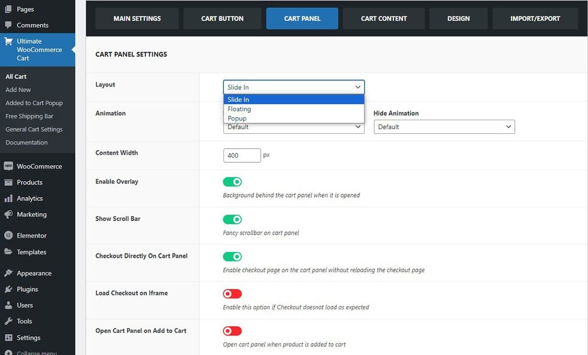
Select the desired way the cart panel appears when customers click on the cart button. To configure the layout section:
- Go to Dashboard > Ultimate WooCommerce Ajax Cart > Cart Panel Tab.
- In the Layout Section, you have three choices:
- Sliding
- Floating
- Popup
- Choose the layout from the options.
- Click on the Save/Update button to save the changes made.
Animation
Select the Cart Panel Animation
In addition to the cart layout, you also have the option to select the cart panel animation when it appears. There is a variety of Show/Hide animations available for the cart panel that you can customize according to your preference. To select the cart panel animation:
- Go to Dashboard > Ultimate WooCommerce Ajax Cart > Cart Panel Tab.
- In the Cart Panel Animation section, you have the ability to select from a variety of animations for when the cart panel opens or closes. These animations include
- Bouncing Entrances/Exits
- Fading Entrances/Exits
- Slide Entrances/Exits
- Zoom Entrances/Exits
- Flip Entrances/Exits
- Lightspeed Entrances/Exits
- Back Entrances/Exits
- Rotate Entrances/Exits
- These animations add visual effects to enhance the appearance of the cart panel as it opens or closes.
- Choose the show/ hide animations from various options.
- Click on the Save/Update button to save the changes made.
If you’d like to preview the animation of the cart panel please visit the demo page.
Content Width
Customize the Content Panel Width
The content width section allows you to customize the width of the content panel when opened. To customize the content width:
- Go to Dashboard > Ultimate WooCommerce Ajax Cart > Cart Panel Tab.
- On the Content Width, add the desired pixel width for the cart panel.
- After making your adjustments, be sure to click the Save/Update button to save the changes you’ve made.
Enable Overlay
Make the Cart Panel More Visible
Enabling the overlay highlights the cart contents, making it more noticeable, while still maintaining the section’s presence in the background when customers hover over the cart. To enable overlay:
- Go to Dashboard > Ultimate WooCommerce Ajax Cart > Cart Panel Tab.
- To increase the visibility of the cart panel, you can Enable the Overlay settings.
- Click the Save/Update button to save the changes you’ve made.
Show Scroll Bar
Enable the Scroll Bar
The stylish scroll bar on the cart panel enhances the user experience as they scroll through it. To enable the scroll bar:
- Go to Dashboard > Ultimate WooCommerce Ajax Cart > Cart Panel Tab.
- Enable the show scroll bar section to show the fancy scroll bar.
- Click the Save/Update button to save the changes you’ve made.
Checkout Directly On Cart Panel
This saves customers from being redirected to another page for checkout, ensuring an easy and convenient process. To enable this feature:
- Go to Dashboard > Ultimate WooCommerce Ajax Cart > Cart Panel Tab.
- In the Cart Panel section, you can easily enable or disable the “Checkout Directly On Cart Panel” settings.
- Click the Save/Update button to save the changes you’ve made.
The Video below shows the checkout page displaying inline, ensuring users remain on the same page.
Load Checkout on IFrame
This feature allows the checkout process or specific payment forms to load within an embedded iframe.
Sometimes, the checkout process does not work as intended and in such cases, it is recommended to enable this feature.
It is commonly used by payment gateways or plugins to ensure secure transactions, maintain PCI compliance, and provide a seamless user experience by keeping customers on the same page during checkout.
OpenCart Panel on Add to Cart
Display Cart Panel upon Adding to Cart
The cart panel automatically opens when customers add a product to their shopping basket. To enable this feature:
- Go to Dashboard > Ultimate WooCommerce Ajax Cart > Cart Panel Tab.
- Go to the open cart panel on the add to cart section and Enable this setting.
- Click the Save/Update button to save the changes you’ve made.
Cart Content
Here you can configure the cart content. You can choose to configure the cart content under these headings:
- Header
- Cart Products
- Coupon
- Buttons
- Shipping Bar
- Suggested Items
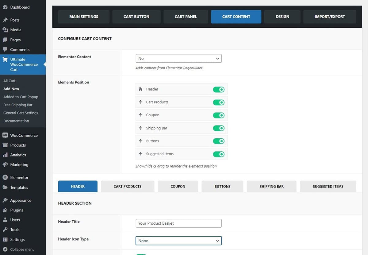
Element Position
You can choose to place the cart contents in any position you like. Simply drag and drop the elements and click on the Save/Update button.
Header
Header Section
In this section, you have the option to select the header title. You can assign a unique display name to your cart. Moreover, you can choose the header icon type. You can choose the default icon or custom upload from your desktop. If you wish to show/ hide the cart quantity and items you can toggle the button right below the Header Icon Type.
After Header Content
The post header content feature lets users add additional text or information right after the header, providing customers with a brief overview of their cart. It supports shortcodes, making it easy to customize and enhance the content area for better convenience.

Cart Products
Configure the Cart Product Section

Let’s see what changes you can make to your cart products:
- You have the flexibility to display the cart products in either a list or grid format, catering to the convenience of your customers in viewing the items they’ve added to their cart.
- By clicking on the cart item header, customers are directed to the product description, facilitating quick access to details.
- During the shopping process, customers often need the option to make essential adjustments to individual items or remove all items at once. To streamline this, we’ve incorporated a “Remove All Button” that efficiently clears the entire cart when selected.
- Finally, you have the option to select the icon that appears when the cart is empty, in addition to customizing the cart text.
After Cart Product Content
The after cart product content feature allows users to add extra text or information right after the cart product details are displayed. This helps customers gain additional insights about their cart in a concise manner, such as shipping details or discount information.
Moreover, the inclusion of shortcodes makes it easier to customize this section, enhancing the overall shopping experience. This placement is necessary to provide customers with relevant information at a critical point in their purchasing process, ensuring they have all the details they need before proceeding to checkout.
Coupon
Coupon Form and Codes Section
The coupon section is the discount offered for a limited period of time to the customers. Let’s see how to configure the coupon field:

- You can customize the label for the coupon application button, which lets you modify the text displayed on the promotional code button.
- The placeholder label for the promo code input field is the text that appears where customers enter their coupon code.
- To display the currently accessible coupons, activate the “Display Available Coupons” toggle button.
After Coupon Content
The After Coupon Content feature allows users to add extra text or information right after the coupon details are applied to the cart. This helps customers gain additional insights, such as final pricing, applicable taxes, or special offers, in a concise manner.
Moreover, the inclusion of shortcodes makes it easier to customize this section, enhancing the overall shopping experience. This placement is important because it provides customers with crucial information immediately after applying a coupon, helping them understand the impact of discounts before they proceed to checkout.
Buttons
View Cart, Checkout, and Continue Shopping Buttons
This section allows you to toggle the visibility of the cart, checkout, and continue shopping buttons. You can also modify the text on these buttons and choose whether to display or hide the subtotal, discount, and total fields.

After Button Content
The After Buttons Content feature in the Ultimate WooCommerce Cart plugin allows users to add extra text, information, or promotional content directly after the action buttons, such as Update Cart or Proceed to Checkout. This feature is useful for providing customers with additional details, encouraging upsells, offering discounts, or giving reminders at a critical point in the shopping process.
Shipping Bar
Free Shipping Bar Settings
In these settings, you can alter the changes that you can make in the shipping bar. Moreover, you can choose the free shipping text as well as the free shipping success text once you enable this settings.
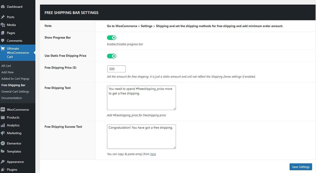
Use Static Free Shipping Price
The static free shipping price typically refers to a fixed or predetermined threshold amount that customers need to reach in their order total to qualify for free shipping. This static price is set by the retailer or e-commerce platform and remains constant regardless of the shipping method chosen by the customer. The progress bar gradually progresses as you add items to your cart and also shows how much more you need to spend to get the free shipping.
If you wish to set the shipping methods you can Go to WooCommerce > Settings > Shipping. In this setup, you can configure the shipping methods. If you offer free shipping for certain regions by setting the method to free and specifying a minimum order amount to qualify. This is beneficial for businesses targeting specific geographic areas or those with varying shipping costs based on location.
For regions where free shipping doesn’t apply, you can set the shipping method to add the appropriate shipping cost based on the customer’s location.
Suggested Items
Suggested Product Carousel
The suggested item carousel displays related products that customers have added to their basket, aiming to encourage additional shopping by suggesting relevant items. Lets see what changes you can make here:
- To Show/Hide the suggested product to the customers Enable/Disable the Display Suggested Products settings.
- Next, you have the option to modify the display of the heading title.
- You can also select the product layout, either vertical or horizontal.
- You can select the number of items to be displayed and determine how many items are visible in the carousel as well.
- Additionally, you have the option to Enable auto play, and infinite loops to move the carousel on its own.
- You can also enable the Pause on Hover feature, which allows customers to pause the carousel when they want to take a closer look at the items that interest them.

After Suggested Items Content
Design Cart Conent Using Elementor
Create and Personalize Your Design with Elementor, a user-friendly page builder that simplifies your workflow with its drag-and-drop functionality. You have the flexibility to either craft your own unique design or choose from a range of pre-designed styles, saving you valuable time. To begin customizing with Elementor:
- Navigate to your Dashboard.
- Go to Ultimate WooCommerce Ajax Cart > Cart Content > Elementor Content.
- Select the “Yes” option to initiate customization with Elementor.
Utilize the 13 diverse cart widgets at your disposal for a seamless and tailored user experience:
- Cart Quantity and Items: Display the number of items in the cart along with their details, ensuring customers have a quick overview of their selected products.
- Cart Products: Showcase a visually appealing and informative list of items currently in the cart, complete with images, names, and prices.
- Cart Amount: Present the total amount or cost of the items in the cart, making it easy for customers to keep track of their expenses.
- Coupon Code Form: Provide a field for customers to enter coupon codes, encouraging them to take advantage of discounts and promotions.
- Coupon Code List: If applicable, display a list of available coupon codes or applied discounts, giving customers transparency and an incentive to complete their purchase.
- Suggested Products: Offer personalized product recommendations based on the items in the cart, encouraging customers to explore additional products before checking out.
- Close Cart Button: Allows users to easily close the cart if they decide not to proceed with their purchase, providing a smooth and intuitive user interface.
- View Cart and Checkout Button: Include a prominent button that leads customers to the cart for a detailed review of their selections or directly to the checkout process, reducing friction in their journey.
- Checkout Button: Make sure the checkout button stands out, with clear and compelling wording, ensuring customers can swiftly proceed to the payment process.
- Back to Cart Button: Offer a convenient option for customers to return to their cart if they wish to make changes or additions before finalizing their order.
- Remove All Button: Enable customers to clear their entire cart with ease, providing a hassle-free way to start fresh if needed.
- Free Shipping Bar: If you offer free shipping based on certain criteria, display a progress bar or message indicating how close customers are to qualifying for this benefit, incentivizing them to add more items to their cart.
- Add to Cart Button: Throughout your website, strategically place “Add to Cart” buttons near product listings or descriptions to streamline the shopping process, allowing customers to quickly add items to their cart without navigating away from the page.
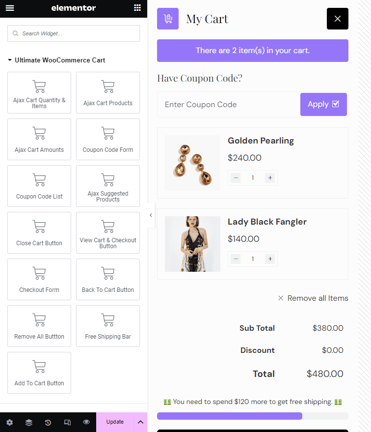
The checkout button simplifies the purchasing process for customers, allowing them to complete their orders with a single click.
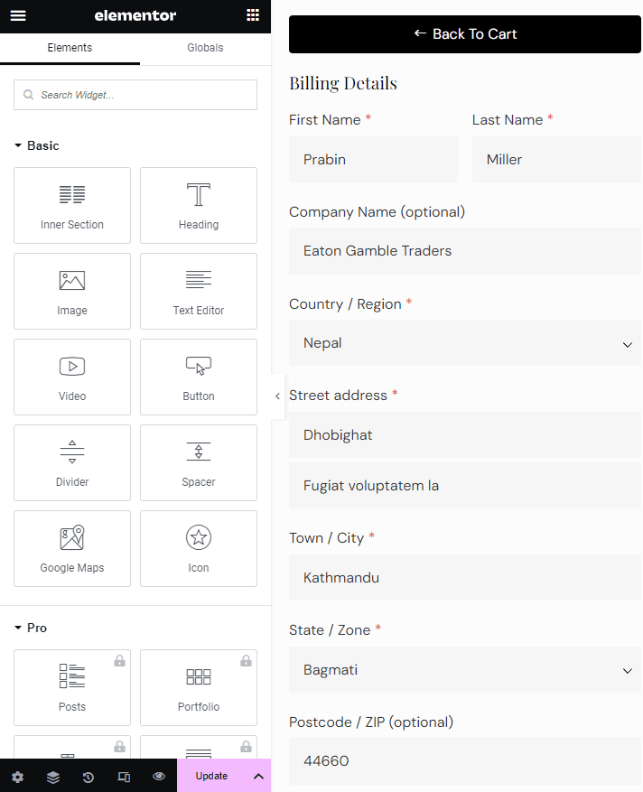
By thoughtfully integrating these elements into your website’s design, you can create an engaging and efficient shopping experience for your customers, ultimately increasing conversions and customer satisfaction.
Design
Choose to design the cart button and configure other settings as well.
Cart Button
Make necessary design changes to your cart basket/button.
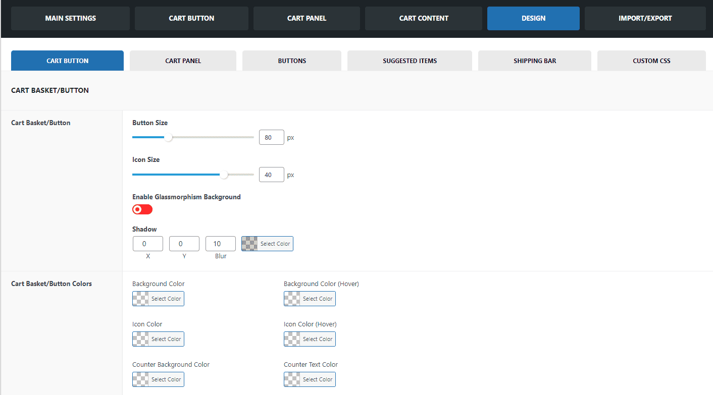
- The settings enable you to customize the size of both the cart button and the cart icon. Additionally, you have the option to apply the Glass Morphism feature to give the cart a sleek, glassy appearance.
- You have the flexibility to personalize the color of your cart button to match your preferred choice.
Cart Panel
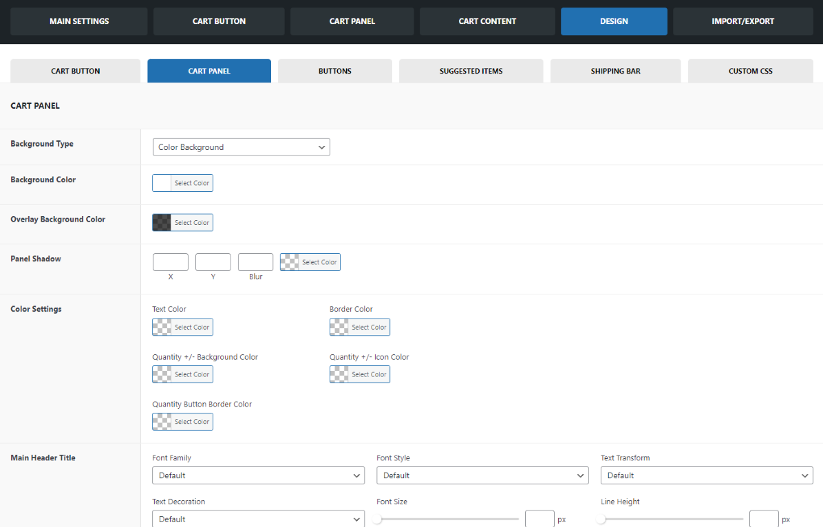
- Background Type: You can select from three background options – Color Background, Custom Image Background, or Glass Morphism Background.
- Background Color: Choose the color you want for the selected background type.
- Overlay Color: Select the color that appears when the cart button is pressed.
- Panel Shadow: Add a shadow effect to make the panel more visually striking and prominent.
Typography Customization: You have the ability to modify the typography for various elements including the main header title, heading title, content, and product title. Further adjust under these headings:
- Font Style: Adjust the style of the font.
- Text Decoration: Apply decorations like underlines or strikethrough.
- Text Transformation: Change the capitalization style.
- Font Size: Set the size of the font.
- Line Height: Define the spacing between lines.
- Spacing: Adjust the spacing between characters and words as needed.
Buttons
You’ll have full control over button aesthetics in this section. Customize button typography and colors, including background color, hover background color, text color, and hover text color for the following buttons:
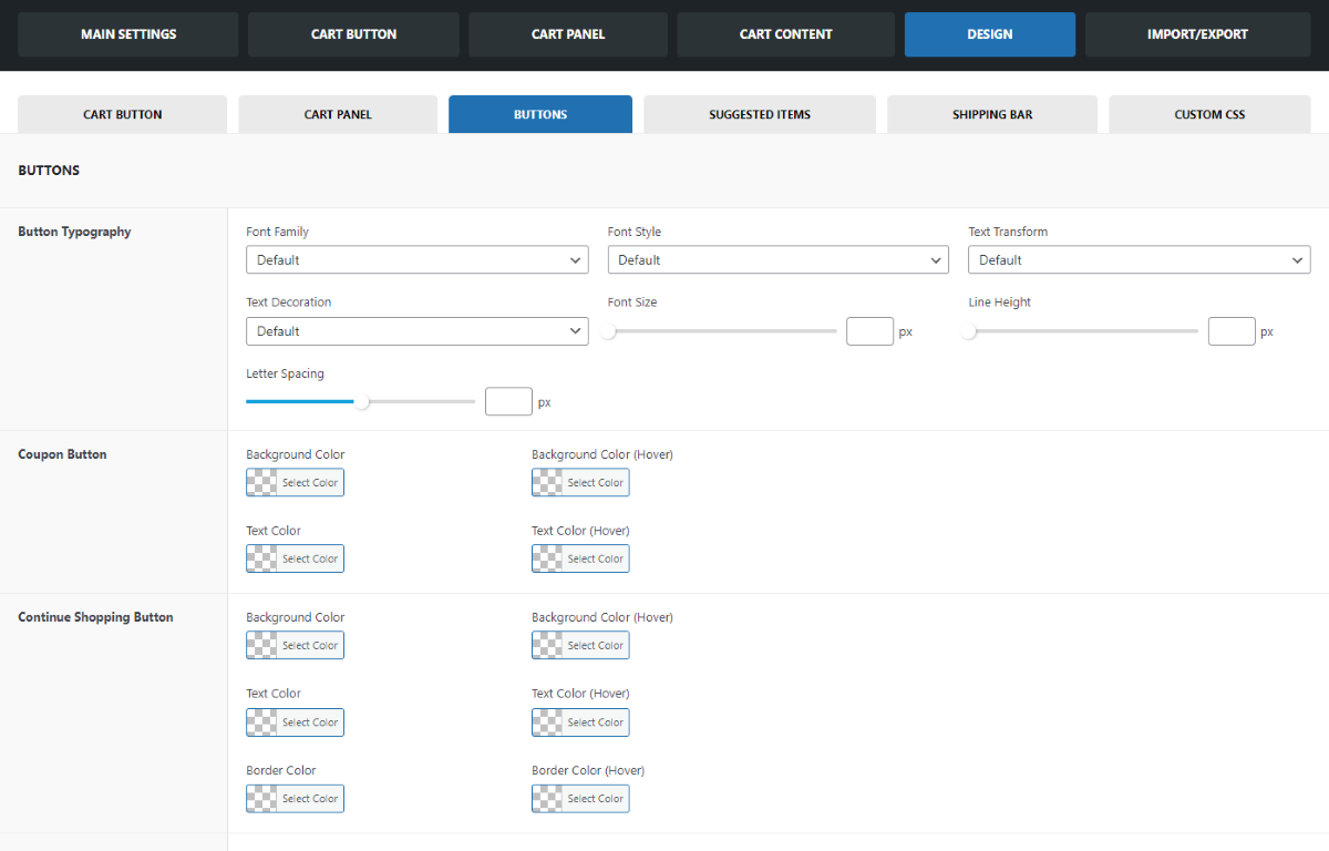
- Coupon Button
- Continue Shopping Button
- Cart/Checkout Button
- Place the Order Button on the Checkout Page
Suggested Items
In this section, you can tailor the appearance of your Suggested Product Carousel to match your design preferences. Here are the available customization options: Navigation Arrow
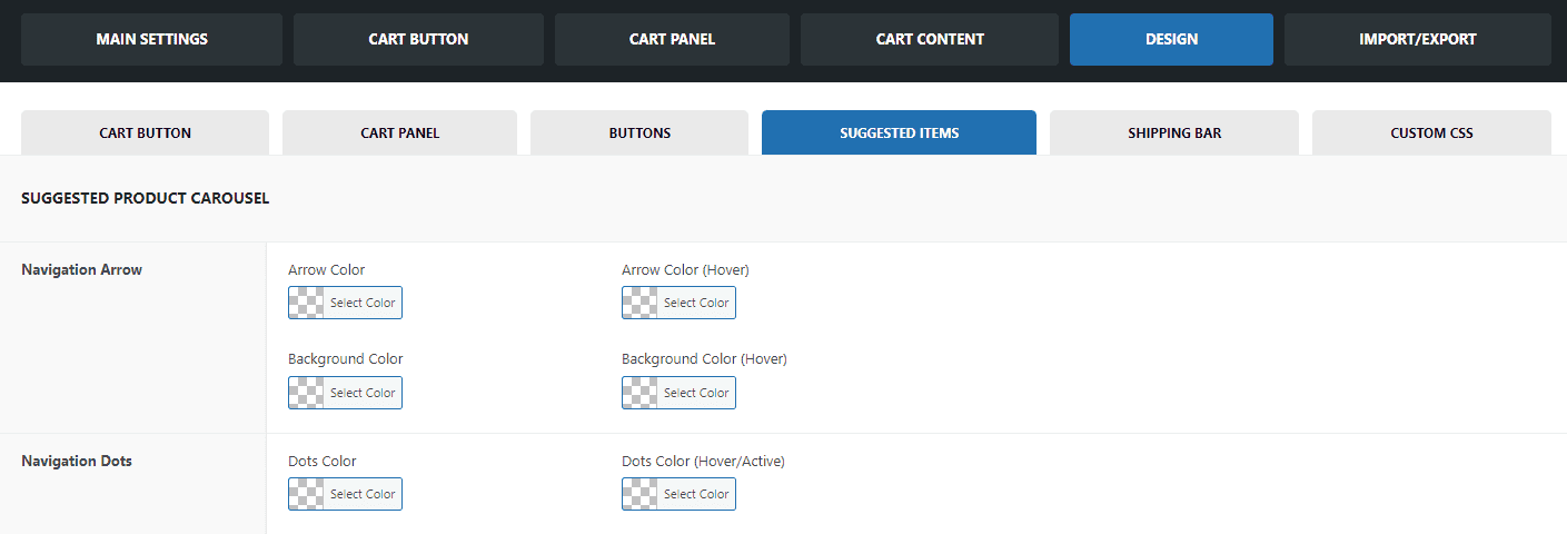
- Arrow Color: Choose the color of the navigation arrows.
- Arrow Color (Hover): Select a color for the navigation arrows when hovered over.
- Background Color: Pick the background color of the carousel.
- Background Color (Hover): Choose a color for the background when the carousel is hovered over.
Navigation Dots
- Dots Color: Customize the color of the navigation dots.
- Dots Color (Hover/Active): Select a color for the navigation dots when hovered over or when they represent the currently active slide.
Shipping Bar
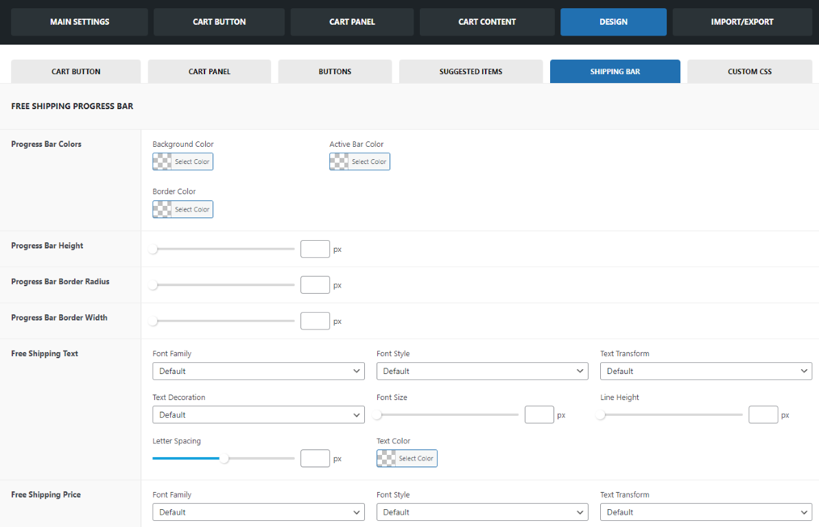
In this section, you can personalize the appearance and style of your Free Shipping Progress Bar. Here are the available customization options: Progress Bar Colors
- Background Color: Choose the color for the background of the progress bar.
- Active Bar Color: Select the color of the active (filled) part of the progress bar.
- Border Color: Customize the color of the progress bar’s border.
- Progress Bar Dimensions
Moreover, you can also make changes to the progress bar height, progress bar border radius, and progress bar border width. Add more style to the progress bar by changing the typography and choose from different font styles and text decoration as well.
Import/Export Settings
Now, you can simply import the templates that you like and make your e-commerce site like you want to.
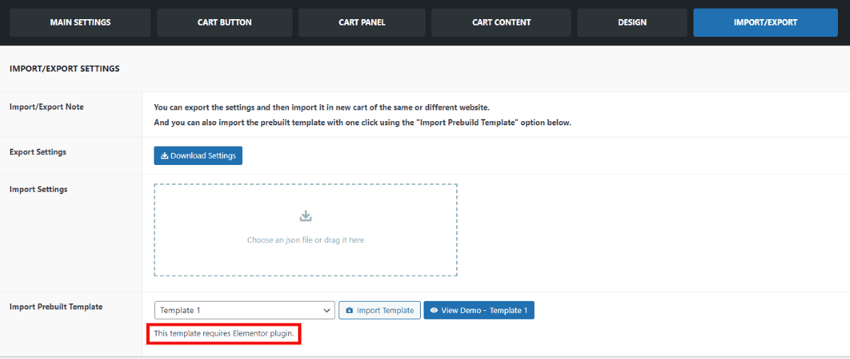
You have the flexibility to export your settings and import them into either a new cart on the same website or a different website. This allows you to replicate your customized configuration easily. Additionally, for a quick and effortless setup, you can use the “Import Prebuilt Template” option located below to import a pre-designed template with just a single click. This feature streamlines the process and ensures a consistent and efficient design across your websites or pages.
Note: Some Template requires the Elementor plugin. So, install Elementor Plugin before importing the Template.
Cart Popup
The primary purpose “Added To Cart Popup” is to confirm to the user that an item has been successfully added to their shopping cart or bag. This notification typically appears as a small overlay or popup window on the screen, providing feedback to the user about their action. The purpose of this popup is to provide feedback to users in a clear and unobtrusive manner, reducing the need for them to navigate to their shopping cart to check if an item was added. It enhances the overall user experience on an e-commerce website by keeping the user informed and making the shopping process more intuitive.
Added to Cart Popup
Configure Cart Popup Settings
You can configure the cart popup setting when the customers add in their product to their basket. Let’s see what changes you can make in this section:
- Main Settings
- Buttons
- Suggested Items
- Display
- Design
Main Settings
Configure the Main Settings
The main settings of the Cart Popup allow you to configure the settings like enabling popup, animation, content width, cart button, checkout button, and continue shopping button.

Enable Popup on Add to Cart
To enable popup on add to cart, you will have to enable this in the settings. To configure this:
- Go to Dashboard.
- Go to Ultimate WooCommerce Ajax Cart > Added to Cart Popup > Main Settings Tab.
- Enable the Popup on Add to Cart.
- Click on the Save Settings to keep the changes made.
Animation
Make Changes in the Popup Animation
You have the option to select the animation style for the popup that appears when items are added to the cart basket. You can customize both the entrance (Show) and exit (Hide) animations from a variety of choices. To modify the animation settings:
- Go to Dashboard.
- Go to Ultimate WooCommerce Ajax Cart > Added to Cart Popup > Main Settings Tab.
- Choose the appropriate entrance and exit animation of the cart popup.
- Click on the Save Settings to keep the changes made.
Content Width
Configure the Content Width
You can manually adjust the content width to your specific preferences. By configuring the content width offset, you can control how the popup is displayed to fit your desired dimensions.
Enable Overlay
The overlay is the background that appears behind the popup when it’s opened. Enable this option to provide a focused appearance to the popup.
Free Shipping Bar
To show the free shipping bar, you can toggle this button.
Button
Button Configuration
The button settings allow you can adjust the button text and customize it by adding additional information both before and after the text. Lets see what further configurations that you can make:

Button Positions
You can position the buttons in two different locations: either in the Sidebar or below the product. These placement options make it easy to adjust the pop-up cart and provide a convenient experience for users.
Cart Button
The cart button takes users directly to their shopping cart, where they can review the items they’ve added. This quick access allows users to double-check their cart before proceeding to checkout. You can choose to show or hide the button and customize the View Cart label.
Checkout Button
The checkout button directs users to the final payment section, where they complete their purchase. You can opt to show or hide the button and customize the label to fit your needs.
Continue Shopping Button
The continue shopping button takes users back to the shopping section, allowing them to add more items to their cart or remove any they no longer wish to purchase. You can choose to show or hide this button and customize its label as desired.
Before/ After Button Content
The before and after button content feature enables you to add information both before and after the button, enhancing the shopping experience. This option can be used to emphasize key messages that need to be communicated to users. Additionally, it supports shortcodes, making it even more versatile and user friendly.
Suggested Items
Suggested Product Carousel
The suggested item carousel displays related products that customers have added to their basket, aiming to encourage additional shopping by suggesting relevant items. Let’s see what changes you can make here:

- To Show/Hide the suggested product to the customers Enable/Disable the Display Suggested Products settings.
- Next, you have the option to modify the display of the heading title.
- You can also select the product layout, either vertical or horizontal.
- You can select the number of items to be displayed and determine how many items are visible in the carousel as well.
- Additionally, you have the option to Enable auto play, and infinite loops to move the carousel on its own.
- You can also enable the Pause on Hover feature, which allows customers to pause the carousel when they want to take a closer look at the items that interest them.
Before/ After Suggested Product Content
This section also lets you insert content before or after the suggested product. The content can be related to similar items or offer information on other products or topics that need attention. It also supports shortcodes, adding to its convenience and flexibility.
Display
Customize Cart Popup Display Options
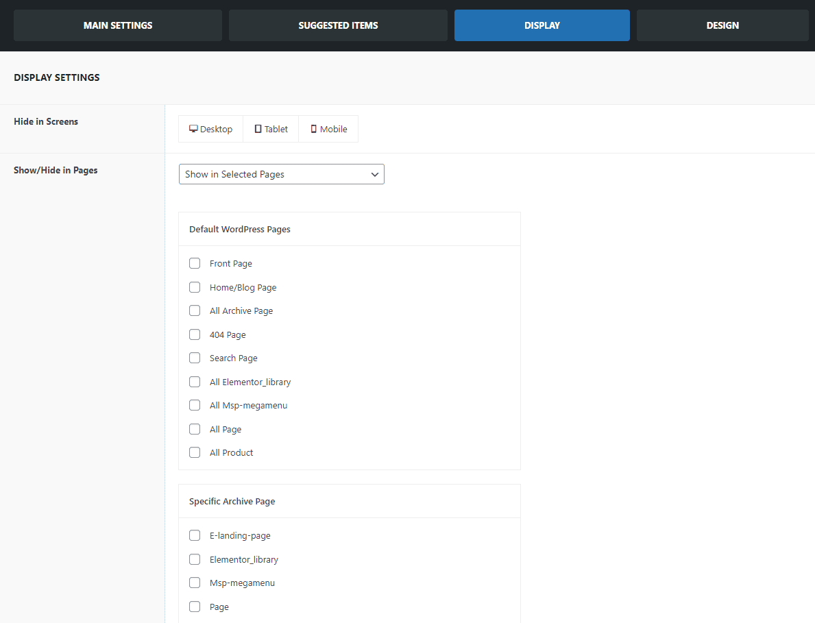
- This section particularly allows you to display the Cart Popup selectively on different pages.
- You can either show or hide the Cart Popup on selected pages. This allows you to control the visibility of the cart popup as you want.
- You can also configure it to display between desktop, tablet, and mobile. Choose the device where you don’t want your cart to be visible.
- You have the freedom to fine-tune the cart’s visibility on selected pages and devices enabling you to eliminate any unwanted appearances of the Cart Popup.
Design
Configure the Cart Popup Design
In this section, you can configure the following settings for the cart popup:
- Popup Panel
- Color & Typography
- Buttons
- Suggested Items
- Scroll Bar
i. Popup Panel
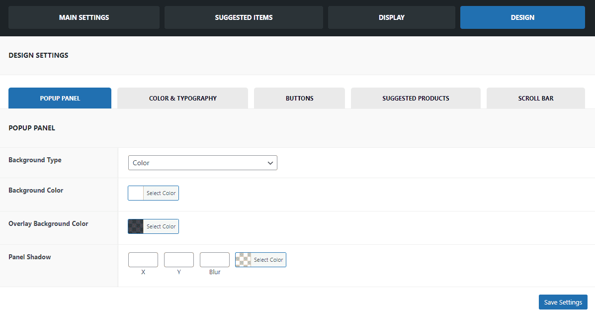
Configure the Background Color and Panel Shadow
This section allows you to make changes in the cart panel color as well as shadow. To make changes:
- In the Background Type section, you can opt for the background type of the popup cart, choosing from Color, Image, or Glass morphism.
- Additionally, in the Background Color section, you can specify the color for the background of the popup cart.
- Within the Cart Panel section, you have the capability to enhance the appearance of the cart. You can configure the cart panel’s shadow settings for both the X and Y axes, and also fine-tune the blur and color options to your liking.
- Click on Save Settings to keep the changes.
ii. Color and Typography
Configure the Color and Typography
In the section you will be given the chance to change the color and typography.
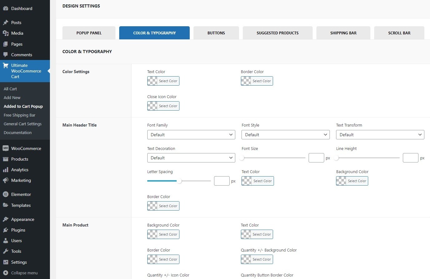
- Choose the color for the Text Color, Border Color, and Close Icon color in the Color Settings.
- Within the Main Header Title section, you have the flexibility to modify various aspects of the main header title’s appearance, including typography, font style, text transformation, text decoration, font size, and height. This allows you to customize the visual style of the main header title to suit your preferences.
- Similarly, for the main product, heading title and content you can make the changes in the typography, font style, text transformation, text decoration, font size, and height.
- Click on Save Settings to keep the changes made.
iii. Buttons
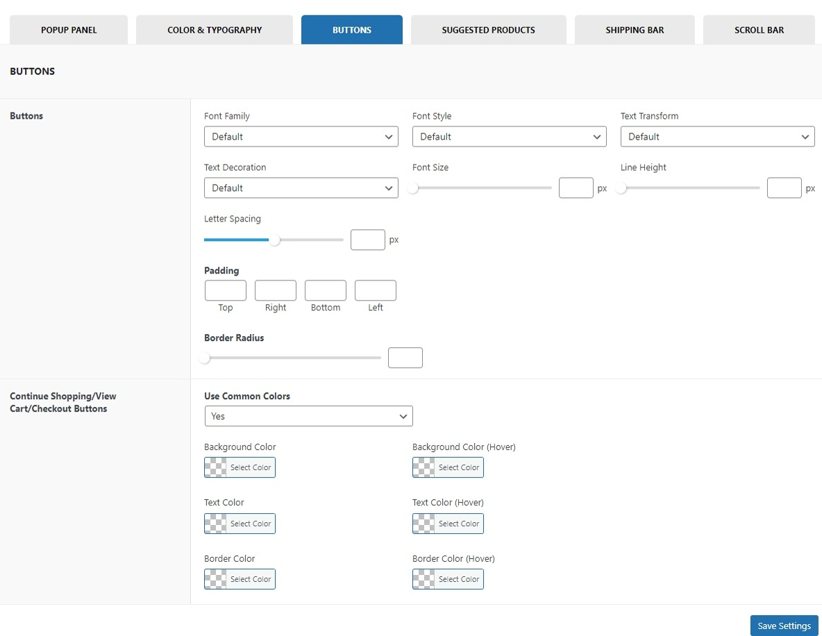
Configure the Button Color
In this section, you can choose the Background Color, Background Color (Hover), Text Color, and Text Color (Hover) for the Continue shopping button, Cart button, and Checkout button.
iv. Suggested Products
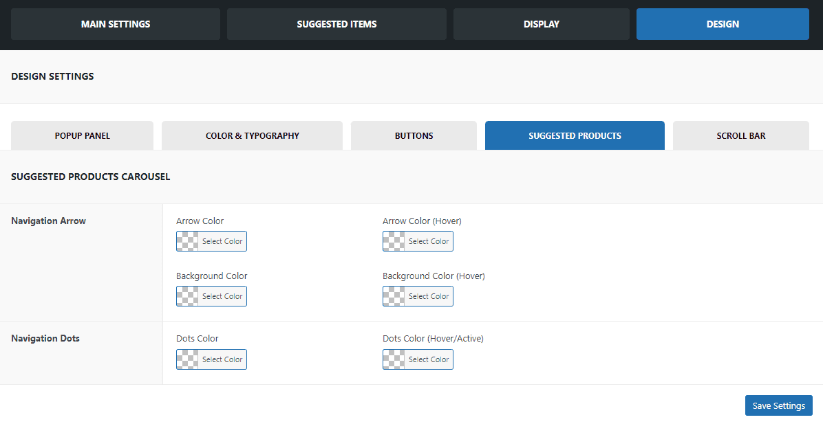
Configure Suggested Product Carousel
- Typically, this section enables you to define the color for the navigation arrow. You can specify both the arrow color and the background color to match your desired color scheme.
- Moreover, the dots color of the navigation dots can also be set manually.
v. Shipping Bar
The shipping bar that you have decided to display can be further customized. Choose the colors, height, and text and further make changes to it. Let’s have a look at what changes can be done in this section.
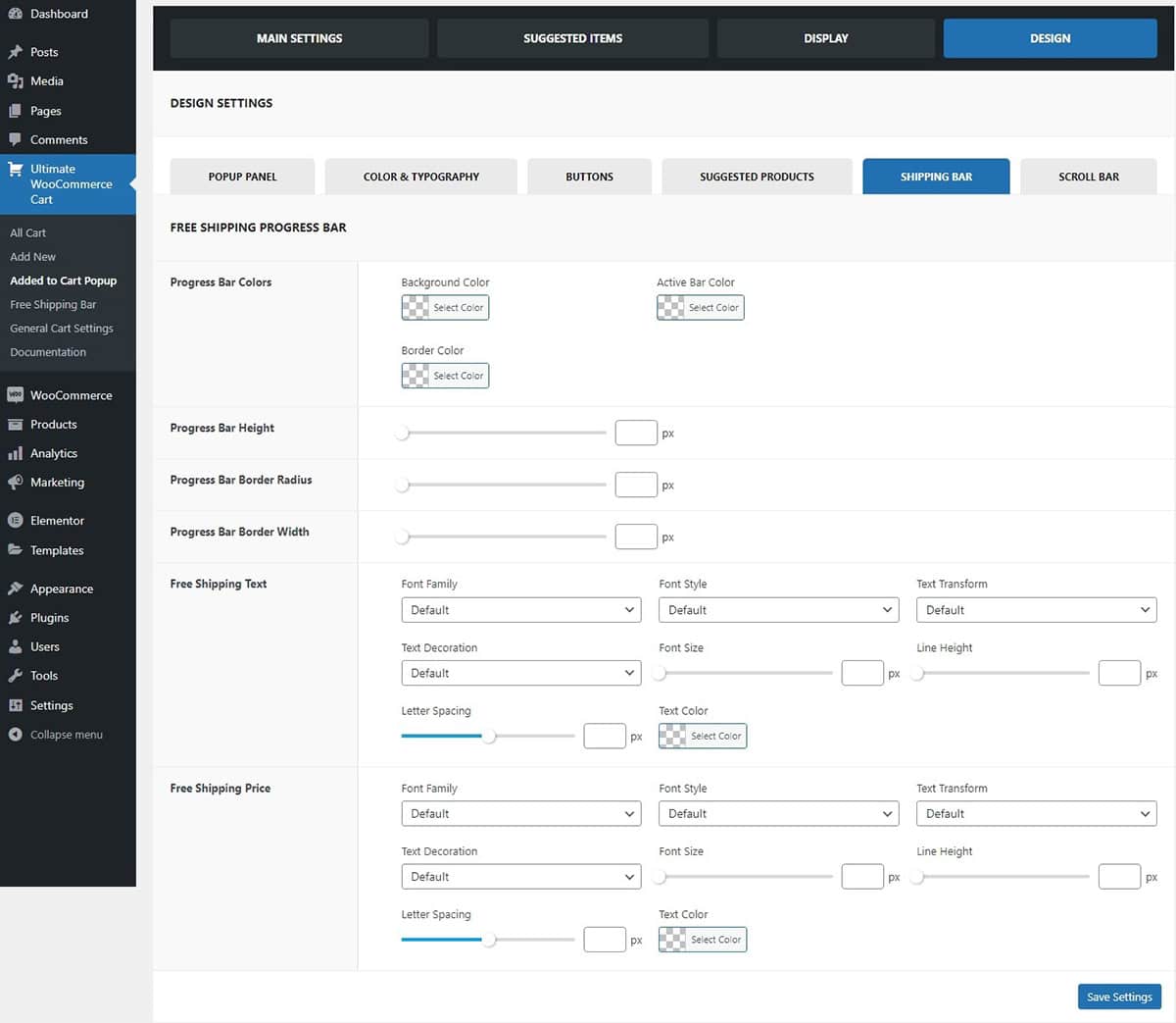
- Firstly, you can choose the Progress Bar Color. Tweak the progress bars Background, Active Bar, and Border color.
- You can customize the progress bar even more by adjusting its height, border radius, and border width in pixels. This allows you to tailor the progress bar to your liking, ensuring it matches your preferences perfectly.
- You have the option to customize the Free Shipping Text displayed alongside the shipping bar. You can select the font family and style, adjust the font size in pixels, add text decorations, and choose the letter spacing and line height to fit your preferences. Additionally, you can enhance the appearance by selecting the text color, ensuring it complements your overall design.
- Also, for the free shipping price you can choose the font family and style. Adjust the font size, letter spacing, and line height along with the text color to match it with the free shipping text.
- Click on Save Settings after you have made the changes.
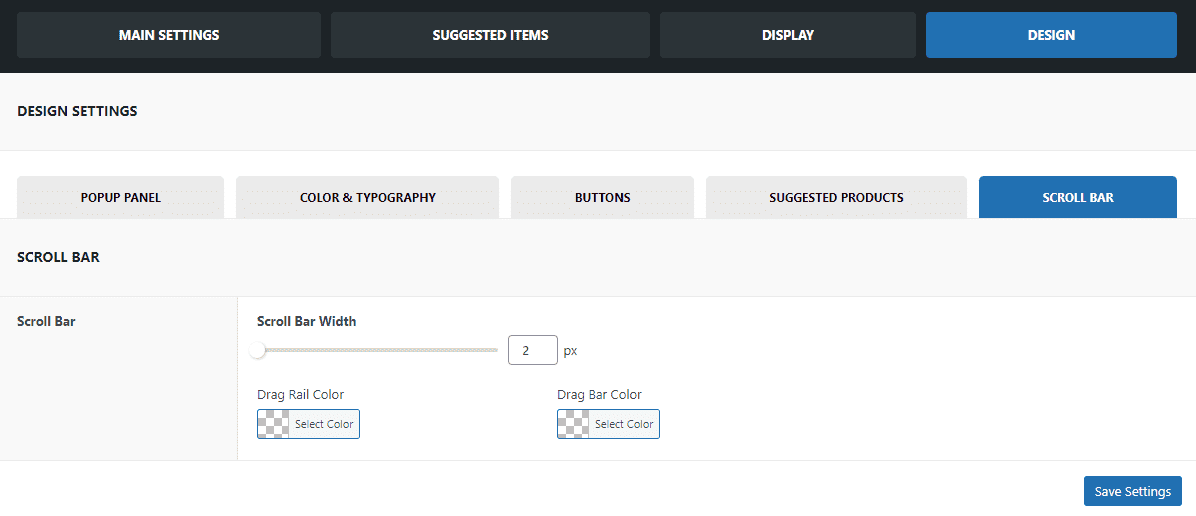
vi. Scroll Bar
Configure the Scroll Bar
This section allows you to choose the scroll bar width along with the drag rail and drag bar color of the scroll bar.
General Cart Settings
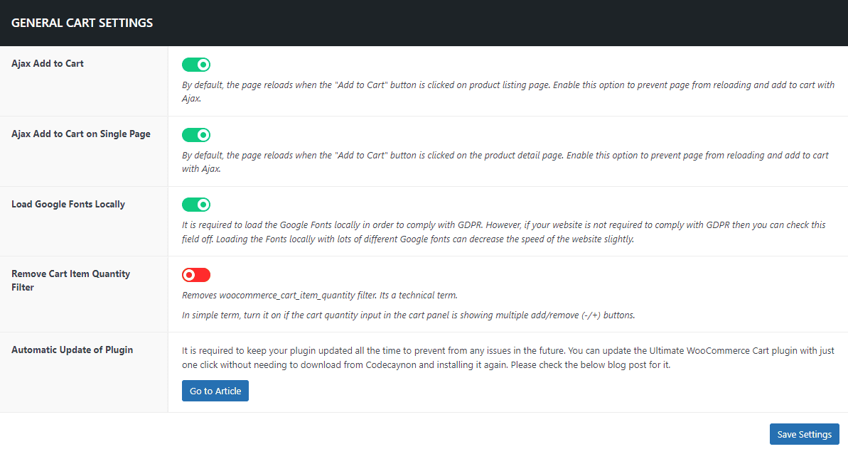
Configure the General Cart Settings
In the general cart settings,
Ajax Add to Cart
By default, when you click the “Add to Cart” button on the product listing page, the page undergoes a reload. To change this behavior and Enable the option to seamlessly add items to the cart without refreshing the page.
Ajax Add to Cart on Single Page
By default, when you click the “Add to Cart” button on a product’s detail page, the page refreshes. To modify this behavior and enable the option to add items to the cart using Ajax without any page reloading, you can make the following adjustment.
Load Google Fonts Locally
To comply with GDPR regulations, it is necessary to load Google Fonts locally. However, if your website does not require GDPR compliance, you have the option to disable this feature. Keep in mind that loading numerous Google Fonts locally may slightly impact your website’s loading speed.
Remove Cart Item Quantity Filter
This option allows you to disable the woocommerce_cart_item_quantity filter. In simpler terms, you can activate it if you want to switch the cart quantity input in the cart panel from displaying multiple add and remove buttons (+/-).
Updating Plugin
Regularly updating your WordPress plugins is crucial for maintaining the security and performance of your website. Developers often release updates to introduce new features, fix bugs, and enhance overall functionality. While the auto-update feature is available for free themes and plugins from the WordPress.org repository, managing updates for premium products requires a manual process. For users of Envato Marketplace, simplifying the update process is possible with the Envato Market plugin. By connecting your Envato account, this plugin enables seamless installation and updates for all premium WordPress themes and plugins purchased from Themeforest and CodeCanyon. This means you can conveniently auto-update Envato WordPress themes and plugins directly from your WordPress dashboard, ensuring your website stays secure and optimized effortlessly. To learn more on how to update follow this article: How to Auto Update Envato WordPress Themes and Plugins?

