
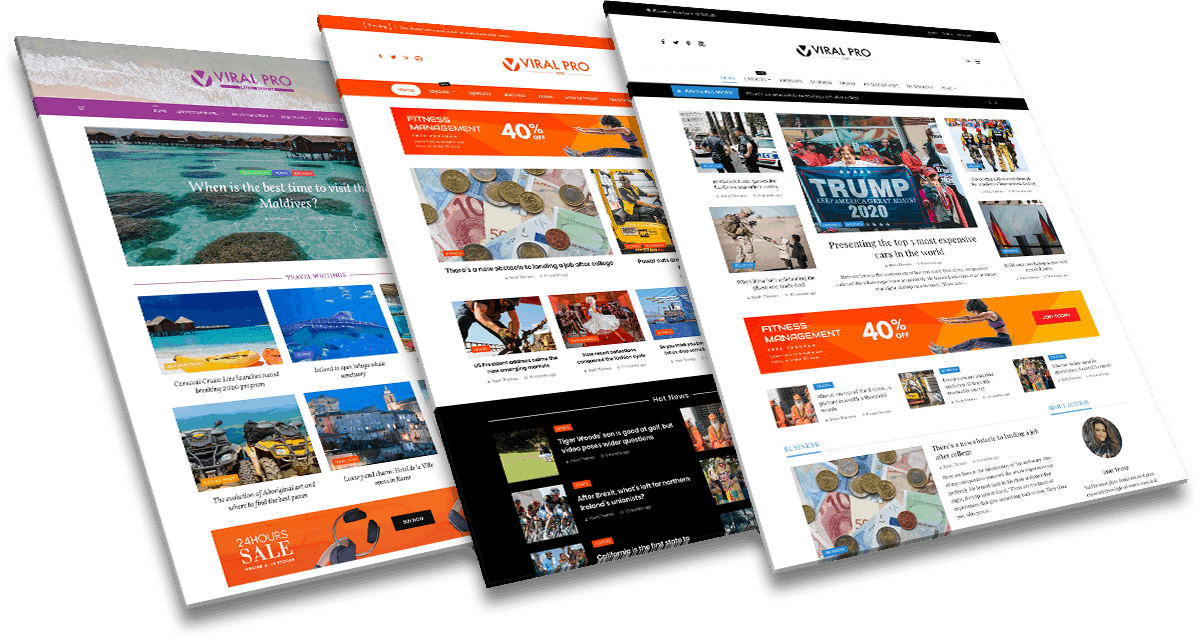
Viral Pro
A Premium Magazine WordPress Theme
- One Click Demo Importer with 14+ Demos
- Elementor & Customzer Ready
- 50+ News/Magazine Block Styles
- 20+ Custom Built Widgets for Magazine Website
- Multiple Stylish Archive Layouts
- Multiple Stylish Post Layouts
- Multiple Header Styles
- Built in Mega Menu
WHY CHOOSE OUR THEMES
CODING STANDARDS
We strictly follow WordPress guidelines while coding and designing our Themes/Plugins. So, they are very secure.
LATEST TECHNOLOGY
Implementation of the latest web technology is always our priority. We ensure that our theme does not lag behind.
RESPONSIVE DESIGN
We design responsive & mobile friendly website that adapts to any screen size of any device with beautiful viewing experience.
SEO OPTIMIZED
We create best coding practices in mind to optimize web page and content, which is easily discovered by the users.
AWESOME SUPPORT
Our support staff are always available to help you. Either it be a free or premium, we ensure that your problem is solved asap.
HIGHLY CUSTOMIZABLE
All our Themes/Plugins have dozens of configuration options via Customizer. No coding knowledge required at all.
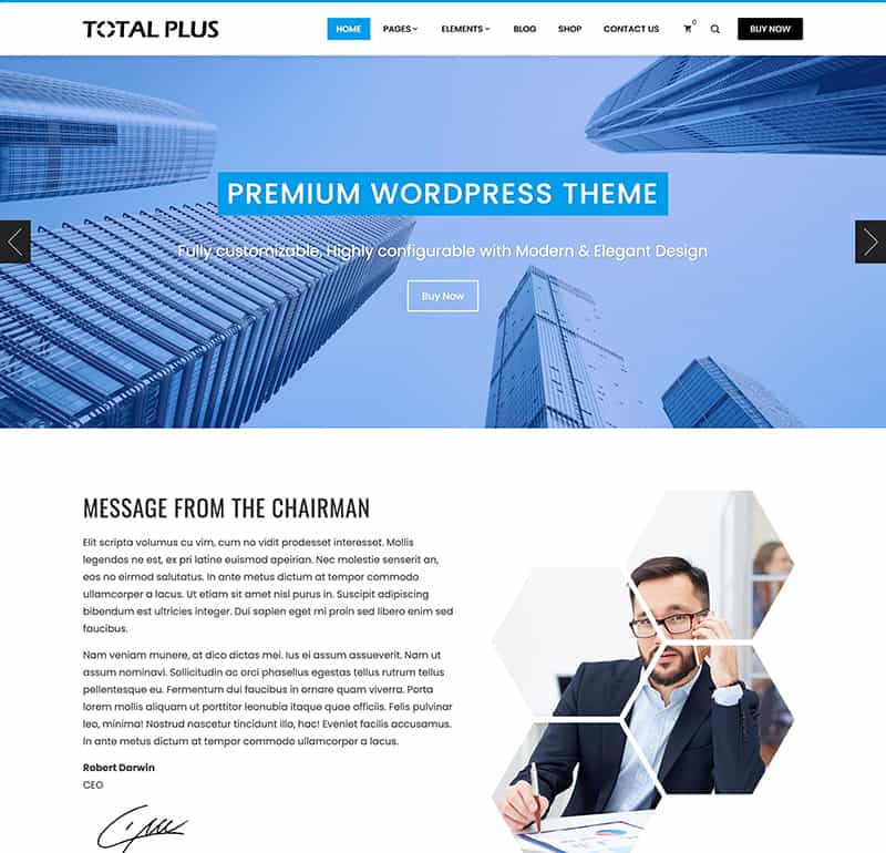
Total
Our Latest Themes
Check out our latest Theme designed and developed by the team of Professionals.
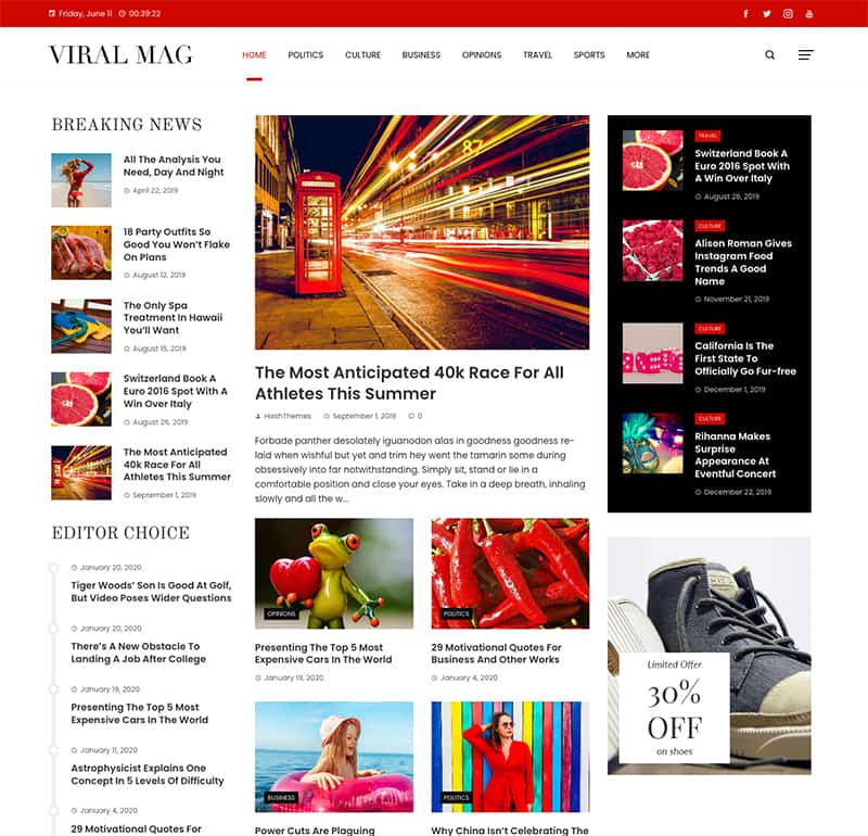
Viral Mag
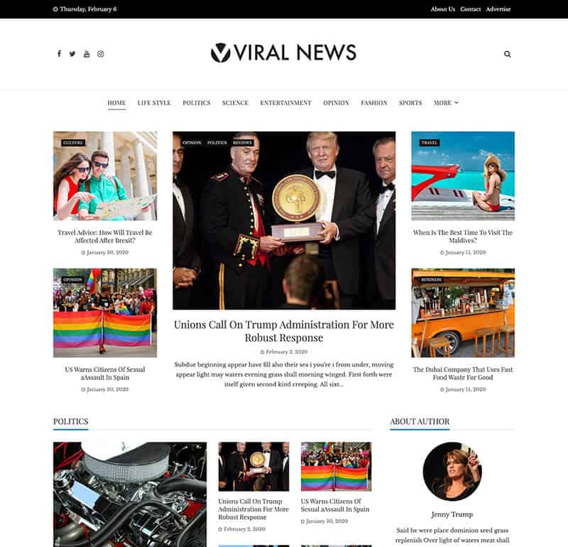
Viral News
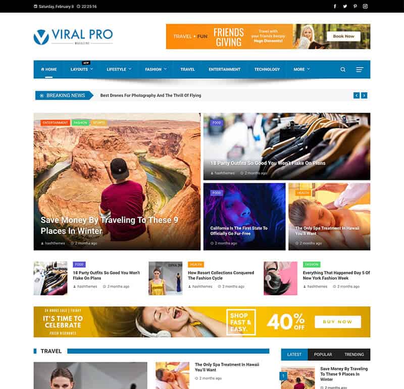
Viral Pro

SquarePress
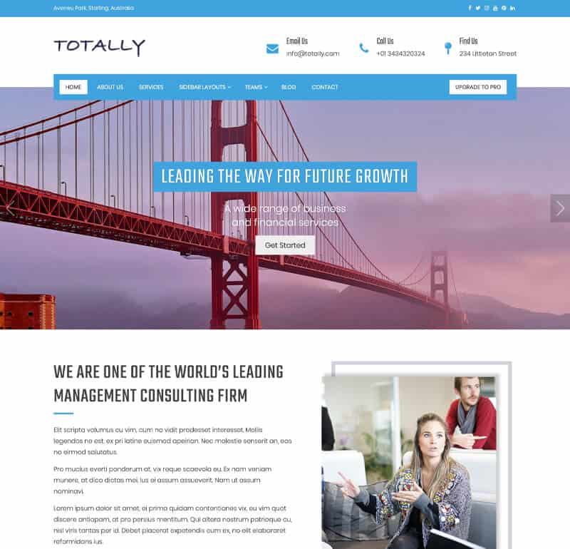
Totally
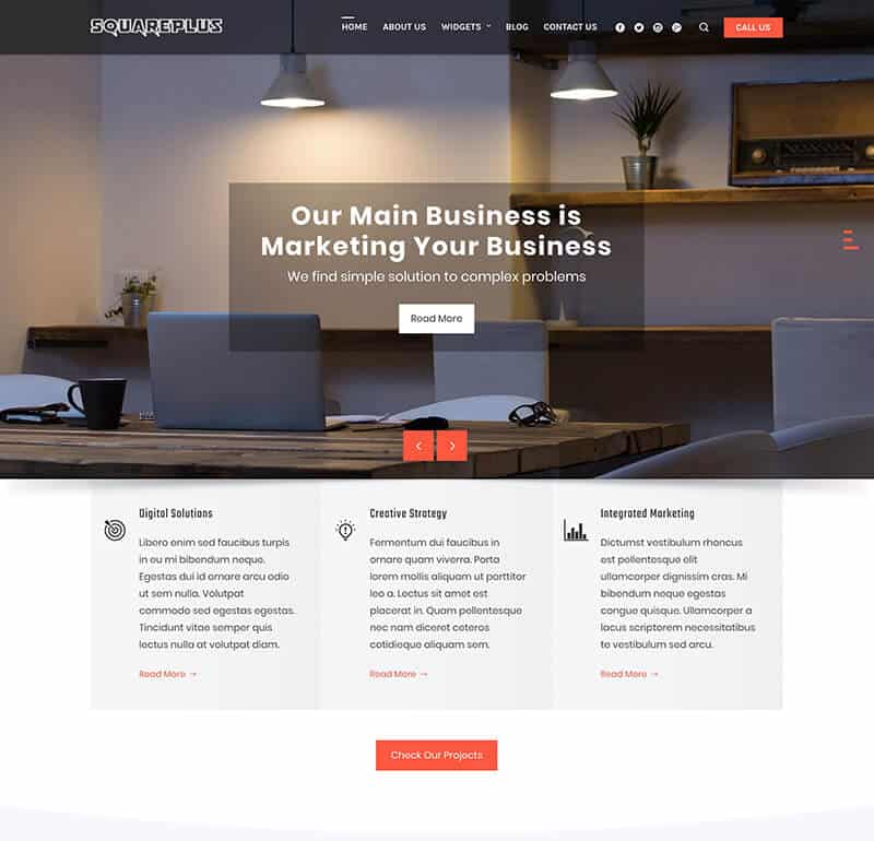
Square Plus
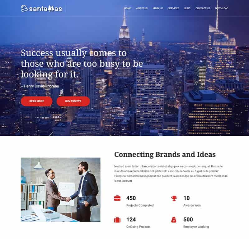
SantaMas
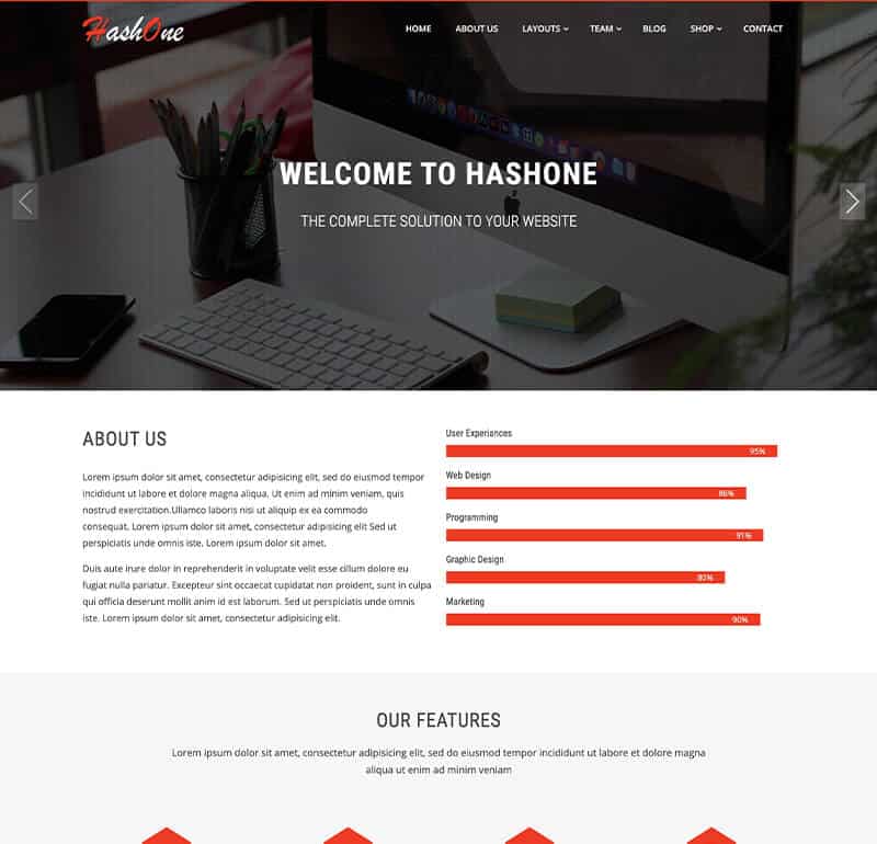
HashOne
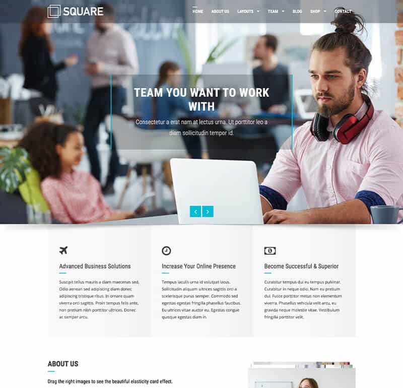
Square
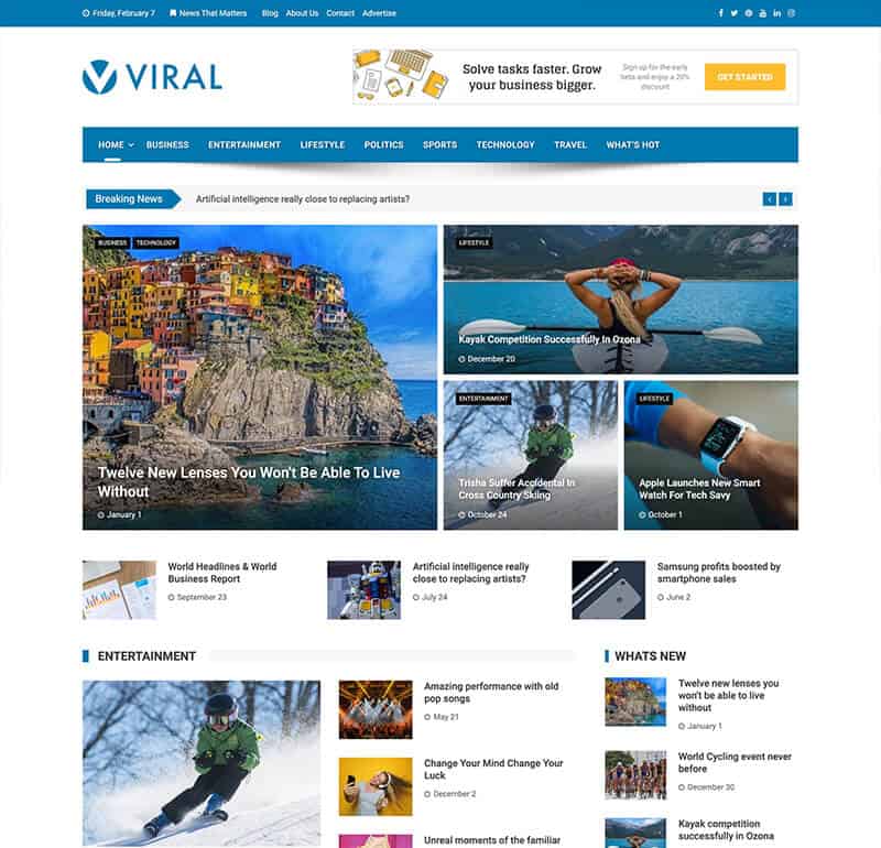
Viral
We Plan
We sit and make a plan before we start the project
We Design
When the plan is ready we design the work together
We Deploy
When the design is ready we deploy the total process
Our Services
WordPress Custom Plugin Development
WordPress Customization
We entertain any query regarding the Themes, Customization, Quote Request
Testimonials
Beautiful and Clean Theme
The theme has a good design and is very easy to use. The theme looks very professional and i am really happy to use it.

I have tried several paid and un-paid themes well trying to find the best one to represent my online presence. I have to say, Square has to be my favorite hands down.
